A UX case study about designing an e-commerce platform for guitar plugins, in 8 days. What we learned? Post-purchase support matters more than flashy features.

Overview
VeJa is a company that creates guitar plugins simulating amplifiers for music production. They were selling exclusively on the MOD Devices platform but wanted to expand their reach with their own online store. The challenge? They had great products, a loyal niche following, but no website. Just a logo. And us.
The brief was simple: Our bootcamp team of three had just 8 days to prototype a e-commerce platform that would help VeJa compete in a saturated market dominated by giants like Neural DSP and IK Multimedia.
The Stakes
The plugin market is crowded. Musicians have countless options. And according to our stakeholder interview with VeJa’s founder, their competitive edge wouldn’t be feature bloat or celebrity endorsements, it would be competitive pricing and a creative, non-traditional approach to amplifier simulation.
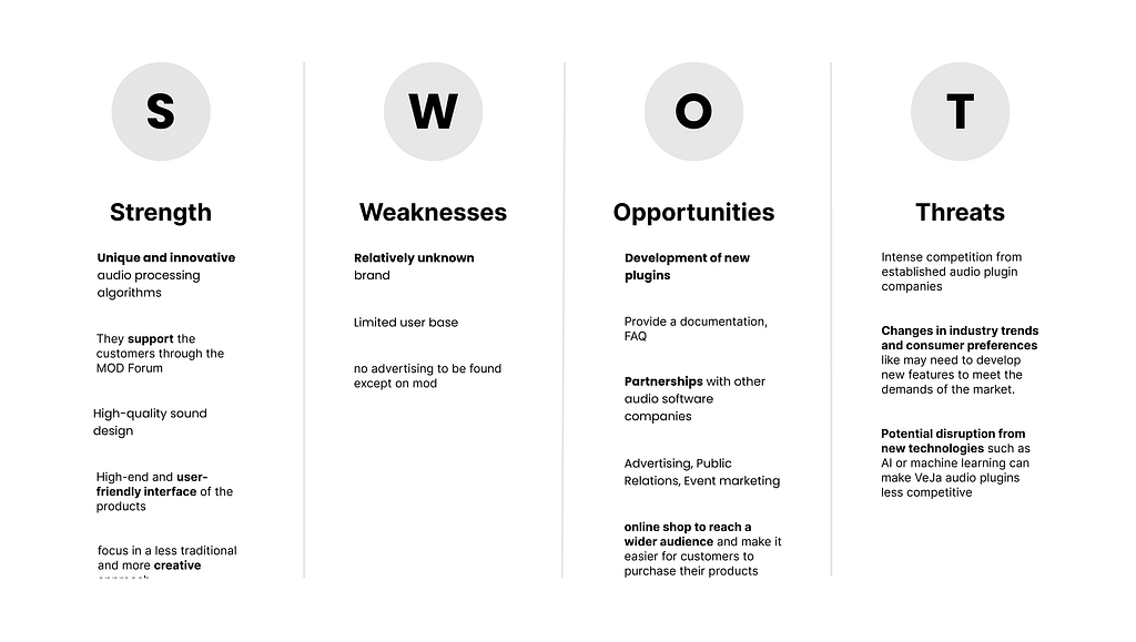
Secondary and Competitive Research
We conducted a SWOT analysis of VeJa’s main competitors: Neural DSP, IK Multimedia, and Guitarix to understand the landscape. What we found: VeJa has unique processing algorithms and hig quality sound design that genuinely stands out.
The opportunity was clear: expand beyond the MOD platform with their own online store and position themselves more competitively in the marketplace. But a website alone wouldn’t cut it, we needed insights from musicians using plugins.
User Research: Why Musicians Hesitate to Buy Guitar Plugins
We interviewed 5 musicians (guitarists, producers, and multi-instrumentalists aged 25–35) who use digital plugins in their creative process for music production. Our goal: understand what they’re searching for and their decision-making criteria when purchasing guitar plugins.
Key Research Insights from User Interviews
What we discovered:
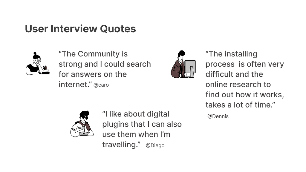
🎸 Installation anxiety
“Installation is often very difficult. The program often crashes. I have to try out a lot and research to find a solution.” — Dennis, 27, band guitarist
🎥 YouTube reviews trump everything:
4 out of 5 participants mentioned YouTube reviews as their primary research method. 3 specifically mentioned watching reviews with “direct links to downloads” or seeing “what equipment others use.”
🔍 Try-before-you-buy isn’t optional
“I need to test it online, feel how it works, hear the sound.” — Julika, 25, singer-songwriter
Musicians don’t want promises, they want proof. One participant used a monthly subscription service (Splice) specifically to try plugins before committing.
📚 Documentation gaps create anxiety “I always need a lot of research on software, compatibility, installing process, license and payment. It’s not very user-friendly.” — Diego, 32, sound engineer
Synthesizing the Insights
Almost everyone mentioned the same decision-making sources:
- YouTube reviews (4 out of 5 people)
- Friends’ recommendations (3 out of 5)
- Being able to try it first (3 out of 5)
And here’s what barely anyone mentioned: fancy websites, celebrity endorsements, or technical specs. They wanted to know it would work and not waste their time.
In other words: Synthesizing our user interviews, we identified the core friction:
“Musicians looking for guitar plugins have to do extensive research after purchase to understand installation and compatibility, which creates frustration and erodes trust before they even hear the first note.”
Unlocking the sound explorer’s journey
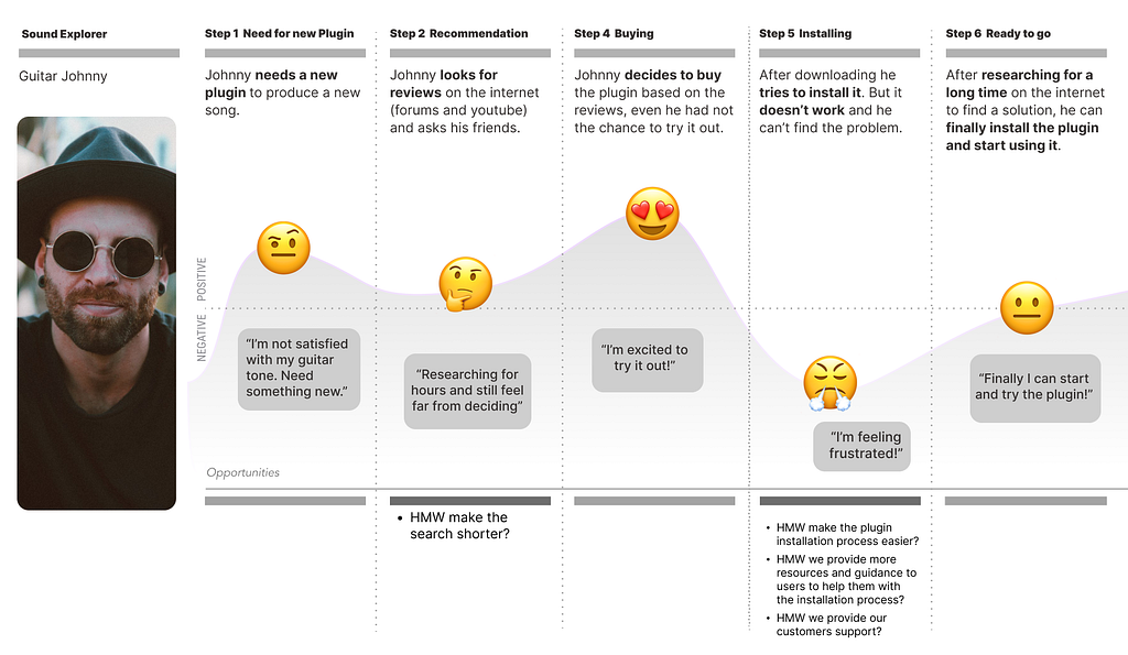
Based on our user research, we created a persona named “Guitar Johnny.” He’s been playing for 15+ years. He uses both analog and digital gear for music production. He relies on reviews and recommendations from trusted sources. But here’s his problem: every plugin he buys comes with a 30-minute installation headache.
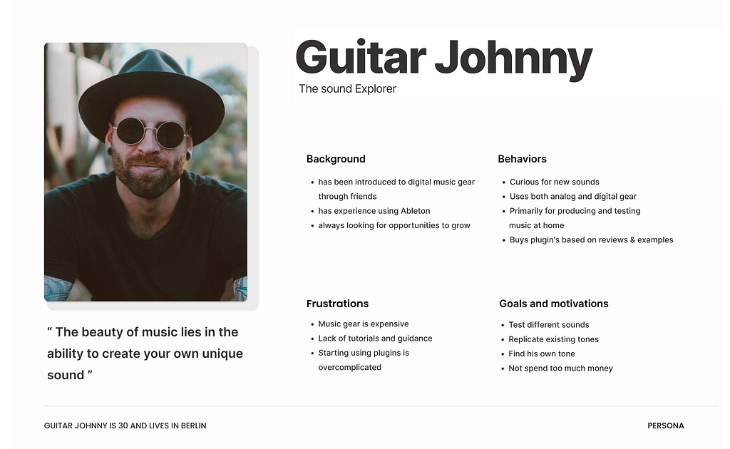
The user journey of Guitar Johnny highlights the problem that musicians face in understanding how to install and use plugins after purchase.
Will it work with his digital audio workstation ? Does he need a certain operating system? Where’s the license key supposed to go? Why is the website’s “support” page just an FAQ from 2019?
By the time he gets the plugin working, he’s exhausted. And a little resentful. Johnny’s journey revealed a critical gap: the moment after purchase was where brands abandoned users, right when customer support mattered most.
This frustrations leads to the problem statement:
“Musicians looking for plugins still have to do a lot of research after purchase to understand how to install and use the plugin, which is very frustrating.”
Our Solution: E-Commerce Design with Post-Purchase Support
Our team realized: the hard part isn’t buying. It’s the aftermath. So we began to ask us how can we provide more resources and guidance to musicans to help them with the installation process and build confidence before purchase ?
We had a lot of great ideas! We used the Crazy 8s ideation method and MoSCoW prioritization:
Must-Haves for Our Prototype
- Sound demos you can play with right on the product page
- Video tutorials showing real installation (not promotional fluff)
- Compatibility info in big, obvious letters (DAW support clearly displayed)
- Discord Community for peer support
- How often a Plugin has been Downloaded
- A simple, transparent checkout that doesn’t feel like a trap
- Responsive design for desktop, tablet, and mobile
- Resource center with installation guides
Site Structure
We created a comprehensive sitemap and defined a “Happy Path” for the ideal user journey:
- Land on homepage
- Browse plugins → hear sound demos
- Select a plugin → see compatibility, tutorials, community size
- Add to cart → clear checkout process
- Purchase → receive installation guidance
Design Process
We started with low-fidelity wireframes, moved to mid-fidelity interactive prototypes, and iterated based on feedback. Our design process was messy, fast, and constantly evolving, exactly what you’d expect from an 8-day sprint focused on user-centered e-commerce design.
Wireframes and prototyping:
We created lofi wireframes and a mid-fi interactive prototype to visually communicate our solution ideas. Based on the feedback from the interviews, we created wireframes and an interactive hi-fi prototype to refine the design and functionality of the online store by iterating over and over again.
Usability and concept Testing Results: What We Learned from 5 Musicians
We conducted tests with five musicians to evaluate our mid- and high-fidelity prototypes. The results helped us understand what felt intuitive and what created friction
✅ What Worked
- 5/5 participants called the design “clean,” “intuitive,” and “easy to navigate.”
- 100% task completion rate for finding and purchasing a plugin.
- 4/5 participants specifically praised the footer for clarity and completeness.
- 3/5 participants appreciated the video tutorials on product pages.
⚠️ What Didn’t Work
- The pop-up cart created confusion and purchase anxiety.
- No visible contact option, which reduced trust.
- Homepage lacked context — users weren’t sure what the site was selling.
- Download numbers (a key trust factor) weren’t visible enough.
Design Decisions: Building Trust Through Transparency
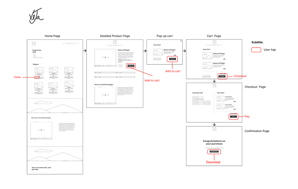
The Cart Pop-Up Problem
Three out of five testers got confused when clicking Add to Cart and seeing a pop-up appear. “Is this the payment page? If I click this button, am I already buying it?” Another: “Sometimes it feels safer to have more steps in the checkout.”
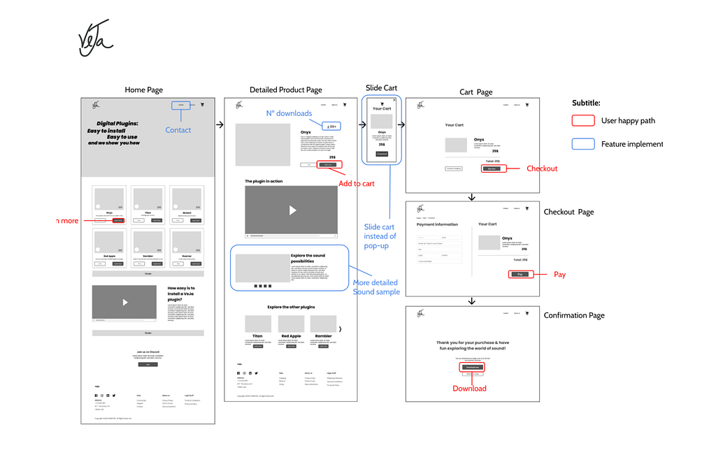
We thought we were being efficient turns out, we were creating anxiety. We replaced the cart pop-up with a slide-in cart panel and added a dedicated checkout page with progress indicators. This gave users the “safety” of multiple steps they expected in e-commerce design
What Actually Built Trust
Multiple people mentioned download numbers: “That’s good for building trust. Maybe show different numbers for each plugin.”Someone else said: “The number of Discord members should be indicated too.” Numbers = social proof = confidence.
We almost left those out because they seemed “too salesy.” Good thing we tested. Each plugin now displays, a total downloads (specific to that plugin), Video tutorials showing real usage and Compatibility badges (DAW icons)
And we Added a dedicated “Plugins” page while maintaining product highlights on homepage, giving musicans both discovery paths.
Brand Identity: Designing From Scratch
With no existing brand guidelines, we started from emotion. We asked: “How should VeJa make musicians feel?”
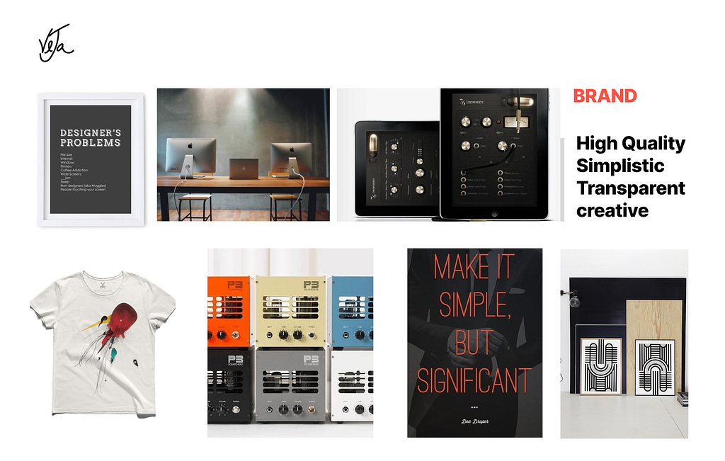
We unleashed our inner artists and created a moodboard. But before we crowned it the perfect representation of Veja, we took it on the road…. well, to the classroom, to play the game “Guess the Attributes.” I enjoyed every minute of it. We identified three brand attributes:
- Creative (non-traditional approach)
- Accessible (approachable pricing and support)
- Confident (professional quality, indie spirit)
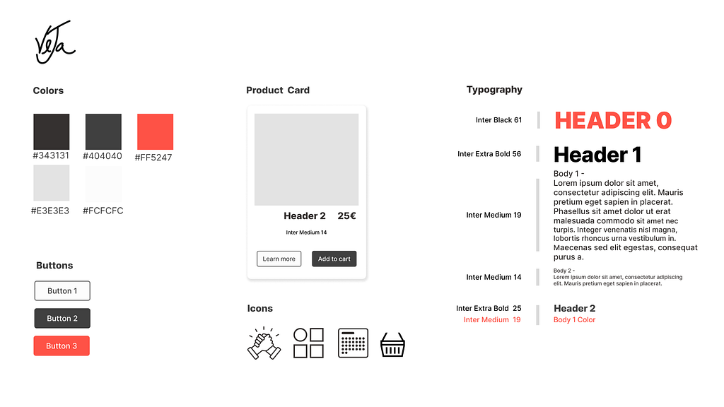
Our design tile reflected this: bold typography, high-contrast color palette, and generous white space to let the product demos shine.
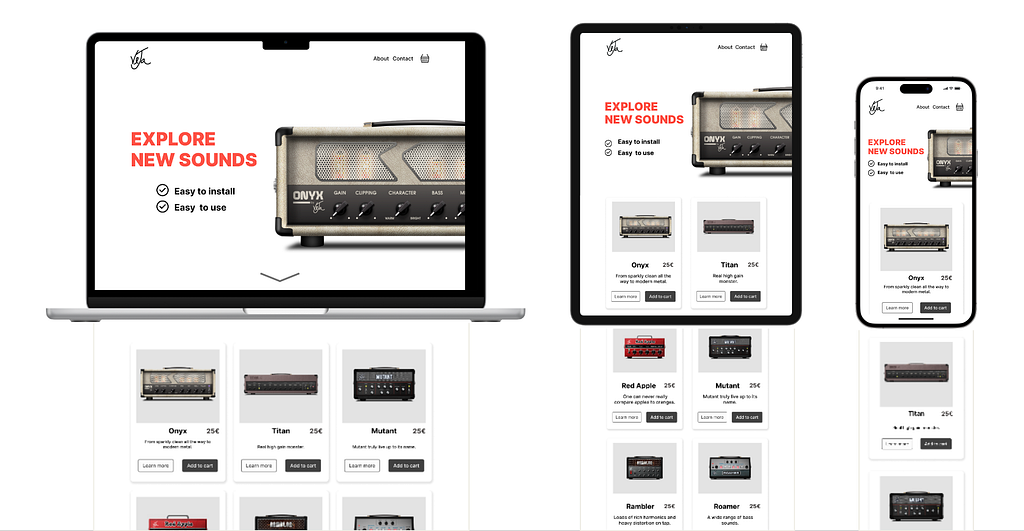
Result of our 8-day journey
Desktop, tablet and mobile version
What We Actually Learned beyond Design
1. Empathy isn’t a buzzword
Talking to Dennis as he described crashing programs and feeling frustrated? That made it real. We weren’t designing for “users.” We were designing for Dennis.
2. Anxiety is invisible until you ask
None of our UX research participants said, “I feel anxious when I buy plugins.” But when we dug deeper during user interviews, asking about past experiences and decision-making, there it was: Installation fears. Compatibility worries. Post-purchase regrets.
Good design sees the feelings beneath the words.
3. Trust is built in tiny moments
Every little choice we made felt like it either added confidence or subtracted it:
- Showing download numbers? +1 trust
- Vague “learn more” button? -1 trust
- Video tutorial on the product page? +2 trust
- Pop-up that feels like a dark pattern? -5 trust
Trust is earned in pixels.
4. We don’t have all the answers and that’s okay
We’re bootcamp students. We had 8 days. We made mistakes and thats important. The cart pop-up didn’t work, or we forgot to explain what VeJa was on the homepage. We almost buried the social proof.
But we tested. We listened. And the next iteration, if there would be one, would fix that.
Perfect doesn’t exist. Better does.
Next Steps
If we could wave a magic wand (or, you know, have more than 8 days), here’s what we’d add:
- AI chatbot to help with installation questions in real-time
- User-generated content section where customers share songs they made with VeJa plugins
- Artist spotlight videos showing professionals using the tools (not endorsements, just real use cases)
- Expanded tutorial library with troubleshooting guides for different DAWs
- Community forum integrated directly into the site
- An e-learning section to help people get onboarded and give them reasons beyond plugins to get into contact with VeJa
Conclusion
This project taught me that UX design isn’t about making pretty websites. It’s about understanding why someone hesitates before clicking “buy.” It’s about seeing the moment a musician opens their laptop at midnight, excited to try a new sound and then spends an hour Googling installation errors instead. It’s about removing the barriers between someone’s creative vision and their ability to make it real. And maybe that’s what good design is: making the hard things feel possible and accessible.
Thanks for reading. If you made it this far, I’d love to hear your thoughts, what resonated, what didn’t, or what I could’ve done differently. You can find me on LinkedIn or drop a comment below 🌻
About – Veronika Lila Nikonova – Medium
![]()
What 5 Musicians Taught Us About Designing a Guitar Plugin Store was originally published in UX Planet on Medium, where people are continuing the conversation by highlighting and responding to this story.