Five ways to instantly upgrade your designs


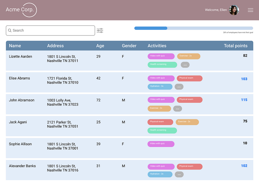
I recently stumbled across my attempt at this UX design challenge I completed nearly three years ago for a job application. The assignment was fairly straightforward: create an admin view to track employee points in a health challenge, with various employee data.
When I saw my original attempt, I immediately wanted to redesign it with my improved UI skills. I remembered designing it three years before, knowing it didn’t look great, but unable to put my finger on what was wrong or how to fix it. My background was in graphic design, and I knew my taste and visual aesthetics were solid, but I wasn’t always able to execute at the level I wanted to.
Since those early days of job hunting, fresh out of a bootcamp and eager to dive into a full time role, I’ve learned more than I could have ever imagined. But I don’t usually take the time to sit down and celebrate my accomplishments–or even to acknowledge them.
I have come a long way since the original design, and I wanted a way to visualize my progress. But more importantly, I wanted to share what I’ve learned and help other designers at the start of their UX journey.
Here are five key areas where I improved my original design, and how you can apply them to your own designs.
Text
One thing I see new designers frequently getting wrong is font size–I know I struggled with it. It’s hard to conceptualize how big something will actually look on a screen when you don’t have any basis for comparison. With a more practiced eye, it was immediately clear to me that my text was way too large. The oversized text also meant that other elements were much larger than they should’ve been, such as the search bar. By changing my body font from 20 pt to 14 pt, I was already able to create a much better hierarchy–not to mention fit more information on the screen. (Check out my typography here).
Color
The first time around, I didn’t have any systematic approach to color. I just chose a couple colors I liked and threw them together. I did use a monochromatic color scheme (mostly), but the colors are overpowering, and the secondary color doesn’t work well with the rest of them.
When choosing a monochromatic color palette, use HSB instead of Hex codes in Figma. Take the hue and keep it consistent across variations of your primary color, as well as any grayscale colors. Here, I used a blue with a hue of 212, which I kept consistent across my primary, stroke, and text colors, even as I changed saturation and brightness.
Components
Although I did a decent job naming my components in a logical way in my first iteration, nothing was componentized. For table design especially, which involves repeating cells, componentizing makes it much easier to work with a design. It may not seem that important for a single page, but getting in the habit makes a huge difference when prototyping. Creating a logical system of components, with cells building to columns to a table, was a key improvement here. (See how I organized these components here).
The screen
In my single-minded focus on creating a great table, I failed to consider all the pieces needed around the table. I forgot that I was designing a screen, not just a table. Although I attempted to add some additional elements, my search bar and single progress bar fell short. Here, with some of the newly acquired real estate gained from shrinking the text and row height, I was able to show some overall metrics to help with data ingestion at a glance. I also added important navigational elements such as a header and breadcrumbs to orient the user.
Inspiration
If you’re only going to take one piece of advice from this article, let it be this one. Look at other tables–and not just on dribble, but in real, functioning interfaces. For some reason, when I started out designing, I assumed that looking at similar designs was cheating. But like my art teacher drilled into my head in college, you have to draw what you see, not what you think you see. If you try to design a table blindly, you’re just going to end up with what you think a table looks like. (See exhibit A if you still think that’s a good idea.)
Also, there are entire articles on good table design. Whatever component you’re designing, reading up on best practices will always help your design skills.
These five tips are the key areas where I improved my original design. Do these, and you’ll see your designs level up.
UX Design Challenge: Then and Now was originally published in UX Planet on Medium, where people are continuing the conversation by highlighting and responding to this story.