Picture this: You’re browsing through a beautifully designed app, enjoying its sleek interface, when suddenly, you find yourself struggling to read the text. The words seem to dance around, making it hard to grasp the information. Frustrating, isn’t it? Now imagine experiencing this every time you interact with digital content. This is a daily reality for individuals with dyslexia, a common learning difficulty affecting reading, writing, and spelling.
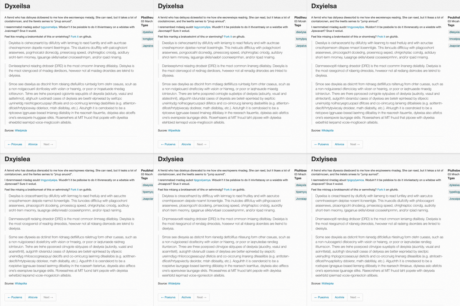
According to Official DyslexiaHelp There has been 30 years of documented, scientific evidence and research proving the existence of dyslexia. It is one of the most common learning disabilities to affect children. And In the United States, NIH research has shown that dyslexia affects 20%, or 1 in every 5 people, and 1 in every 10 people in the UK has some degree of dyslexia.[1] As a designer, when you’re designing a new product, you have to make sure it is accessible for everyone, this article covers one of the most common challenges, and we’ll explore practical and effective design strategies to enhance digital accessibility for dyslexic users.
What is Dyslexia
Dyslexia, a specific learning difficulty affecting reading and spelling, is a neurological condition, not an indicator of intelligence. It’s a unique processing difference in the brain that’s often hereditary.
Contrary to common misconceptions, dyslexia has no link to one’s IQ.
In fact, many with dyslexia have excelled in various fields due to their distinctive problem-solving skills and creativity. Take, for example, Albert Einstein, whose groundbreaking contributions to physics reshaped our understanding of the universe, or Steven Spielberg, whose dyslexia didn’t stop him from becoming one of the world’s most renowned filmmakers. Richard Branson, another iconic figure with dyslexia, has achieved immense success in the entrepreneurial realm. These individuals exemplify how dyslexia, far from being a barrier, can accompany extraordinary talent and innovation.
Large Blocks of Heavy Text

This is possibly the most challenging aspect for dyslexic users. Large, unbroken sections of text can be overwhelming and extremely difficult to navigate.
High Contrast Levels
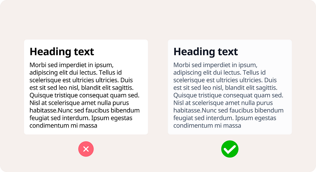
High contrast, especially on digital screens, can cause letters and words to appear as if they’re moving or shifting, making reading strenuous and uncomfortable. Avoid using pure Black (#000000) and pure White (#ffffff) together, instead use grey tones.
Enough line height

Adequate line height is crucial. It helps in reducing visual stress and improving readability. A good line height ensures that text is more spaced out, making it easier for dyslexic readers to follow lines and distinguish between them. Generally, a line height that is about 1.5 times the font size is recommended for optimal readability. This provides enough white space between lines to prevent crowding, reducing the chance of words or lines merging visually.
Inappropriate Font Choices
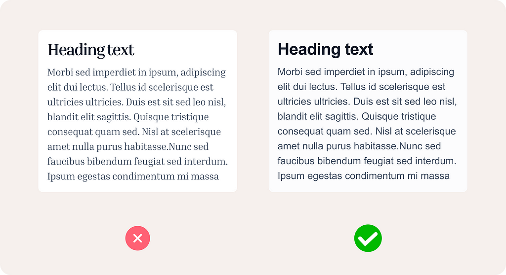
Using fonts that are not dyslexia-friendly can significantly hinder readability. Fonts with similar-looking letters or complex styles add to the reading challenge. For dyslexic users, appropriate font choices are those that increase readability and minimize visual confusion. Fonts that are often recommended include:
Open Dyslexic: This font is specifically designed for dyslexic readers. It includes weighted bottoms to help indicate direction and reduce letter swapping.
Arial and Helvetica: These sans-serif fonts are clear and simple, making them easier to read for many dyslexic users.
Comic Sans: Surprisingly, Comic Sans can be effective due to its irregular letter shapes, which can help differentiate similar-looking letters.
Verdana: Known for its wide spacing and clear letter shapes, Verdana is another good choice.
Tahoma: Similar to Verdana, Tahoma has clear, simple forms that aid in readability.
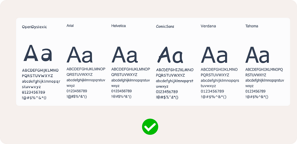
You’ve probably seen it at least once, maybe back in school, when a classmate confused the letters ‘d’ and ‘b’. It’s a common mix-up, especially among kids. It appears, common mistakes when reading and spelling are mixing up b’s and d’s, or similar looking words such as ‘was’ and ‘saw’, ‘how’ and ‘who’. This mix-up is exactly why choosing the right font is crucial in design, especially for dyslexic users. Fonts where letters look unique and aren’t mirror images of each other, like Tahoma or Verdana, can prevent such confusion, making it easier for everyone to read accurately.
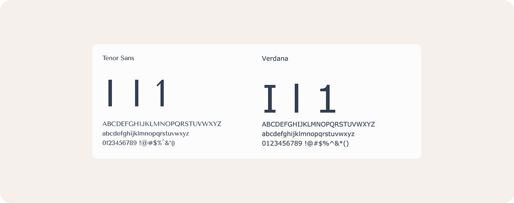
For instance, Above you have Sans font and Verdana. In some fonts like Tenor Sans, the uppercase ‘I’, lowercase ‘l’, and the number ‘1’ look almost the same, which can be confusing. The same goes for letters like ‘e’, ‘c’, and ‘o’ — they should be easy to tell apart.
Avoid Long and complex copy
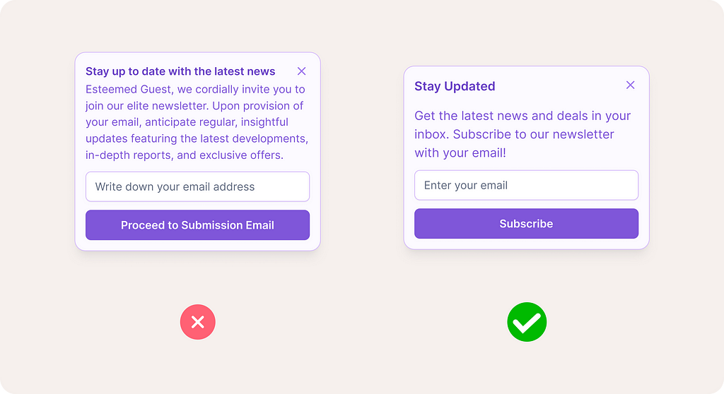
Dyslexic readers often recognize patterns in letters rather than reading each word. To help them, use simple words and short sentences. For example, use ‘buy’ instead of ‘purchase’. Adding graphics can aid in understanding. This approach benefits all readers, not just those with dyslexia.
Alignment: Avoid Justified text
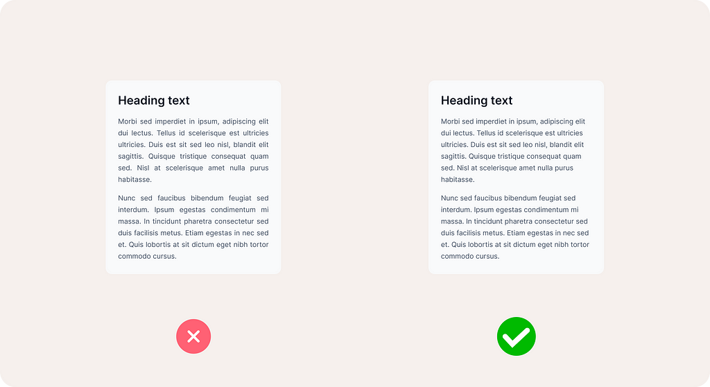
Justified text alignment, where both the left and right edges of a paragraph are aligned, can be problematic for readability due to several reasons: Uneven Spacing, Hyphenation Issues, Alignment and Readability, Visual Strain. Compared to left-aligned text, justified text can be harder to read for everyone because the uneven spaces affect the rhythm and pacing of reading. This is particularly true for longer paragraphs. Overall, while justified text might appear neater or more formal, it can reduce readability and comfort for all readers, not just those with dyslexia. Left-aligned text is generally preferred for its consistent and predictable spacing.
Tools to help: Stark Plugin
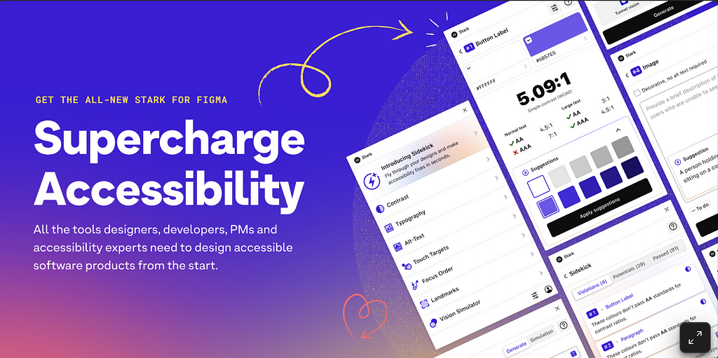
I’ve shared in previous articles a couple of tools for elevating your designs, e.g., Figma accessibility tools. These will help you check the contrast to make sure it’s adhering to modern standards.
Remember, tailoring your website to this audience makes your digital content accessible to everyone.
Stark includes a Contrast Checker to ensure designs adhere to AA or AAA standards, a Vision Simulator to simulate designs for different vision types, including color blindness and blurred vision, and Alt-Text Annotations to provide suggestions for screen reader-friendly and SEO-optimized alt text. Additionally, it offers a Typography Analysis to check that fonts and styles are legible for different vision types, and Touch Targets to ensure touch targets in mobile designs are adequately sized for easy interaction.
Conclusion
In conclusion, designing for dyslexia is not just about avoiding certain pitfalls; it’s about embracing inclusivity in our digital world. By choosing the right fonts, ensuring adequate line height, and simplifying text, we make content accessible not just for those with dyslexia, but for everyone.
Let’s remember, accessible design benefits all users, enhancing overall user experience. As designers, we have the power to make the digital world a more welcoming place for everyone.
By keeping these principles in mind, we can create designs that are not only beautiful but also universally accessible.
What to Consider When Designing for Dyslexia was originally published in UX Planet on Medium, where people are continuing the conversation by highlighting and responding to this story.