The redesigned UI of WhatsApp caused a sensation across the internet, with designers eagerly sharing their thoughts. But what makes this redesign such a significant change, particularly with the introduction of the Bottom Navigation bar? These are the questions that every designer pondered upon when they first laid eyes on the revamped WhatsApp UI.
As someone who enjoys delving into UX intricacies, let’s dive into the details and explore the rationale behind these design choices. Let’s solve this case together!

Lot of people are really frustrated with the update because they can’t able to digest the change in the UI that’s coming from ages. Well this is Status Quo effect, I don’t want talk about it much but still I’ll attach some good source to understand it here.
Something new is designed when there is a problem. So I will try to mention the problems behind this case study and then validating the designed answers for it.
What was the Problem that has been addressed in this Particular Redesign?
Whatsapp has tried to address the accessibility and tried to prioritize the stuff and wanted people to try the features more.
- Communities is the feature that was literaly hidden and people who are not familier with the usage of that feature, maybe never went and tried it because it is in that place where people eyes won’t be going with concentration. When Communities got introduced, Whatsapp has replaced it with the open Camera option. But it was temporary and Whatsapp realised that it is not getting much attention, maybe they have done some research and now they want to prioritize this feature very well.

2. WhatsApp’s one-handed mode doesn’t allow access to high-priority buttons such as Communities, Status, etc., making them unclickable with a single hand.
What was the rationale behind this design solution?
Introducing the Bottom Navigation was the answer. But why? To grasp this, it’s essential to comprehend the evolution of mobile navigation, transitioning from the Hamburger menu to the Bottom Navigation bar.
Let’s Deep dive into the Evolution
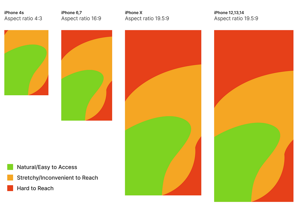
The entire layout of the mobile app is split into three sections, arranged according to where your thumb naturally reaches. Honestly, every action you take on a mobile device, including in popular apps, follows this principle to make using the app easier and keep you engaged.
The shift from the Hamburger menu to the Navigation bar is all because of mobile devices. Why blame the devices? It’s actually the height of the devices to blame. Yes, everything relates to the height of the devices, or what we call aspect ratio.
You may have heard this term, but might not know how it impacts your overall experience. Nowadays, phones come in aspect ratios like 16:9, 18:9, and 21:9.

As shown in the image above, users face difficulty clicking on elements in the ‘Hard to Reach/Red zone,’ especially on devices with taller screens. This challenge arises due to the increased height in the aspect ratio of these devices.
To address this issue, many applications have transitioned from utilizing the Hamburger menu to incorporating the Bottom Navigation bar. This shift aims to improve user interaction and accessibility, particularly on devices with larger screens.
Traditionally, essential features such as the search bar and Hamburger menu are positioned at the top of the interface. However, this placement can make them less accessible, particularly when navigating with one hand or on devices with larger displays.
An example of this adaptation can be seen in popular applications like Amazon, which have opted to replace the Hamburger menu with the Bottom Navigation bar. This strategic adjustment enhances usability and ensures that key features remain easily accessible to users.
Changed the Design, But didn’t change the Interaction
WhatsApp totally revamped its navigation, yet kept our interactions the same. That’s what I call a brilliant redesign strategy. On WhatsApp, everyone simply swipes to switch between Chat, Status, and Calls. Now, WhatsApp cleverly places the Communities page between the Status and Calls pages. So, when you switch, you’re automatically checking out the Communities feature. That’s how WhatsApp can attract more people to use Communities.
Hope you enjoyed the breakdown of the WhatsApp redesign.
You can connect with me for FREE
Hey guys, I have recently started connecting with people on Topmate, and right now as a earlybird you can book a session for FREE. Let’s connect and talk something amazing regarding Design.
🎉Kudos to you for sticking around till the very end!
Connect with me on LinkedIn and let’s keep the design conversation going. Can’t get enough? Neither can I! Stay tuned for more design hacks and quirks. Happy designing, and remember: life’s too short for boring interfaces!
Why WhatsApp Redesigned Its UX was originally published in UX Planet on Medium, where people are continuing the conversation by highlighting and responding to this story.