Hey fellow designer!
I wanted to drop you a quick note to express my gratitude for all the emails, messages, connections, followers, and social media reposts. Your support truly warms my heart, and I feel both thankful and inspired.
I’m excited about what’s ahead! Let’s chat about the upcoming series and the roadmap for my Medium articles. I can’t wait to share what we’ll be covering in the future. Make sure to stay tuned! 🙂
Cheers!
In this series of articles, we have seen about
- Design Systems: A Beginner’s Guide: click here
- Create your own Design System: Chapter Typography: click here
- Create your own Design system: Chapter Colors: click here
- Create your own Design system: Chapter Color tokens: click here
In today’s article, we will see about basics of iconography (●’◡’●)
What is an Icon?
An icon is like a tiny, visual shortcut that represents something bigger or more complex. Imagine it as a little picture that quickly tells you what a button or an action does on your phone or computer. For instance, a heart icon might mean “like” or “favorite,” and a trash can icon could represent “delete.” Icons are like the superheroes of your digital world, saving you from reading many words and helping you understand and interact with things easily!
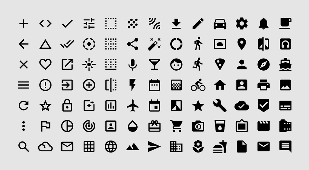
Basics of iconography:
Define Purpose and Meaning
Clearly understand the purpose of the icon. Identify the specific message or action it represents within the context of your design. A clear understanding of the purpose will guide your design decisions.
Research and Understand User Context
Research the target audience and understand their preferences, cultural context, and expectations. Icons should resonate with users and align with their mental models for quick recognition.
Simplify
Strive for simplicity. Icons should be instantly recognizable, even in small sizes. Avoid unnecessary details and complexities that might hinder quick comprehension.
KEEP IT SIMPLE
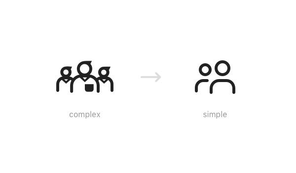
Consistent Style
Establish a consistent style for your icons. This includes decisions about stroke weight, shapes, and visual aesthetics. Consistency ensures a cohesive look and feel, especially when icons are used together.
Consistency is key

Consider Scalability
Icons should be scalable to various sizes without losing clarity. Test how they appear at different resolutions to ensure they remain effective on both small and large screens.
Metaphors for Intuition
Leverage metaphors that are intuitive and widely understood. For example, a trash bin for deletion or a magnifying glass for search. These metaphors enhance quick recognition.
Test in Context
Test your icons within the context of your design system or application. Ensure they integrate well with the overall visual language and provide clear visual cues in the intended environment.
Collaborate Across Teams
Foster collaboration between design and development teams. Ensure the technical requirements for exporting & implementing the icons are considered, and collaborate on any necessary adjustments.
How to create icons?
Grid and Alignment
Design icons on a grid to maintain alignment and visual harmony. A consistent grid helps organize the elements within the icon and ensures they fit seamlessly into different layouts.
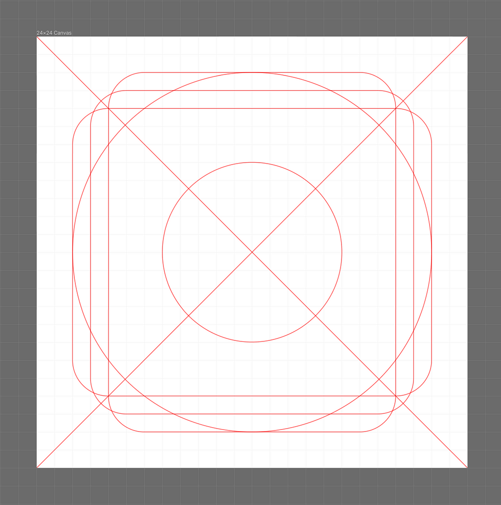
You might be wondering why we use multiple lines to create icons instead of sticking to a uniform 24px size for all of them. Well, the thing is, each shape has its own weight and boundaries. To keep everything looking consistent, we’ve got to make sure all shapes have the same weight, and that’s where our handy grid system comes into play!
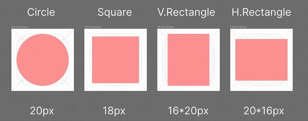
Different shapes have different visual weights so we can’t use the same size for all shapes. In that scenario, we can use these key lines.
Stroke weight
Stroke weight refers to the thickness or width of the lines used to outline the shapes within the icon. It’s a critical design element that influences the visual appearance, readability, and overall aesthetic of the icon.
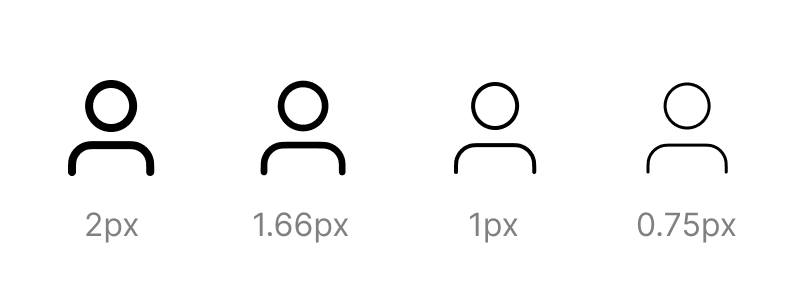
The usual stroke width for 24px icons is 2px. This stroke width provides a balance between visibility and detail, ensuring that icon elements are clearly defined without appearing too heavy or cluttered. However, the specific stroke width may vary depending on the style and complexity of your icons. For simpler icons with fewer details, a 1px stroke may be sufficient, while more intricate icons may require a 3px or 4px stroke to maintain clarity.
Here’s a general guideline for stroke widths based on icon size:
- 16px icons: 1px or 2px stroke (I use 1.66px)
- 24px icons: 2px or 3px stroke (I use 2px)
- 32px icons: 3px or 4px stroke (I use 2.66px)
Remember, these are just guidelines, and the optimal stroke width will depend on the specific design of your icons. It’s always a good idea to experiment with different stroke widths to find what works best for your project.
Exporting icons for developers
When exporting icons for developers, it’s essential to provide files and assets in a format and structure that facilitates smooth integration into the development process. Here are steps to ensure a seamless export of icons to developers:
File Formats
Export icons in commonly used file formats, such as SVG (Scalable Vector Graphics) or PNG. SVG is preferable for its scalability and adaptability to various screen sizes. IOS uses icons in text format, we will discuss that in future articles we have some plugins that convert SVG to text format icons which will be useful for scalable and responsive designs
Size Variations
Provide icons in multiple sizes to accommodate different screen resolutions and device requirements. This ensures that developers have the flexibility to choose the appropriate size for various UI elements.
Consistent Naming Conventions
Maintain a consistent and clear naming convention for the exported files. This makes it easy for developers to identify and integrate icons into the codebase. Use meaningful names that reflect the purpose or content of each icon.
Include Hover or Interaction States
If your icons have hover or interaction states, export assets that represent these variations. Developers can use these assets to implement dynamic behaviors in response to user interactions.
Documentation
Create a comprehensive documentation file or document that accompanies the exported icons. This documentation should include details about each icon, its purpose, and any specific implementation considerations or guidelines.
Collaboration with Developers
Foster open communication with developers. Provide a channel for them to ask questions or seek clarification about the icons. Collaboration between designers and developers ensures a smoother integration process.
Useful resources
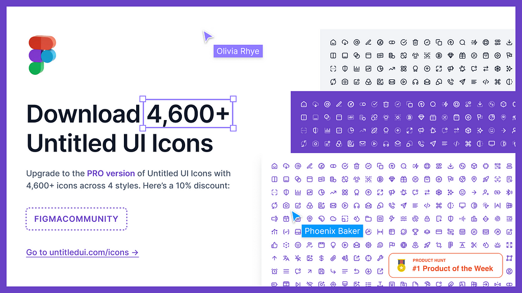
Untitled UI
The untitled UI file is my one of favorites because it has editable vector lines, so we can change the stroke weight as needed which will be very convenient in some cases
❖ Untitled UI Icons – 1,100+ essential Figma icons | Figma Community
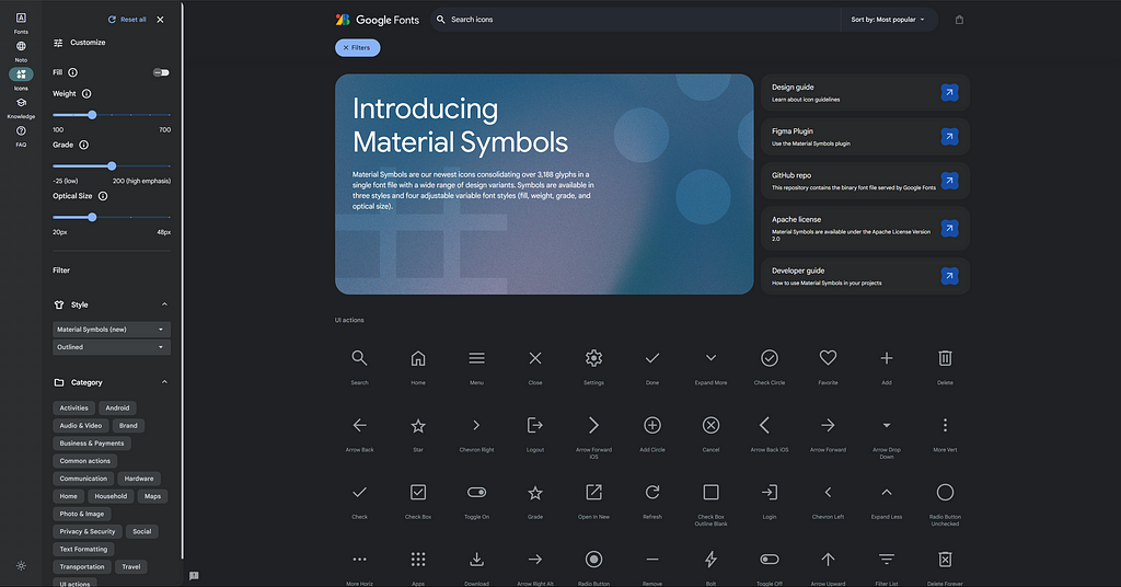
Material Design Icons
Material Symbols are Google’s newest icons consolidating over 3,188 glyphs in a single font file with a wide range of design variants. Symbols are available in three styles and four adjustable variable font styles (fill, weight, grade, and optical size).
Material Symbols and Icons – Google Fonts
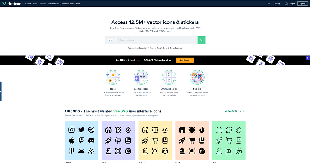
Flat Icons
Flat icons are collections of icons with different themes and unique icons and some are paid but we can get many variations and it is one of Freepik’s product
Free Icons and Stickers – Millions of images to download
And that’s a wrap! Piqued your interest? Just holler!
Twitter | LinkedIn | Let’s Chat
Do follow the series and send me suggestions. I’m happy to connect
Happy designing !!!
Create your own design system: Chapter Iconography was originally published in UX Planet on Medium, where people are continuing the conversation by highlighting and responding to this story.