For visionary startups, transforming groundbreaking ideas into tangible products requires a crucial first step: creating a low fidelity wireframe. These basic layouts, whether hand-drawn sketches or simple digital mockups, serve a critical purpose: validating concepts long before a single line of code is written. Think of the iconic iMac, the revolutionary Tesla Roadster, or any other world-changing app or website — each of these innovations probably began as a low-fidelity wireframe. This rapid prototyping tool has become essential in today’s fast-paced design landscape, where design ideas need to be practical, viable, and user-centered from the start. This article throws light on the transformative power of low-fidelity wireframes in detail. But first, let’s define some basic concepts relevant to this topic.
What Is a Wireframe?
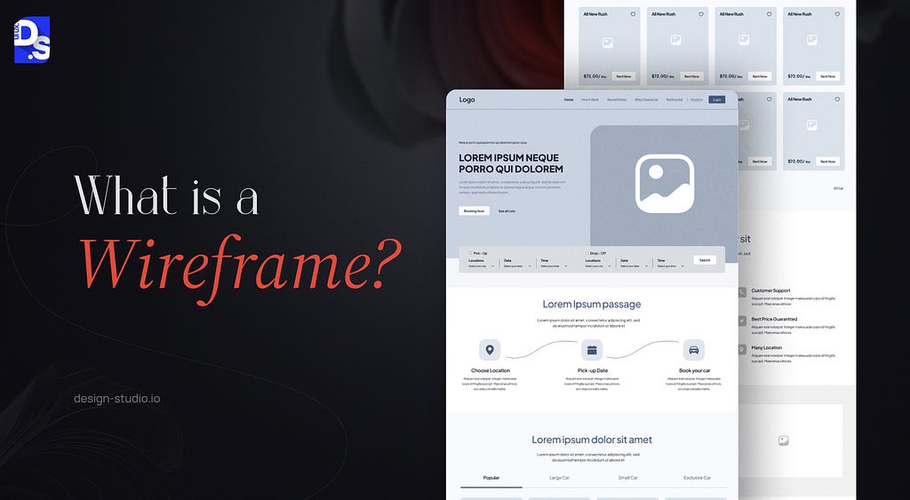
At the heart of a successful UX design lies the wireframe — a basic blueprint outlining the core functionality and structure of a single webpage or app screen. Wireframes progressively increase in detail as the design evolves. Initially, however, they are likely to be low-fidelity sketches packed with basic black-and-white shapes and outlines that represent where key navigational elements, text, and graphics will reside. By creating multiple wireframes for different webpages or app screens, you can establish a comprehensive skeletal view of your entire product.
These simple sketches, whether digital or hand-drawn, function as powerful ideation and collaboration tools, facilitating rapid design iterations and fostering alignment across teams. This, in turn, significantly contributes to a more streamlined and effective UX design process. These benefits of wireframing are undeniable, with studies suggesting a reduction in overall design time by up to 50%.
What is Low Fidelity?
In UX design, fidelity refers to the degree of detail and resemblance a wireframe bears to the final product. This applies to both website and app design. Three key aspects determine fidelity level:
- How closely do the layout and organization of the wireframe reflect the final product?
- The level of detail and comprehensiveness of the content included in the wireframe (text, images, etc.).
- The degree to which the wireframe incorporates interactive elements and simulates the final product’s behavior
Highly detailed wireframes that closely resemble the final product in terms of visual design, content, and interactivity are called “high-fidelity wireframes.” Here’s a general outline of the different types of wireframes you can create:
- Low Fidelity Wireframes: Quick, rough sketches of the product’s structure and UI elements, focusing mainly on describing core functionalities and user flows.
- Mid Fidelity Wireframes: Slightly more detailed wireframes that feature more visual and functional elements, but still lack all the design elements.
- High Fidelity Wireframes: Detailed, interactive wireframes that closely resemble the final product and include visual design elements, graphics, and interactive features.
By understanding fidelity, you can create the right wireframes for different stages of the UX design process. Low-fidelity wireframes are ideal for early concept exploration and validation, whereas hi-fi wireframes excel at refining the final product’s look and feel pre-launch.
What is a Low Fidelity Wireframe?
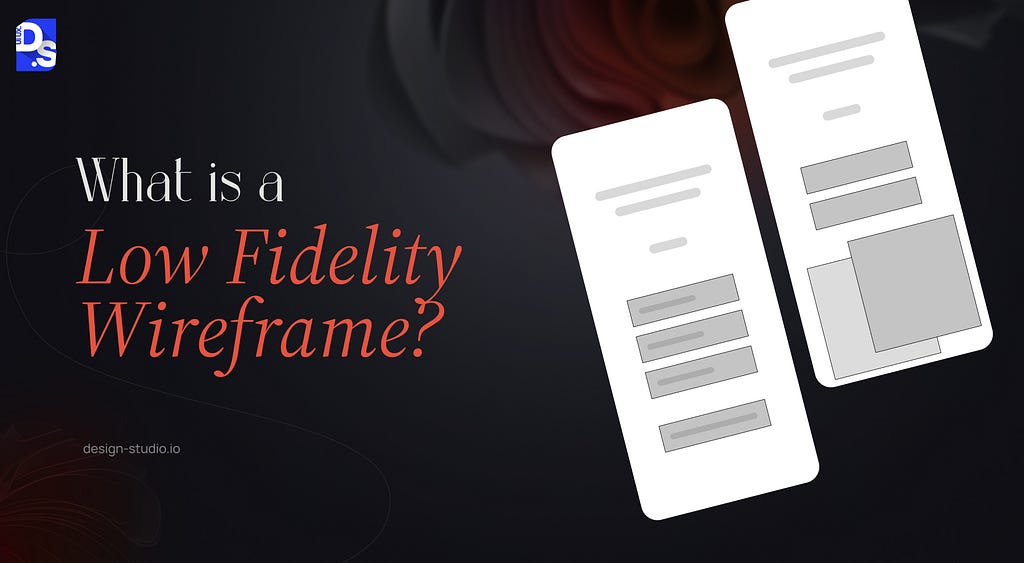
The low fidelity wireframe (lo-fi wireframe) stands as the most basic form in the wireframing hierarchy. These stripped-down representations prioritize core concepts and value propositions, leaving out intricate visual details like imagery and polished text. Think of lo-fi wireframes as grayscale blueprints:
- They focus on the core features of an app or website, typically using basic shapes, lines, and placeholders to represent content, images, and other elements.
- They are ideal for outlining the fundamental structure of a web page, app, or user interface idea.
- These wireframes are created during the early design stages, following initial brainstorming and concept development.
Lo-fi wireframes can be rapidly sketched on paper or created within minutes with simple digital tools. This makes them ideal for quickly testing and validating design ideas. Here are some other key benefits of low fidelity wireframing:
Enhanced Feedback
Their simplicity encourages stakeholders and users to prioritize functionality and usability over aesthetics. This leads to valuable feedback that strengthens the overall UX design.
Agile Iterations
Easy modifications allow designers to experiment with various design ideas quickly, essential for refining the design to meet user needs.
Saving Time and Resources
Early identification and rectification of potential issues through lo-fi wireframes saves time and resources later in the design process.
Improved Communication
Lo-fi wireframes bridge the communication gap between designers, developers, and stakeholders by providing a clear layout and user flow. This fosters a shared understanding of the product’s direDesign Validation and Functionality Checksction.
Design Validation and Functionality Checks
Lo-fi wireframes help validate design ideas and gain client approval before extensive design work begins. They also serve a practical purpose — checking screen interaction functionality before the final design. Once finalized and approved, lo-fi wireframes serve as a roadmap for the design phase.
User Flow Visualization
Lo-fi wireframes contribute to user-centric design by focusing on user experience. Insights gathered during the design process inform the creation of lo-fi wireframes, which can later be refined into more detailed prototypes.
Lo-fi wireframes start by outlining the basic layout and user interface (UI) elements, prioritizing functionality over visual design. This stage is crucial for visualizing the product’s overall structure and user flow, ensuring a user-centered and functional design foundation.
As the design process progresses, lo-fi wireframes evolve into more detailed mid-fidelity and high-fidelity prototypes, incorporating visual elements and interactive features.
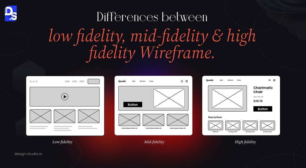
To simplify things, in the table below we have outlined the core differences between low, mid, and high-fidelity wireframing:
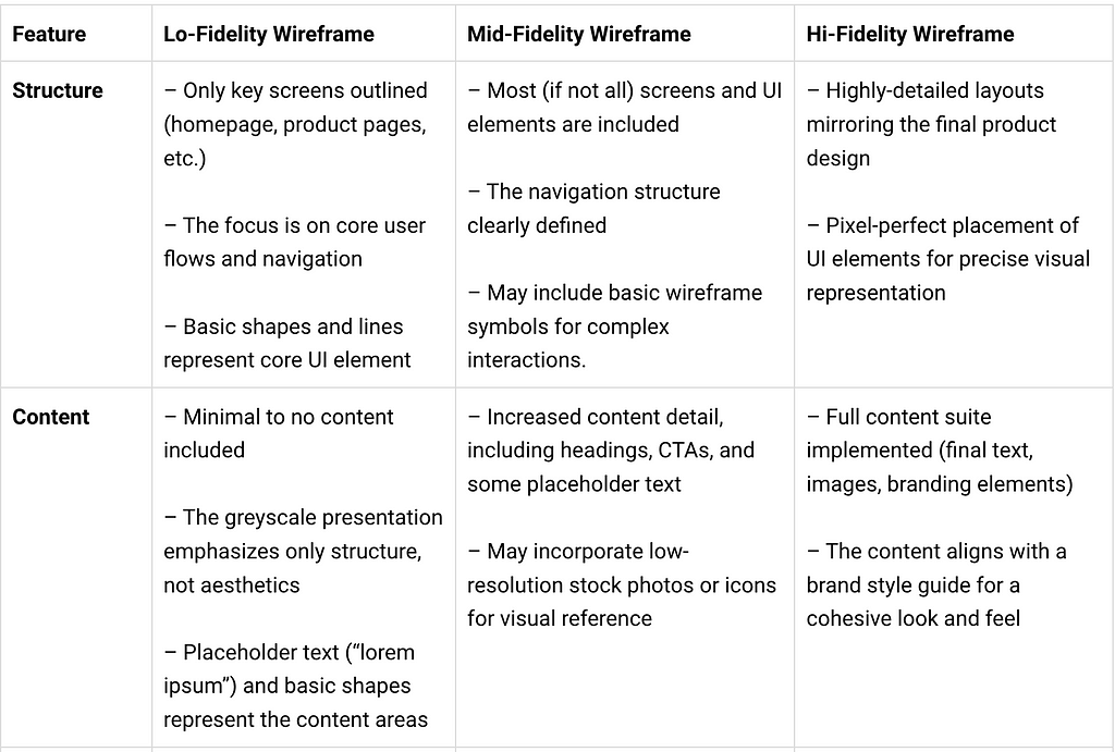
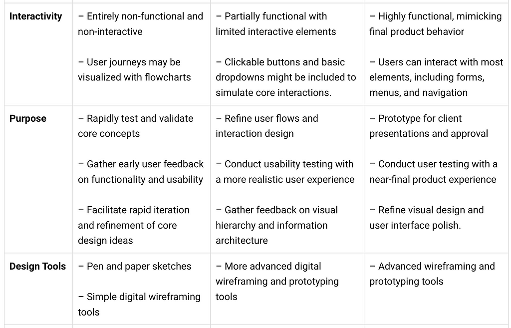

The design process often begins with a flurry of creative energy, translating initial concepts into quick sketches. These sketches can range from detailed illustrations to basic layouts, laying the groundwork for the user experience (UX) journey. As ideas solidify, these sketches can evolve into paper prototypes, providing a tangible representation of the steps a user would take to complete a task. By scanning these paper prototypes and leveraging image editing software, designers can efficiently bridge the gap from low to mid to high-fidelity wireframes.
What is a Low Fidelity Digital Wireframe?
While the terms “wireframe” and “digital wireframe” are often used interchangeably, the former explicitly denotes the use of digital tools in the creation process. Both wireframes and digital wireframes can exist in high-fidelity or low-fidelity formats, offering varying levels of detail. However, digital wireframes typically prioritize simplicity, focusing on the core elements of the interface blueprint. This includes lines, shapes, and other visual cues that represent the intended layout and design components. Designers have a wealth of tools at their disposal to create professional digital wireframes, catering to both high-fidelity and low-fidelity needs. Popular options include Balsamiq, InVision, Figma, Sketch, and UXPin.
Limitations of Low Fidelity Wireframes
While low-fidelity wireframes offer a treasure trove of benefits in the early design stages, they also come with inherent limitations. The very essence of Lo-Fi wireframes — their simplicity — is one of them. The lack of detail in a low-fidelity wireframe can make it challenging for team members or stakeholders to fully grasp the intended user experience. Without visual cues and interactive elements, it may be difficult for them to envision the final product accurately.
- No Visual Appeal: Prioritizing functionality over aesthetics, lo-fi wireframes can struggle to engage stakeholders or users.
- No Interactivity: Static lo-fi wireframes do not allow user interaction, hindering the ability to accurately depict and test user flow and interaction.
- Potential Miscommunication: Over-simplistic lo-fi wireframing can lead to miscommunication within teams or with stakeholders, especially those unfamiliar with wireframing principles.
- Limited Later-Stage Use: Lo-fi wireframes excel in the early design stages. As the project progresses, more detailed high-fidelity wireframes or prototypes become necessary.
Despite these limitations, lo-fi wireframes remain an essential tool for early-stage design. Let us look at some low fidelity wireframe examples to find out how they help designers.
Low Fidelity Wireframe Examples
By prioritizing minimalism and abstraction, lo-fi wireframes ensure the design clearly communicates core functionality — the primary objective at this early stage. This emphasis on core functionality allows for valuable early-stage feedback and iteration before investing significant time and resources into more detailed design elements. Ultimately, lo-fi wireframe examples serve as a springboard for design exploration, paving the way for a more refined and user-centered final product. Here are some examples:
i) Hand Drawn Low Fidelity Wireframe (Basic)
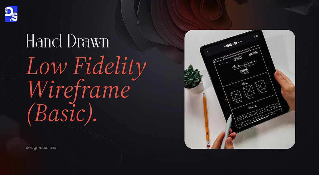
This is a hand-drawn lo-fi wireframe sketch. This rapidly-drawn sketch is light-on-details. It features no text, images, or specific app functions. However, by depicting three to four main sections or app pages, we can instantly glean the website’s or app’s core functionality. This example perfectly illustrates the power of lo-fi wireframes. Despite its simplicity, it effectively communicates the core user journey, allowing for early feedback and refinement before delving into intricate design details.
ii) Hand Drawn Low Fidelity Wireframe (Advanced)
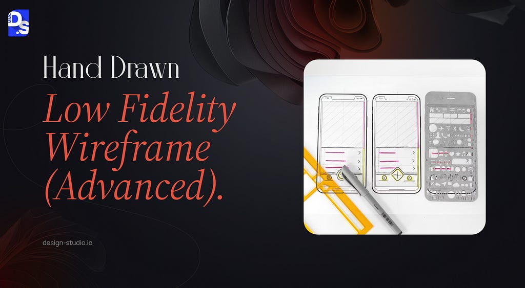
Alexandra Davis’ hand-drawn lo-fi wireframe redesign of the Bandsintown app again exemplifies the power of low-fidelity wireframes.
While a lo-fi sketch, it clearly depicts the entire app structure and its core functionalities. The wireframe is divided into sections labeled “Popular,” “Search,” “Your Tickets,” “Profile,” and “Friends”. Within each section, basic shapes and lines represent UI elements like buttons, navigation bars, and content areas.
This lo-fi wireframe perfectly conveys the core functionalities of the redesigned Bandsintown app — browsing popular artists, searching for specific musicians, viewing tickets, and potentially managing social connections. Despite its simplicity, it lays the ideal groundwork for a user-centered design.
iii) Responsive Low Fidelity Wireframe
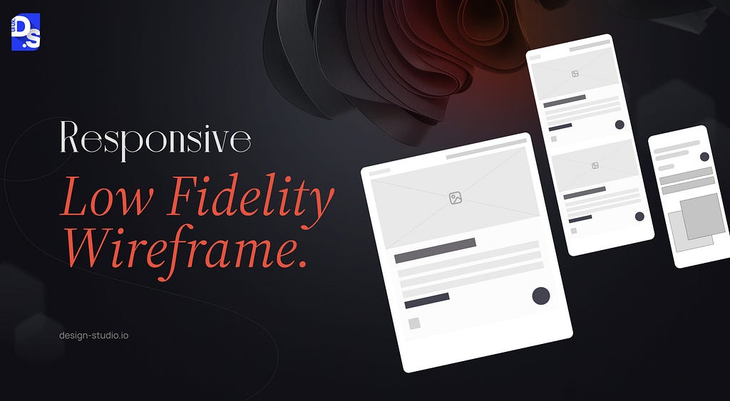
A responsive lo-fi wireframe is a basic visual representation of how an interface adapts to various screen sizes and devices.
This responsive low-fi wireframe depicts a single design layout viewed on three different screens — desktop, tablet, and mobile. The layout adapts to each screen size, with elements rearranged and resized to fit the available space. While the design is low-fidelity (basic shapes and lines), it communicates the responsive nature of the interface. Responsive lo-fi wireframes bridge the gap between design and development teams. By outlining the interface architecture and component placement across different screen sizes (desktop, mobile), they ensure clear communication and minimize misinterpretations.
Developers gain a foundational understanding of the intended structure and functionality on various devices. A ‘best practice’ in responsive low-fi wireframing is to prioritize mobile-first wireframing. This ensures critical functions and content are prioritized for smaller screens. Given the dominance of mobile web browsing, focusing on mobile wireframes aligns the design with user needs and behaviors.
iv) Low Fidelity Wireframe for Mobile Apps
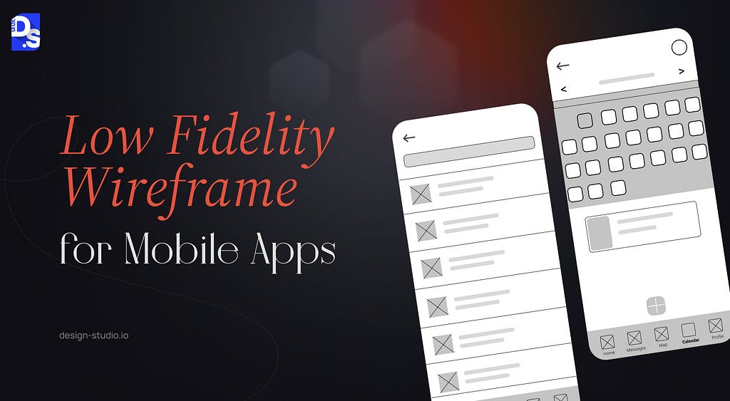
Low Fidelity mobile app wireframes are essentially design sketches that map out the layout and functionality of a mobile app interface. These foundational blueprints created digitally or by hand, prioritize core elements like screen layout, content placement, and user navigation.
In this lo-fi mobile app wireframe, basic shapes represent core UI elements like buttons, navigation bars, and content areas. While lacking detail or text, the wireframe clearly conveys a tabbed navigation structure at the bottom and a content area displaying a list of items. It establishes a foundational structure for user interactions and navigation before the team dives into more intricate design details.
How to Create a Low-Fidelity Wireframe
The beauty of lo-fi wireframing lies in its accessibility. Anyone can get started with just a pen and paper. Here’s a quick guide:
- Grab Your Tools: A pen and a sheet of paper are all you require to unleash your design ideas.
- Sketch the Layout: Start by outlining the core structure of your web page or app screen. Use basic shapes like squares, rectangles, circles, and lines to represent key elements. Establish the foundation for your design’s functionality and user flow.
- Add Essential Elements: Now, incorporate placeholders for text and images. Simple text labels and basic shapes will suffice.
- Refine and Iterate: Use your lo-fi wireframe to test and refine your design ideas. Share it with stakeholders and users to gather valuable feedback and make adjustments as needed.
Use your lo-fi wireframe as a springboard for testing and refining your design ideas!
Final Take
New to wireframing? Not anymore! Use this guide to start experimenting with hand-drawn sketches. Use free wireframing tools like Figma or Miro to build slightly more advanced lo-fi wireframes as well. As you progress, explore more advanced software options tailored to your specific needs. At Design Studio, we leverage a diverse wireframing toolkit to ensure our designs are both visually appealing and functionally sound. This strategic combination of best-in-class tools and our UX design expertise allows us to create innovative and user-friendly solutions that consistently meet the evolving needs of our clients and users.
What is Low Fidelity Wireframe? Guide & Examples was originally published in UX Planet on Medium, where people are continuing the conversation by highlighting and responding to this story.