
Payment button is one of the most important elements for any eCommerce or SaaS website. It’s way more than just a functional element — it’s a critical touchpoint in the user journey that can make or break a transaction.
A well-designed payment button is intuitive, accessible, and visually appealing. This article reviews 7 best practices that will help you design effective payment buttons.
1. Label the action clearly
Avoid using generic labels like “Submit” or “Continue” for buttons that trigger payment processing. Instead, use actionable labels such as “Pay” or “Pay now” will inform users of what will happen when they click/tap it.

2. Use a visual style that will make button distinct
It should be easy for users to find the button on a page/screen. Position the button in a layout where users expect to see it, and use a contrasting color to attract more attention to it.
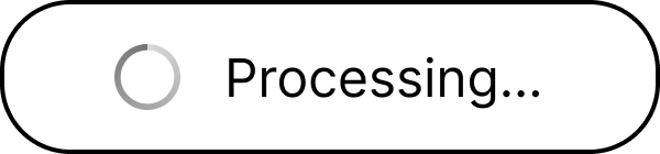
3. Incorporate visual feedback during payment processing
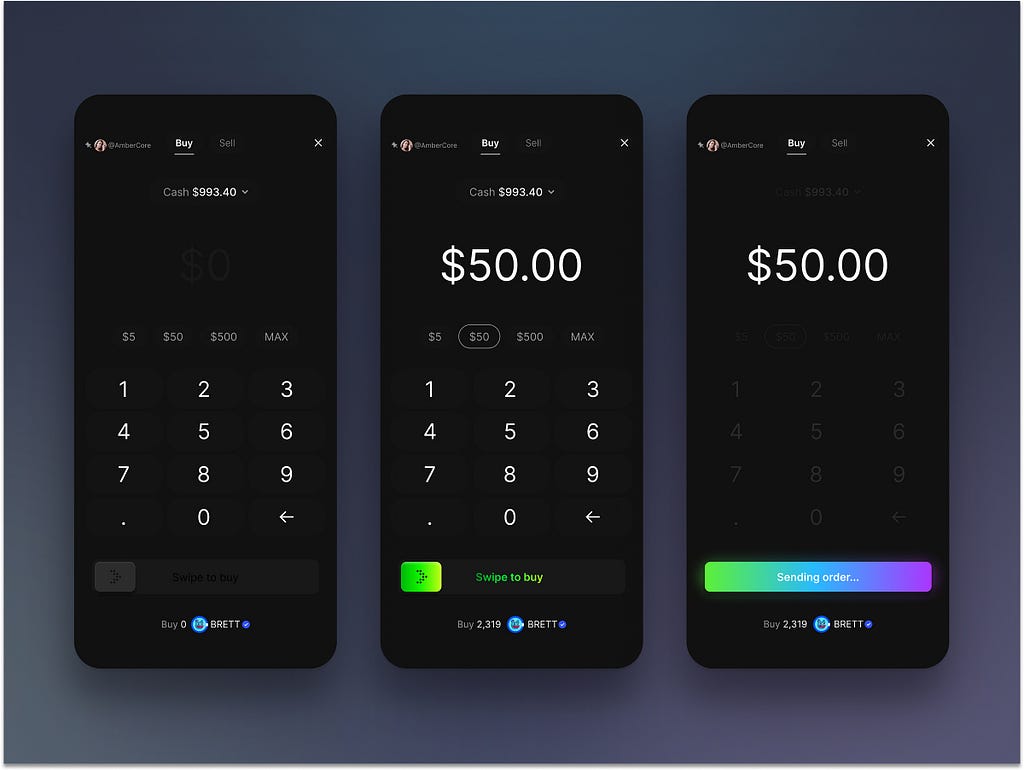
When clicked/tapped, the button should visually change to reflect that the process has started. This will give users an understanding that the system is processing payment right now and prevent them from tapping the button again.
- Incorporate a spinner or pulse animation to indicate ongoing processing.
- Use success and failure indicators for payment results. After the process is complete, show a success icon (green checkmark, green tick). If the payment wasn’t processed, show a red cross error with a message about what went wrong.

Use smooth animations to transition between states such as ease in and out. Try to keep animations short (~ 1 second) to maintain responsiveness.
4. Disable the button while the payment is processing
Just having visual feedback for payment processing is not enough. To prevent unnecessary clicks/taps, you need to disable the button during payment processing.
5. Watch wait time
Payment processing shouldn’t take more than 5 seconds. If the payment operation takes more than 10 seconds, this will likely lead to user frustration.
6. Handle errors gracefully
If the process fails, change the button state to an error indicator and show a message that will explain what went wrong.
7. Prioritize accessibility
On desktop:
- Keyboard focus. Ensure the button can be activated with a keyboard and focus changes are managed during state transitions.
- ARIA labels. Communicate the button’s state changes (e.g., “Processing…” or “Submission Successful”) using ARIA live regions.
On mobile:
- Be careful with “Swipe to pay” pattern. Compared to a simple “Tap to Pay” button, swiping requires more time and effort and is proned to errors, such as incomplete swipes, unintentional releases, or accidental direction changes.
Want To Master Product Design?
Try Interaction Design Foundation. It offers online design courses that cover the entire spectrum of product design, from foundational to advanced level.
This post contains affiliate link(s)
Payment Button Design Best Practices was originally published in UX Planet on Medium, where people are continuing the conversation by highlighting and responding to this story.