6 Essential tips for designing effective progress bar
Practical recommendations along with tutorials for Figma that will help you design the best progress bar for your product.
1. Avoid using a progress bar for quick tasks
For tasks that take less than 5 seconds its better to use skeleton screens or loading spinners.
2. Keep design of a progress bar simple
The bar itself shouldn’t attract too much attention. Most products will benefit from clean, clear visuals with minimal distractions (without excessive flashy animations). When reviewing the visual and interaction design of your progress bar, think about how it will work for first-time and regular users. Ask yourself
How will my design look on the first and 1000 times the user sees it?
It will help you avoid creating excessive animations that might look good for first-time users but will likely annoy regular users.
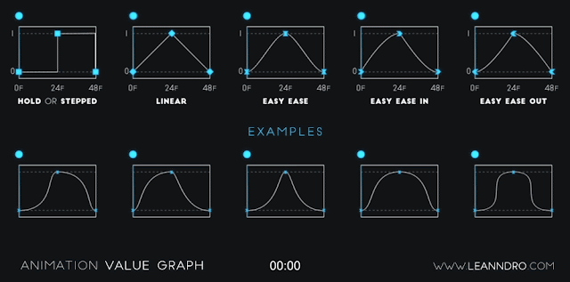
When choosing an animation curve for your progress bar, use easing curves such as ease-in or ease-out to make the movement feel natural.
You can make the transition feel soft by adding a pulse glow or a subtle change in opacity around the progress bar.
3. Avoid misleading progress
Progress bar is a functional element that serves a particular purpose — communicates the status of a current operation. When a progress indicator fails to do it, it immediately breaks user trust. One typical example is when a bar moves linearly all along the way but suddenly freezes nearly at the end, blocking the user. When users experience this, they immediately assume that this progression doesn’t have any relation to what the system is doing at the moment.
4. Use proper type of a progress indicator
There are two types of progress indicators — indeterminate and determinate.
An indeterminate indicator is used when the duration is unknown and progress cannot be measured. So basically, instead of showing progress, the system indicates activity to reassure users that work is happening. Progress bar simply shows “something is happening.”

For tasks where time is certain (e.g., loading system updates), a progress bar visually moves toward completion. You can show determinate progress bars along with additional information such as:
- Time it takes for the system to complete the operation (e.g., “20 min remaining”).
- What the system is doing at a moment (e.g., “Step 2 of 4”) to communicate the progress.
You can also turn one type of loading indicator into another.
5. Keep users engaged during the long wait time
If user has to wait for a longer period of time, you can make the wait time less frustrating by:
- Offering micro-interactions or mini-games. Some apps allow users to tap objects to “collect points” as they appear on the screen.
- Using subtle text like “We’re almost there!” when the wait time is almost over.
6. Smooth transition to the next step
Think about what users will see when the process is finished. Add a subtle completion animation when the process is finished. For example, you can turn a progress bar into a checkmark icon on completion.

Want To Master Product Design?
Try Interaction Design Foundation. It offers online design courses that cover the entire spectrum of product design, from foundational to advanced level.
This post contains affiliate link(s)
Progress Bar Design Best Practices was originally published in UX Planet on Medium, where people are continuing the conversation by highlighting and responding to this story.