
When the App Has All the Power — and You Have All the Consequences
A frustrating experience with a ticketing app in Paris shows how unclear design can mislead users — and why designers should take responsibility when their systems cause real-world problems.
I recently visited Paris with my sister and my little daughter. Like many tourists, we used public transportation to get around the city. Buying a metro ticket is usually easy: every station has machines. But you can’t find them easily at bus stops. We had to rely on an app.
That’s where things got complicated.
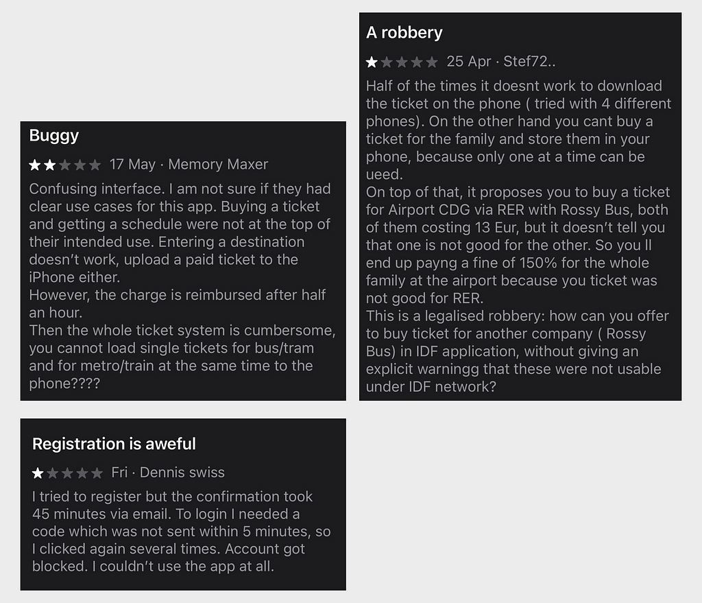
We were at the bus stop near the Louvre. Signs instructed us to download an app (IDF Mobilités) to purchase tickets. So we did — because we had no other option. The app wasn’t very intuitive, especially for a first-time user (which I’m sure is a very common case — it’s Paris, not Gorzów Wielkopolski) — but after a few failed attempts, we managed to buy two tickets. Success! We used the English version and the interface said “Buy and validate” — we assumed that meant the tickets were now active and valid for a set period of time.
We boarded the bus through the middle door, because of the baby stroller. A few stops later, a ticket inspector appeared. She looked at our tickets and said: “They’re not valid”
Apparently, the tickets weren’t “validated.” Moreover, each person was supposed to have their own ticket, bought and activated on their own phone. It wasn’t enough that we had paid. Because we didn’t validate the mobile tickets at the front of the bus, next to the driver — and even if we had, one of us would still have been without a valid ticket, since both were stored on a single device.
We tried to explain. She wouldn’t listen. Her response — delivered in memorized English — was: “You pay now 70 euros or later 120 through the embassy.” (seriously, the embassy? She exaggerated a bit). Unfortunately, the language barrier was not in our favor. No discussion and no empathy.
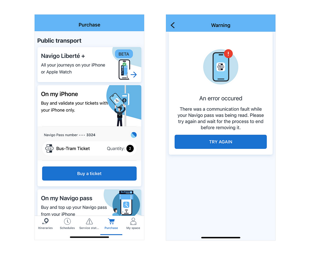
Later, we did everything the right way. We bought rechargeable transport cards, and tried to load new tickets through the app. But even that was initially confusing. For example: to load a ticket, you had to hold the card near your phone. But the app told you it was complete too early — before the transfer actually finished. We kept removing the card before the ticket was saved. A really annoying experience, especially in front of the entrance to the metro. It was only after failing a few times that we figured out what the app really wanted from us. After that, it all made sense. But that’s the point — only once you’ve failed does it become clear.
This entire experience left us frustrated. We were penalized not because we refused to pay, but because we misunderstood a poorly designed system. Yes, we didn’t validate the tickets. But we didn’t intend to cheat. For that mistake, we paid a heavy fine (money I would’ve much rather spent in a local restaurant). And because of other confusing elements of the app, we wasted so much energy and time.
And this got me thinking:
Why are we so quick to blame users for failures that come from design?
Design That Punishes
The app didn’t fine me. But it created a situation where a fine was almost inevitable. We talk a lot about user error. As if it’s just a matter of being careless. But when millions of people use a service for the first time — for just a few days — and regularly make the same mistakes, that’s a design problem.
Design isn’t neutral when the consequences are real. If the interface isn’t clear, assumes prior knowledge, or silently allows you to do the wrong thing, then it’s not “just bad UX” — it’s a trap. A trap with consequences. And yet, in every one of those outcomes, the system says: It’s your fault.
We don’t tend to think of apps as authority figures. But when they become the only way to access a service, they become the rules. And when they’re confusing, incomplete, or rigid, they don’t just frustrate — they punish. You’re guilty by default — not because you were dishonest, but because you didn’t understand a set of rules no one ever clearly showed you.
Designers, This Is On Us
If you design digital tools — especially those used in public spaces or for essential services — you should take responsibility for how understandable the experience is and whether people can actually complete their tasks. That’s why user research isn’t optional — it’s essential. It’s not enough to say “it’s in the instructions” or “the button is there.” If your system punishes people who are new, rushed, confused, or simply not fluent — that’s on the design.
Clarity is a form of care. Confusion is a form of harm.
If your app holds all the power, and the user lives with all the consequences, then the burden is on you to make it human.
Design isn’t just how something looks. It’s how it works — and who it works for. If you’re designing also for people who will be using your app for the first time, in an unfamiliar environment, and in a hurry — make it work for those circumstances.
In this case, it didn’t work for us.
Read more
- “Who should take responsibility for evil UX design and digital ethics?” https://uxdesign.cc/who-should-take-responsibility-for-evil-ux-design-and-digital-ethics-4d96597908e8
- “Deceptive Patterns in UX: How to Recognize and Avoid Them” (Nielsen Norman Group) https://www.nngroup.com/articles/deceptive-patterns/?utm_source=chatgpt.com
![]()
When the App Has All the Power — and You Have All the Consequences was originally published in UX Planet on Medium, where people are continuing the conversation by highlighting and responding to this story.