Midjourney is a great AI imagery generator. The latest version (v7) is capable of producing decent-quality visual output. A lot of articles and videos show how Midjourney can generate different kinds of visuals, but a few demonstrate UI design output.
In this article, I want to share a prompt template that you can use to generate UI design with Midjourney, tips & tricks on how to achieve better results with the tool, and examples of the output generated by the tool.
Prompt template
Here is a prompt template that I use for UI generation with Midjourney:
[project type] UI design for [product or audience],
[style keywords],
[layout type],
[color palette],
[design system],
[lighting/texture],
[rendering style] --ar 16:9 --v 7 --style raw
Parts in brackets like [color palette] are optional for the prompt, so you can skip them.
Tips and tricks
Midjourney system keywords
At the end of the prompt template, you likely noticed this part:
--ar 16:9 --v 7 --style raw
Let me explain what it means:
— style raw. I use it to achieve sharper, cleaner UI details. It helps avoid overly artistic blur
— ar 16:9. As you probably guessed, this is the aspect ratio. I typically use ar 16:9 for web and ar 4:5 for mobile.
— v 7. Midjourney version that will be used to generate visuals. I typically use the latest version v7. But I’ve noticed a very interesting thing: v7 tends to generate pseudo 3d layouts, while v6 typically generates flat layouts. I’ve demonstrated the difference below.
Use “design vocabulary,” not “art vocabulary” when prompting the tool
Midjourney responds differently to design vs art terms. When you design UI screens, use UI/UX-specific words to get functional results.
❌ Avoid art words: “beautiful”, “fantasy”, “render”, “painting”
✅ Use design words: “interface”, “layout”, “component”, “Figma”, “design system”, “HIG”, “Material 3”
Here are two prompt examples:
❌ “beautiful mobile banking product, minimal futuristic style”
✅ “mobile banking app UI in Material Design 3, clean layout, consistent spacing, data cards with key financial metrics”
Anchor your prompt with design systems
Adding a design system name (Apple, Material, Carbon, etc.) drastically improves structure.
Examples:
- “Material Design 3” → balanced spacing, cards, shadows
- “Apple HIG” → soft radii, clear typography, native feel
- “Atlassian design system” → enterprise dashboard layouts
- “IBM Carbon design system” → B2B tone, crisp typography
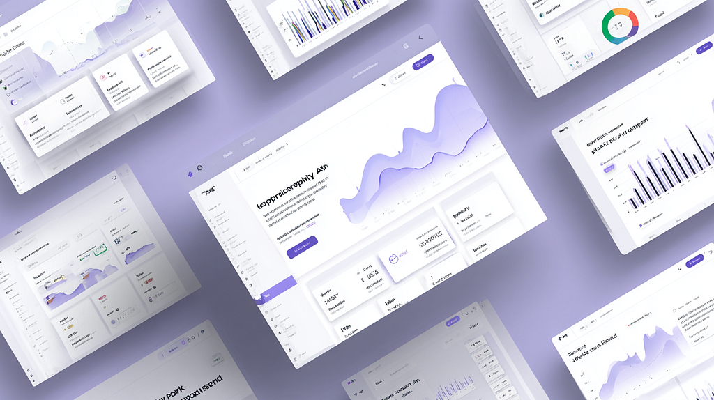
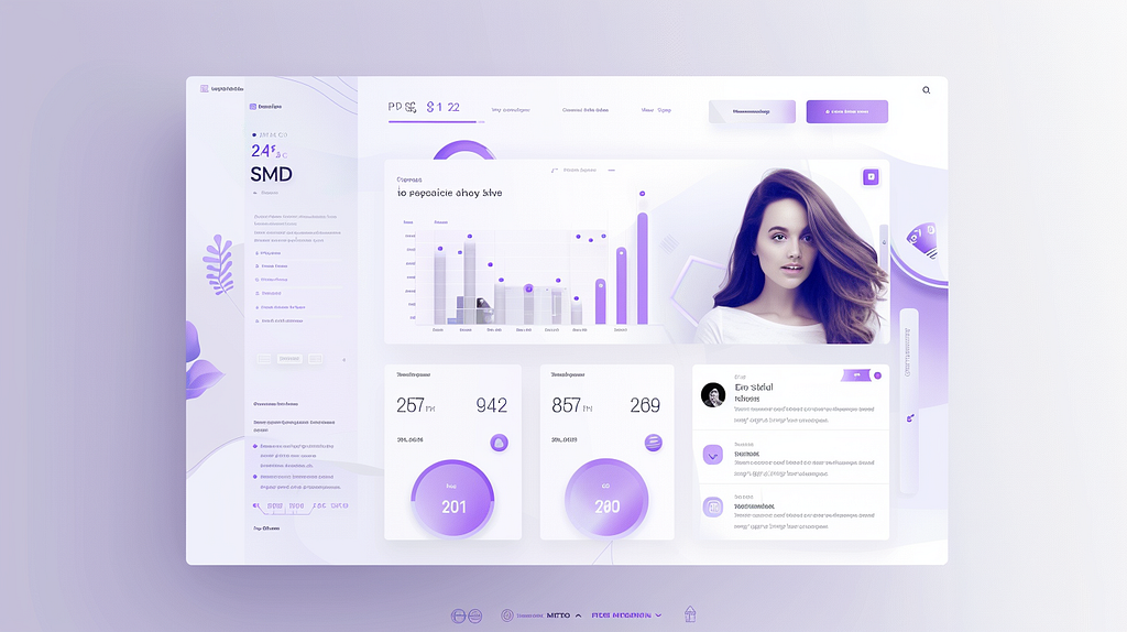
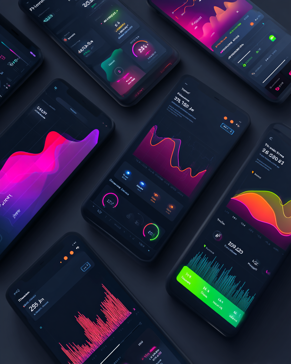
Examples of UI design output generated by Midjourney
I didn’t cherry-pick visuals for this section. All examples are real outputs, shown exactly as Midjourney generated them on the initial try.
Website page
Modern SaaS landing page UI for AI productivity app,
clean layout, hero section with dashboard preview,
subtle gradients, neumorphism + glassmorphism blend,
minimal typography, white and lavender palette --ar 16:9 --style raw --v 6
Mobile design
Mobile app UI for fitness tracking, dark mode,
Material Design 3, vibrant accent colors,
modern data visualization, rounded cards,
motivational look --ar 4:5 --style raw
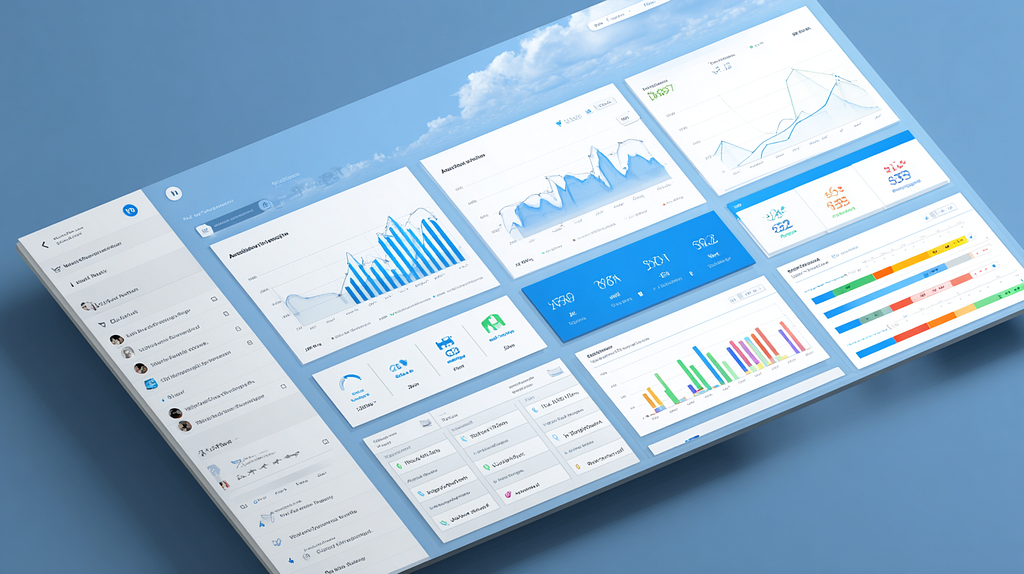
Dashboard design + reference of design system
Web dashboard UI for hospital management system,
clean data visualization, white + sky blue color scheme,
modular card layout, IBM Carbon Design System influence,
professional tone --ar 16:9 --style raw
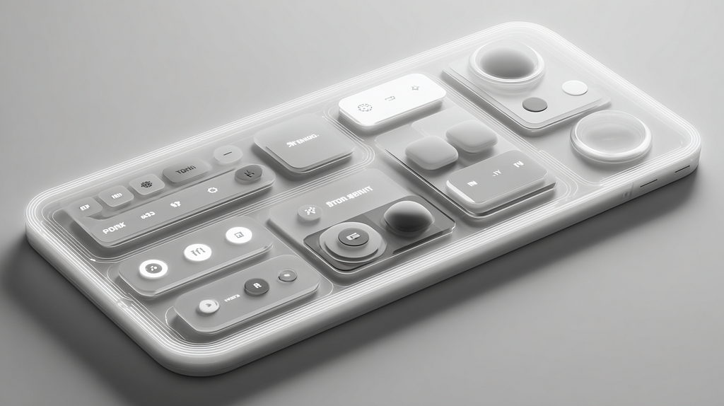
Experimental / Aesthetic Styles
Futuristic neumorphic UI design, 3D depth, soft shadows,
monochrome palette, clean layout, subtle glow,
minimalist buttons --ar 16:9 --style raw
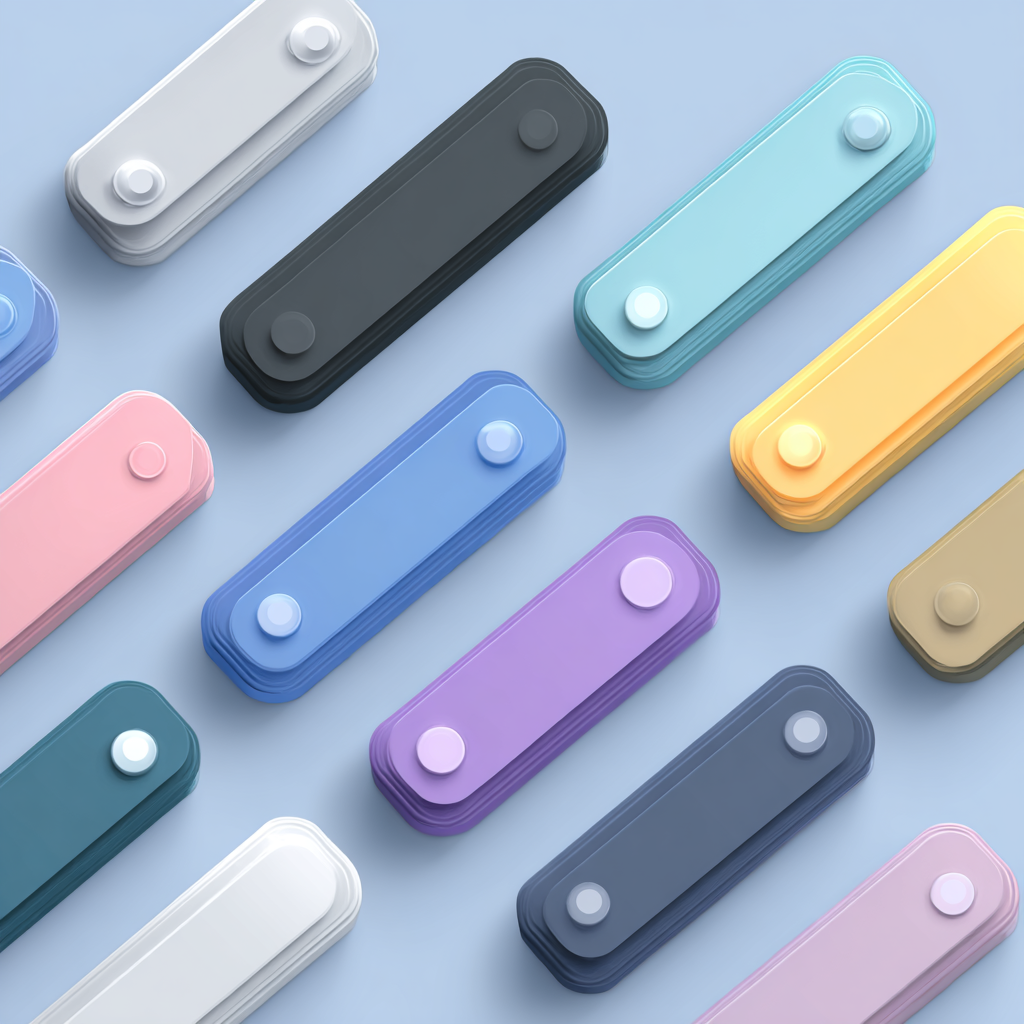
Design System & Component Exploration
UI design system buttons set, primary/secondary/ghost styles,
Material 3 tokens, Figma component sheet,
consistent 8px grid --ar 1:1 --style raw
Next steps
Now, when you see the output generated by Midjourney, you likely wonder, “What to do with it? How can I bake it into my design process? As for me, I typically use visuals generated by Midjourney during the early phase of design exploration: when I need to experiment with the look & feel of the product, rather than diving into details. Once I identify the right look & feel, I can re-create a high-fidelity version of UI design using tools like Figma Make:
Or even jump to Claude to quickly craft an interactive prototype of the future product.
If you have more tips on making the most of Midjourney, please share them in comments.
Written by Nick Babich
![]()
UI Design with Midjourney was originally published in UX Planet on Medium, where people are continuing the conversation by highlighting and responding to this story.