Tips and Insights to Create Intuitive, User-Centered Data Tables

Data tables provide a structured way to organize and manage information, making it easier to analyze and visualize data effectively. Well-designed tables enable users to access, analyze, and act on critical information quickly and accurately. However, creating effective data tables is not as simple as organizing rows and columns. It requires a thoughtful approach to user experience (UX), usability principles, and visual design to ensure clarity, accessibility, and functionality.
In this article, we’ll delve into the best practices for designing tables that convey information and enhance the overall user experience. The best practices shared in this article are based on my personal experience as a Digital Product designer, working on diverse applications and tackling various design challenges. While this list is by no means comprehensive, it offers actionable insights to help you elevate your table designs.
Why Data Tables Are Important in Application Design
- Organized: Presenting Data in a Meaningful Way. Data tables ensure that information is structured and easy to navigate. By organizing content in a meaningful way — such as by hierarchy, alphabetization, or logical grouping — they allow users to quickly locate and comprehend relevant details. Proper organization minimizes cognitive load and streamlines the decision-making process, especially when users need to sift through complex datasets.
- Interactive: Customizable and User-Friendly Displays. Well-designed data tables empower users to interact with the displayed information, offering customization options that cater to diverse needs. Features like filtering, sorting, and column resizing transform static tables into dynamic tools, enabling users to personalize the data view according to their preferences.
- Intuitive: Simplifying Data Interpretation. Ease of use is at the heart of a great data table design. A logical structure, clear labels, and thoughtful layout ensure that even complex information is accessible and understandable. Intuitive design reduces confusion, boosts productivity, and makes users feel confident in navigating the data.
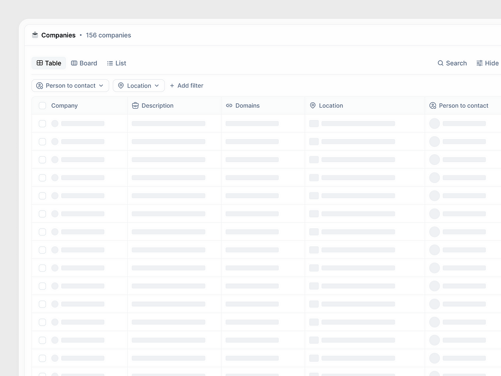
#1. Use the Search Function for Quick Data Access
The search function in a table allows users to quickly locate specific information within large datasets. A well-designed search bar with auto-suggestions or categorized results improves efficiency and ensures a smoother experience. Highlighting the matched search results adds clarity and ensures users can navigate directly to the desired data.
💡 Pro Tip:
Incorporate the option to save recent search queries or display them as suggestions. This feature enhances usability for frequent users, making data retrieval faster and more efficient for regular tasks.
💎 User Benefits:
✦ Time-Saving: The search function significantly reduces the time spent scrolling through large datasets, allowing users to quickly locate specific information.
✦ Improved Efficiency: Features like auto-suggestions and categorized results streamline the process, helping users refine their queries and find relevant data faster.
✦ Enhanced Clarity: Highlighting matched results eliminates guesswork and helps users focus on the exact data they need.
✦ Personalized Experience: Saving recent search queries or offering suggestions caters to frequent users, improving their workflow and making repetitive tasks more seamless.

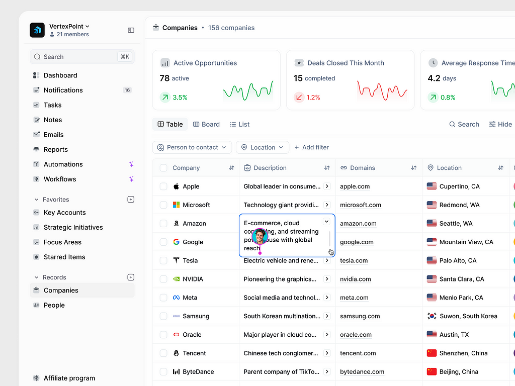
#2. Allow Manual Adjustment of Column Widths
Providing users with the ability to manually adjust column widths by dragging the column borders enhances table flexibility and usability. This feature allows users to focus on the most relevant data by customizing their view, especially when dealing with varying text lengths or complex datasets.
💡 Pro Tip:
Include a double-click action on column borders to auto-fit the width based on the content size. This will save time and ensure that all data is visible without excessive manual adjustments.
💎 User Benefits:
✦ Customizable View: Allowing users to adjust column widths empowers them to personalize the table layout based on their specific needs, making the data presentation more relevant and user-friendly.
✦ Improved Readability: Users can optimize the display of content, ensuring longer text entries or critical information are fully visible without being truncated.
✦ Flexibility for Complex Data: This feature accommodates datasets with varying text lengths, such as detailed descriptions or numerical values, improving clarity and reducing clutter.
✦ Time Efficiency: The auto-fit option via double-click saves users time by automatically resizing columns to fit content, offering a balance between manual control and convenience.

#3. Streamline Data Management with Bulk Actions
Bulk actions enable users to efficiently manage multiple rows of data at once, reducing repetitive tasks and enhancing productivity. By allowing users to select multiple entries and perform actions such as “Change Status,” “Export,” or “Delete,” you streamline workflows and provide a more user-friendly experience, particularly for handling large datasets.
💡 Pro Tip:
Incorporate visual feedback, like confirmation dialogs and progress indicators, to reassure users about their actions. Additionally, providing “Undo” functionality can enhance trust and reduce errors during bulk operations.
💎 User Benefits:
✦ Increased Productivity: Bulk actions save users significant time by allowing them to perform operations on multiple rows simultaneously, eliminating repetitive, one-by-one actions.
✦ Simplified Workflows: Features like “Change Status,” “Export,” or “Delete” streamline data management, especially when handling large datasets, making complex tasks more manageable.
✦ Error Prevention: Visual feedback, such as confirmation dialogs and progress indicators, reassures users about their actions, reducing anxiety and the likelihood of mistakes.
✦ Enhanced Confidence: An “Undo” option provides users with a safety net, allowing them to quickly recover from unintended changes, fostering trust in the system.

#4. Optimize Data Management with Flexible Filtering
Allow users to apply filters dynamically and exclude already-applied filters from the list to avoid redundancy and confusion. This ensures users can quickly understand which filters are available and which are in use. Providing advanced filtering options empowers users to refine their data view more effectively, catering to complex use cases.
💡 Pro Tip:
Include real-time visual feedback when filters are applied, such as updating the displayed data instantly. Additionally, allow users to save their filter combinations for repeated use, further enhancing efficiency and personalization.
💎 User Benefits:
✦ Improved Clarity: By excluding already-applied filters from the list, users can easily understand which filters are still available, avoiding redundancy and reducing confusion.
✦ Enhanced Efficiency: Flexible filtering allows users to quickly refine their data view, helping them focus on the most relevant information without unnecessary steps.
✦ Adaptability for Complex Use Cases: Advanced filtering options cater to diverse needs, making it easier to manage intricate datasets and drill down into specific data subsets.
✦ Real-Time Updates: Instant visual feedback ensures users immediately see the effects of their applied filters, boosting satisfaction and workflow speed.
✦ Personalized Experience: The ability to save filter combinations streamlines repetitive tasks, enabling users to return to their preferred views effortlessly.

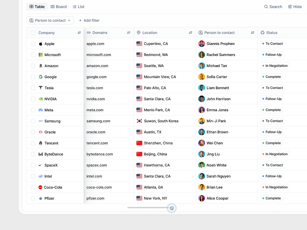
#5. Enhance Usability with Frozen Headers and Key Columns
Fixing header rows or key columns in place ensures critical information remains visible while users scroll horizontally or vertically. This feature improves navigation within large datasets, making it easier to maintain context and quickly reference key data points.
💡 Pro Tip:
Allow users to customize which columns or rows to freeze based on their preferences. For added functionality, include a visual indicator to show frozen elements, ensuring a clear and intuitive experience.
💎 User Benefits:
✦ Improved Navigation: Frozen headers and key columns ensure vital information remains visible, helping users maintain context while scrolling through large datasets.
✦ Enhanced Data Accessibility: By keeping critical data points, such as column titles or unique identifiers, always in view, users can quickly reference and compare information.
✦ Personalized Experience: Allowing users to customize which rows or columns to freeze provides flexibility, enabling them to tailor the table to their specific needs and workflows.
✦ Intuitive Interaction: Visual indicators for frozen elements add clarity, ensuring users can easily distinguish between static and scrollable sections.
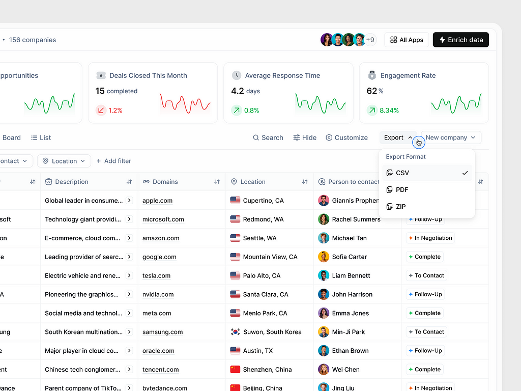
#6. Enable Data Export in Popular Formats
Providing the ability to export data in commonly used formats, such as CSV, PDF, or ZIP, empowers users to utilize table data outside the application. This functionality is crucial for seamless data sharing, further analysis, or integrating with other tools and workflows.
💡 Pro Tip:
Allow users to customize the export by selecting specific columns or applying filters to include only relevant data. Including a progress indicator for larger exports also enhances the user experience by keeping them informed during the process.
💎 User Benefits:
✦ Increased Flexibility: Allowing users to export data in popular formats such as CSV, Excel, or PDF empowers them to use the data outside the application for various purposes like reporting, analysis, or sharing.
✦ Enhanced Productivity: Export functionality saves users time by providing an easy way to download and work with large datasets, eliminating the need for manual data transfer.
✦ Broader Compatibility: Supporting widely-used formats ensures users can seamlessly integrate the exported data into their preferred tools and workflows.
✦ Improved Accessibility: Users can access the exported data offline, making it more convenient for situations where internet connectivity may be limited.
✦ Streamlined Collaboration: Exporting data in shareable formats enables better communication and collaboration with team members, stakeholders, or external partners.
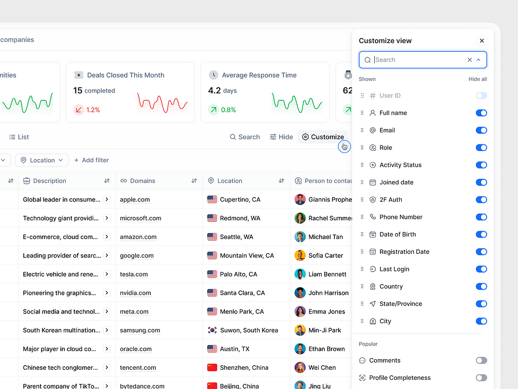
#7. Empower Users with Customizable Data Views
Allowing users to customize visible columns ensures that they can focus on the most relevant information for their specific tasks. A “Customize View” option lets users toggle column visibility, providing a tailored experience that adapts to different workflows and preferences.
💡 Pro Tip:
Include a “Save View” feature so users can store and quickly switch between different column configurations for various use cases. Adding a search function within the customization panel also helps users find specific columns quickly in datasets with many options.
💎 User Benefits:
✦ Personalized Experience: Customizable data views let users tailor the table to their specific needs, focusing only on the information that matters most for their tasks.
✦ Streamlined Workflows: By toggling column visibility, users can reduce visual clutter, making the table easier to navigate and improving efficiency.
✦ Enhanced Flexibility: A “Customize View” feature adapts to various use cases, allowing users to switch between different configurations depending on their goals or context.
✦ Saved Effort: A “Save View” option enables users to store their preferred setups, saving time by avoiding repetitive customization for recurring tasks.
✦ Improved Usability: Including a search function within the customization panel helps users quickly locate specific columns, especially in large datasets with numerous options.
#8. Enable Direct Data Editing in Tables
Allowing users to edit data directly within the table enhances efficiency by eliminating the need for additional forms or modals. This feature is particularly useful for quick updates or corrections, streamlining workflows and reducing clicks for users managing large datasets.
💡 Pro Tip:
Incorporate inline validation to catch errors immediately as users edit data. Additionally, provide a save or cancel option for each change to ensure users can review edits before committing them, increasing confidence in data accuracy.
💎 User Benefits:
✦ Increased Efficiency: Direct data editing eliminates the need for extra steps like navigating to separate forms or modals, enabling quicker updates and corrections.
✦ Streamlined Workflows: Users can make changes on the spot, reducing clicks and time spent managing large datasets.
✦ Enhanced Data Accuracy: Inline validation ensures errors are flagged immediately, helping users input accurate data and avoid costly mistakes.
✦ Improved Confidence: Save and cancel options for each edit give users control over their changes, allowing them to review and confirm updates before finalizing them.
✦ User-Centric Convenience: By making the editing process intuitive and seamless, users can focus more on their tasks and less on navigating complex interfaces.
#9. Improve User Experience with a Loading Skeleton
Implementing a loading skeleton in data tables provides a visual placeholder while data is being fetched. This feature reassures users that the system is actively working, reducing perceived wait time and improving overall user experience.
💡 Pro Tip:
Match the skeleton’s structure to the actual table layout to set accurate user expectations. Additionally, consider including a subtle animation (e.g., shimmer effect) to indicate activity and make the interface feel more dynamic and responsive.
💎 User Benefits:
✦ Reduced Perceived Wait Time: A loading skeleton keeps users visually engaged while data loads, making the wait feel shorter and less frustrating.
✦ Enhanced Transparency: By showing placeholders that resemble the table layout, users know the system is working, building trust and reducing uncertainty.
✦ Improved Visual Continuity: Matching the skeleton’s structure to the actual table layout helps users anticipate the final content, creating a smoother transition once the data appears.
✦ Dynamic and Engaging Interface: Adding subtle animations, such as a shimmer effect, conveys activity, making the interface feel responsive and alive.
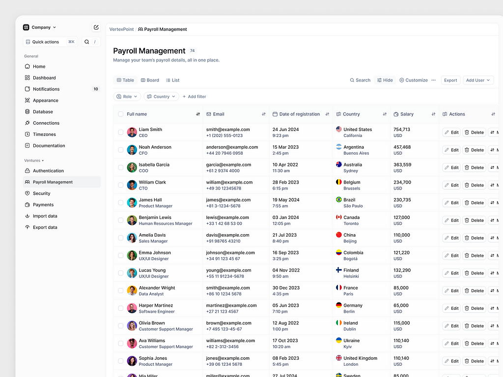
#10. Utilize Double Rows for Complex Data Tables
Using double rows in data tables allows for displaying additional information in a structured and readable manner. This approach is particularly useful for complex datasets where key details, such as roles, emails, or timestamps, need to be shown alongside primary data points without overwhelming the user.
💡 Pro Tip:
Ensure clear visual hierarchy by using typography (e.g., bold for primary data, lighter text for secondary data) and spacing to distinguish between rows. Consider collapsible secondary rows for better space management on smaller screens or in cases of excessive data.
💎 User Benefits:
✦ Improved Readability: Double rows organize complex datasets into a structured layout, ensuring users can view primary and secondary details without cluttering the interface.
✦ Enhanced Data Clarity: Displaying additional information, such as roles, emails, or timestamps, alongside primary data points helps users make quicker and more informed decisions.
✦ Efficient Use of Space: By utilizing double rows, you maximize the table’s information density while maintaining a clean and user-friendly design.
✦ Simplified Navigation: Users can access all relevant details at a glance, eliminating the need to open additional menus or modals for secondary information.
✦ Better Workflow Support: Complex data is presented in an organized manner, reducing cognitive load and enabling users to focus on actionable insights.
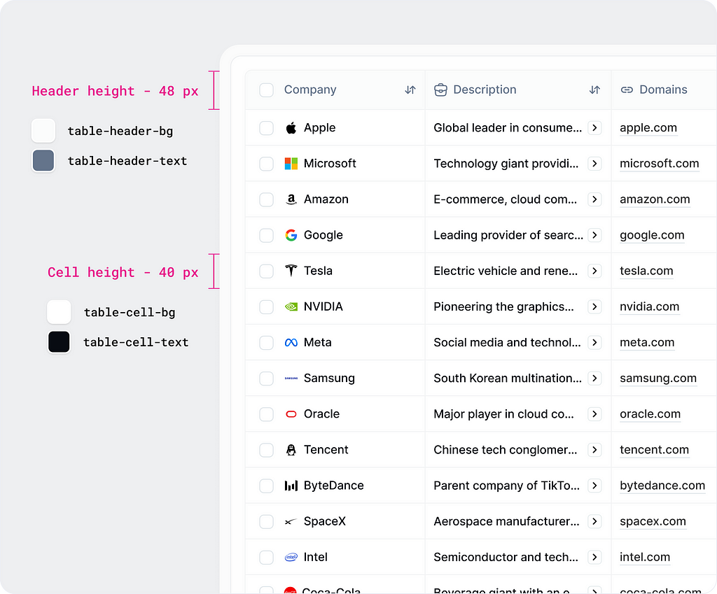
#11. Differentiate Table Headers and Cells with Height and Styles
Using distinct heights and styles for table headers and cells enhances readability and establishes a clear hierarchy. For example, slightly taller headers with bold or contrasting text help users quickly identify column labels, while uniform cell styles ensure a clean, organized data presentation.
💡 Pro Tip:
Use a subtle background color or border for headers to visually separate them from the table content. Additionally, ensure consistent alignment of text within headers and cells to maintain visual harmony and improve readability.
💎 User Benefits:
✦ Enhanced Readability: Differentiating table headers with distinct heights and styles ensures users can easily identify column labels, improving navigation and comprehension.
✦ Clear Visual Hierarchy: Bold or contrasting text in headers creates a clear distinction between headers and data, making the table more intuitive and user-friendly.
✦ Organized Data Presentation: Uniform cell styles maintain a clean and consistent appearance, reducing visual noise and helping users focus on the content.
✦ Faster Data Interpretation: Clear header styles enable users to quickly understand the table’s structure, saving time when analyzing or comparing information.
✦ Professional Aesthetic: Thoughtful styling enhances the table’s overall design, giving the interface a polished and user-centric look.
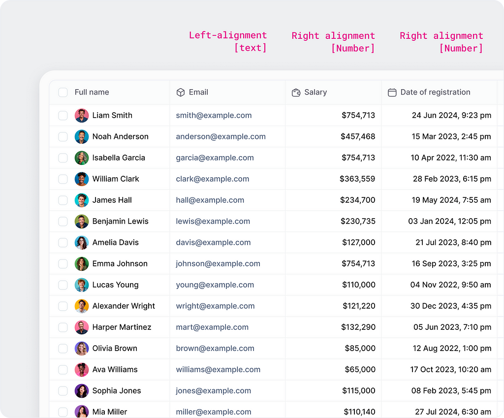
#12. Align Text and Numbers for Better Readability
Left-align text and right-align numeric values in table columns to improve readability and clarity. This alignment standard ensures that textual content is easy to scan, while numeric data aligns neatly, making comparisons between values more intuitive for users.
💡 Pro Tip:
Apply consistent padding and spacing between columns to further enhance visual structure. For dates and time values, follow the numeric alignment style to maintain uniformity and improve comprehension of chronological data.
💎 User Benefits:
✦ Improved Readability: Left-aligning text ensures that column content is easy to scan, especially for names, descriptions, or other textual information.
✦ Enhanced Clarity for Numbers: Right-aligning numeric values creates a consistent alignment, making it easier for users to compare figures and identify patterns.
✦ Streamlined Data Interpretation: Clear alignment reduces cognitive load, allowing users to quickly focus on relevant data without unnecessary distractions.
✦ Professional Presentation: Proper alignment demonstrates attention to detail, enhancing the overall visual quality and usability of the table.
✦ Consistent Formatting: Adhering to alignment standards creates a uniform layout, reinforcing a logical structure and improving the user experience.
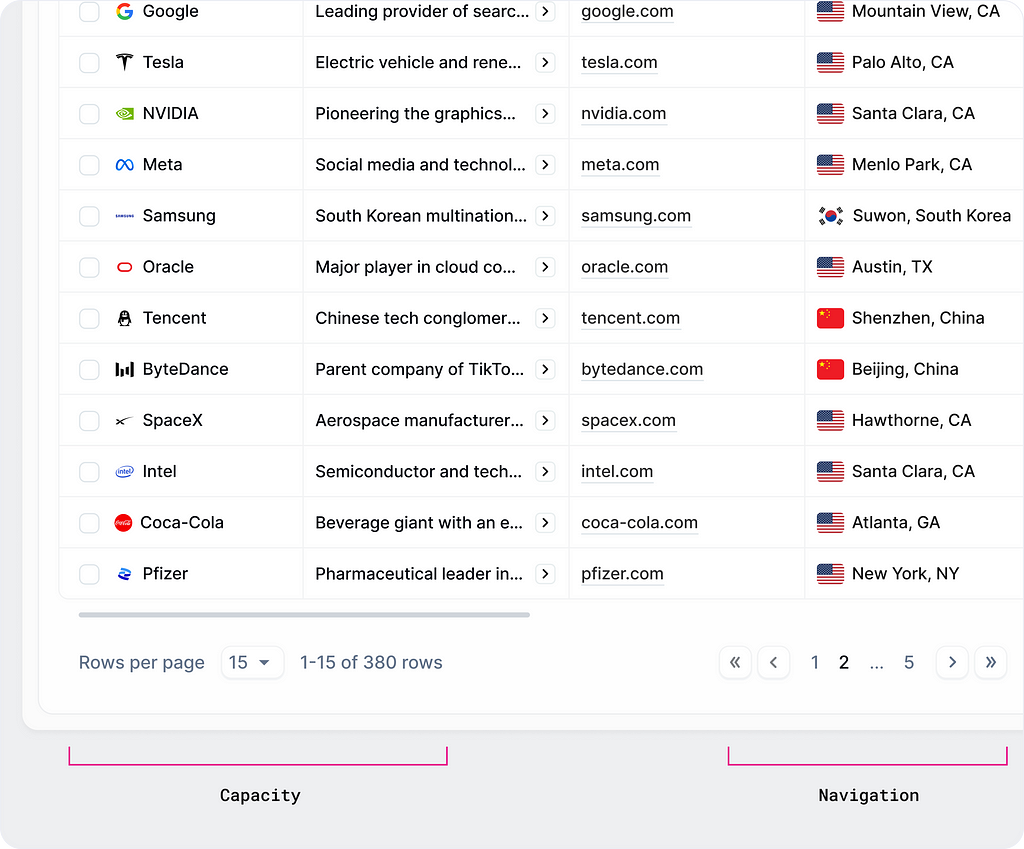
#13. Break Data into Manageable Chunks with Pagination or Infinite Scrolling
Pagination and infinite scrolling are effective ways to handle large datasets without overwhelming users. Pagination divides content into smaller, numbered pages, providing clear navigation and control. Infinite scrolling dynamically loads more data as users scroll, offering a seamless and uninterrupted browsing experience.
💡 Pro Tip:
For pagination, include “Rows per page” and total data indicators to give users control over how much data is displayed. For infinite scrolling, consider adding a “Load More” button at the end to give users a sense of control and avoid endless scrolling fatigue.
💎 User Benefits:
✦ Reduced Overwhelm: Breaking data into smaller, manageable chunks prevents users from feeling overwhelmed by excessively large datasets, improving their focus and efficiency.
✦ Enhanced Performance: Pagination or infinite scrolling ensures smooth loading and interaction, particularly for tables with extensive data, avoiding performance lags.
✦ Improved Navigation: Users can explore datasets step by step, maintaining clarity and better control over their browsing experience.
✦ Customization Options: Pagination often allows users to choose how many rows to display at a time, catering to individual preferences and workflows.
✦ Seamless Interaction: Infinite scrolling provides a continuous data browsing experience, reducing the need for manual navigation, while keeping users engaged.
#14. Enable Quick Updates with Inline Status Changes
Allow users to update item statuses directly from the table using a dropdown menu. This inline interaction reduces navigation time, making it easy to keep information up-to-date while staying focused on the task at hand.
💡 Pro Tip:
Use distinct colors or icons for statuses to provide instant clarity. Add a subtle animation or success message to confirm changes, ensuring a smooth and intuitive user experience.
💎 User Benefits:
✦ Increased Efficiency: Inline status changes eliminate the need to navigate away from the table, allowing users to update information quickly and seamlessly.
✦ Streamlined Workflow: Dropdown menus integrated into the table reduce clicks and interruptions, keeping users focused on their tasks.
✦ Enhanced Usability: Quick updates directly in the table improve the user experience, especially for repetitive actions like changing statuses across multiple items.
✦ Real-Time Updates: Immediate status changes provide instant feedback, ensuring users see the results of their actions without delay.
✦ Reduced Friction: Simplifying the process for status updates minimizes frustration and enhances the overall flow of managing data.

Conclusion
Data tables may seem like a straightforward UI component, but their impact on usability and efficiency cannot be overstated. By applying these best practices, you can create tables that are not only visually appealing but also functional, accessible, and tailored to your users’ needs.
It’s important to note that this list is not exhaustive; it reflects insights I’ve gained through hands-on experience. Designing exceptional data tables often involves ongoing experimentation, iteration, and user feedback. I encourage you to adapt these tips to your specific context and continuously refine your approach based on user needs and evolving design trends.
By integrating thoughtful design principles and putting the user first, you’ll be well on your way to transforming how your application presents and manages data.
Thank you for reading, and please tell me. Did you find this article helpful? 🙌
I’d love to hear your thoughts!
- Which of these features would have the most impact on your daily workflow? Why?
- Are there any additional functionalities or design improvements you would like to see in a data table to better meet your needs?
Drop a note in the comments, I’d love to discuss.
Follow me further for more UX insights ✨
Say hello at 📩 : ux.sergushkin@gmail.com
Visit my Website 🌎: dmitrysergushkin.com
Linkedin | Behance | Medium | Layers | Dribbble | Twitter
![]()
Best Practices for Usable and Efficient Data table in Applications was originally published in UX Planet on Medium, where people are continuing the conversation by highlighting and responding to this story.