A short tale on how I designed a data analytics section at Dukaan.

Data is the compass that guides us through the turbulent sea of decisions, and, with the right design, it can be a treasure map leading business owners to success.
This case study revolves around the design decisions I took while working on the analytics section for Dukaan. This was one of the most intense work I did during my time at Dukaan.
✱ All about Dukaan
Dukaan is a DIY platform that empowers merchants to swiftly establish and expand their e-commerce stores in a matter of minutes.

✱ Meet the Team
I was the solo designer for this feature who worked from the beginning to the end but it wasn’t a solo act, I had a fantastic ensemble of talented collaborators by my side!

- Designers: Helped me with providing constructive design feedback and amazing ideas during the brainstorming sessions.
- Engineers: Helped me to map the intended data points with the best possible way to get that number and to ensure that final output is matched with designs.
- Product Manager: Helped me navigate the project scope and requirements.
✱ Kicking Things Off!
My aim with this feature was to simplify data and be the friendly guide, no matter the size of user’s business or their experience with the analytic jargons.
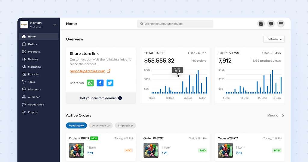
Prior to the rollout of this project, Dukaan’s dashboard only displayed total sales and total orders to users.

To eliminate this bridge between business owners and data, we decided to add a detailed analytics section in the seller dashboard.
✱ Research: The Quest for Insights
➺ GETTING STARTED
I began with a collaborative brainstorming session with the team. During the session, we explored fundamental questions and brainstormed ideas. Subsequently, we conducted anonymous voting to identify the top ideas.

How it helped?
The answers to these questions gave some clarity on the purpose and the goals of this feature.
➺ THE SEA OF DATA METRICS
There exist tens of data metrics and hundreds of ways to visualise the data.
Choosing what data to show and how to represent it in the best possible way was a big task.
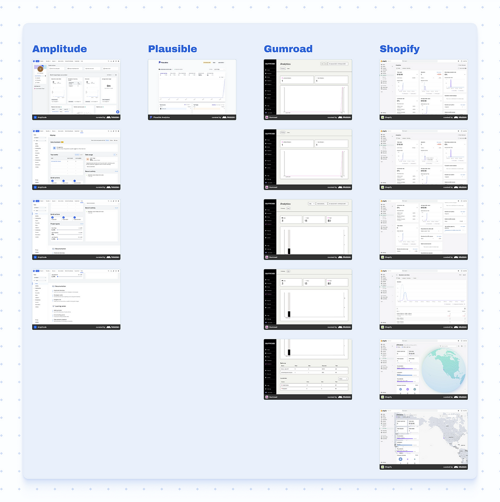
I conducted a competitive analysis where I studied used data points. My primary focus was on platforms in the e-commerce domain like Gumroad, and Shopify but I also went through Amplitude and Plausible that are purely analytics platform.
How it helped?
The competitive analysis helped me in finalising a list of data points that are popularly used by other platforms and are known to business owners. I also found that most of the data points fall under the umbrella of “Sales,” “Traffic,” and “Products & Category”.
➺ ORGANISING THE CHAOS
After closely analysing our competitors and asking basic questions like “Why would a business owner need this feature?” and “What metrics are crucial for a busy business owner to see daily?” I arrived at a list of approximately 20 important data points.
The challenge was to categorise them into “Must-Haves,” “Nice-to-Haves,” and “Not-Important,” a task that demanded great awareness of how our users think.
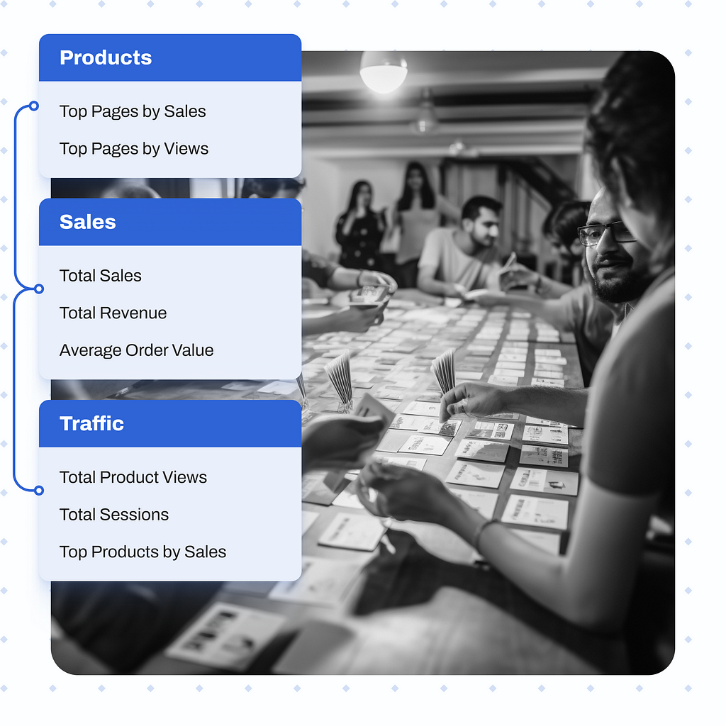
To navigate this effectively, I turned to the card sorting method. I teamed up with our product team, as they’re closely connected with our users.
Each data point was represented as a ‘card,’ and the goal was to organise them into three main groups: “Sales,” “Traffic,” and “Products.” In these groups, the priority was to place the most vital data points at the top.
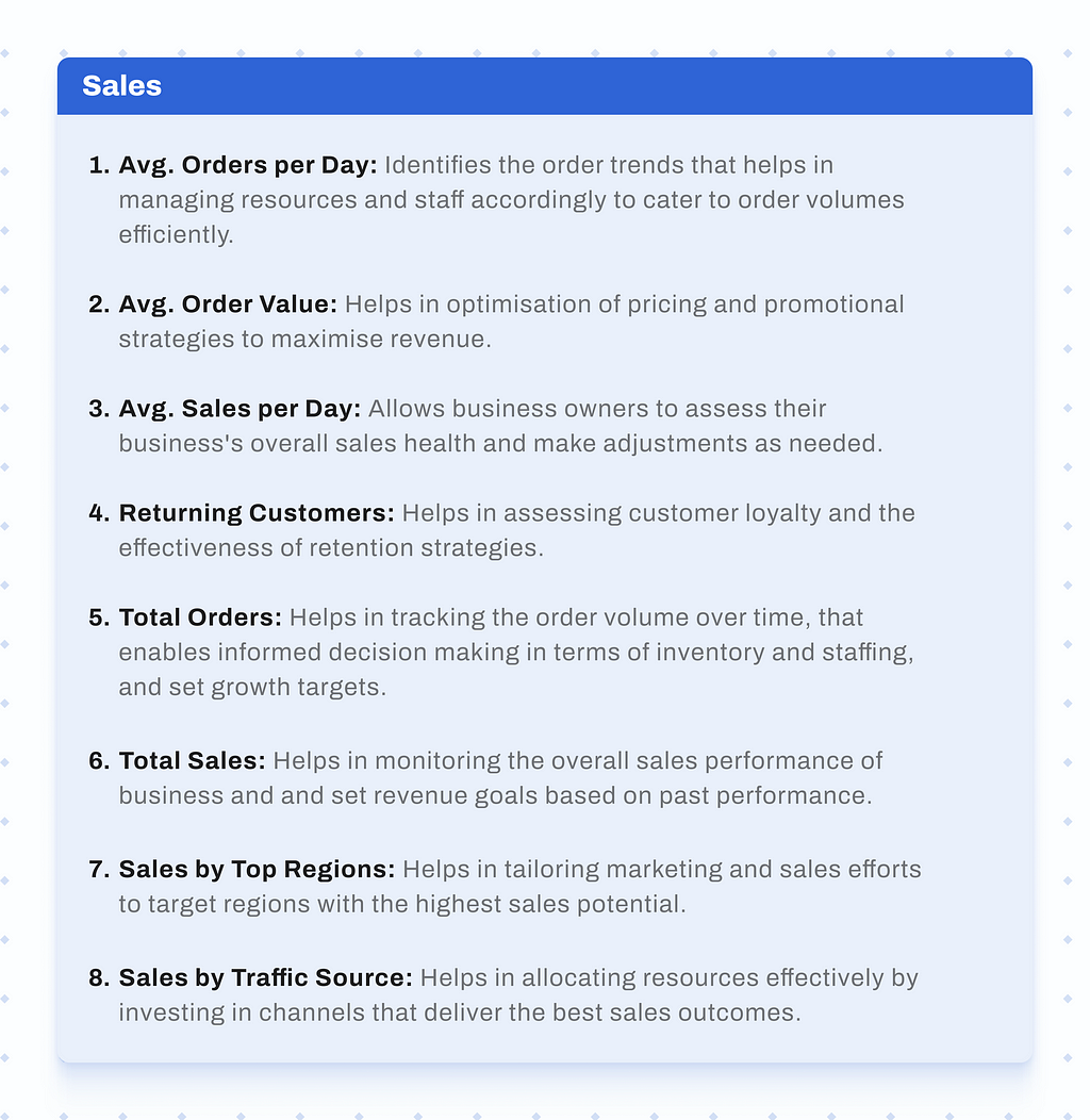
Here’s how each data set would help business owners:

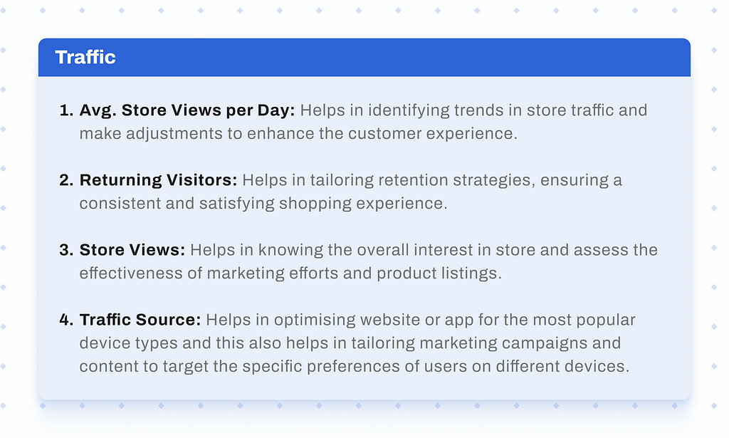
How it helped?
This approach ensured that I grasped the user perception of these data points and it made me think hard of how each point will add some value to the business.
✱ Diving into designs
Till this point, I had all the data and user insights in hand. It was time to bring the analytics section to life.
➺ CONSIDERATIONS
After the research and brainstorming, a set of insights stood out. Some were rooted in the initial research, while others took shape from my design intuition. Here’s what became evident:
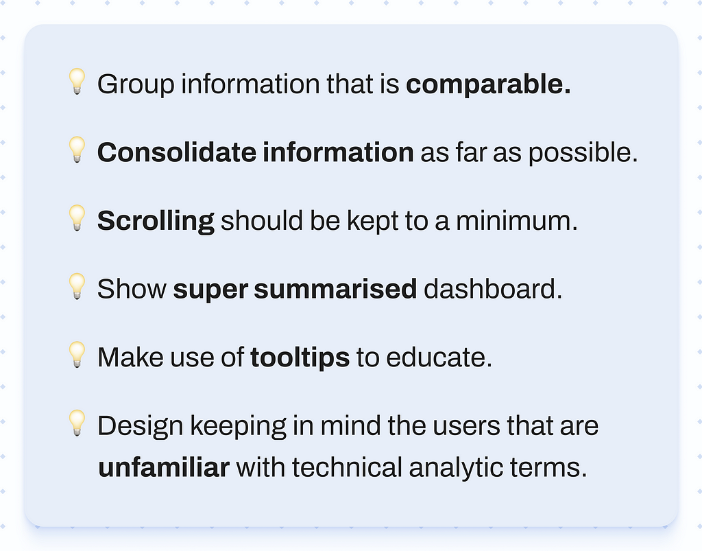
➺ GRAPH-O-LOGY
Choosing the right graph was a big decision. I wanted graphs to be straightforward and effective so I started reading about Data Visualisation Techniques. That’s where the ‘Data-Ink Ratio’ came in.
Data-Ink Ratio is a helpful principle by Edward Tufte, I’ll explain how it guided me to create clear and meaningful graphs without making things complicated.

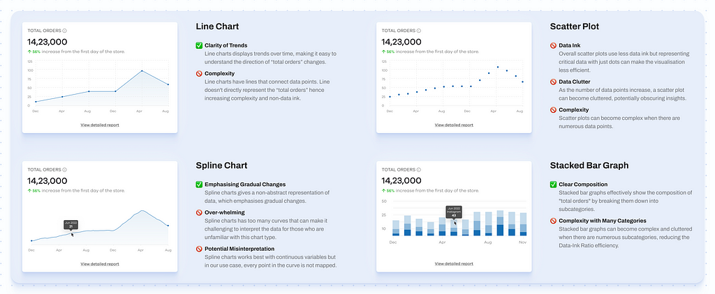

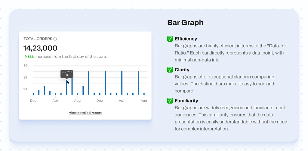
Consequently, the bar graph was used to convey various data points.
➺ TECH CONSTRAINTS
Tech constraints posed a significant challenge during the development of this feature.
- Ensuring alignment with the tech team was crucial, especially when dealing with data, as misinterpretations of data points could easily occur.
- To address this issue, I organised collaborative calls with both the backend and frontend teams.
- These sessions allowed me to explain my intentions clearly, developing a shared understanding of the feature’s requirements.
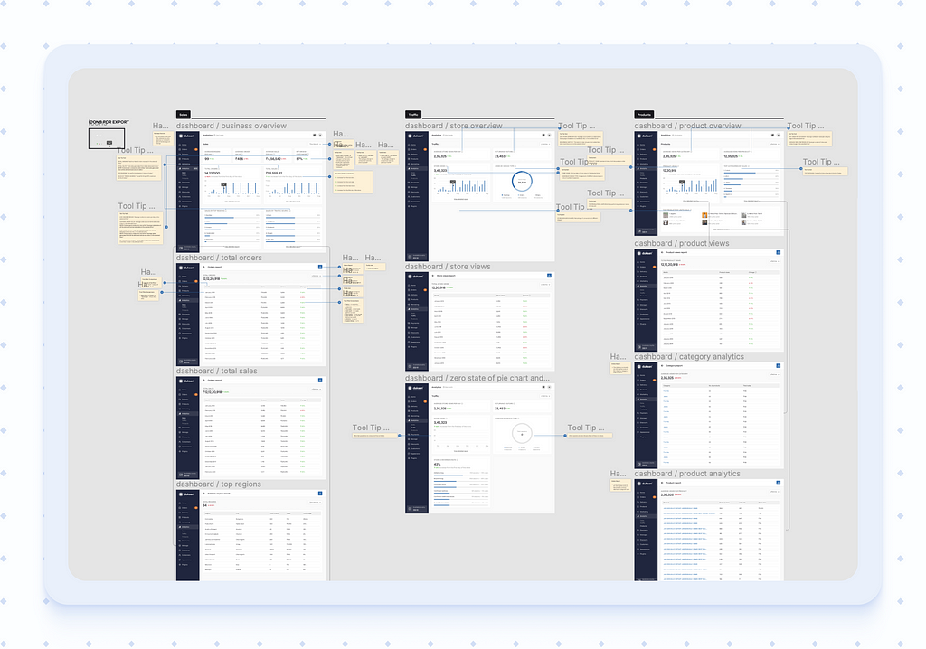
- Additionally, I maintained detailed notes within the Figma file to provide developers with essential context, minimising the risk of miscommunication.
➺ SHOW TIME
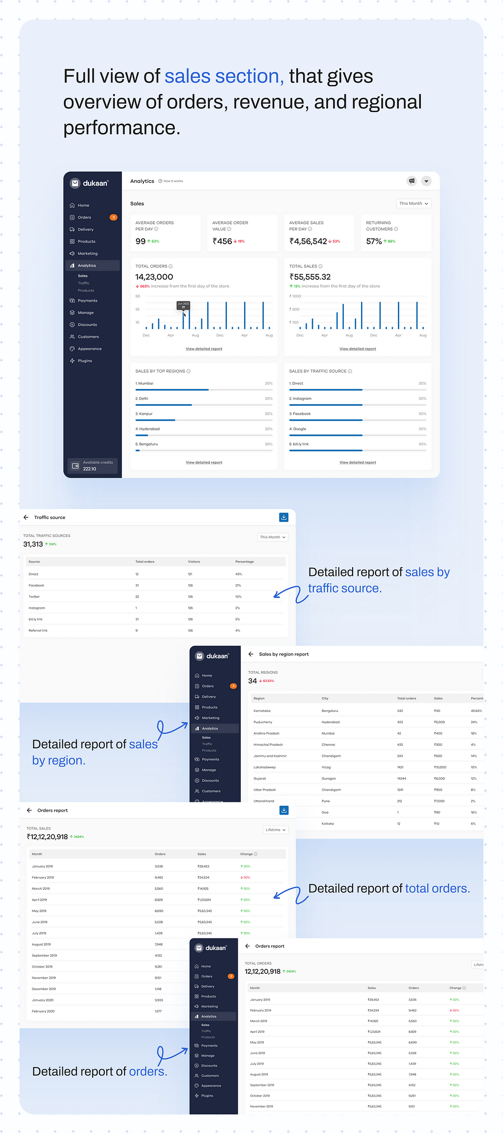
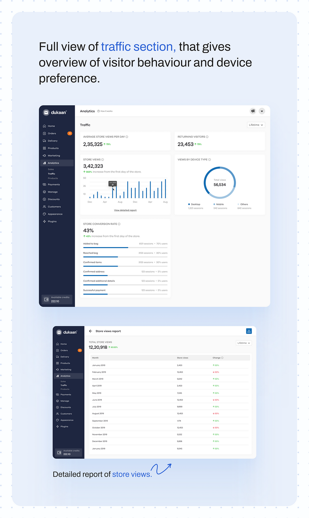
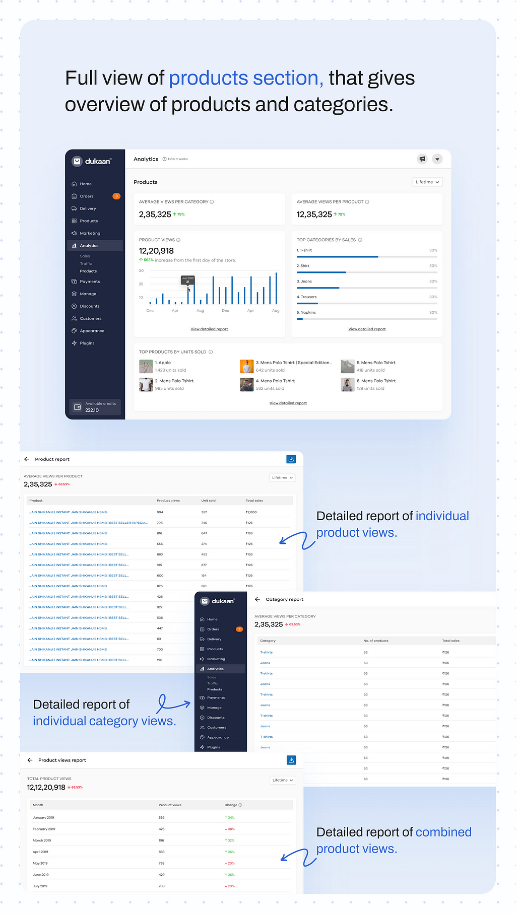

Though I have aimed to cover the feature’s design comprehensively, this case study provides a top-level view to respect time limitations. If you’d like a deeper dive or have questions, let’s connect via a call.
Bridging the Data Gap for Business Owners was originally published in UX Planet on Medium, where people are continuing the conversation by highlighting and responding to this story.