Case Study : Improving Data-Driven Decision Making for CSR Leadership
Civian is a data-driven platform designed to help businesses measure, optimize, and showcase the social and economic impact of their investments in communities. As a part of my curriculum at Pratt Institute, I worked with Civian to analyze & solve for usability issues on their platform.
Problem Brief
Over a span of 4 weeks, we tested Civian’s platform and created design solutions to improve the overall user experience of the dashboard.

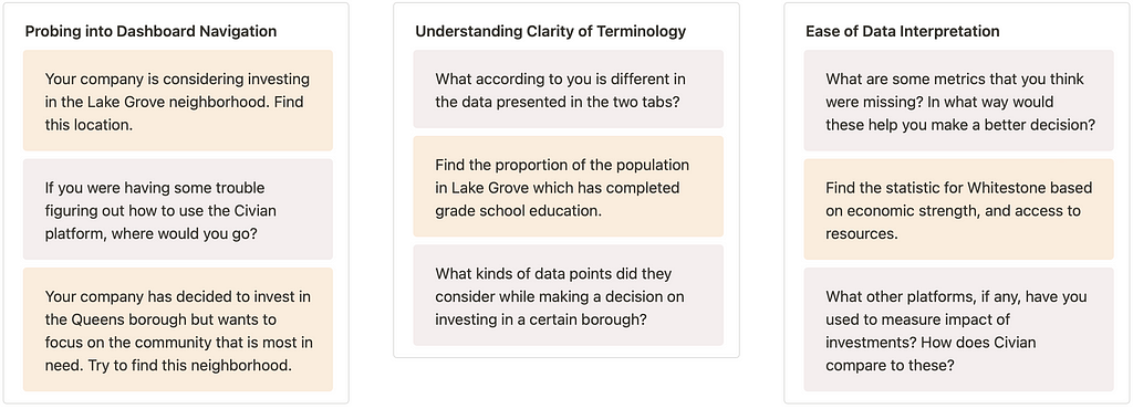
To make our interviews more fruitful, we established specific research objectives. We concentrated on three primary goals for optimal insights of the redesign:

Overview
We used various recruitment tools to interview and analyze insights through 8 moderated usability tests. We proposed 4 high-impact solutions through prototypes on Figma. Our broad recommendations were-

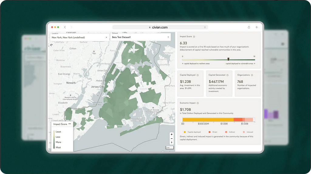
How did we evaluate the website?
Drafting an interview protocol
While drafting our script, we created a scenario for users where in they had to perform and answer a mix of tasks and questions. We also encouraged them to think out loud while they were navigating the dashboard, to help us uncover their mental model and identify hidden insights.
📌 Scenario: You are on the board of a public company. You are tasked with deciding how to spend the surplus Corporate Social Responsibility budget via the Civian dashboard.
Civian’s target audience were B2B users with C-Suite titles working in credit unions, and had prior experience with CSR activities
As we attempted recruitment along these lines, we realized this posed a HUGE challenge. After finding multiple screening rejected candidates, we sat down together to redefine target and potential users who could help us broaden our search.

Recruiting participants
Our new user group consisted of a wider user group spanning across multiple industries. Through our screening questions, we were able to tap into mirroring Civian’s user group quite accurately. Here’s a deeper look into our Participant Demographic–

Think-aloud Usability Testing & Evaluation
Over a span of 1 week, we conducted 8 remote moderated usability tests of the Civian platform to determine ease of use, clarity of terminology, digestibility of data, usefulness for decision-making of investments, and overall desirability of the platform.

We used a variety of recruitment platforms to find our perfect users which included –

Analyzing findings
We created FigJam boards to review our notes and jot down key insights from our interviews. By creating an Affinity Map out of our findings, we were able to group common themes together.

Results and Recommendation
While Civian offers a novel and valuable approach to investing, users encounter several challenges with its functionality. During our tests, we identified some broader user behavior trends:
1. Feature Engagement — Users most frequently gravitated toward the map to explore and compare data. The map acted as a starting point, and most users then drilled down into more specific data after trying to play around with the map.
2. User Intent — Many users expressed an interest in leveraging Civian’s data for investment research, market comparisons, or understanding neighborhood trends. A user mentioned that they’d be interested in such an application if Civian could draft a custom report for them in addition to the dashboard.
́3. Navigation Habits — Users appeared to value efficiency and expected intuitive pathways to frequently used tools(e.g., comparison tools and filtering methods). They were quick to abandon less responsive or unclear functionalities unless prompted to explore alternative ways.
Apart from these broad mental models, we were able to pinpoint several other usability issues, let’s go over them:
Issue 1: 📊 Data Comparison is Cumbersome
When tasked with comparing neighborhood to invest capital to maximize ROI, users leveraged key statistics. Since statistics are only visible for one community at a time, comparison of these insights became tough.
I don’t know if I need the map at this point to do much of anything. Other than showing where the places are at this level, I feel like a table comparing them (numbers) would be more effective
~ Tester #3 after spending 2 mins switching between two neighborhoods

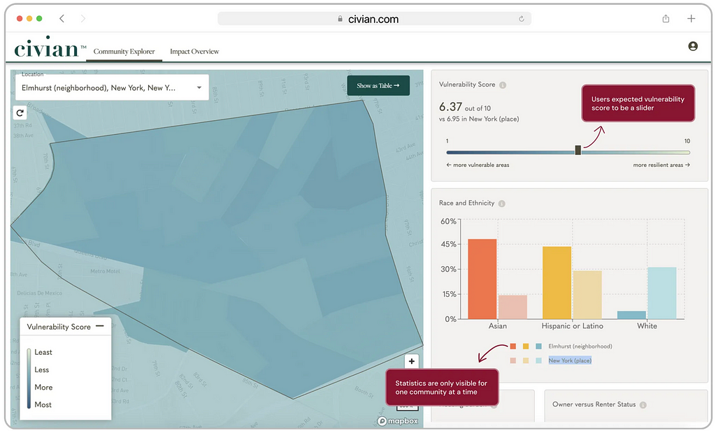
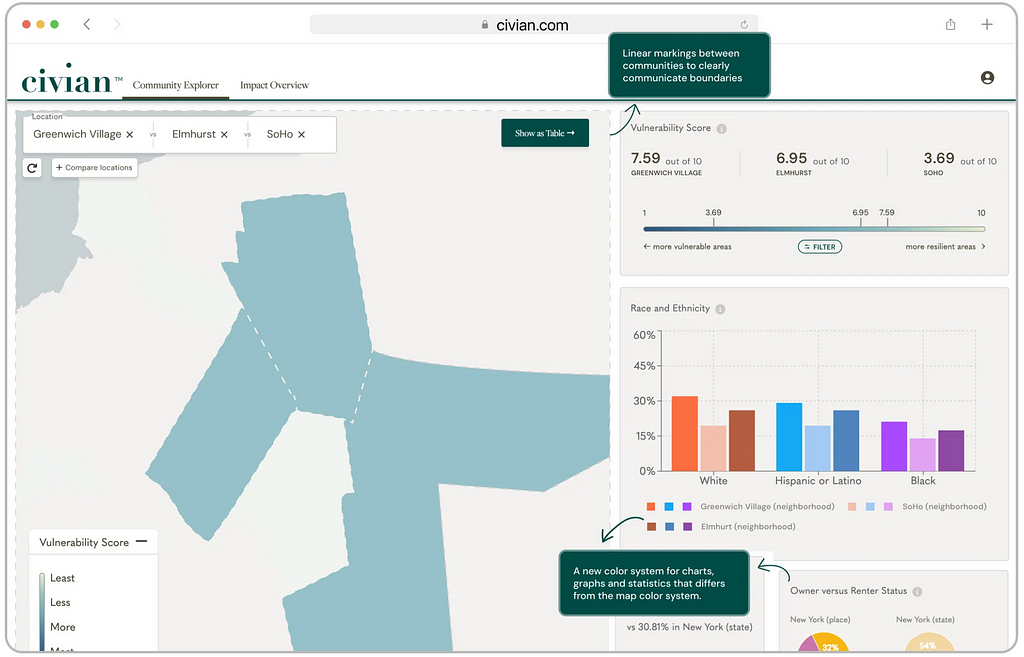
💡 Recommendation 1: So, we designed a dedicated comparison tool that enabled users to select multiple neighborhoods direct comparison
This feature allows users to view key statistics side-by-side on the righthand panel for a thorough analysis. By incorporating the slider as a filtering tool, we hoped to further streamline the evaluation process.

Issue 2: 🗺️ The Map has Poor Readability
While conducting the interviews, we noticed that users struggled with reading the map data. Some of the issues included overlapping use of colors, poor boundary definitions and a lack of system feedback.
…colors are kinda merging, (this is) so confusing
~ Tester #5 while trying to understand if the color systems are correlated

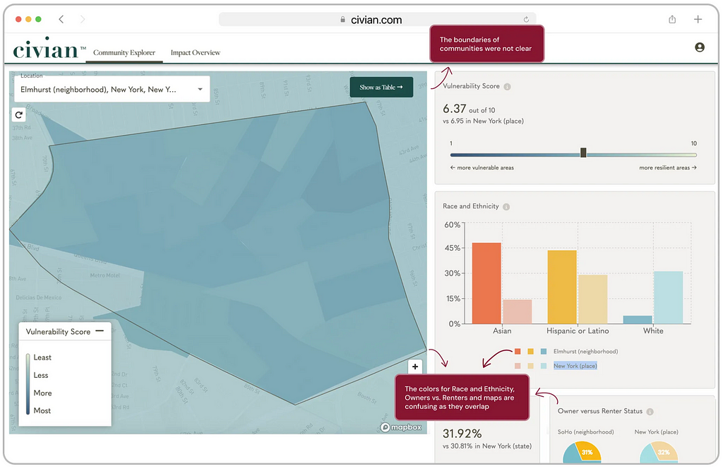
💡 Recommendation 2:Rethinking the color system — a visual overhaul…
We complete redid the interface by implementing distinct geographical boundaries, and adopting a revised color system that avoids reusing the same color. This helped us enhance clarity and reduces cognitive load around the map and its data.
Issue 3: 📈 Users Desire Richer Data
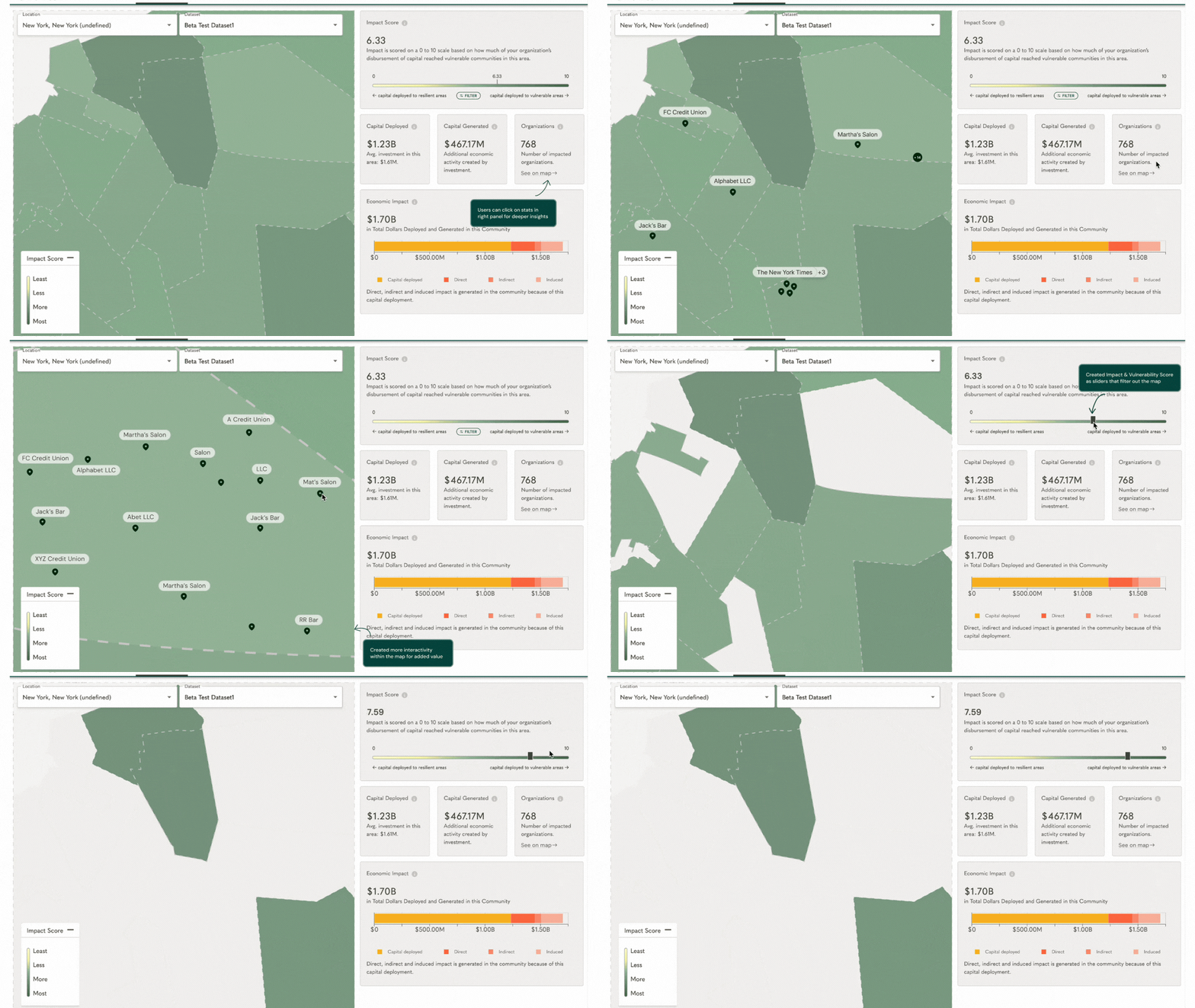
While the map took up half of the real estate on the dashboard, it didn’t provide the kind of nuanced data that users wanted. By expanding the data into insights, Civian could allow for more thorough identification of investment opportunities. Users would also get a deeper understanding of how their company’s deployment of capital led to an impact.


💡 Recommendation 3: Creating an interactive map experience!
Rather than the current static data points in the right panel, users can interact with them to see accordingly deeper data reflected in the map. Some testers were curious about the specific organizations that are impacted. This interaction would allow for more thorough view of each organization and its location relatively to where users want to invest their CSR budget.
Issue 4: 🧠 Users Need Accessible Help
While a help guide is offered on the platform, it is hidden away in the dropdown menu under the user’s profile. The platform does not clearly communicate where users can find help, resulting in some users taking excessively long to find an FAQ guide and 1 user missing it altogether.
Moreover, new features built were getting lost in all the different tools offered by the platform.
Wait, when did this compare table button come in? It definitely wasn’t there earlier!
~ Researcher #2 when they opened the platform after Thanksgiving

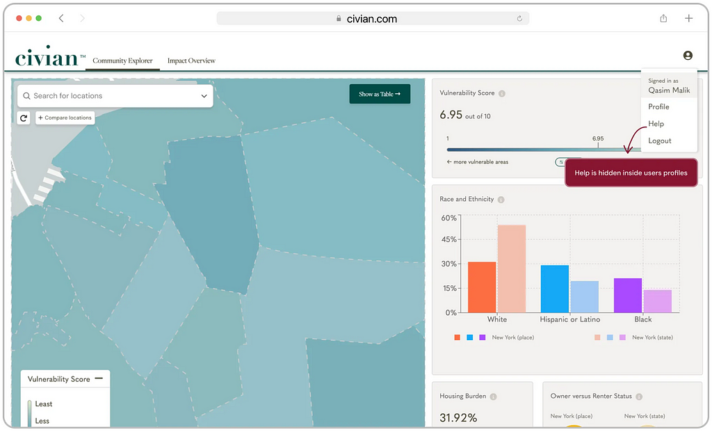
💡 Recommendation 4: Designing a new contextual onboarding flow
Moving the help button outside of the dropdown menu increases its visibility, ensuring users can easily access guidance when needed.
During usability testing, users benefited from moderators’ guidance on synthesizing data for decision-making. Simulating this type of assistance — by offering a targeted onboarding experience and readily available answers to specific questions — reduces the friction of learning the platform and enhances its overall usability.

Feedback
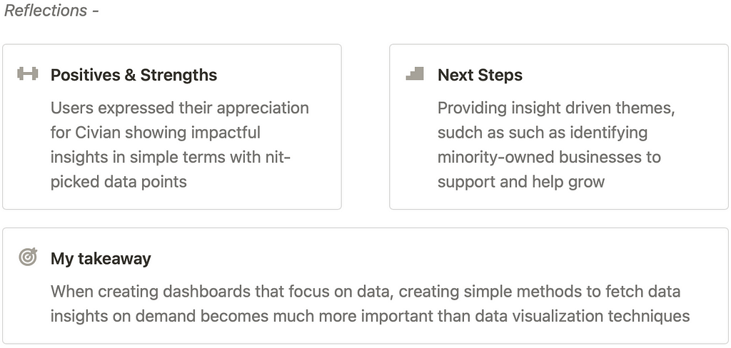
We presented our findings to Jim Sullivan (Director of Engineering) and Shannon D’Alessio (Chief Product Officer) from Civian who appreciated our work. The Civian team particularly appreciated our map insights since their parent company, Inchor Tech creates and sells such map software.

Conclusions
Small changes, Big Impact! 🥳
Our research & recommendations were deeply appreciated by Civian’s team, and were in line with their expectations of evaluating the product and understanding user mental models.
🏁 That’s a wrap!
If you’ve reached this far, thank you so much for reading!
I would love to hear your thought- connect with me on LinkedIn or Twitter
Did you know? You can give up to 50 claps on Medium, press and hold the clap icon and try it out! 👏🏼 ✨
Case Study : Improving Data-Driven Decision Making for CSR Leadership was originally published in UX Planet on Medium, where people are continuing the conversation by highlighting and responding to this story.