The dark mode is a night-friendly UI design style that predominantly features dimmed, dark, and grey color themes for all UI elements. This design style is considered to be “night-friendly” because darker colors reflect less light. Less light means less glare from the screen. In low-light environments, activating ‘dark mode’ can provide some much-needed relief when your eyes feel strained from staring at bright screens. That’s why “dark mode” has become more than just a design style. On many apps and websites, dark mode is a default feature that users can switch to any time they feel tired of using the standard “light theme.”
Twitter (now X) was one of the pioneers of the dark mode UI design trend. It released the dark mode feature in 2016. The app still allows users to switch from light to dark mode at will.

Apps like X, Adobe Creative Suite, and Spotify have used dark color palettes for their interfaces for a long time. But, this design style became wildly popular in 2019 when it was introduced as a default feature on both Android 10 and iOS 13. Users could now apply systemwide dark modes across all apps and platforms on their Android or Apple mobile phones. Since then, there’s been an explosion of consumer-facing dark mode options. Here are some prominent examples of the dark revolution in 2019:

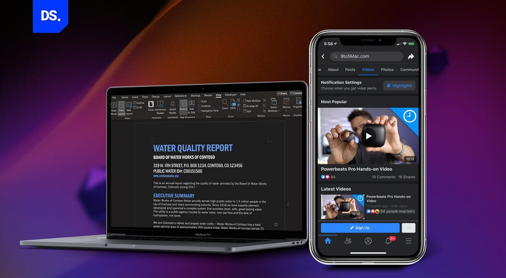
(i) Microsoft Word: Microsoft Word launched a dark mode in which entire documents were presented as dark canvases.
(ii) Facebook: Facebook started offering dark mode on both the app and the desktop site. This feature became available globally.

(iii) Halo: Many gaming app UIs, like Halo, also started featuring darker themes. Dark backgrounds reinforce the striking visuals and add a sense of mystery to the UIs.

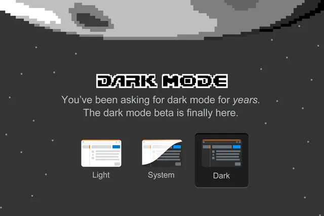
(iv) Stack Overflow: Dark mode was the most-requested feature on Stack Overflow and was finally added to the platform in 2020.

(v) White House Official Website: In a bid to boost accessibility, even WhiteHouse.gov added a dark mode option.
So, why are so many website design, app design, and web app design professionals switching to the dark side? Ultimately it all boils down to delivering good user experiences. Just imagine yourself in a setting where the lights are dim and other people are around, like on a night flight. If you’re using a laptop or a mobile in such a setting, using dark mode is the polite thing to do because that way your screen won’t emit as much light or glare.
Here are some other factors that are driving the popularity of dark color palettes in UI/UX, website, and app design.
The Reason Behind the Popularity of Dark Mode Theme
Relief from Computer Vision Syndrome (CVS)
Computer Vision Syndrome (CVS), commonly known as ‘digital eye strain,’ is an ocular disease. It’s caused by prolonged exposure to the light that emits from digital device screens. People who use digital devices for 2 or more hours a day are highly prone to getting CVS.
Dark mode has the potential to reduce this risk. When your screen is in dark mode, it emits much less light compared to bright, white backgrounds. Transitioning to dark mode can reduce eye strain and fatigue, especially in low-light environments where the bright light from white backgrounds feels extra harsh on the eyes.
No one needs relief from CVS more than developers and designers. According to a survey conducted by Thomas Steiner, an engineer at Google, 82.7% of the company’s development team used dark mode at work. They claimed dark mode was more comfortable for their eyes.
Improved Battery Life
Most modern-day smartphones and laptops feature OLED screens. On these screens, each pixel is illuminated individually. That means when your screen is in dark mode, fewer pixels are activated. This leads to improved battery efficiency and less power consumption.
Some estimates suggest that dark-mode screens consume 6 times less power than their light-screen counterparts. Designers who want to prolong their app or website usage times can benefit a lot by integrating this battery-friendly design style into their digital products.
Focus on Content
Bright backgrounds are inherently distracting. The dark mode is the opposite. In UI design, a dark color palette is an effective tool for reducing visual noise and directing the reader’s attention toward the content. Once the content takes center stage in the reader’s mind, the web or app becomes more readable and engaging.
Visual Hierarchy
Brighter elements and text in bright-colored font automatically stand out against dark backgrounds. UI designers use this fact to give their designs well-defined visual hierarchies. Dark mode makes it easier for them to direct the user’s attention toward specific page sections and design elements.
Aesthetic Appeal
Lastly, and most significantly dark mode looks and feels sleek to countless users across the world. For many users activating dark mode is an easy way to make their interfaces appear elegant, sophisticated, and easier on the eyes.
Potential Disadvantages of Dark Mode Theme in UI Design
Since we want to be fair, let’s discuss some of the “doomy and gloomy” aspects of dark mode in UI design as well.
Potential Accessibility and Readability Issues
Reading light-colored text against dark backgrounds is not everyone’s idea of a positive experience. This is especially true for people with visual impairments like astigmatism and color blindness. Apps/websites that only feature dark mode are inaccessible to such users.
Potential Branding Issues
Not all brand colors and logos look good against dark backgrounds. If your brand design is not suited to the dark mode color palette, adding this feature to your website/app may not be a good idea.
Limited Compatibility
Not all device platforms and operating systems support dark mode. If your website or apps are going to be accessed on such platforms/devices, they better feature supplementary “light modes.” Or else, your app’s availability and functionality will be limited.
While these potential disadvantages are valid reasons for concern, they can all be avoided if you follow the best practices for using dark mode in UI design.
Dark Mode UI Design Best Practices
Here are some essential practices that professional UI designers engage in to avoid the pitfalls mentioned above and seamlessly integrate dark mode into their app or web designs.
1. Dark Mode Does Not Mean Pure Black
Giving your app or website UI a pure black background is not a good idea. White text on a pure black background has too much contrast, and can cause severe eyestrain. Google’s design team recommends using the color “Cod Gray,” i.e., “color #121212” instead.

In the RGB color model, pure black is called “color #000000” because this color contains 0% red, 0% green, and 0% blue. Color #121212, on the other hand, contains 7% red, 7% green, and 7% blue. That’s why this color (cod gray) looks like a dark shade of gray.
Color #121212 provides subtler contrast for UI elements compared to pure black. Interfaces with this color look more sophisticated and are easier on the eyes.
2. Avoid Saturation
Design elements with bright, saturated colors stand out on light surfaces. They stand out even more against black backdrops. The first is good for user experience. The latter isn’t. Here’s a visual example:

Notice how the design element titled “Calls” on the right appears more pleasing to the eye compared to its over-saturated counterpart on the left? Lighter, less-saturated colors are always easier to read on interfaces with dark backgrounds.
3. Never Use Pure White
Bright white-colored design elements glow too much in a dark mode UI creating an irritating visual effect. So, always use a color palette that has a slightly dialed-down shade of white in text fonts and design elements.
4. Create Your Own Brand of Dark
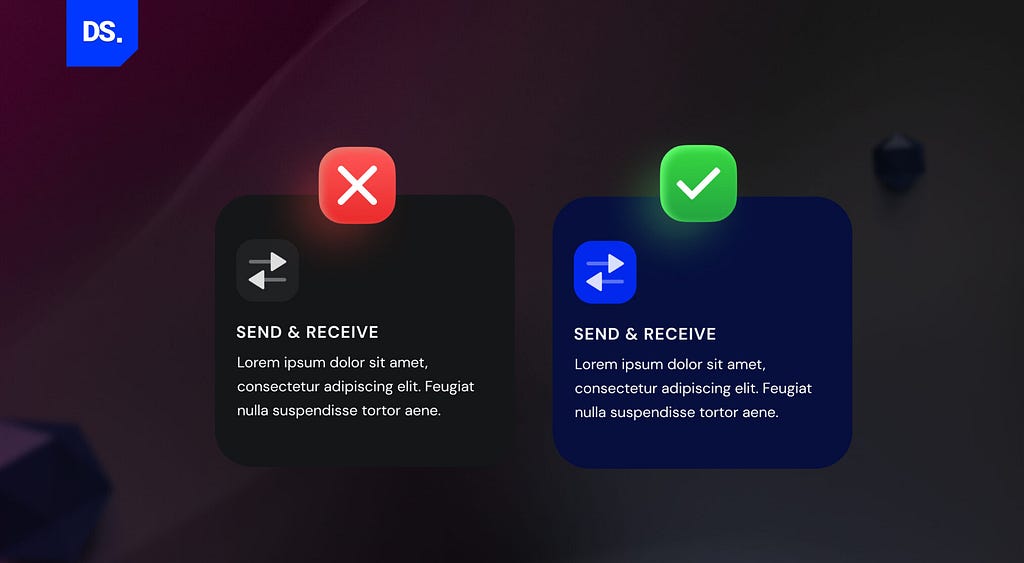
Want to make your dark mode UI stand out? Instead of black or gray, use a much darker shade of your primary brand color as the background. Here’s an example:

Notice how the branded dark mode design looks more eye-catching? Combining the dark background with colored fonts makes the design on the right stand out.
5. Inverting the Color Scheme Is Not Enough
If your website or app already has a light mode design, don’t assume that merely inverting its color scheme will create an appropriate dark mode design. You’ll have to separately create dark mode-specific design strategies and color palettes to create a UI that’s pleasant to the eye.
6. Communicate Depth Without Using Shadows
In standard (light mode) UI design, designers use subtle shadows to communicate depth and create visual hierarchies. In dark mode UI design, this option isn’t there. Shadows are not visible on dark mode elements.
To communicate depth and hierarchy, designers must take other steps like applying lighter fills for the elements they want to appear higher. Here’s an example of how lighter color shades can be used to convey depth in dark mode UI design:

7. Use Saturated Color Palettes for The Text
A pitch-black background combined with text presented in pure white is the perfect recipe for eye strain. That’s why using slightly darker shades of white for the text is a must. Here’s designer Michael Malewicz’s guide to using lighter font weights for dark mode UI design:

8. Focus Indicators Should Be Visible
Focus indicators are visual indicators that “highlight” the design elements selected by the user. People who use keyboards to navigate websites/apps use commands and focus indicators to identify which elements on the screen they’re interacting with.
These visual indicators are typically presented as simple outlines around the design elements. If these focus indicators aren’t present when they’re using your app/website in dark mode, their user experiences may get ruined. Here’s an example:

Notice how the Chrome and MS Edge buttons in the image above have two outlines around them. These outlines create just enough contrast on the dark background to let users know where their cursor or keypad is on the screen.
On the contrary, the Firefox button has a black focus indicator that disappears into the background. Don’t make this mistake. Make sure your focus indicators stand out against the dark background.
9. Use Images That Match the Dark UI
Don’t use the same images for your light and dark mode interfaces. Instead, use dark mode CSS media queries so that your app/website can responsively load the right images whenever users toggle from light to dark mode and vice versa.
10. Test in Low and High-Light Settings
Before finalizing your dark mode UI design, check how it looks in all types of light settings: low and high. Try conducting incandescent lighting testing on your design as well.
Final Take
Dark mode has become a staple feature in most popular apps, websites, and operating systems. Hence, crossing over to the “dark side” is a skill that most new-age UI designers must master.
Originally posted on design-studio.io.
Dark Mode UI Design Best Practices was originally published in UX Planet on Medium, where people are continuing the conversation by highlighting and responding to this story.