
Date picker should allow users to select a date quickly and intuitively. This component consists of an input field and a calendar. This article reviews ten recommendations for designing an excellent date picker.
Let’s start with design recommendations for the input field:
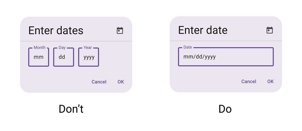
1. Offer input flexibility
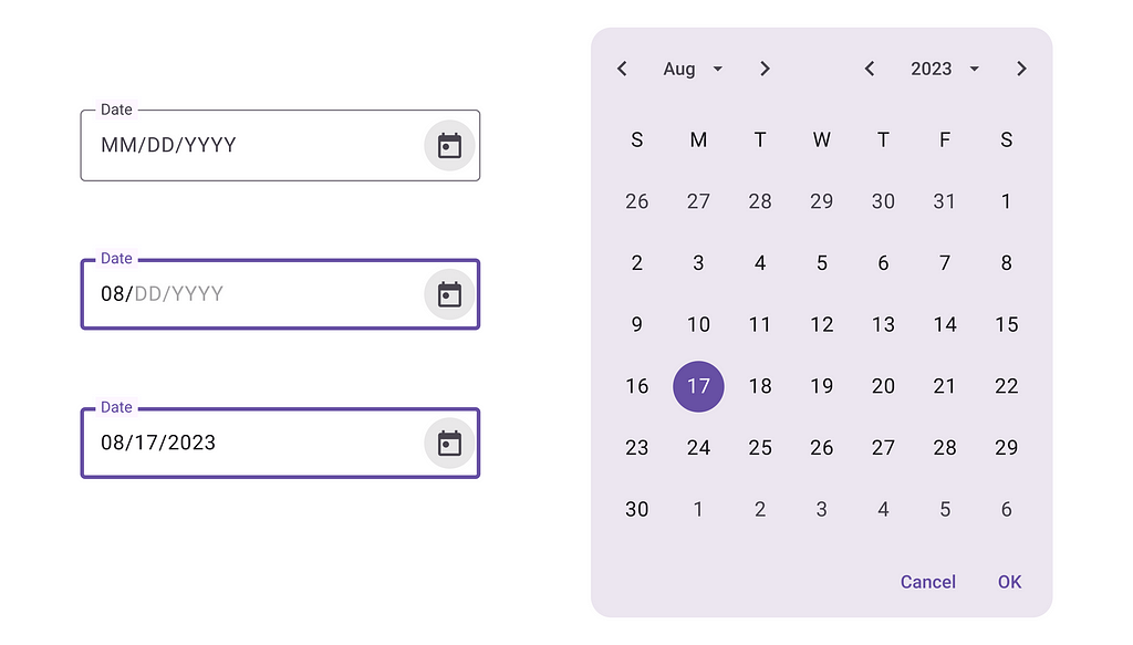
Allow users to manually input the date in addition to using the calendar. As the user starts typing, the transition between day, month, and year should happen automatically, without any effort from the user’s side. That’s why splitting the month, day, and year into separate input fields is not recommended.
💡 How to design an input field with a floating label in Figma:
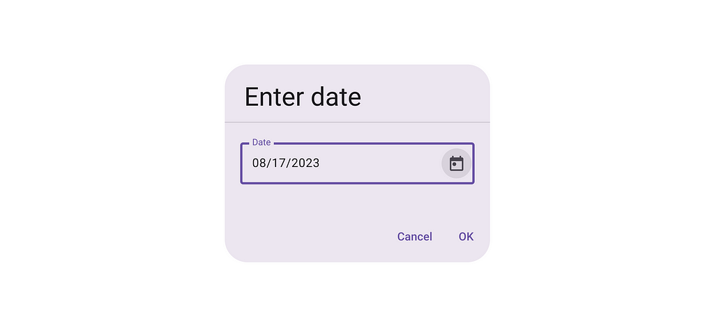
2. Make it obvious it’s a date picker
Use a trailing icon of a calendar along with the field label to indicate it’s for date selection.
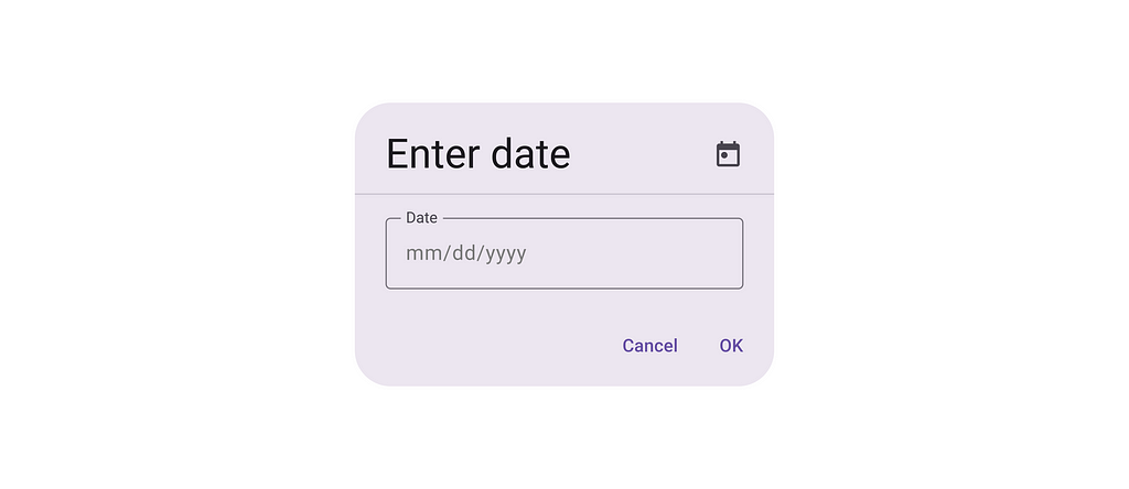
3. Use a conventional format
Use an intuitive and familiar date format. Consider the norms of a region you design for. For example, in the United States, the format is MM/DD/YYYY, while in Europe, it is DD/MM/YYYY. Use an inline placeholder to inform users about the format.
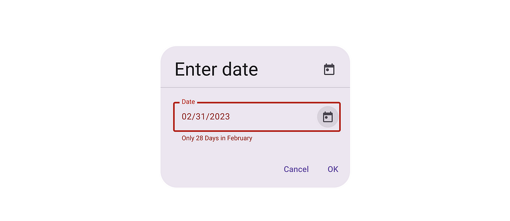
4. Validate user inputs on the fly to prevent errors
Offer inline error validation and inform users when they type impossible dates like February 31. Avoid using generic error messages like “Incorrect date”; instead, write an error message that clearly articulates the problem.
5. Follow accessibility standards
Support keyboard input and navigation. Allow using arrow keys to change dates. And allow users to copy & paste data in data input.
6. Pre-select current date
If you’re designing booking services, consider setting the default date to the current date to save users time.
Now, let’s talk about the calendar widget:
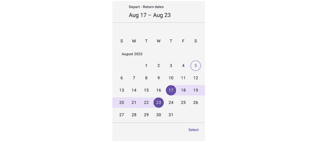
7. Provide clear visual feedback for selected dates
Ensure that the date picker is easily visible on the screen and users can easily identify selected dates (or dates). Use contrasting color to make the selected date stand out.
💡 How to design a calendar in Figma:
It is worth citing selected dates in the calendar context to reassure users that they selected the correct dates.
8. Make sure users can easily navigate through months and years
Users should be able to select the correct month & year quickly.
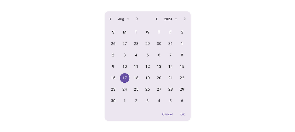
UI controls should allow users to move between the next/previous months, as well as select a month/year from a different range.

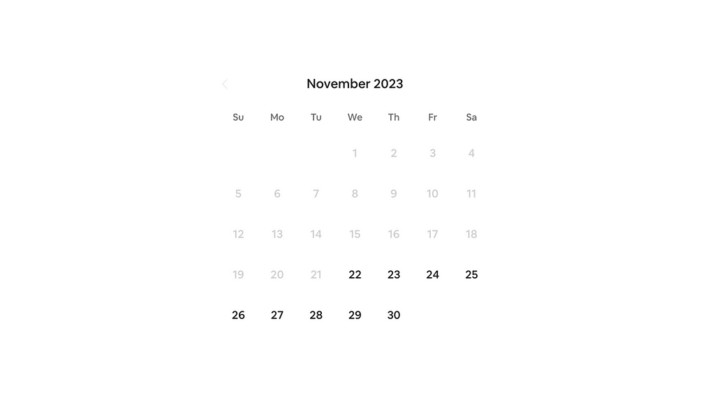
9. Disable impossible dates
If a date range has constraints, disable dates outside of those ranges. For example, if you’re designing a hotel booking service, there is no need to leave past dates active.
10. Responsive design
The date picker should work equally well for mobile and desktop users. Ensure the date picker is responsive and works well on different screen sizes and resolutions. It’s possible to achieve this goal using simple UI components like the one shown below:
Want to learn UI design?
Try Uxcel. Uxcel will help you learn and improve your design skills with interactive UI courses and skill tests built specifically for professional designers. You will get 25% off discount for the Pro Yearly subscription if join through this link.
The best way to learn UX design
This post contains affiliate link(s)
Design Perfect Date Picker was originally published in UX Planet on Medium, where people are continuing the conversation by highlighting and responding to this story.