For many online shopping or browsing experiences, searching and filtering are as important as business-critical functions like account creation and checkout. The reason is simple: if users can’t find what they’re looking for, they won’t buy (or consume) it. Yet there is no authoritative playbook for how filter menus should look and behave.
I’ve been working to standardize filter menus as part of an industry-recognized effort to reimagine Cisco.com and I want to share a few observations I wish I had known upon starting this work.
Find a meaningful default presentation order
In our work with filters at Cisco, we learned that users value a thoughtful ordering of the list items, even if they can filter the list. We realized it is a mistake to assume the user’s objective is to filter; in reality, the user simply desires meaningful content. An arbitrary sort order makes the user do more work.
Cisco.com users tended to click on the first item in a filterable list, even though it was only first because the list was ordered alphabetically. This wasn’t necessarily the behavior we intended; users might have been inferring curation when there wasn’t any. To confirm the importance of curation, we exposed subjects to different types of default sort logic in a user test; 13 out of 15 testers preferred a Best Match default logic over Most Recent or A-Z.
We are now working on strategies to render filterable lists according to popularity or relevance of the list items.
Optimize for scroll and mobile
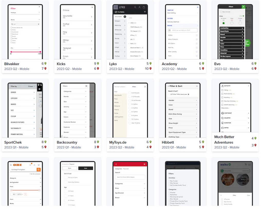
In doing this work, I examined hundreds of filter menus. The best ones keep the menu within reach as you scroll down the list, either by making it sticky to the top of the screen or by presenting a floating button. On mobile, the latter is usually the most elegant option.
Out of the top 10 US e-tailers — a cohort one would expect to invest heavily in the user experience for filter menus — Walmart, Apple, and Best Buy optimize for scroll on desktop while eBay and Apple do so on mobile. The image below shows eBay and Apple’s mobile treatment, with Kayak also thrown in.
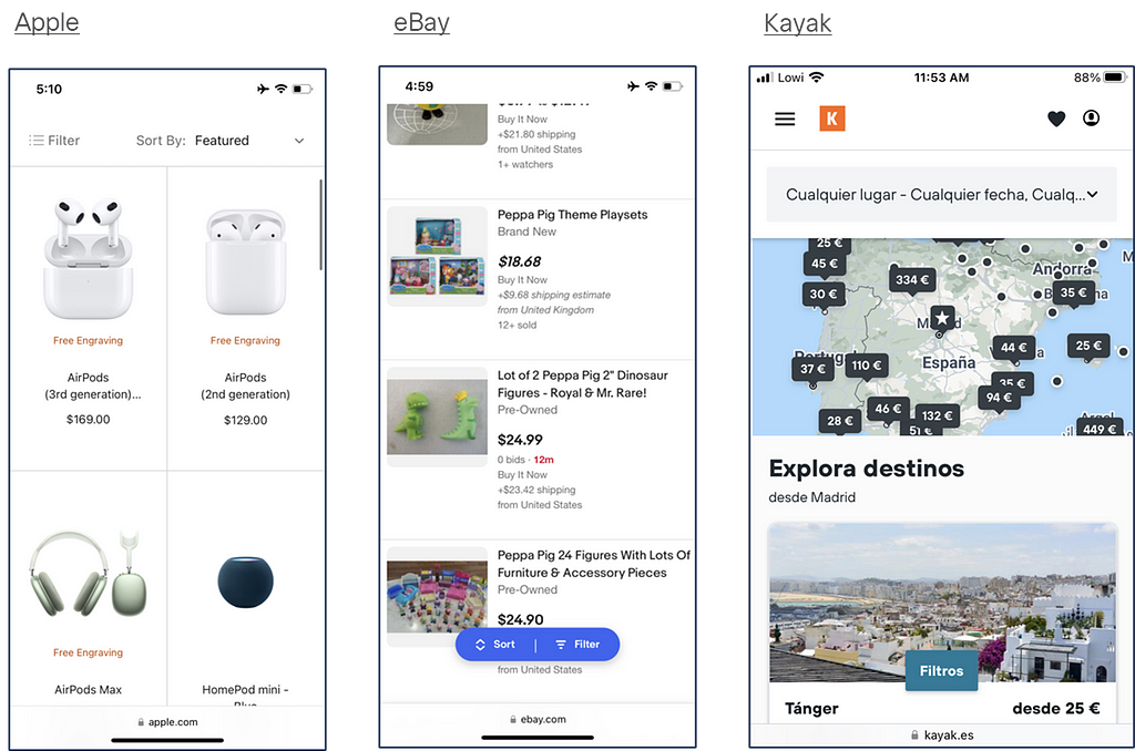
That these treatments produce the best user experience is hard to argue. Whether the best user experience is always necessary for scrolling in a filter menu is up for debate. If users tend to click on the top few results after searching and filtering, optimizing for scroll may not be worth the extra effort. Perhaps ensuring relevance via search and popularity algorithms delivers more bang for the buck. It’s also worth mentioning that preexisting sticky elements like navigation, headers, or chat widgets can preclude adding a new floating or sticky element; this is the case with Cisco.com.
Anatomy of an intuitive, scalable filter menu
Filter menus must be helpful without being a distraction. They should be intuitive and non-intrusive, neither clunky nor overwhelming.
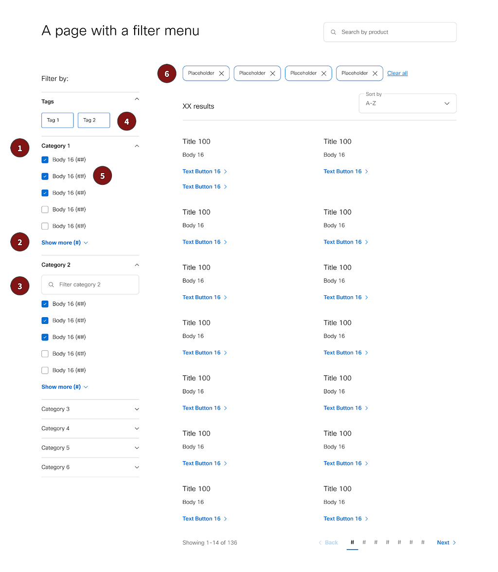
On a typical laptop screen, users can see about 700px above the fold in a web browser, taking into account machine toolbars and browser menus. That’s usually not enough real estate to accommodate a full filter menu. To ensure digestibility without having to scroll or click around too much, we settled on a few conventions for Cisco.com filter menus (see below the list for an image):
- Filter categories open and close like accordion drawers. Page authors are encouraged to open only the first two categories by default so that users can see most categories, if not all, on first paint.
- Filter categories display only the first 5 attributes by default, with a “Show more (##)” text button to open the full attribute list.
- For even longer attribute lists (for instance, filtering by country) a text input is included to search/filter the attribute list.
- A handful of filter attributes can be displayed as tags at the top of the menu (e.g., new, popular, expiring soon, on sale). Tags are intended for binary attributes that wouldn’t make sense to show as a category.
- Counts for each attribute display in parentheses following the attribute name.
- Dismissible chips representing selected filters appear at the top of the results list to provide traceability and afford a second path to quickly remove a filter.
Not everything is set in stone. Page authors decide the category order and which attributes to feature as tags. They also decide whether to display attributes alphabetically, in a custom order, or by weight (e.g., number of results).
Below is an example Cisco.com filter menu aligning to the conventions described above. It’s a bit basic initially. In the future, we may add support for iconography, filtering by customer ratings, and filtering by price range.
Update filters as the user interacts
Users expect the filter menu’s state to reflect the selections they’ve made. Attribute counts should update each time a filter is added or removed. This necessitates frequent API calls but according to our user research, static attribute counts fail to meet users’ expectations. Some filter menus have an “Apply” button to avoid server pings until the user finishes adjusting their filter selections (we do this only on mobile).
Users also expect filter options to be removed if they no longer apply based on previous selections. For example, selecting a particular price range might rule out certain brands or models (or vice versa). There are a couple implementation strategies for this. In our research, 10 out of 15 testers preferred a design that removed filters that could no longer be used, versus one that displayed unavailable options but with a disabled treatment.
There is one important exception to the rule that filters should update as the user interacts. As the user interacts with a particular filter category, the attributes in that category should not change. This allows the user to multi-select within that category.
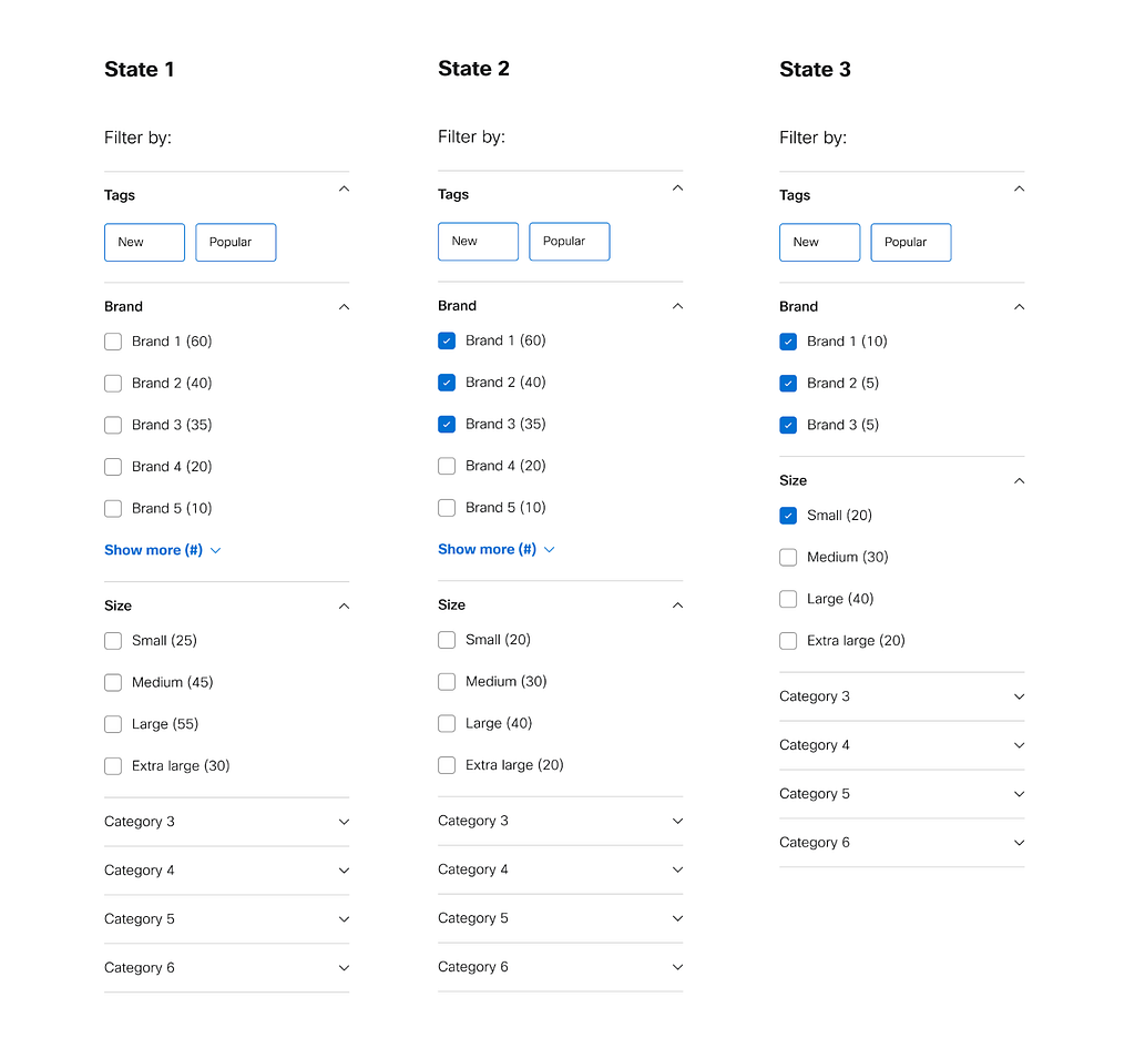
This is best explained in an example. Consider a filter menu with two categories: brand and size. If the user selects a few brands, the counts for size should update and non-matching sizes should be hidden, but the brand list should remain static, assuming this is the last category the user interacted with. If the user then selects a size, the brand list should update while the sizes remain static.
The mockups below illustrate the example. State 1 is the default; no filters applied. In State 2, the user has selected a few brands, resulting in decreased attribute counts for size. As yet no sizes are hidden, but this occurs in State 3 where the user filters to the small size. Now the filtered list reflects the true union of the selections.
This behavior may feel confusing but it is second nature to users of leading e-commerce sites like eBay and Best Buy.
Wrapping up
Cisco.com is a hodgepodge built over time using different technologies. In recent years we’ve reined in the chaos with a new design system, page templates, and reusable modules like filters. Although filters appear in diverse contexts on our site — from browsing hardware models within a product family to searching for webinars and events — we believe that common design and interaction patterns will reduce cognitive load for Cisco.com visitors and contribute to improved page performance. I would welcome readers’ thoughts about outstanding filter menus you’ve seen across the web.
Author Bio / Acknowledgments
Andrew Pollen is a UX leader for Cisco.com, focusing on the home page, flagship marketing campaigns, and ongoing efforts to reimagine high-traffic site areas. He is indebted to Amanda Jones, Bailey Moulden, and Dasha Babic for their contribution to UX/UI design and user research for the filters menu.
Uplevel your filter menu was originally published in UX Planet on Medium, where people are continuing the conversation by highlighting and responding to this story.