
If you’re a product designer, chances are you’ve relied on one of Figma’s default device frames to design your interfaces. But have you ever stopped to wonder: how do these frames relate to the actual devices? Why does designing on a frame which is much smaller in size still work for a phone with a much higher resolution? And what role does pixel density really play? Here is a simple guide for any product designer to understand the modern screen.
Screen size
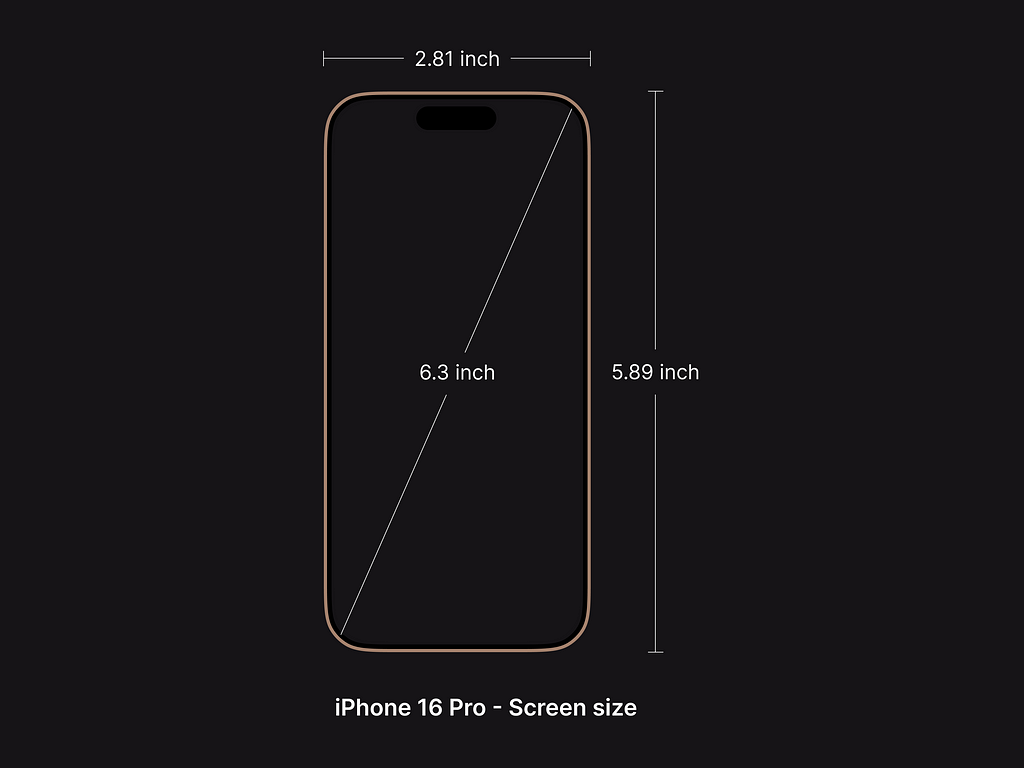
Let’s start with the basics. Screen size refers to the physical dimensions of a display, usually measured diagonally in inches. For example, an iPhone 16 Pro has a 6.3-inch screen. The screen size impacts how much real estate is available for a user to use. Screen size doesn’t tell you how sharp or detailed a display is — that’s where resolution and pixel density come in.
Resolution
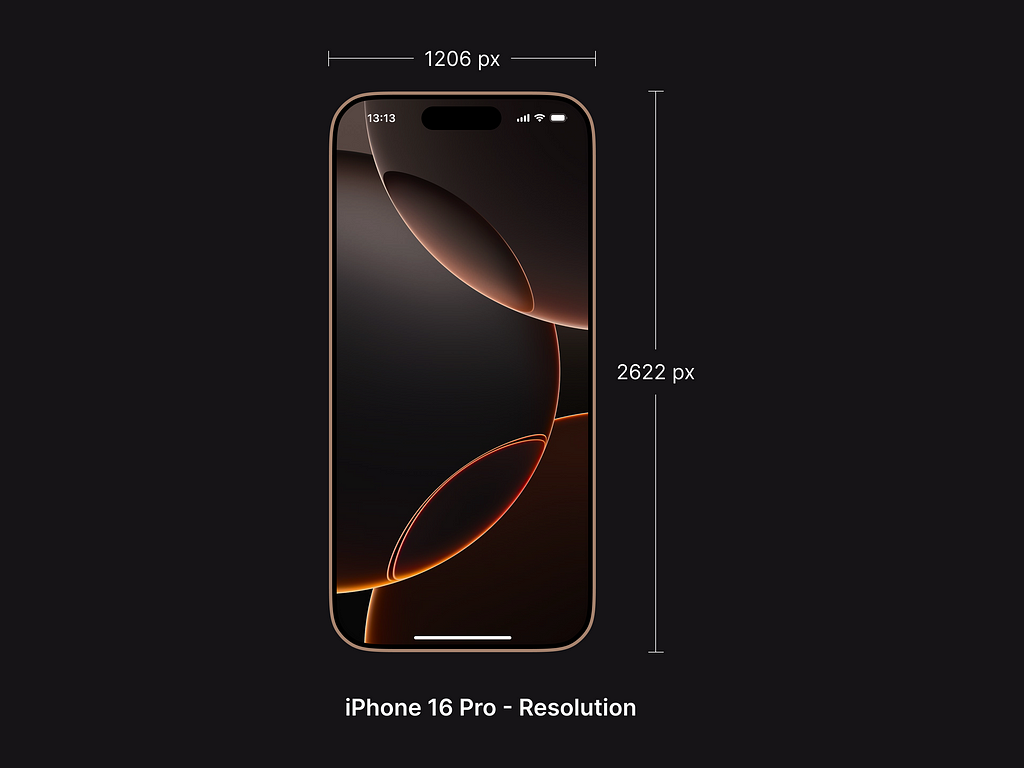
A pixel is the smallest unit of a screen. Essentially, a screen is made up of several pixels. Resolution is the total number of pixels a screen can display, expressed as width × height. For example, an iPhone 16 Pro has a resolution of 1206 × 2622 pixels. This is, in a way, another method of measuring a screen. A higher resolution means more pixels, which can display more detailed and crisp visuals.
Pixel density
Pixel density refers to how tightly packed the pixels are on a display, measured in PPI (pixels per inch). To calculate the pixel density of a screen, divide the total pixels that are present diagonally by the screen size. By this logic, an iPhone 16 Pro has a pixel density of 460 PPI.

Now, the number of pixels packed in a screen depends on the underlying technology being used to manufacture the display. Some common examples include Retina, Super Retina, etc.
For the purposes of a product designer, higher PPI means sharper visuals. This means that two screens with the exact same physical dimensions can differ in terms of visual quality depending on their pixel densities. A design that looks sharp on a high-density screen may appear blurry or pixelated on a lower-density screen.
If that’s the case, how can a product designer design interfaces for multiple devices while ensuring efficiency and scalability? That’s where the scale factor comes into picture.
Scale factor
As we discussed earlier, the physical dimensions of a screen are measured in pixels. Similarly, the logical dimensions are measured in points (or density-independent pixels). Unlike pixels, which are tied to the physical resolution of the screen, points provide a more abstract, device-independent way to design user interfaces.
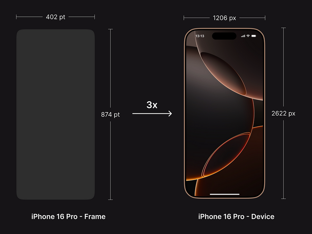
Scale factor (or device pixel ratio, DPR) is the ratio between a device’s resolution (physical pixels) and its logical resolution (points). It essentially dictates how many physical pixels represent one point in your design. For example, an iPhone 16 Pro has a 3x scale factor, meaning that 1 point is equivalent to 3 pixels.

And this is how the frame sizes in Figma are determined. Figma’s device frames use logical resolution (points), not physical resolution (pixels). So, when designing for an iPhone 16 Pro, you’d use the 402 × 874 frame (logical resolution), even though the physical resolution is 1206 × 2622. This ensures that your designs scale correctly on the actual device.
The scale factor also ensures that the interface remains visually consistent across different devices. For example, a button of size 200 × 64 pts will remain the same size when placed on different device frames in Figma, and will be rendered to an appropriate similar size on the actual devices, depending on each device’s pixel density.
Now, different devices may have different scale factors, depending on the pixel density and the quality of the display. The good part is that as a product designer, you don’t have to worry about it. As long as you are designing your interface in points, the scale factor and the device technology will handle the scaling of points to pixels on the actual display.
Want to discuss anything and everything design? Let’s connect on LinkedIn, or explore my work on my portfolio.
#NeverStopLearning 🚀
Designing in Points: Product Designer’s Guide to Modern Screen was originally published in UX Planet on Medium, where people are continuing the conversation by highlighting and responding to this story.