Drinking beer — a UX Case Study
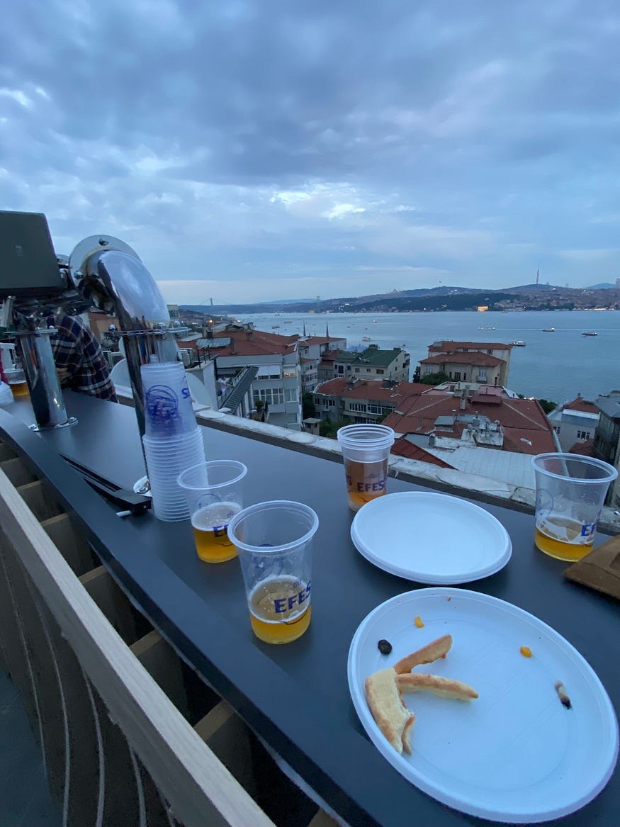
An experience study with pizza and beer in Bosphorus, Istanbul
Background of the study
In June 2023, I attended the “Welcome Summer” event organized by the Üretim Bandı, which is an educational platform that shares information in the fields of product development and company management.
At the terrace of the Pubinno office, while enjoying beer and pizza with a view, the experience of those who wanted to drink beer caught my attention.

In order to get a better view of the scenery, while I was eating my pizza right next to the Pubinno product (the product we got our beer from), I suddenly found myself immersed in research. I began to deeply examine the experience of first-time users of a B2B product by those who are not its direct users. The reason? Simply for pleasure.
This time, instead of using pen and paper or a digital tool for conducting research, I opted for beer and pizza with a view of the Bosphorus 🙂
Enjoy reading! 🍻
What is Pubinno?
Before diving into the details of the study, I’d like to briefly introduce the product that is the subject of this research.
Pubinno is a company that develops products aimed at providing beer lovers with the perfect beer experience, leveraging patented solutions in artificial intelligence and robotics. It is a product-focused company that works on optimizing beer quality and standardization by monitoring more than ten parameters such as keg freshness, temperature, pressure, and line maintenance in real time. While doing so, it utilizes smart flow algorithms to maximize keg efficiency, ensuring that the beer served is consistently of high quality.
Research
In this study, I observed 27 individuals and conducted brief one-on-one interviews. This observation includes the dialogues between users and their friends, as well as their interactions with the product.
Since I was standing right next to the product throughout the event, I received many direct questions about the use of the product. I addressed these questions as if in an in-depth one-on-one interview, which also allowed for brief conversations.
“If you don’t pay for the product, you are the product.” — a researcher conducting a study with people drinking free beer, 2023
Pubinno is actually designed for use by professionals who are formally trained in its operation, ensuring they understand all the details thoroughly before use. Here, I aimed to explore the user experience of a B2B product in a practical manner, aiming to bring forth different perspectives and insights.
I drafted the article within the framework of the following three key insights:
1- The anxiety and social pressure created by a lack of knowledge about the product’s use
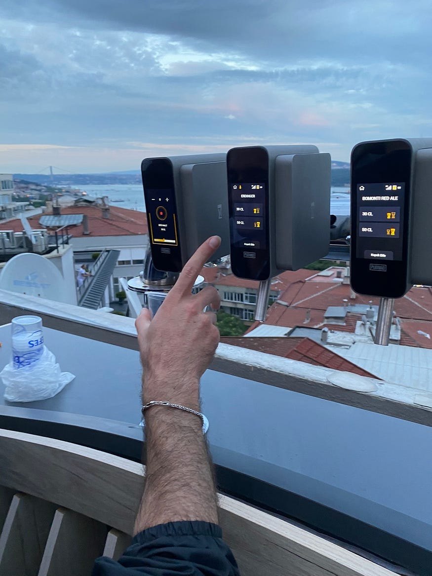
People interacting for the first time with an innovative product, which they don’t encounter in their daily lives, were hesitant to use the product, especially when the product owners were present, because they did not know how to use it. They approached the product with caution, asking questions and trying to observe how others used it to learn through their interactions.
2- Understandability and clickability of the screen
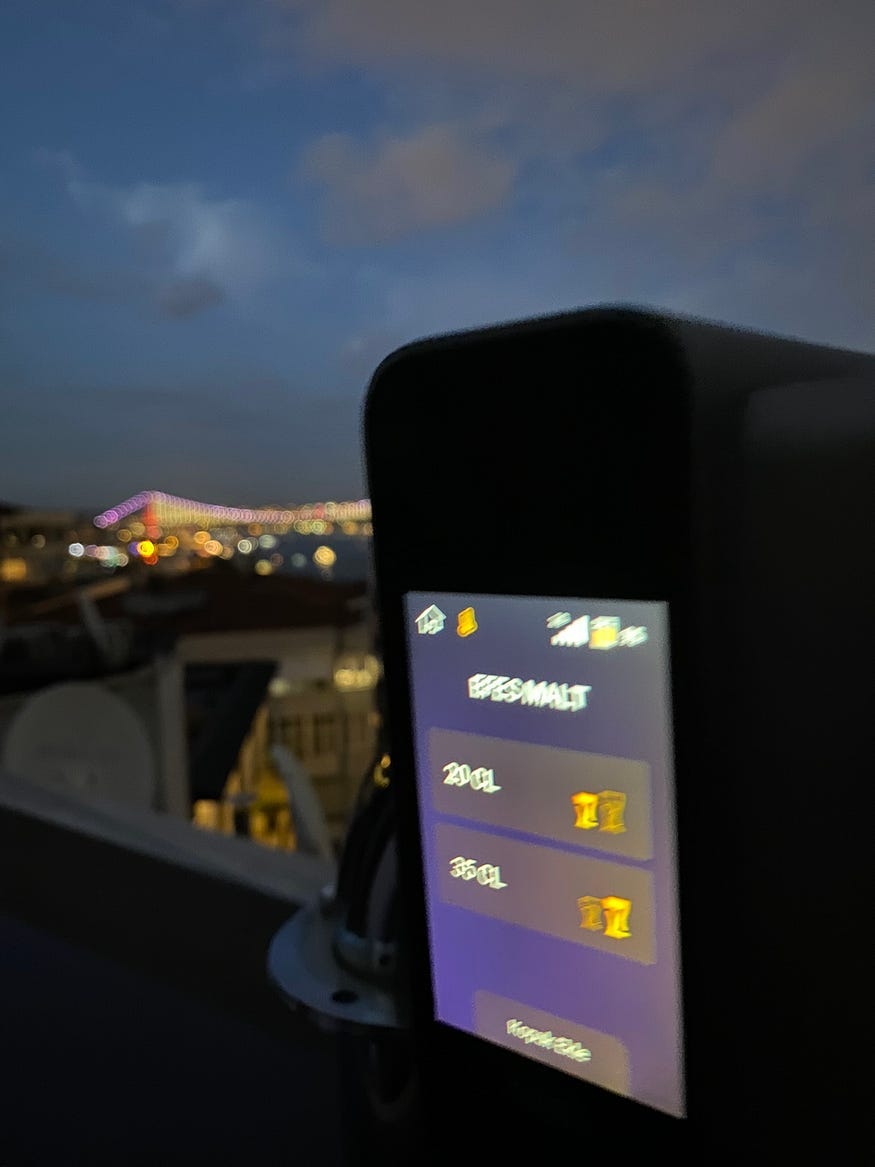
Choosing a beer, not knowing how much beer would be dispensed, and the size of the glasses, as well as attempting to add foam, presented challenges for the users.
3- Differences in product usage behaviors
Factors such as whether the person getting the beer was left or right-handed, had long fingers, or the direction from which they approached the product in a crowd, created variances in the beer dispensing process.
Foam Adding Experience
After getting your beer, you can add foam on top of it by pressing the “add foam” button.

People who saw this screen initially thought it was only for adding foam. In reality, when the square area on the screen is touched, beer flows. Users accustomed to digital products typically expect to see text or an image at the top and a button at the bottom, which they can click to proceed. This different setup caused some hesitation among users.
“Haven’t got my beer yet, mate, why would I add foam first?”
“Can you show me how to get the beer before the foam?”
“Why do I choose the volume of the foam? What’s the point?”
This screen appears only when there is a single volume option. As you can see in the video below, when there are multiple options such as 20 cl, 40 cl, etc., there wasn’t an issue with understanding how to get the beer.
- Out of the 27 people I observed, 8 couldn’t click the add foam button on their first try. And no, they were not drunk yet.
- The person in the video couldn’t click the ‘add foam’ button three times in a row.
Users who utilized the foam adding feature experienced additional anxiety due to not knowing how much foam would be dispensed and how it worked.
“I can’t figure out how many times I can press the add foam button before it overflows the glass, please don’t let it spill.”
“Does it stop by itself? I mean, it’s supposed to be smart, but I can’t be so sure. I don’t want to embarrass myself here haha.”
“What if I can’t use the product hosting the event? They would laugh at me haha.”
First-time beer takers (Newcomers)
Of the 27 people I observed,
- 21 touched the screen with their left hand.
- 6 touched the screen with their right hand.
I could ask 4 people who held the glass with their left hand and touched the screen with their right hand; all four said they were not left-handed. Why did they hold the glass with their left hand and touch the screen with their right if they were not left-handed? Why did those who touched with their left hand hold the glass with their right?
The physical environment of the people who will use the product should be examined, and digital designs should be accordingly adapted. I observed similar experiences that need to be studied on the screens used for ordering without waiting in line at chain fast-food restaurants.
Right-left hand dominance can also vary. For example, which hand do you keep on top when sweeping, or which hand do you use to grap the bottle when opening a bottle cap? Dominance can be determined based on several such questions. Product design and processes could be shaped according to these variables and data.
If you’re interested, you can explore the Edinburgh Handedness Inventory from here, a scale used to assess a person’s dominance of the right or left hand in daily activities. This inventory is a widely used tool in research to determine whether a person is left-handed, right-handed, or ambidextrous based on their preferences in performing a variety of tasks.
For example, if the beer glasses icon are displayed on the right side of the screen, it might naturally encourage users to use their right hand to interact with it. Conducting tests on this hypothesis and adjusting the position of the beers and the screen accordingly could potentially lead to a more comfortable and enjoyable beer service in the given environment. This is just an idea, but such research could identify the most effective use of the product, allowing for regular improvements.
Additionally, 3 individuals were able to touch the screen with the same hand holding the glass. These individuals had larger hands and longer fingers, which enabled them to do so.

CL capacity of glass and beer
During the event, there were plastic drink glasses available, but they didn’t have their volume marked. People were unsure which option to choose from the screen’s 20, 35, and 40 cl (centiliter) options.
“I got stressed out; isn’t this glass 33 cl, but the beer option is 40 cl?”
“There’s no volume written on the glass; I’ll press 20 to drink less but make sure it doesn’t overflow.”
“It must know when to stop, thanks to artificial intelligence, but how will it know the limit of the glass I have?”

There was initial difficulty and apprehension with the first use of the product, but adaptation occurred over time. Eventually, I was found out and discreetly concluded my research to avoid influencing the results further :))
“I’m used to it now, but I was a bit anxious earlier because I didn’t know how to use it.”
“So that’s why you didn’t answer my question earlier, you were asking questions. Enjoy your free research.”
Conclusion
As physical and digital realms increasingly intersect, the more we know about the physical uses and characteristics of our target audience, the better we can design our digital products. This study showcases real examples and the voices of users.
I conducted this study both out of genuine interest in the behavior and experiences observed and for enjoyment. Seeing different perspectives shows that we can think differently about our own products.
I believe not every study needs to conclude with a definitive “We’ve learned X, Y, and Z.” Sometimes, it’s sufficient if it opens a small new window in our minds. Different outcomes can emerge from those windows when the time comes 🙂


English UX Articles & Cases – Kerem Can Demirtas
You can feel free to reach out to me on LinkedIn whenever you’d like.
Drinking beer — a UX Case Study was originally published in UX Planet on Medium, where people are continuing the conversation by highlighting and responding to this story.