Dive into this case study for a fun journey of how I jazzed up the much-loved ‘Polls’ feature from Unacademy’s live classes, turning it into a lively playground for both Learners and Educators. Let’s roll! 🎉
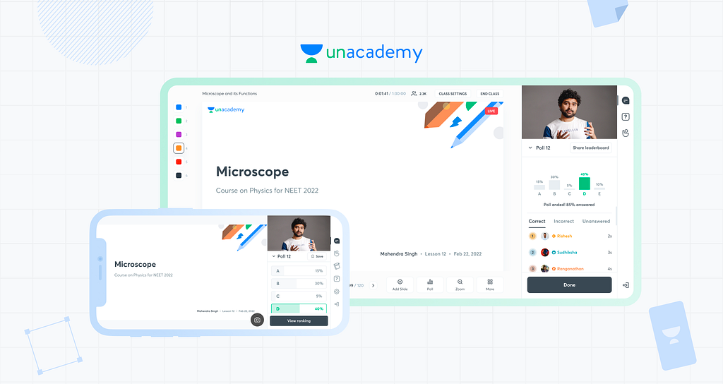
Unacademy has been the leader in the Indian EdTech space for quite a long time, mainly for its comprehensive and user-centric design. The platform bridges the gap between conventional and digital education with a suite of products catering to Educators and Learners.
The polls feature was introduced in 2020 and has always been an integral part of live classes. Think of it like “Kaun Banega Crorepati” (or “Who Wants to Be a Millionaire?” for the non-Indian audience) in a classroom. The teacher is the host, and the students are competing with each other. But sadly, no flashy cheque to show off here!
Yet, it needed to align with high-end design standards and showed potential for boosting Learner participation while providing Educators with valuable insights.
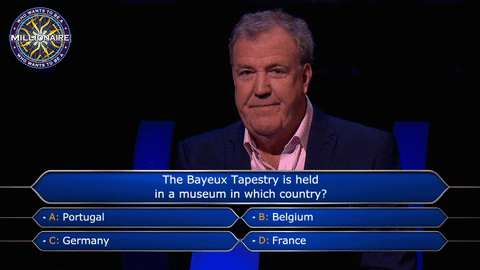
Before you have the same reaction as Jeremy Clarkson, let’s begin!
This case study is a pretty long one, so grab your popcorn, and get ready for the ride 🎢
🌟 At a Glance
Enhancing polls to make it more engaging and insightful for Educators, while improving its prominence, adding delight factor, and delayed gratification for Learners.
💭 Context
Functionality of Polls
Poll has a versatile function in live classes. Here are some ways Educators use them:
- Quizzing Learners: Some Educators use polls to quiz their students on the topic being taught. It’s an instant way to gauge comprehension and reinforce learning.
- Gathering Feedback: Polls also serve as a means for Educators to understand the sentiment of the class. For instance, they might use a poll to determine when the majority of students would prefer the next test to be scheduled.
Why Redesign Polls?
Some reasons why we picked this project:
- Educators and Learners deemed it outdated as the ROI was pretty low for both parties due to a lack of updates since 2020
- This caused usage to drop: from 83% to 61% for Educators and 75% to 47% for Learners
♟️ Platforms
- Educators: Browser 🌐
- Learners: Mobile App 📱
The experience that each of these groups go through is very different. Hence, I will be splitting the case study accordingly.
Educators are the showrunners of Unacademy. We ensured that we maintained the highest quality while onboarding them. This meant we had to give them the right tools to help them achieve their goals.
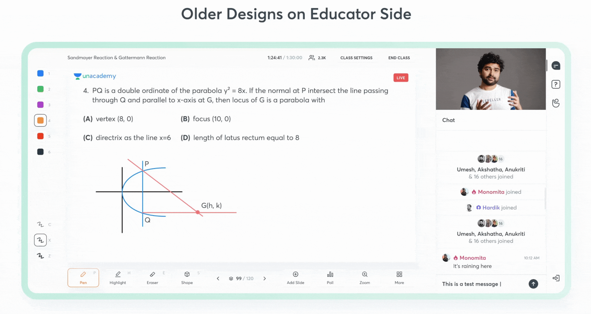
To kick things off, let’s set some context about the existing design.
📜 The Old Flow
Check out how the old version worked for the Educators:
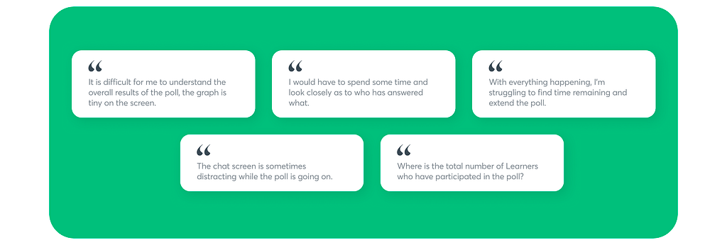
🚧 The Problem
A pressing concern was the decreased use of Polls by Educators.
Through intensive research, shadowing sessions, and direct feedback, we gathered insights. Here’s what they had to tell us:
Imagine you’re a teacher in a classroom who has just collected the answer sheets from all the students after a surprise test. There are certain things you do when you look at the papers.
🔝 You look for the highest scorer
🙅🏻♂️ You evaluate students who answered incorrectly and plan a performance enhancement strategy
⏳ You notice students who couldn’t complete on time and hear their concerns out
This was the same experience we aimed for. And this is where the HMWs come into play.

🧐 How Might We
𝟷. How might we support Educators with more actionable insights and results in polls?
Let me explain by giving some examples:
- Spotting low performers to give them more attention
- Acknowledging the top rankers to applaud them
And so on.
𝟸. How might we reduce distraction and give more prominence to polls, so that the next steps are easier to think about?
Great! Having identified our challenges, let’s go section by section to understand the whole process.
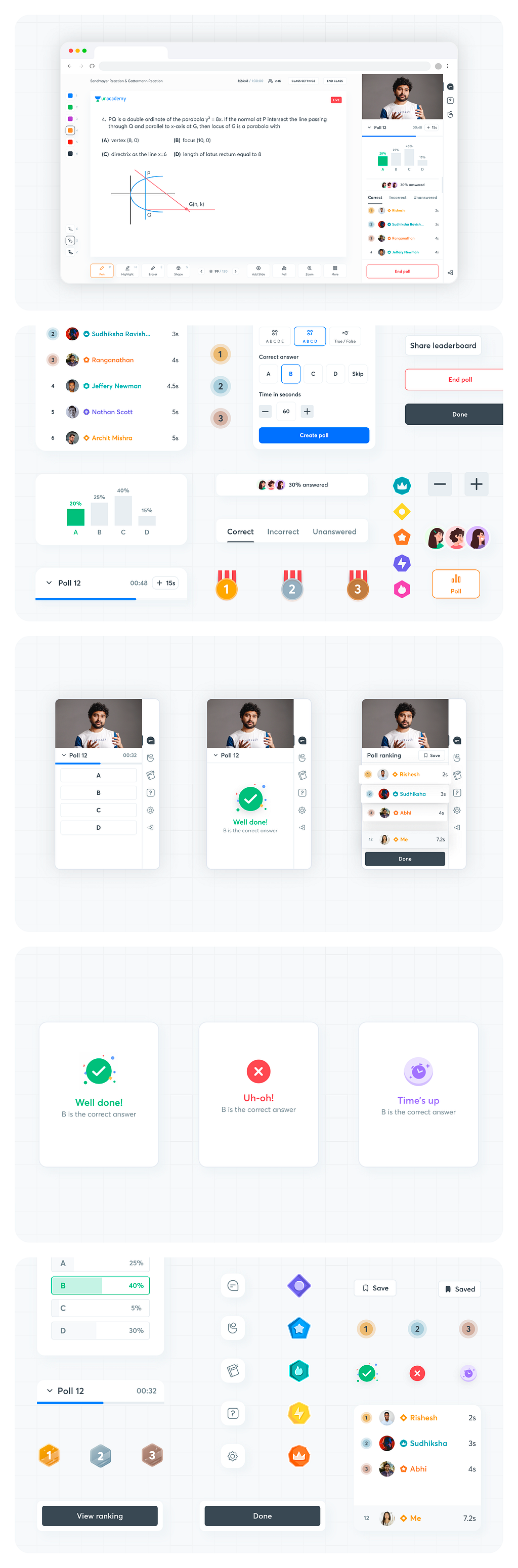
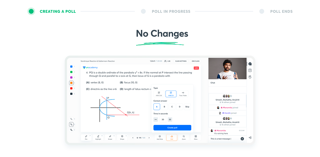
🔮 Creating a Poll
We did not touch this part because we realized there was nothing to fix. Here is what it looks like while creating a poll.
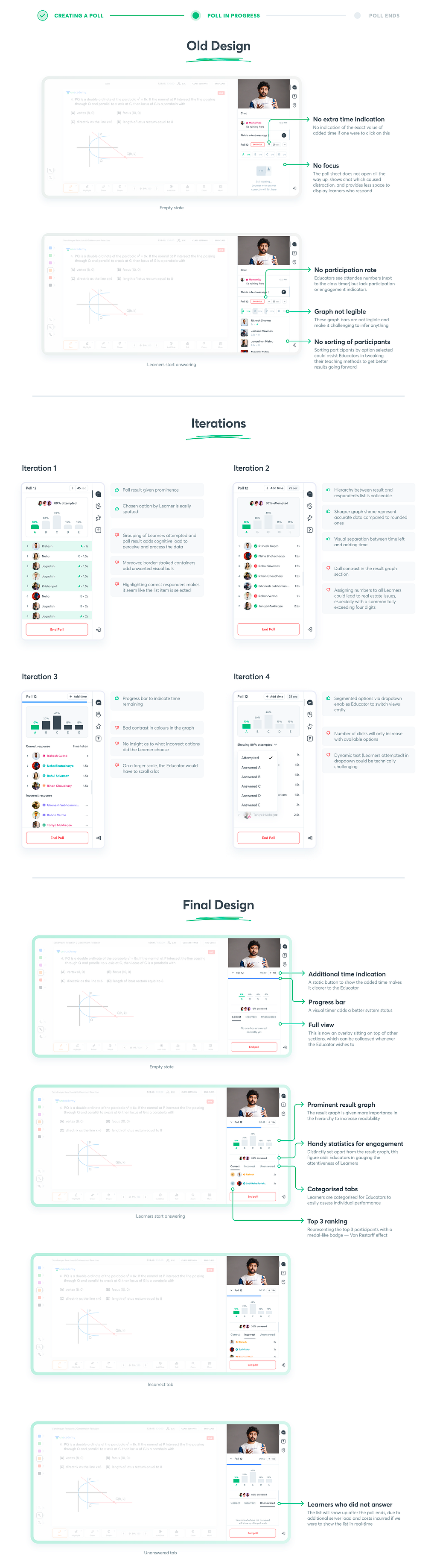
🏗️ Poll in Progress
Once the Educator has created the poll, they are shown the interface for tracking responders and the cumulative result of chosen options.
🏆 Poll Leaderboard
When the poll ends, the Educator may choose to share the leaderboard with the Learners with the overall stats.
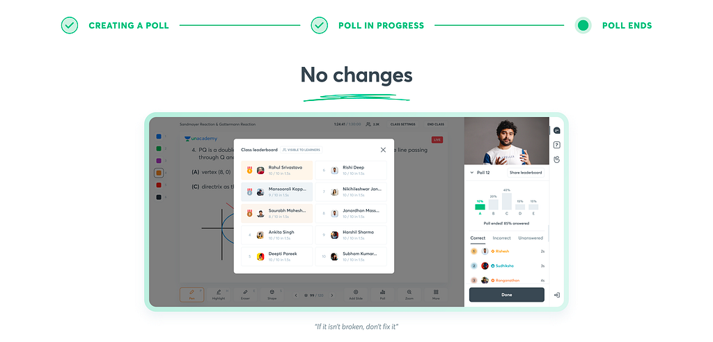
We did not find any problems with the existing design for the poll leaderboard; it worked as it was intended. Hence the decision to keep the same design was made.
That wraps up the designs for Educators!
🔖 Results from Testing

𝟷. Enhanced Clarity and Decision Making
Educators appreciated the redesigned graphs and participants list which provided a clear and comprehensive view of poll results and gave them deeper insights into the class performance. This feedback successfully resonated with our first problem:
HMW 01: How might we bring in more actionable insights and results into polls for Educators?
𝟸. Accessibility and Ease of Use
Educators expressed that the redesigned interface was accessible and easy to navigate with the least amount of distraction, making the poll management process smoother even for those who are not tech-savvy. Thus, we achieved our second How Might We as well:
HMW 02: How might we reduce distraction and give more prominence to polls, so that the next steps are easier to think about?
All in all, the Educators expressed their excitement for this much-awaited redesign of the feature that is so crucial to their classes.
We expected an increase of at least 30% in usage.
You’re now set to host an episode of Kaun Banega Crorepati. You see all these new features added on the screen in front of you, hence you’re able to complete your tasks faster.
But where’s the consistency if the participants do not get to witness the reactions to the actions from all the new features on your side?
So, let’s switch seats and look at the updates on the Learner side!
As of 2022, Unacademy had 50 million active Learners. That is 3 million more than the population of Spain! Imagine having a user base that’s more than the population of a country that once hosted the FIFA World Cup.
Anyway, back to the topic. The Learners are always greeted with a memorable experience and a state-of-the-art user interface, be it in any part of our app.
Hence, the bar was set high for this one.
To understand the circumstances better, here’s some context about the older designs.
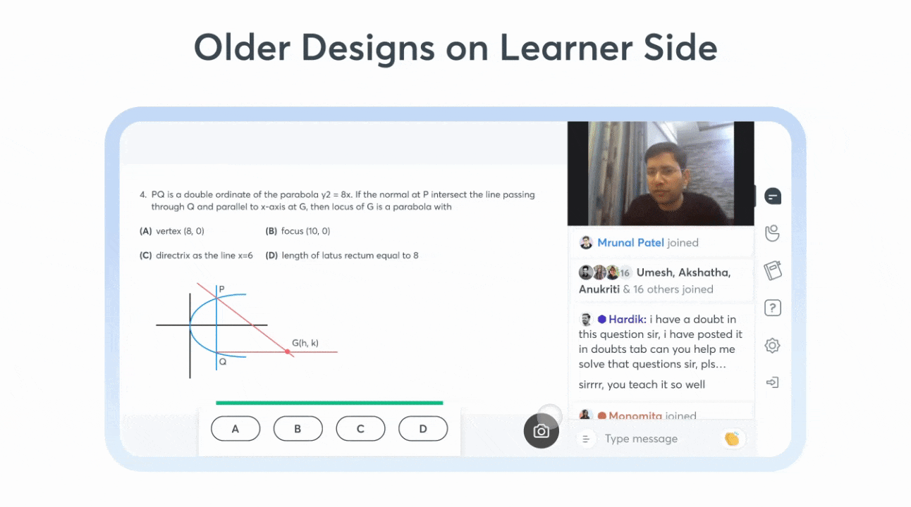
📜 The Old Flow
Here’s a glimpse of the old setup for the Learners.
This GIF includes both correct and incorrect responses.
🚧 The Problem
What caused the decline in interest in Polls for the Learners?
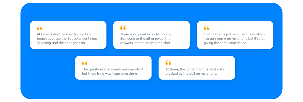
From our database, we selected a random group of Learners who initially engaged in polls actively but later showed diminished participation, and called them to set up a session for our research.
Here’s what they had to tell us👇🏻
Imagine you’re a student, and you’ve just received an unexpected test. Each time, you follow a familiar sequence:
📝 You tackle the test, aiming to complete it within the time frame.
🤔 After finishing, you await the results. Just like you, no one else knows the correct answers.
😯 When the results are finally revealed, your curiosity piques: you wonder who achieved the highest score and where you rank in comparison to them.
We wanted to recreate the same experience, in the same order. But how might we do that?
🧐 How Might We
After diving deep into the existing issues, and figuring out what exactly needs to be fixed, we came up with one final HMW that could cover all the underlying questions.
How might we support Learners to ensure maximum participation in polls?
Still with me? If you’ve taken in all the information up to this point, here’s a hearty virtual high-five for your dedication! ✋🏻🌟
👉🏻 Some things we decided beforehand…
Just like how one clue leads to another, the problems mentioned led us to solidify the foundation.
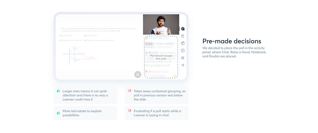
These were some fair trade-offs to make to deliver the best experience.
Alright, let’s break it down step-by-step, like we did with the Educators!
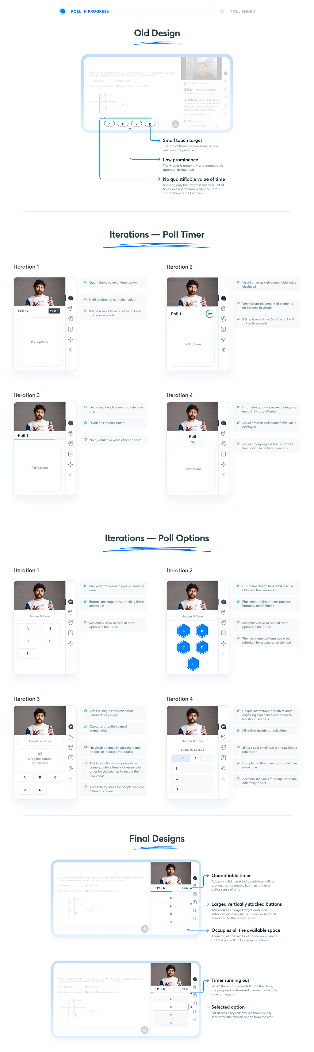
🔮 Poll Begins
When the Educator creates a poll, the Learners see it instantly on their screen. This part was one of the core problems we had to tackle smartly since we were focusing on getting more participation.
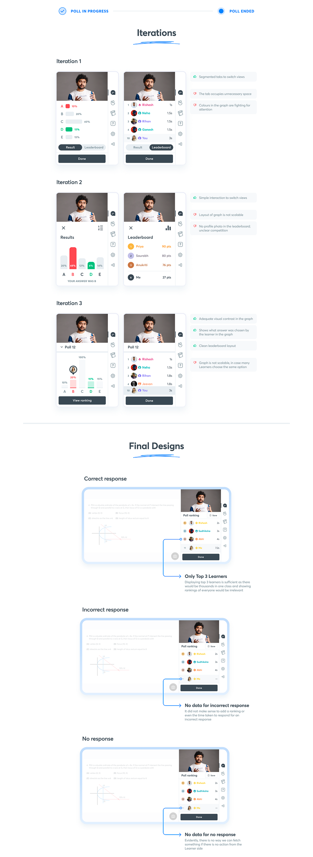
💥 Poll Results
As a student, you’re naturally curious about both your performance and the class’s overall results. There was potential to redesign to make it more interesting.

📥 Saving a Poll
Taking notes during class is typical, and our platform already offers this feature for Learners. However, what if you wished to save the poll question for later reference?

🏆 Poll Ranking
The poll-specific ranking is different from the global leaderboard discussed in the Educator section. While the leaderboard has a broader scope and its display depends on the Educator, the ranking for a recent poll is auto-shown to Learners without the Educator’s intervention.
As the button in the above image says, we’re done with the designs on the Learner’s end!
Now comes the fun part!
🎮 Play with the Prototype
Explore the new Polls Experience with the prototype for Learner-side designs and see it come to life!
I made this button on Figma and further linked it to the ProtoPie URL since ProtoPie does not have any “embed preview” function for Medium as Figma does to ensure it grabs your attention 🫠
Talk about problem-solving abilities! 😎
While it was not easy at all to nail the end-to-end prototype, it was certainly rewarding for me to master ProtoPie in a matter of a few days.
🔖 Results
We were quite skeptical about the reaction of the Learners because they can be brutal sometimes. Fortunately, we were relieved! 👇🏻

Reflecting on the primary challenge we aimed to tackle:
How might we support Learners to ensure maximum participation in polls?
With the following feedback that we received, we were able to successfully solve the above issue.
𝟷. Quicker Interactions
The new positioning of the polls section, combined with its easy accessibility, resulted in a significant increase in interaction time. Moreover, its collapsible nature ensured other parts of the live class remained accessible.
𝟸. Positive Feedback on Animations
The designed animations, intended for user delight, were overwhelmingly received with positivity, becoming the highlight of user testing. This feedback was a testament to our exploration:
𝟹. Result Only After Poll Ends
With the revisited logic, delayed gratification for poll results ended up ensuring Learners that the number of killjoys giving out the answer before everyone responds will significantly reduce.
𝟺. Enhanced Leaderboard
Learners felt motivated and engaged with the revamped leaderboard. Its simple design provided the right amount of information, fostering a healthy competitive spirit and keeping participants attentive throughout the sessions.
𝟻. Usability Improvements
Learners found immense value in the newly introduced “save poll” feature. The ease of revisiting polls post-session was a marked improvement from the previous design, which lacked this functionality.
The overall positive response motivated us to ensure we launched this as soon as possible.
But did we go ahead with all of this?
✨ Conclusion
Unfortunately, this project did not see the light of the day. The business priorities changed and we had to shift our focus to another project with immediate effect.
The feeling was synonymous with reaching the final question on Kaun Banega Crorepati and losing. 😫
However, I did not consider this a loss! I was fortunate enough to work on this and the learnings that followed are invaluable.
Some learnings
☁️ Flexibility is Key: While having a design vision is crucial, being adaptable based on real-world use and feedback is equally important. Some features that looked good on paper might need tweaks when put into actual use.
💻 Importance of Testing on Multiple Devices: Given the difference in platforms (web for Educators and mobile for Learners), it became evident how vital it is to test designs across different device types to ensure consistent user experience.
⚖️ Balancing Functionality and Simplicity: While it’s tempting to add multiple features for comprehensiveness, it’s essential to strike a balance. Keeping the interface simple and intuitive, without overwhelming the user, is always a challenge but a necessary one.
🤝🏻 The A-Team
This surely wouldn’t have been possible without Parul Bhatti guiding me throughout.
The coolest creative lead who was always impressing the team, Anukriti Vijayavargia.
The Michael Schumacher of motion design, Kailash B. (No, I didn’t mean he’s in a coma, just that he’s fast in delivering the assets)
And of course, the brainiest and the most patient product manager, Himanjali Jhala, who kept me sane the whole time.
What else can I add? Thanks for sticking around till the very end!
This is just one of the few gargantuan projects I took on at Unacademy and is very close to my heart, hence the lengthy case study! I hope you had fun reading it as I did while writing it.
Also, check out my appearance on the Design Hat Podcast where I talk about my design journey, my experience at Unacademy, thoughts on mentorship, and more:
Got feedback? Reply below, or connect with me on Twitter or LinkedIn ✌🏻
Remember the drill: nothing less than 50 claps 😉 👏🏻
![]()
Enhancing Polls Experience in Live Classes at Unacademy: a Product Design Case Study was originally published in UX Planet on Medium, where people are continuing the conversation by highlighting and responding to this story.