Introduction
Patients are often required to fill out a patient form before their medical appointment. This process can be time-consuming and frustrating, especially if patients are required to fill out the form in a waiting room or hospital lobby. Additionally, patients may find the form difficult to understand, navigate, or complete, leading to errors or delays in their medical care. These issues can be particularly challenging for patients with limited mobility, language barriers, or cognitive impairments. Therefore, there is a need to design a patient form that is quick, easy to use, and accessible to all patients, regardless of their background or abilities.
As a UX designer, I focused on developing ideas to address the current issues.
Problem Statement and Challenges
Filling out forms at the hospital can be a difficult and time-consuming task for patients due to the length and complexity of the forms. This can lead to anxiety, stress, and frustration, particularly for patients who have difficulty with mobility or understanding the questions. As a solution, it is necessary to develop a patient form that is easy to fill out, intuitive, and can be completed at the patient’s convenience.
Purpose
The objective is to create a patient form that enables patients to conveniently provide their information before their scheduled appointment. They should be able to fill out the form either at home or at the hospital, whichever suits them best. The form should be designed in a way that it is effortless to complete, with a user-friendly interface that is simple to comprehend and navigate through.
UX Process
In order to create a patient form that is simple to fill out and easy to understand, we conducted research to identify the needs and challenges of patients. This research helped us develop potential solutions, and we used affinity maps, user personas, empathy maps, and journey maps to gain a better understanding of patient requirements.
To ensure that the user flow is intuitive and easy to navigate, we created a sitemap and a user flow, which we tested and improved upon through heuristic evaluations, discussions with developers and analysts, and feedback from team members. Finally, we developed a style guide that adheres to our brand guidelines, with the option for clients to customize the color scheme to match their brand if desired.
Three W’s and How of UX Design
What is the purpose?
- Collects patient details before their appointment.
- Ease of access based on convenience.
- Intuitive, understandable and easy to navigate through.
Why are we working on it?
- Currently its a daunting and time-consuming task.
- Causes anxiety and stress for patients.
- Significant challenges for patients with limited mobility or those who struggle with reading and understanding questions.
- Improve the patient experience and reduce anxiety and stress associated with the form-filling process.
Whom is it for?
For all those patients who wants to get rid of the lengthy process of filling up forms after reaching hospitals and have a seamless hassle-free experience of sharing details.
How will we do?
Designing a patient form that is easy to fill out, intuitive, and easy to understand.
Research
We conducted a comprehensive research to examine the current process of filling out patient forms and to identify the challenges patients encounter. We also analyzed the effectiveness of existing solutions in the market and identified several areas that need improvement. Based on our research, we found that
- Process is time-consuming.
- Patients face difficulties understanding the questions.
- There are accessibility concerns, such as issues with readability and the sequencing of questions.
Affinity Mapping
To identify common challenges and requirements, we conducted an affinity mapping exercise. Through this exercise, we discovered few pain points.
Pain Points
- Patients often find forms overwhelming, and that they may need to complete multiple forms.
- Patients also expressed concerns regarding privacy in the waiting room
- They have difficulty filling out forms due to limited mobility.
Additionally, we were able to identify some key needs, such as
- Quick and easy form filling process
- Clear and concise language
- The ability to complete forms from the comfort of their home, and
- An intuitive form design.
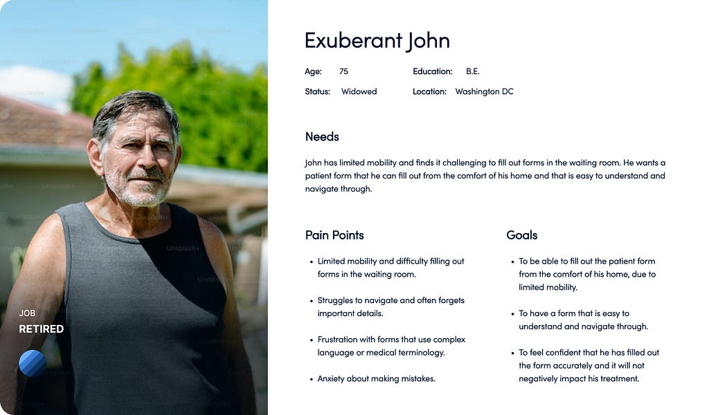
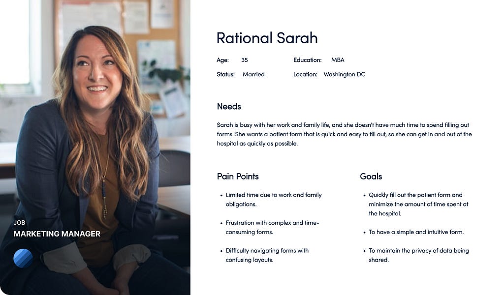
User Personas
During the research process, we identified two personas. The user personas helped to identify key user priorities, which include the desire for a platform that saves time, offers enhanced experiences, and enables users to feel in control of their tasks.
Empathy Mapping
We developed an empathy map to gain insights into our users’ behavior, actions, feelings, and thought processes. Here are the key findings we discovered.
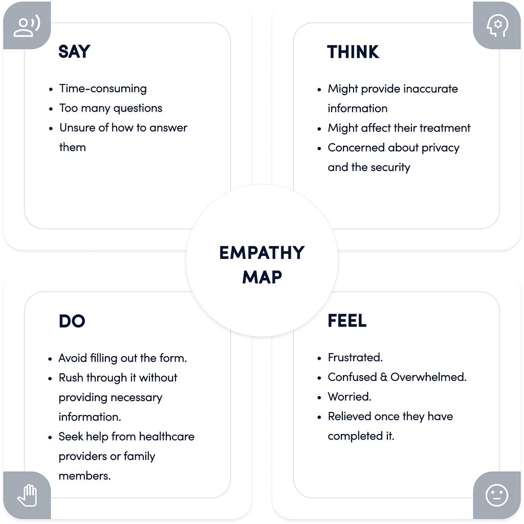
Key Findings
- They may need a simpler form or clearer instructions to help them complete it.
- Providing feedback on the importance of accurate information and reassuring patients of the confidentiality and privacy measures in place can help alleviate their concerns.
- Creating a form that is quick and easy to fill out with intuitive navigation could encourage patients to complete it without any hassle.
- Providing patients with feedback on successful submission of the form can increase their satisfaction and reduce any anxiety related to the process.
Journey Map
To gain a deeper understanding of our users, we developed journey maps to evaluate the emotions patients experience at critical points throughout the process.
John’s Journey
Scenario — John has been experiencing pain in his knee and wants to get it checked out at the hospital.
- John arrives at the hospital for his appointment
- He is handed a patient form by the receptionist.
- He finds a seat in the waiting room
- He struggles to fill out the form due to his limited mobility and finds it difficult to hold a pen.
- He finds some questions to be confusing and is worried that he might make mistakes.
- He spends a lot of time completing the form and feels anxious about getting it right.
- He seeks help from the receptionist and other people around him since he has multiple questions and he is unable to reach out to the receptionist every time.
- He hands in the completed form and waits for his appointment.
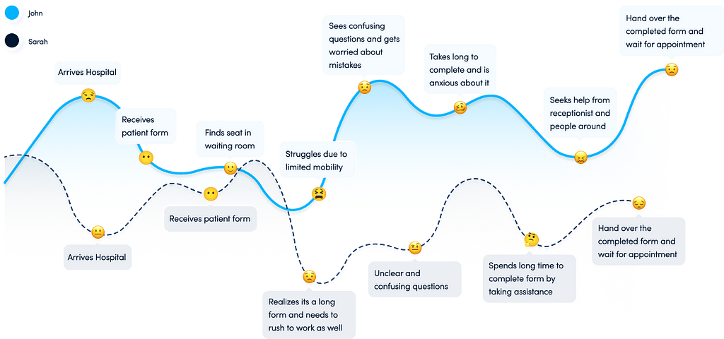
Sarah’s Journey
Scenario — Sarah has been experiencing persistent headaches and has decided to visit the hospital to get checked out.
- Sarah arrives at the hospital for her appointment
- She is handed a patient form by the receptionist.
- She realizes that the form is several pages long and contains a lot of questions and she needs to rush to her work as well
- She starts filling out the form but finds that some questions are unclear or confusing.
- Sarah spends a lot of time completing the form, taking help from the receptionist which makes her feel frustrated and stressed.
- Sarah hands in the completed form and waits for her appointment.
Expectations
To have a form that is easy to understand and have a certain level of guidance or personal help since he has limited mobility while filling up the form to be able to fill it out correctly
Quickly fill out the form and minimize the amount of time spent at the hospital.
Potential Solutions
After conducting research and analysis, we have identified potential solutions to improve the design of the patient form.
- Providing a digital form
Providing a digital form for patients to fill out from home can save time and reduce anxiety while also ensuring more accurate and complete information.
- Simplifying the form
Simplifying questions and breaking them down into smaller sections can reduce the form’s overwhelming nature, while tooltips or explanations can aid with complex medical terms.
- Intuitive Flow
To ensure an intuitive form, we arranged questions in a logical sequence, starting with basic information and moving on to insurance and health-related details, including allergies.
- Easy to understand and navigate
To improve clarity, providing clear instructions for each section of the form and visual aids such as icons can help patients understand the questions better. A progress indicator can also help patients keep track of their progress in the form-filling process.
- Ensuring accessibility
To ensure that the form is accessible to all patients, designing the form with accessibility features in mind which include features such as larger fonts and high contrast colors for patients with visual impairments.
- Allowing patients to save their progress
To provide flexibility and accommodate patients who can’t complete the form in one sitting, allowing them to save their progress and return later will reduce frustration and anxiety.
Solutions for Improved UX
We developed two flows to cater to diverse patient needs, including elderly patients or those with limited mobility.
The first one is Seamless Solution which provides a simplified form-filling experience for old-aged patients, allowing them to focus on one question at a time. The link to the form is shared after scheduling the appointment on call, making it more convenient and accessible, reducing stress and anxiety.
The second one is Streamlined Solution which is accessible to patients after they create an account on the hospital’s portal, enabling them to fill/complete the form, schedule appointments, and track their details from one place, saving time during their hospital visit.
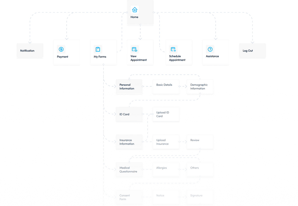
Sitemap & Information Architecture
We organized the sitemap in a simple and intuitive manner that allows users to navigate it without any assistance. At the same time, we kept edge cases in mind and provided an option for users to easily reach out to support if needed, from the comfort of their home and at their convenience.
Seamless Solution

Streamlined Solution
Conceptualization
Following multiple design iterations to create a patient form that meets business goals, client requirements, and provides a smooth experience for users, we finalized the screens and interactions and proceeded with the development of a style guide.
Style Guide
Typeface — Sofia Pro
Web Font size — 16, 20, 24 & 28| Weight — Regular & Semibold
Mobile Font size — 10, 12, 14 & 24| Weight — Regular & Semibold
While choosing the typeface “Sofia Pro”, we considered several factors.
- Firstly, we ensured that it is highly legible, even at small sizes, as this is crucial for a patient form where there is a lot of text that needs to be easily readable.
- Additionally, we considered the clean and modern design that aligns with our user-centered approach.
- The fact that it is a web-safe typeface ensures accessibility across devices.
- Finally, we used this typeface to reinforce our brand identity and maintain consistency throughout our materials.
Color Scheme —
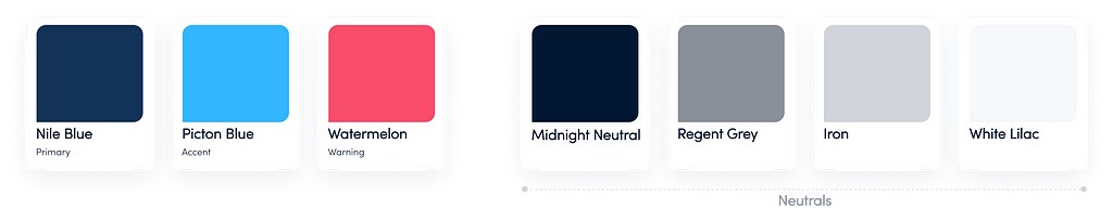
We kept colors like Nile blue and Picton blue as primary and secondary colors as-
- It’s associated with calmness, trust, and reliability. This can help create a reassuring and calming environment for patients who may be feeling anxious or stressed about their upcoming appointment.
- Using these blue colors can provide a high level of contrast with white text, making it easy to read and legible.
- Blue is a widely popular color and is generally well-liked by most people. This can help create a positive emotional response and improve the overall user experience.
- To help maintain consistency and reinforce the brand identity.
Usability Testing
We conducted usability testing among our team members and obtained some impressive results.
Key Findings
What worked well with users?
- Users were able to complete the form quickly and easily.
- They found the form to be intuitive and easy to navigate.
- They appreciated the ability to submit the form in advance and save time during their appointment.
- Users felt reassured by the clear and easy-to-read design of the form.
- The use of blue colors and the Sofia Pro font was appreciated, as it created a calming and professional environment.
- They found the form to be well-organized and easy to follow, with clear section headings and instructions.
- The ability to review and edit their entries before submitting the form was appreciated.
What needs to be improved?
- Some users expressed confusion about certain medical terminology and abbreviations used in the form, suggesting the need for clearer explanations or definitions.
- Users suggested about minimizing the number of questions asked as much as possible to decrease the amount of time invested around filling up the form significantly.
- Consider conducting user research to gather more feedback and refine the design further.
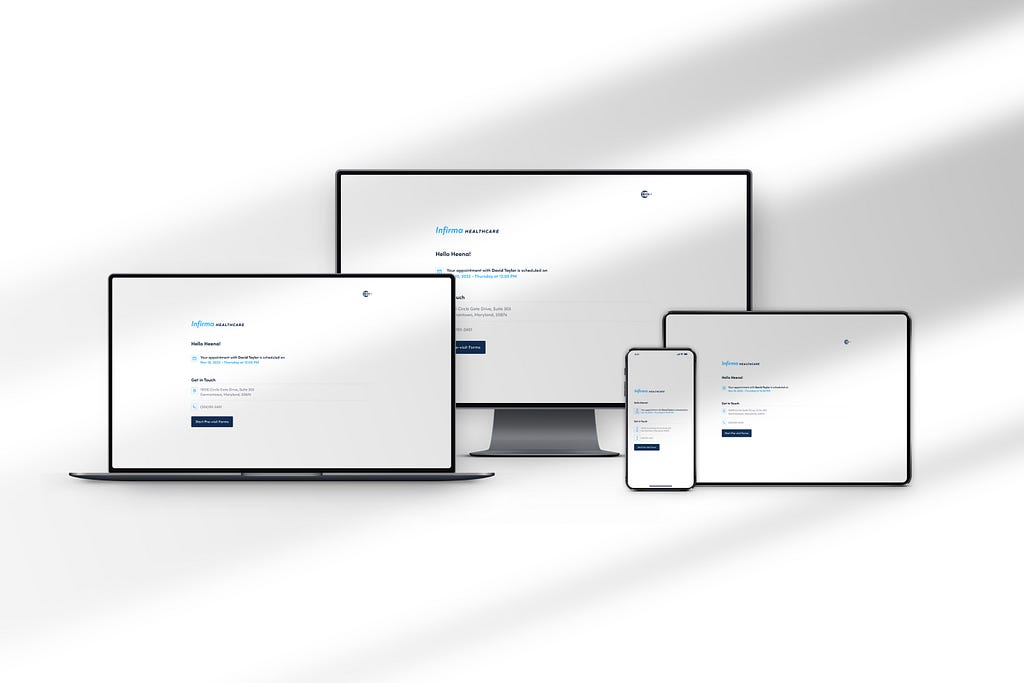
Design
Based on the comprehensive research and meticulous design processes outlined above, I have arrived at the following design conclusion.
Streamlined Solution

Seamless Solution
Outcomes & Lesson Learned
The outcome of this UX case study is understanding how critical it is to understand the needs and expectations of patients.
UX tools and techniques are crucial for gaining a deeper understanding of the user’s emotions, thoughts, and behaviors. Also the collaboration between designers, developers, and stakeholders is critical to the success of a UX project. By working together, we were able to create a user-friendly patient form that meets the needs and expectations of patients.
Overall, this UX case study highlights the importance of putting the user first and using a data-driven, iterative approach to design. By doing so, we can create user-friendly products that meet the needs and expectations of users and improve their overall experience.
![]()
From Friction to Flow: Improving Patient Forms with UX was originally published in UX Planet on Medium, where people are continuing the conversation by highlighting and responding to this story.