From using sensible defaults at various places like during creation of “Links” or “defaulting to 30 mins slot”, Calendly has kept the UX game on top.
When you grow like Calendly user onboarding can be challenging. But,..
With user centric approach you can nail it.
Just did a mini audit to study how calendly caters to so many use cases with perfection and precision.
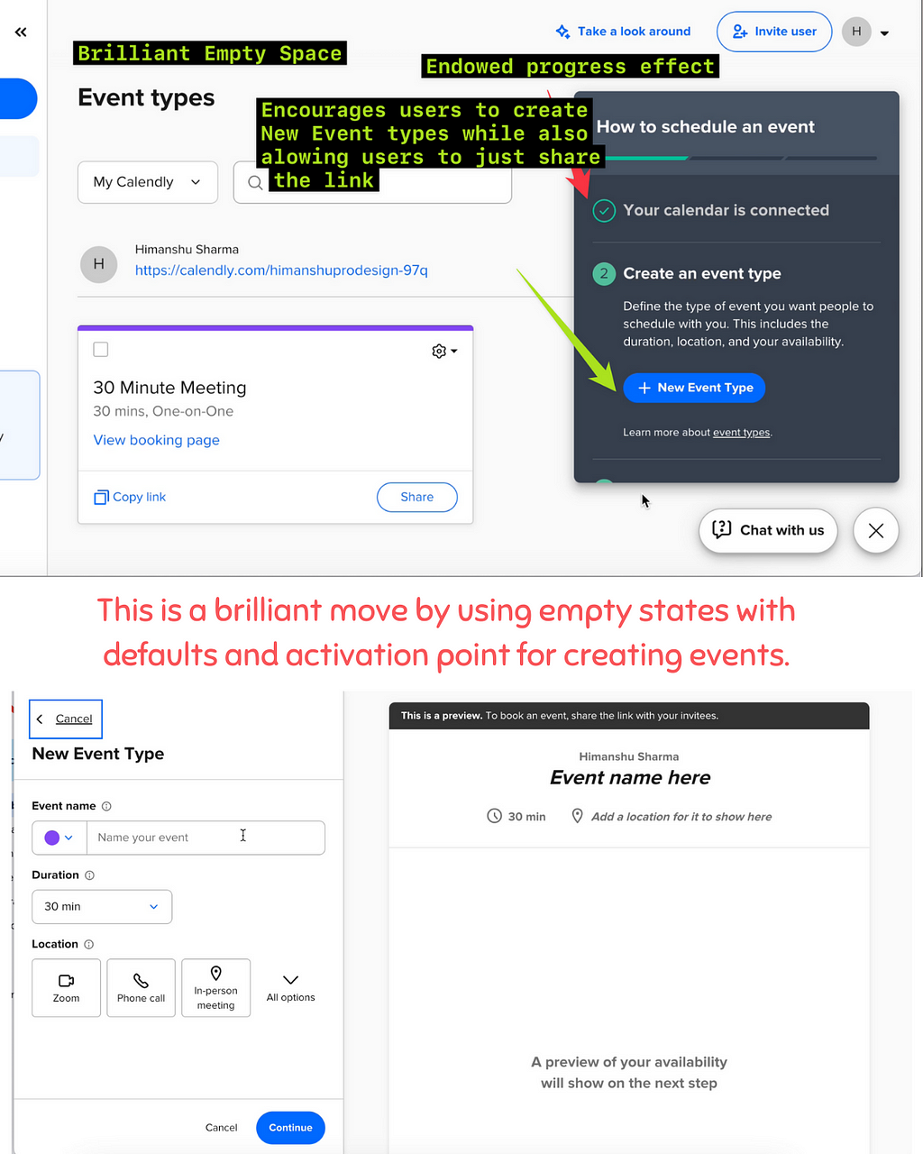
Really loved the way how they have scaled the guidance from the landing screen to motivate users to create new event types to creating or just sending a spot of 30 mins with a link.
From using sensible defaults at various places like during creation of “Links” or “defaulting to 30 mins slot”, Calendly has kept the UX game on top.
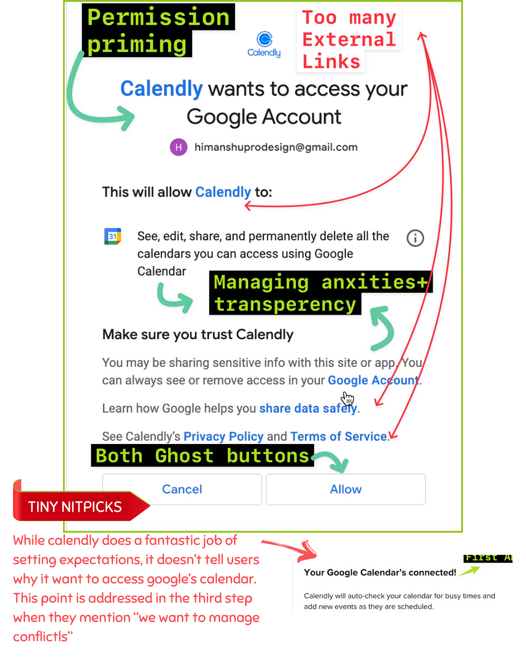
Permission to connect with Google
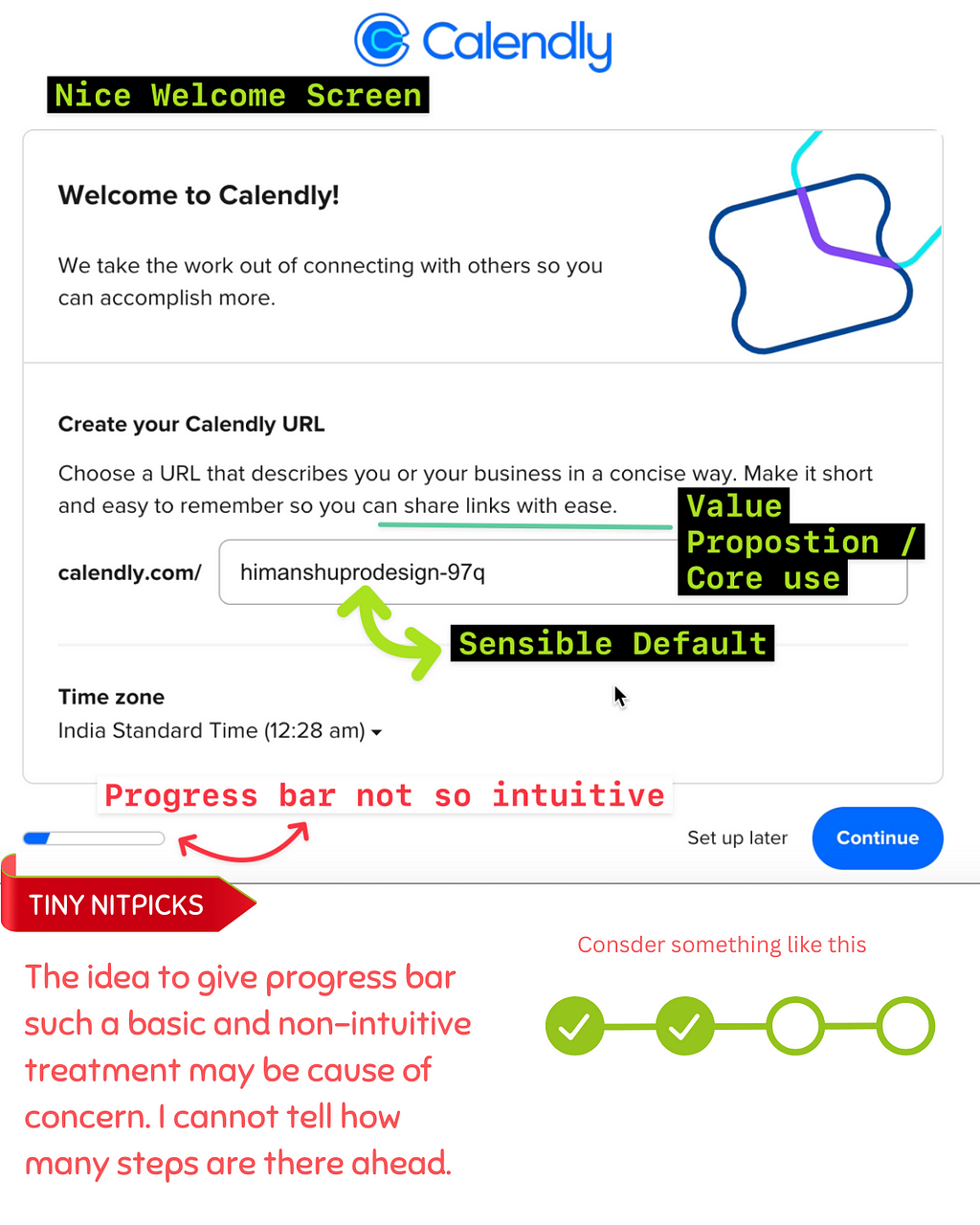
Welcome Screen
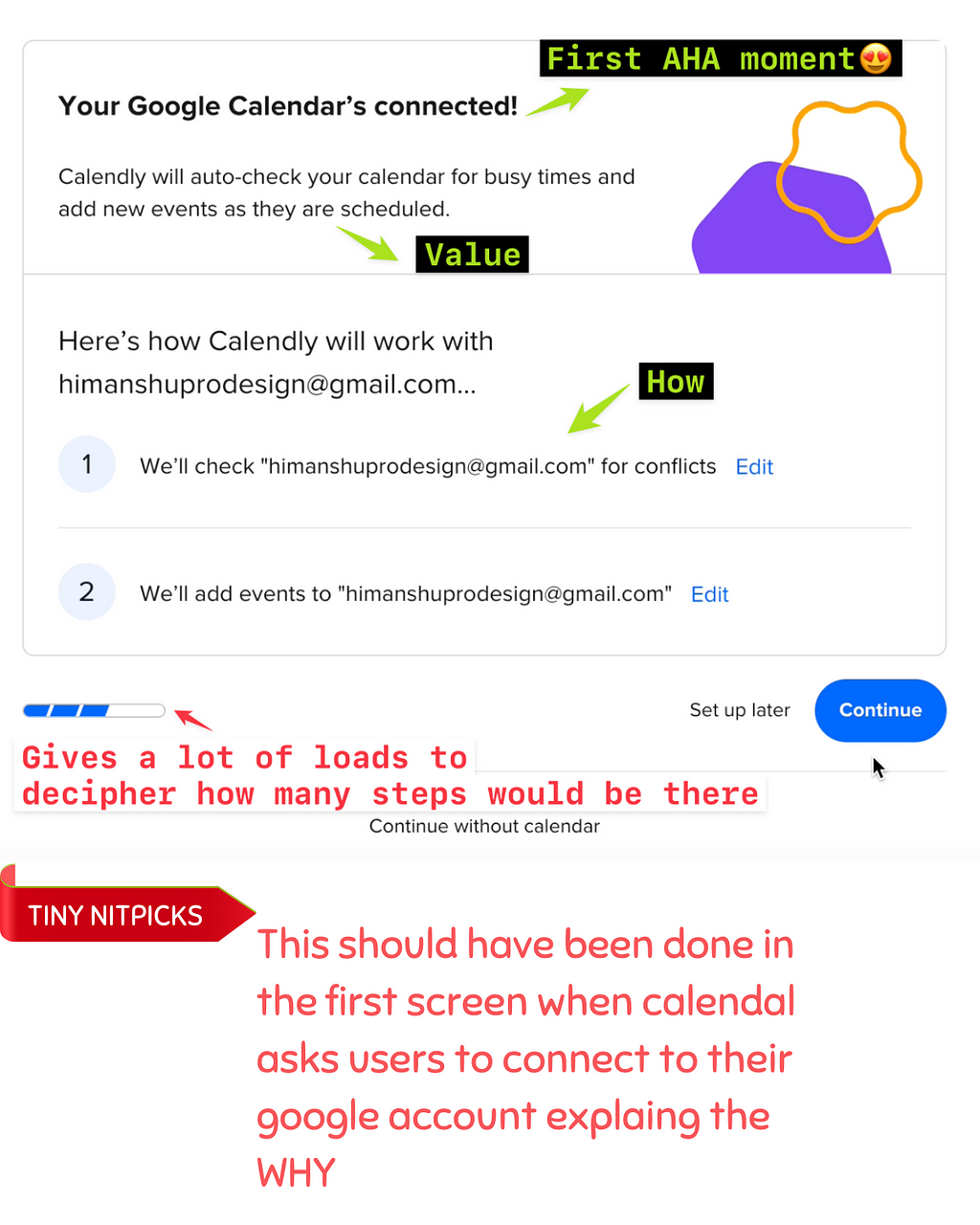
The AHA Moment
Setting the stage
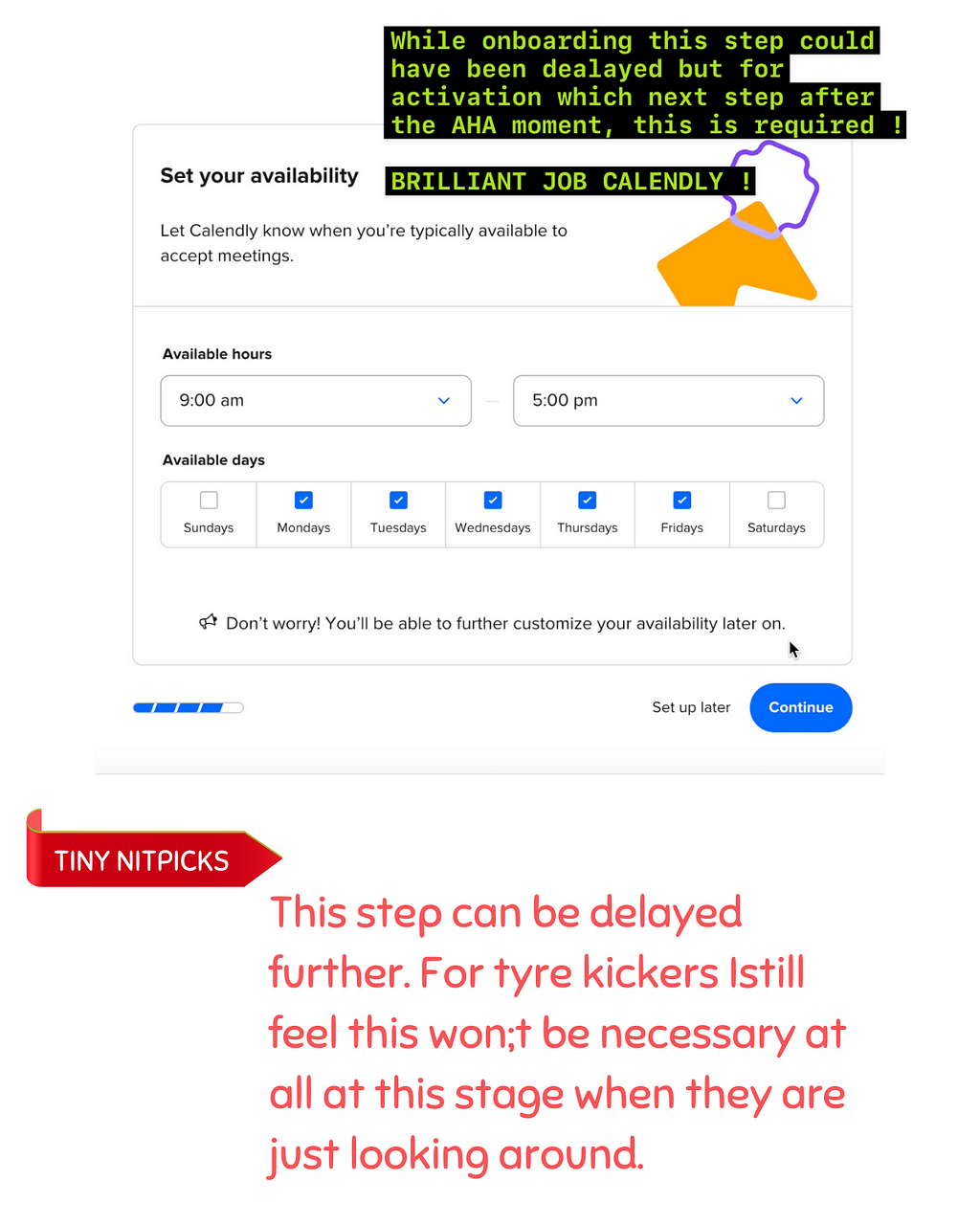
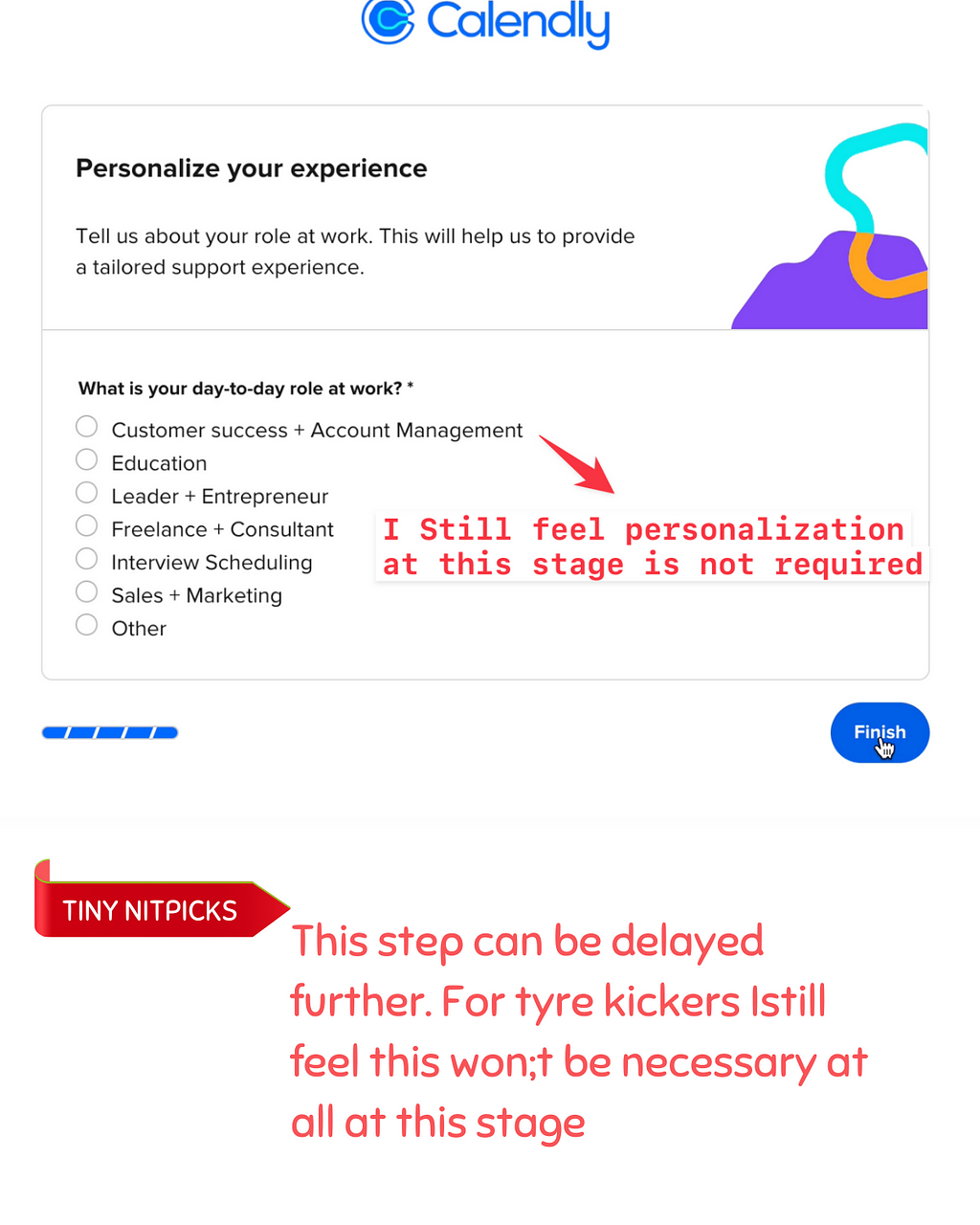
Personalisation
Empty Screens
Event Description with TOOLTIP
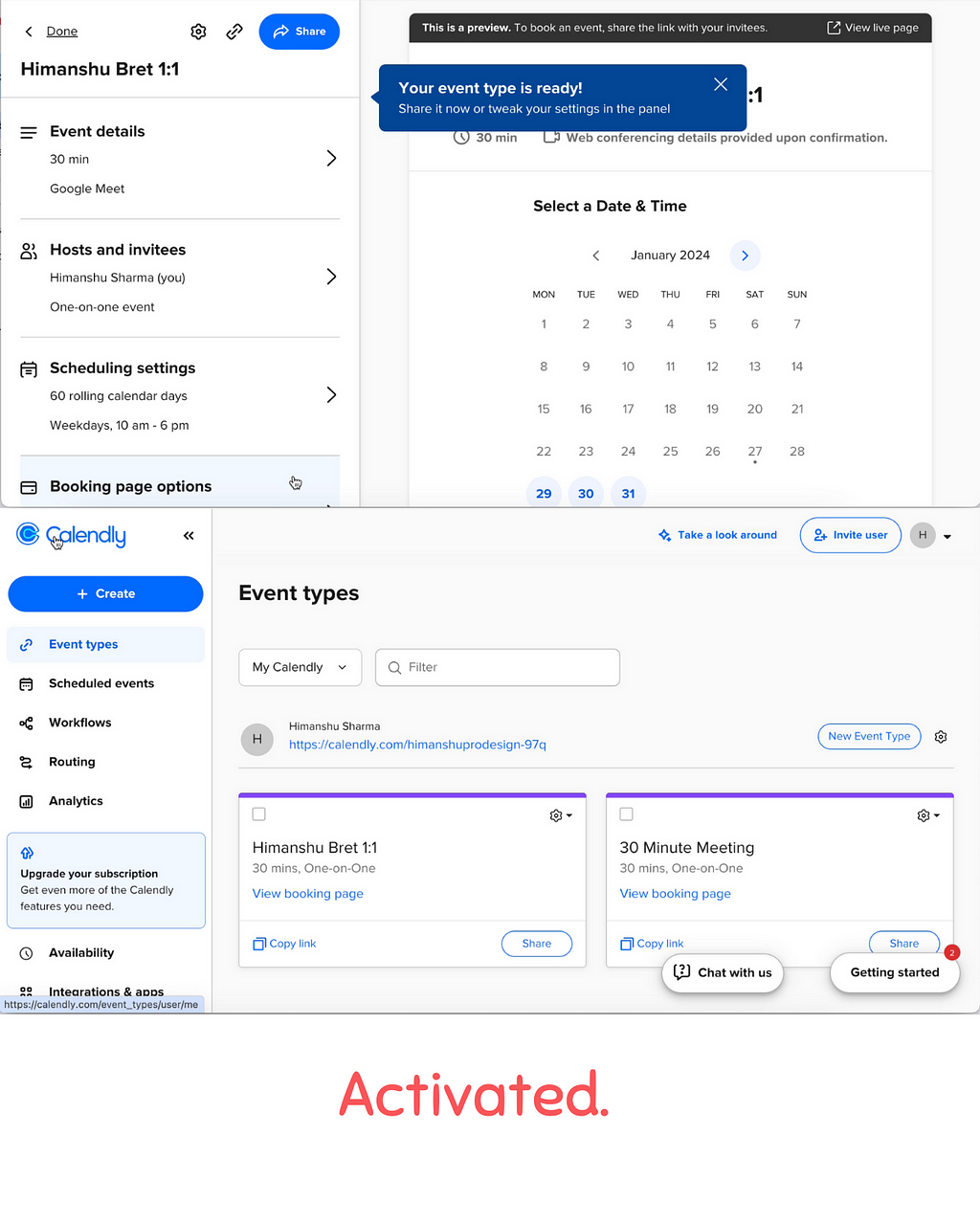
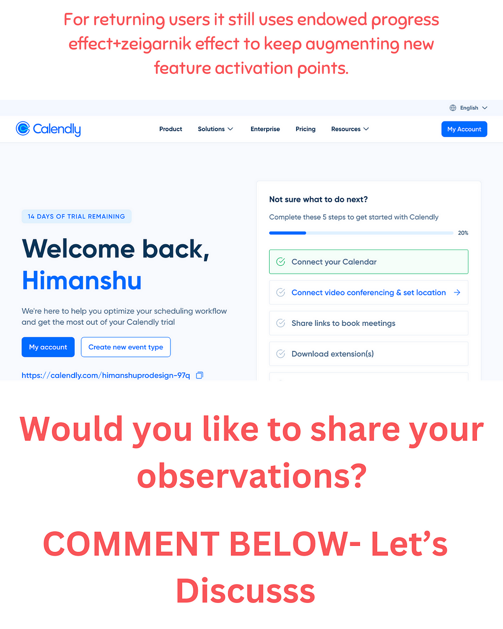
Scaling guidance for Returning users
Here’s what I loved:
✅ Understanding the context that majority of its use cases would involve integration with existing calendar and the timing to connect is just right. I am sure this task might have required working backwards from core usage output toward the entry point.
✅Permission prompts at right places to set expectations and increase trust quotient through transparent dialogues and signposting
✅Helping users get a series of AHA moments, for creating a link, to adding to calendar to scheduling availability to creating new events and finally to design a landing page with endowed progress effect that’s there’s still more.
✅Scaling guidance at empty states with a checklist to create events and motivating the users with endowed progress effect that first step has been taken
✅ Using just the right amount of design patterns from checklists to tooltips(Avoiding tooltip overload). The progress bar probably might need some treatment(I have covered in my nitpicks🤫 below)
🥱TINY NITPICK and recommendations😵💫
LOAD AT PRE-FRONTAL CORTEX: 🧠😵
➡️Since the complete onboarding took an active 3–4 minutes with a bit of new experience along the way, a good practice would be to incorporate breaks or rest points and rewards, where users can digest information, reinforcing key concepts, feel a sense of progress and are prepared for the next steps.
➡️A lot of illustrations used on the top right are a bit abstract. Instead, visuals that help users envision the improvements would help.
For example, during the instance of “calendar connected” can be framed around what benefit it might give and how is it relevant to subsequent steps might soothe a lot of anxieties.
➡️For the small progress bar in bottom left: Our eyes aren’t good at attributing quantitative value to two dimensional spaces. So, if you see a void and want users to understand that there are 4 or 5 more steps, it can bring about a bit of confusion and cognitive load.
➡️While landing on the main interface or Empty Screen the user is suddenly introduced a new term “New EVENT”. The user needs to be educated about what EVENTs mean and what’s the difference between default “30 min lot” and a NEW EVENT.
All in all a great job and so many things to learn from Calendly !
Thanks for giving us such a wonderful onboarding experience. Darren ChaitJess Clark Stephen Hsu
Find me on LinkedIn: ➡️https://www.linkedin.com/in/productdesigneronboardingux/➡️
I offer comprehensive UI/UX onboarding audits and consultations, tailored specifically for product managers, Startups, and Product designers in Europe and the US.
How Calendly nails user onboarding for complex use cases was originally published in UX Planet on Medium, where people are continuing the conversation by highlighting and responding to this story.