Does this come a bit out of character from me ?
Because 99% of the time I only speak about design here ? Yes.
But as someone who spends an ungodly amount of time on Hinge, this was bound to happen.
Also I really had this urge to build a side project as it’ll help me come off as a more well rounded web designer.
And here’s how it went.
Why even ?
I happen to live in a country that is very conservative (1.5B population lmao), but there’s a hustling-bustling small dating community too.
I also happen to be the exact age where most people get into online dating, thus I ended up spending a lot of time there.
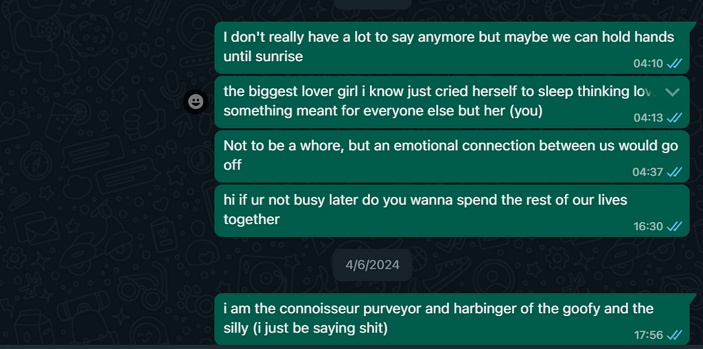
Slowly I also found some niche subreddits where people post screenshots of their conversations with their matches..
…and they were awfully bland and boring.
Because flirting is a skill, that hasn’t been mastered here.
Like, you actually have to spend time speaking to many women to learn the basic etiquette and mannerisms of flirting.
And I happen to be a very smooth talker with immense knowledge of what words to use to get the ball rolling.
There was a market — millions of 18-23 year olds
There was a problem — conversations were drier than Sahara
There was a need — lame and boring people were getting unmatched
There must’ve been a solution — but no, there wasn’t…
Hence the idea struck, to build a website where people with the personality of a thumb can copy and paste lines with their thumb (hehe) for their matches to help the conversation move forward.
As someone with 0 skills in actually building a finished product, I felt like I struck gold.
Research + First Draft
I was part of the above-mentioned subreddits for many months, and had a clear idea of who the end user was going to look like.
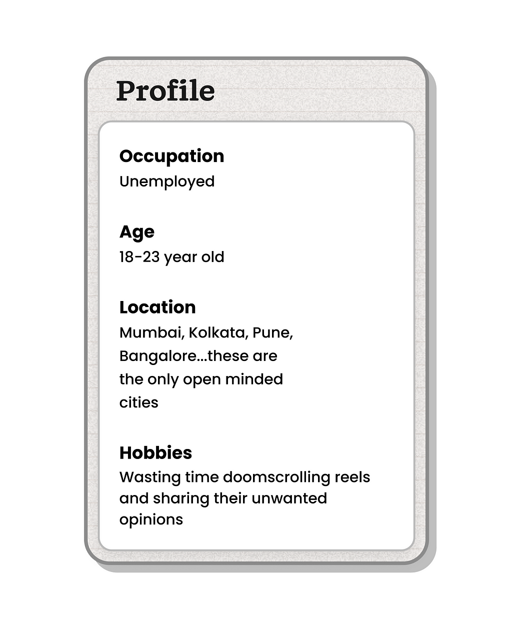
With that, I had the Ideal Customer Profile ticked off.
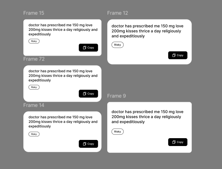
Now I won’t lie, I directly jumped into Figma to design the first basic wireframe of what I had in mind.
I envisioned a landing page with serif font in the hero section to denote class and romance, followed by a bunch of cards with a button to copy the pickup lines from.
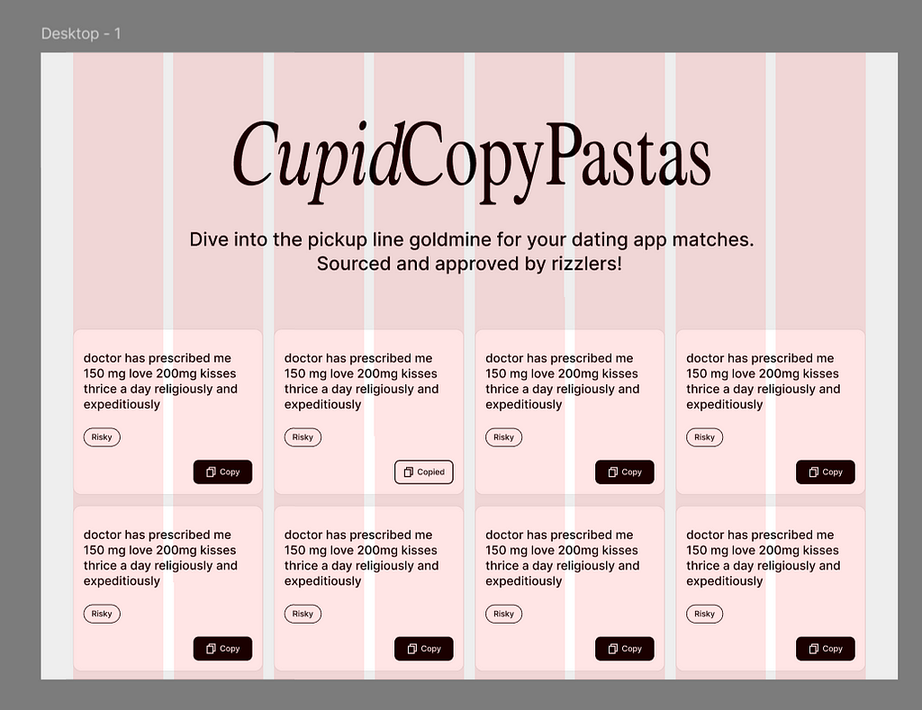
This is what it looked like.
I added a small category bubble too, because not everyone would know what to say at what place.
Which can lead to really messy situations, I wouldn’t want my customers to suffer from it. Nuh-uh.
But why name it CupidCopyPastas ?
Copy Pastas on Reddit refers to texts copied and pasted repeatedly across threads, often for sarcasm, which sometimes evolves into memes.
And where exactly did I get the idea for the site ? Yes.
This was a small way to pay homage to Reddit for the role it played in this project.
Curating The Lines
With the ideation and basic concept done, I now needed to find the pickup lines.
And you guys must be wondering how long it took me to find them ?
Perhaps maybe months ?
Nah, a day at best.
Because I had them all saved ever since I joined Hinge.
Whenever I came across a banger tweet or Reddit post, I bookmarked it for future purposes.
Some I felt like using, but the rest remained locked in until future usage was needed.
Well, now I needed them.
And I had like 150+ of them spanning across different topics and situations, this was going to be a massive collection.
Designing & Building
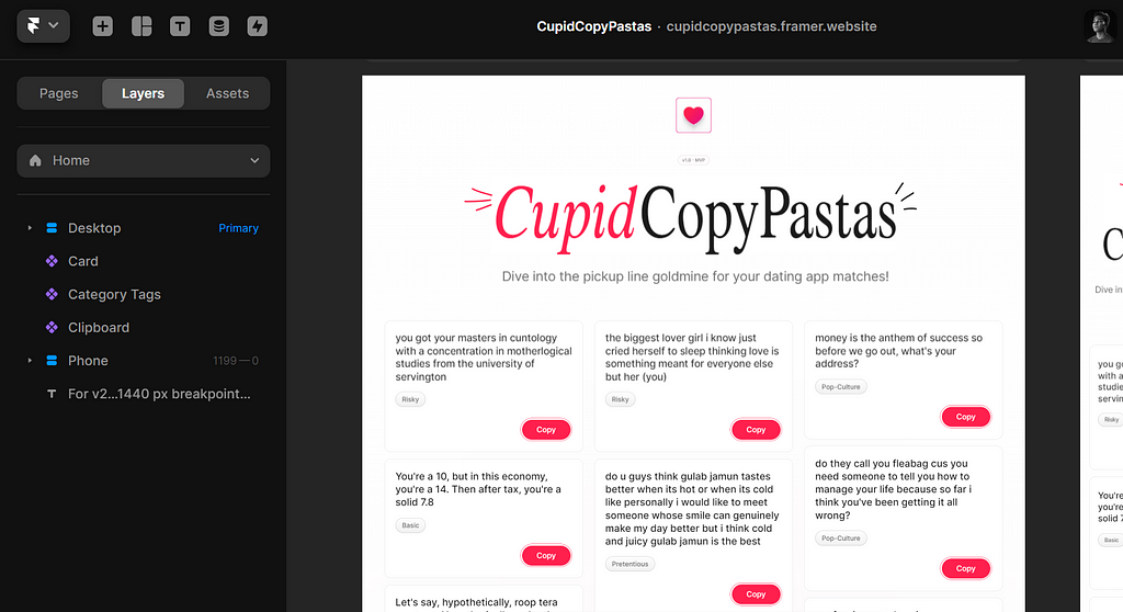
Now the main thing, designing the UI in Figma first and then re-designing it again in Framer.
It sounds counterproductive until you design from scratch on Framer, then you’ll know what I mean.
I designed a few iterations of the cards because that’s the main shit out here.
Everything else is of lower importance.
Once I had the card ready, I went ahead to Framer but boy, was I going to get stuck.
Apparently making a custom copy component button on Framer is hard, and the one they provide is flat, ugly and also uneditable.
This forced me to lower the amount of shadows and gradients I initially had in the design.
Now I had to find a middle ground, a UI style that used both dim shadows and flat colors.
A couple minutes of redesigning around and I settled on the final UI that’s ready for development.
Over on Framer, to ensure uniformity on the site, I made the components first.
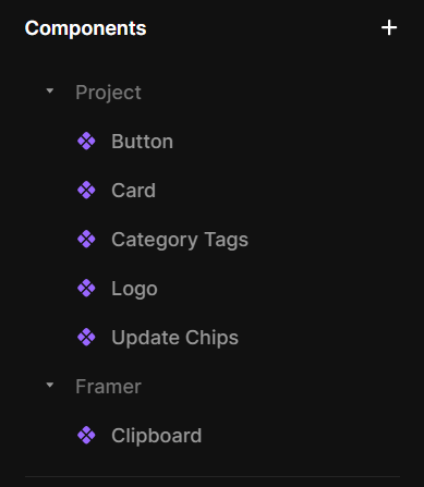
And these were nested components, with lots of limitations.
All of these and their breakpoints too, I only did 1200px & 360px though.
But I finished that and started making the landing page.
I honestly forgot how stacks worked, as I was returning to Framer after a long time and had to spend a while just watching tutorials.
I figured out how everything must go, and built the final site.
With all the components and their breakpoints ready, I added all the pickup lines into them.
Early Reviews
Before I launched it to the public, I went over to some of my trusted peers to get their initial reactions.
Which was 70% positive, but they did point out a bunch of things that could’ve been improved.
- The labels didn’t pop out well
- The chip above the hero text was ugly
- Needed more visual stimuli, added animations
- The content distribution was odd on larger breakpoints
- Too much red on the buttons (this feedback I avoided)
I took another day and updated these things for a better experience.
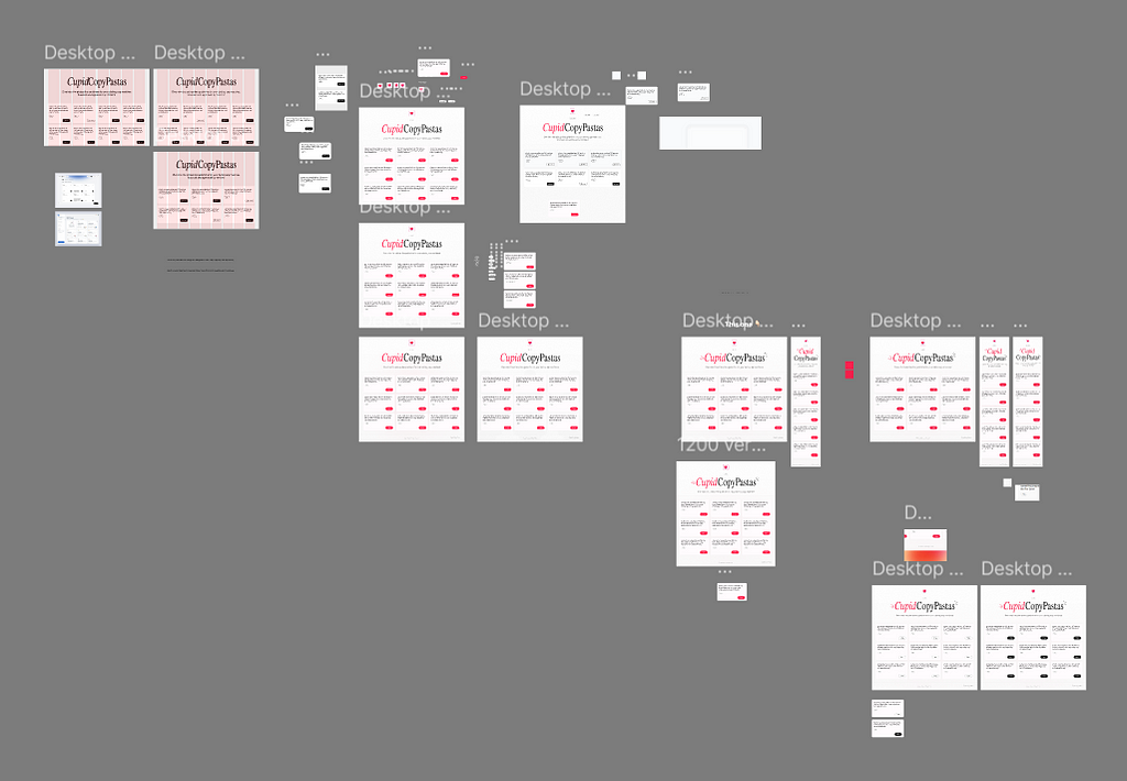
Here’s what the file with all the older versions looks like.
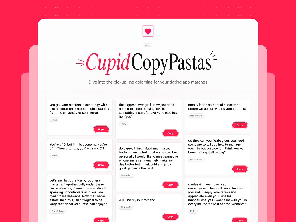
The Launch
I put a lot of effort into this one, as it is something that I’d personally use as well.
I did already launch it on Twitter first, but here’s the announcement for my Medium followers!
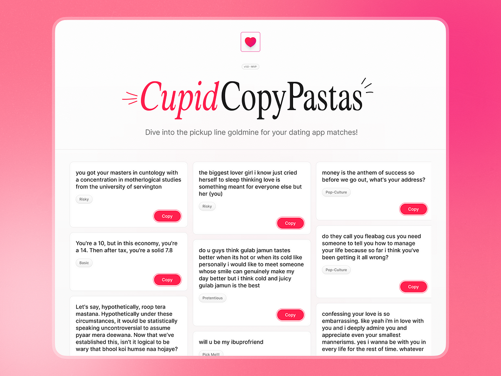
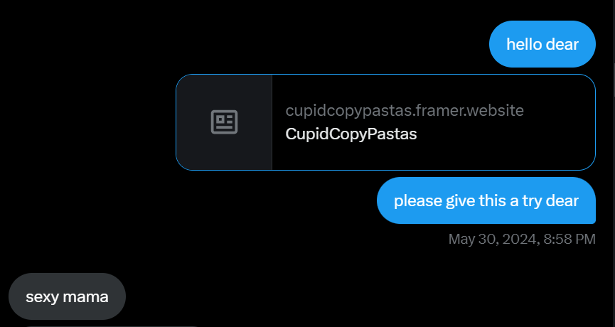
Give CupidCopyPastas a try!
I hope it helps you get a few matches, and it’d be lovely to receive feedback as I prepare to design the next update 🙂
Roadblocks & Takeaways
But before we end, what’s a side project if it didn’t teach you anything ?
Here’s some of my key learnings as I built my first proper side project in about a week.
- Framer is easier than I expected, just needed to understand specific concepts
- Framer is also extremely limited in its component library, sometimes you’ll have to compromise on things
- I should’ve launched quicker, maybe under 3 days
- I should’ve teased the launch more on Twitter, as it was a flop (only got 40 likes)
- I added very few functions, nothing else is enticing about the site
- The final site didn’t feel as premium as I wanted, something was off
Hi there 👋🏻 I’m Sharanya — a freelance UI & Web designer writing about design and documenting his journey.
Currently booking projects — let’s chat.
Check my design templates on my shop.
Find me on Twitter, Dribbble & LinkedIn!
Sign up for my newsletter over here!
![]()
I Built A Website To Copy & Paste Pickup Lines From was originally published in UX Planet on Medium, where people are continuing the conversation by highlighting and responding to this story.