A simple, perfectly timed design decision that every UX designer should learn from
A few days ago, I opened my finance app to check my card details.
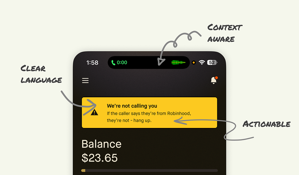
Nothing unusual about that. Except this time, I was already on a call.
The moment the app loaded, a bright yellow banner appeared across the top of the screen:
We’re not calling you
If the caller says they’re from Robinhood, they’re not — hang up.
It wasn’t just another static security warning that you scroll past without reading. It felt alive. It was responding to what I was doing in real time.

The context
For those unfamiliar, Robinhood is a US-based finance app known for stock trading and investing. They’ve recently expanded into offering a credit card. That’s what I was using when this happened.
And here’s the key detail: this warning isn’t something that’s always sitting there in the interface. It’s not cluttering the design or nagging you every time you open the app.
It only appears when the app detects you’re on a phone call.
Why is this so clever
There’s a common scam where fraudsters call pretending to be from your bank or finance company. They might try to get you to share sensitive information while you’re distracted on the phone.
Robinhood’s design team clearly thought about that. Instead of showing a warning somewhere deep in the FAQ or in a one-time onboarding message, they built a context-aware alert.
Here’s why it works so well:
- It’s timely — The warning appears at the exact moment the risk is highest.
- It’s clear — The language is plain and leaves no room for confusion.
- It’s actionable — It tells you exactly what to do next.
- It’s unintrusive — It only shows when relevant, so you’re more likely to take it seriously.
The UX principle at play: Just-in-time design
In UX, there’s a simple truth: if you give people too many warnings all the time, they stop paying attention.
It’s called “alert fatigue” and it happens fast.
By contrast, just-in-time design delivers guidance exactly when it’s needed — no sooner, no later. It’s one of the most effective ways to get users to actually follow security advice.
What designers can take away
Whether you’re working on a finance app, e-commerce site, or healthcare product, there are a few lessons here:
- Trigger alerts based on context rather than showing them constantly.
- Use human language that any user can understand without technical knowledge.
- Keep it visually distinct so it stands out in the interface.
- Give a clear action so the user knows exactly what to do next.
Why this matters
Security isn’t just about encryption or backend safeguards. It’s also about how you communicate risks to the person holding the device.
When you design security into the user experience, you’re not just preventing fraud, you’re building trust. And trust is the one thing no app can afford to lose.
I’m curious, have you seen other apps that nail security design like this? Share them in the comments. I’d love to collect more examples.
![]()
I Opened My Credit Card App While on a Call, & This UX Surprised Me was originally published in UX Planet on Medium, where people are continuing the conversation by highlighting and responding to this story.