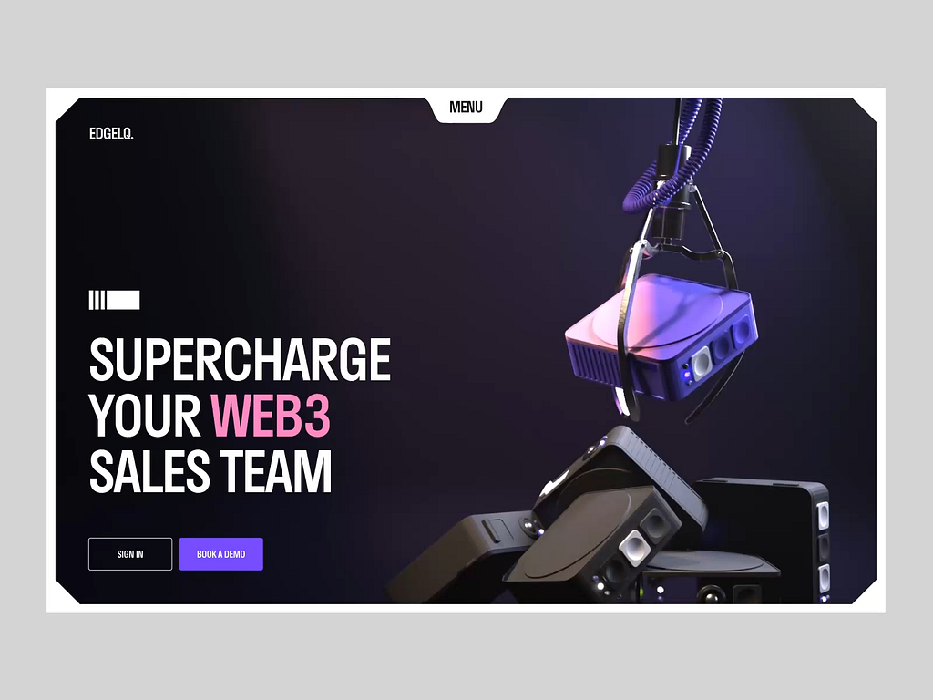
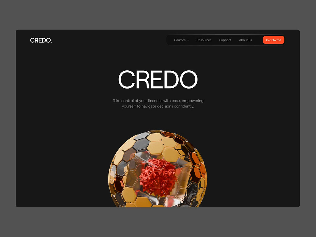
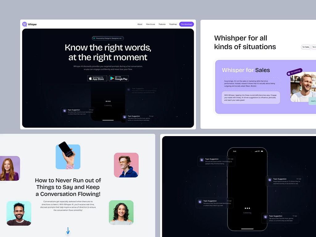
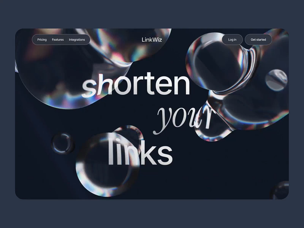
A field-tested structure and practical hacks for building landing pages that actually convert
Hi, friends!
I try to share things you can actually use, grounded in real experience, both mine and my team’s.
Today, I’d like to delve into the topic of landing pages. Creating a successful landing page isn’t that difficult if you know some essential points.
There’s no perfect, universal landing page structure. However, there is a sensible and proven scheme based on the AIDA sales concept. Using it correctly significantly increases your chances of creating a high-conversion landing page.
So, how does it work?
1. Conscious construction
Usually, a landing page structure is developed based on marketing recommendations. But what ruins even the best marketing ideas isn’t sloppy execution — it’s a lack of clarity around goals. A landing page requires deliberate effort: those creating it must clearly understand who they’re designing it for and why, what techniques fit the audience best, and which tools should be used to reach the goal.
This isn’t groundbreaking; it’s just a reminder of how critical marketing research is as the foundation for everything. The revelations come next 🙂
2. The core principle most people get wrong
Most of us are familiar with the sales model called AIDA:
A — Attention
I — Interest
D — Desire
A — Action
A landing page typically consists of several blocks arranged logically one after another. It’s essentially the “story” of a company or product, guiding visitors from start to finish, proving to them that this product or service is exactly what they need.
For some reason, many people mistakenly believe the AIDA model corresponds directly to these blocks. They assume the first block captures visual attention, the second builds interest, the third ignites desire, and finally, users click the CTA button in the fourth block.
Friends, this is a costly mistake.
Each block should reflect AIDA — both on its own and in the page’s overall structure.
What does this mean practically?
AIDA works differently in each block. Still, throughout the user’s journey, their interest and enthusiasm shouldn’t fade. Instead, their enthusiasm should continuously build and peak before reaching the CTA.
So, what helps us achieve this goal?
Let’s break it down. The next few points are practical tools that do the heavy lifting, on both the psychological and visual levels.
3. Uniqueness — what it really means
Let’s be honest: real uniqueness doesn’t exist anymore. Even if you’ve come up with a revolutionary idea, it’ll probably get copied and mass-produced by tomorrow.
That’s why our job is to plant the idea of uniqueness in the user’s mind.
This is pure marketing. And the designer’s job? To support that idea visually, so it sticks in the user’s brain on a subconscious level.
Keep reminding people: the product is special — and so are the ones who choose it.
Smart, selective, with a strong sense of style. In short, people who earn the right to own it.
4. Working with objections
A misunderstanding of how AIDA works often leads to creating a separate block specifically aimed at resolving user doubts. This approach is noticeable and frequently causes the opposite reaction.
You can’t resolve all doubts at once, in a single block. It’s better to do it gradually — if not in every block, then in those where it’s possible, and only addressing doubts relevant at that particular stage of product exploration. Dispel doubts by embedding phrases into the content, reinforcing your message with convincing visuals.
Throughout the entire journey, users should feel understood and supported.
After all, you wouldn’t smile at your friend only on Mondays and ignore them for the rest of the week, would you? Resolving doubts in a separate block is exactly like that.
5. Pattern interrupt
In the first 3 seconds, users decide whether to stay or leave. We must understand this clearly: users initially plan to leave quickly. Their brain is already in “skim-and-bounce” mode. To interrupt this and shift their mindset, we can use pattern interrupt.
This life hack combines two approaches: psychological (marketing) and visual (design).
In practice, it looks like this:
Marketing: grabbing attention with meaning
Our goal is to break user expectations.
Instead of writing “The best solution for your business,” you might say: “We’re not the best. We just clearly explain what we do.” “No, this isn’t a genius solution. But it works.” “You don’t have to trust us. Just see what we do.” “This site isn’t for everyone. It’s for those tired of the usual bullshit.” This causes a cognitive hiccup in the user’s brain, awakening curiosity: “Alright, what exactly do you smart folks have to say?”
The main goal is simply keeping the user engaged and moving to the next screen.
A compelling, honest story
Include a micro-case study, quote, or personal confession right on the first or second screen. This hooks users effectively if you truly know your audience and can find a story emotionally and mentally aligned with their concerns.
The question that bothers them
Not something generic, but specific. Again, it’s about knowing your target audience well. A pressing question immediately grabs attention, prompting users to expect an answer (a solution to their problem).
Design: grabbing visual attention
I’ve worked with designers for many years and know firsthand that they’re always eager to flex their creative muscles — even when it’s unnecessary 🙂
Creative elements should serve a purpose and align with the landing page’s goal.
Otherwise, creativity can be irrelevant and even harmful.
What design tools do we have to attract attention?
Visual аccents:
- One strong focal point per screen (headline, number, illustration)
- Contrasting CTA buttons (color, shape, size)
- Clear text hierarchy (large/medium/small, step-by-step readability)
- Highlighted keywords (using color, bold, or markers);
- Accent colors in strategic spots — not just aesthetics, but meaning
- White space to give eyes a rest and direct attention precisely
Navigational accents:
- Clear logic for transitioning between screens (like chapters in a story)
- Scroll indicators / small prompts (“read more,” “look down”)
- Fixed navigation elements, progress indicators
- Rhythm and repetition (consistent block structure for easy reading)
Dynamic attention-grabbing accents:
- Micro-animations triggered by hover, clicks, scrolling
- Gentle background movements or icon animations — not overwhelming
- Interactive content (expandable sections, toggles)
- Engaging patterns — clickable elements, scrolling with surprises
- Pattern breaks — changing rhythm, color, or grid at just the right moment
Intriguing micro-animations
These are engaging animations that users enjoy and find intriguing. For example:
- A gently trembling arrow
- An element that “looks” or “follows” your cursor
- A pause followed by a flash with a playful prompt like, “Click if you dare” (but friendly)
Silence
A blank screen with just one word or one question. For instance:
(on a white background) “Are you sure?”
Visual silence can speak louder than a flashy banner.
Unusual illustrations or metaphors
People always gravitate toward the unusual. Occasionally, that very creativity designers bring can breathe life into your landing page and win over users’ hearts. But remember, this must be based on marketing analysis. Otherwise, you risk entertaining users briefly before they leave, and that’s not the goal, right?
Pattern Interrupt works best when honest messaging meets bold visuals.
6. Anticipation
Yep — and we’ll have to work on this if we want a landing page with high conversions.
Consciously creating anticipation is an interesting challenge!
On each screen, the desired user action is moving to the next screen and keeping attention.
Anticipation sparks the desire to keep going in expectation of a reward.
Moving on to the next block is already an action, so each block should make a promise that stimulates the user’s mind and senses. This promise should motivate users to learn more, see more, and feel more.
Here’s an old but still relevant and popular article about what “more” actually means: 7 Magic “Mores” to Improve UX/UI
The promise of reward is the reason to continue.
Do this in every block. Promise users the most exciting stuff is still ahead!
7. Helping users “own” the product
This means creating a feeling in users that they already own your product. How can you practically do this?
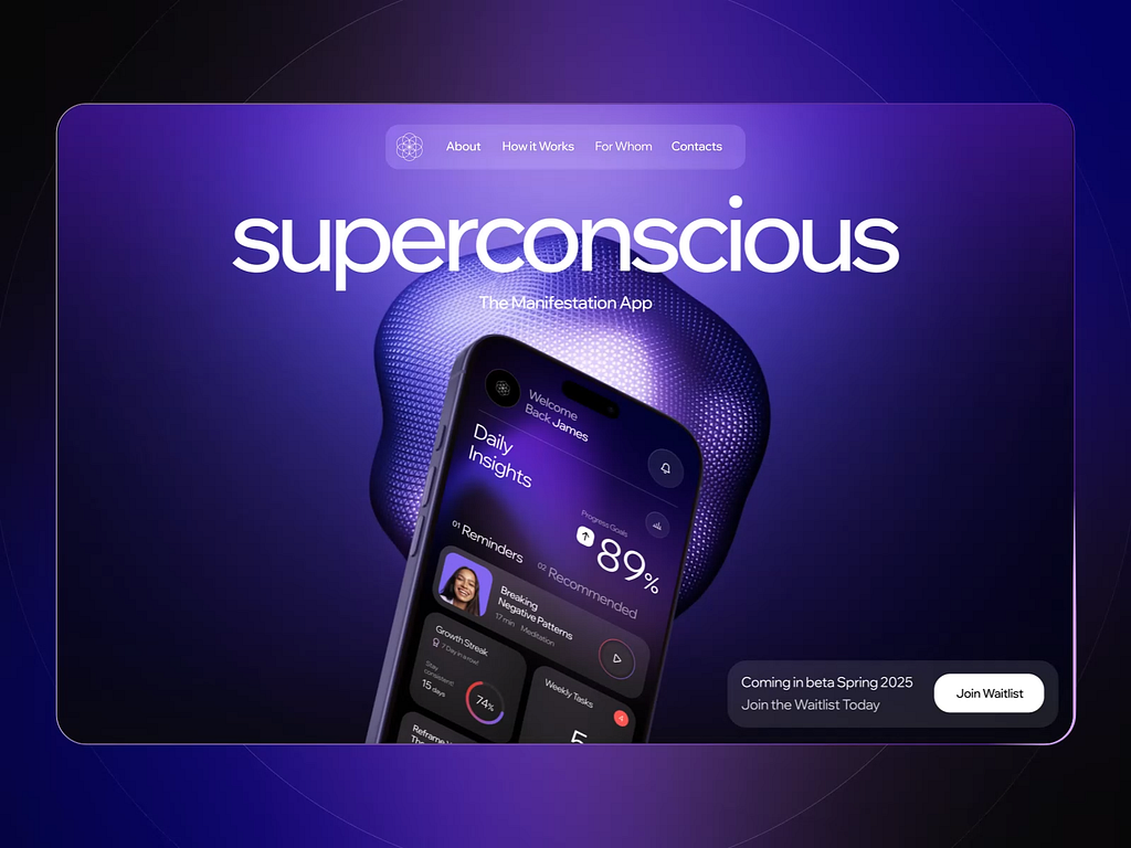
Here’s a simple example: Don’t just put an abstract product photo on your landing page, even if it’s stunning. Instead, show an image of someone actually using the product. A car alone is boring; someone driving it is entirely different. This helps users easily visualize themselves owning and enjoying your product. Looking at a picture where someone successfully uses an item makes users want it for themselves. This isn’t just my imagination; it’s a powerful, proven marketing hack. You’re welcome, friends!
Instead of conclusion
Creating a great landing page is the result of deliberate and structured work. To make it clear, engaging, and effective in achieving its purpose, we focus on:
- Marketing foundation
Start by deeply understanding your target audience, their needs, pain points, and expectations. The landing page should be tailored specifically for this audience and aligned with business goals.
- Effective structure
Use the AIDA model — not as a block-by-block division, but as the underlying logic within each screen: Attention, Interest, Desire, Action.
- Pattern interrupt
To prevent users from leaving within the first seconds, it’s crucial to break their expectations: use an unconventional headline, honest statement, surprising question, or intriguing story.
- Working with objections
Work with objections gradually, not all at once. Address relevant doubts within the context of each block, using supportive phrasing and visuals. A separate “objections” block feels unnatural — reassurance should be woven into the whole journey.
- Visual and navigational accents
Clear visual hierarchy, strong focal points, contrasting buttons, intuitive navigation, and logical transitions between blocks help maintain attention and guide users seamlessly.
- Micro-animations and interactivity
Subtle animations, reactions to user actions, visual “pauses,” and occasional surprising elements make the landing page lively and engaging.
- Working with anticipation
Every screen should inspire users to move forward by promising valuable, interesting content and escalating engagement.
- Product “ownership”
A great landing page doesn’t just explain the product — it helps people feel like they already own it. Show how it looks in real life, how it works, how it fits into familiar situations. When the offer feels close, clear, and easy to picture, people naturally start seeing themselves as the owner.
A smart landing page shouldn’t look like it’s trying to sell.
It just shows the product in a way that makes people think, “Yeah, that’s for me.”
![]()
Landing Pages That Sell was originally published in UX Planet on Medium, where people are continuing the conversation by highlighting and responding to this story.