Simplify your site’s structure to keep users engaged and satisfied effortlessly.

59 milliseconds — that’s how long it takes for users to form their first impression of your website. It’s less than a blink of an eye, yet in that brief moment, users decide whether your site is worth their time. Does it meet their needs? Is it easy to navigate?
As designers, whether in content or UX, it’s our job to capture attention quickly and ensure the site structure is intuitive, aligns with your brand and effectively tells your story.
Why site architecture matters
When designing a website, it’s easy to focus on visuals, content, and branding. These elements often take centre stage, and rightfully so. However, in my years working in UX, one critical aspect that’s often overlooked is site architecture and navigation. Many stakeholders don’t fully understand how vital a well-structured site is to the overall user experience.
A common challenge
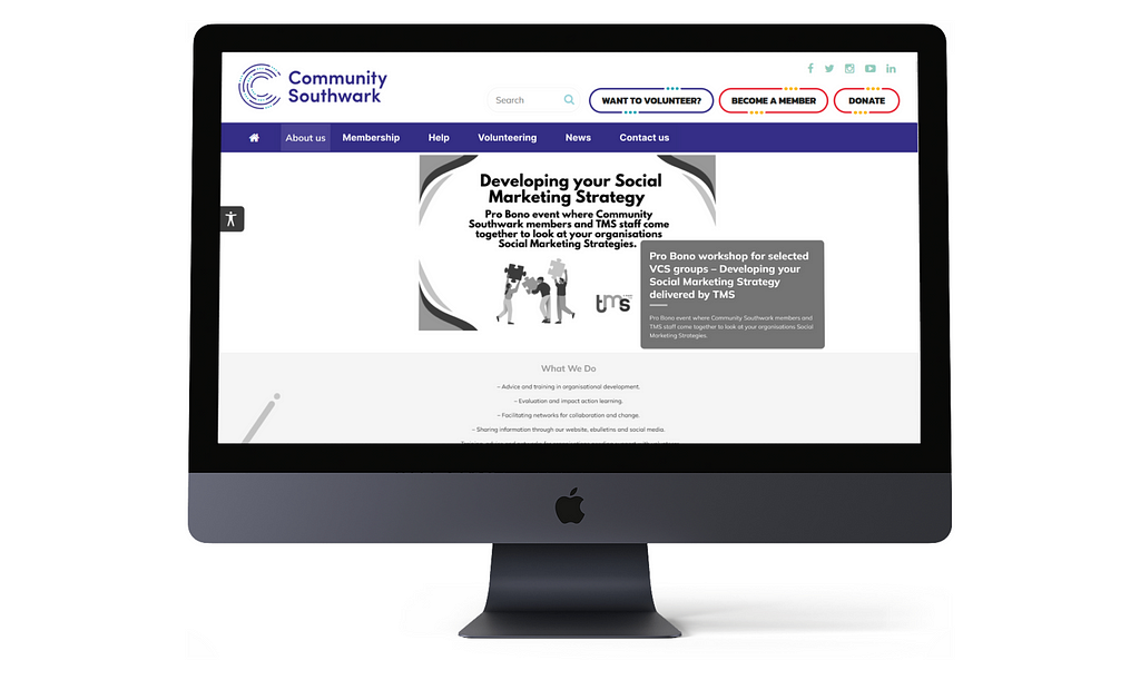
Take Community Southwark, for example — a charity supporting local organisations. Their website struggled to meet its objectives because users found it hard to navigate. The site was cluttered, lacked a logical user journey, and hindered the organisation’s ability to communicate effectively. Unfortunately, this is a common issue many websites face.

Aligning structure with goals
Through user research, it became clear that Community Southwark’s site architecture didn’t align with user needs or the organisation’s goals. This disconnect might stem from limited resources, a lack of awareness, or simply neglecting the importance of navigation. Too often, the focus is on aesthetics and content, while the structure that guides users to that content is overlooked.
The backbone of a user-friendly website
Site architecture and navigation are the backbone of a user-friendly website. They shape how easily users find information, complete tasks, and, ultimately, how they feel about their experience. Here’s why they matter:
- Improving findability
A well-organised structure helps users find what they need quickly, reducing frustration and increasing the likelihood of return visits. For Community Southwark, poor navigation meant users spent too much time searching for simple resources, as reflected in their feedback. - Enhancing user satisfaction
When navigation is easy, users are more satisfied. It reduces cognitive load, allowing them to focus on their goals. A revamped site structure would make content easier to find for Community Southwark’s users, likely resulting in greater satisfaction. - Supporting strategic goals
A website is often key to achieving an organisation’s objectives, whether to inform, engage, or convert. If navigation is a challenge, these goals are compromised. In Community Southwark’s case, poor site structure hindered their mission to assist members, share resources, and promote community engagement.
Why navigation and architecture are overlooked
Despite their importance, navigation and site architecture are often sidelined during design. Why?
- Focus on visual design
Visual elements are immediately noticeable, so they tend to receive the most attention. However, without a solid structure underneath, even the most beautiful site will fall short in user experience. - Underestimating complexity
Organising a site’s content in a way that aligns with user behaviour requires careful thought. It’s often easier to focus on design elements that are less complex. - Lack of user research
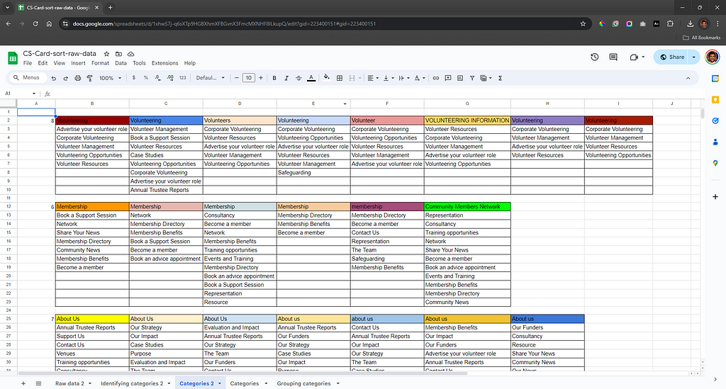
Without proper research, it’s easy to assume users will navigate the site as intended. Community Southwark’s experience shows that users often perceive and categorise content differently than expected. Exercises like card sorting can provide valuable insights into how to structure the site.

The value of a user-centred approach
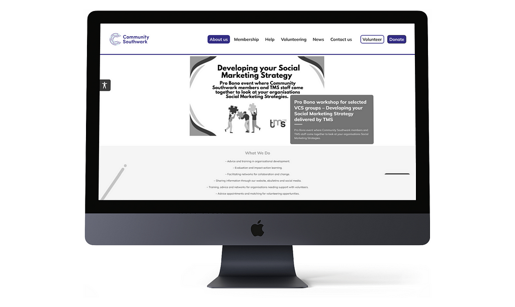
Community Southwark’s ongoing website overhaul is a great example of the power of a user-centred approach. By conducting a card sorting exercise, they gained a deeper understanding of how users categorise and label content. This led to the creation of a new, user-friendly structure that aligns with how people think, improving overall satisfaction. (At the time of writing, the improved navigation is being developed.)
One of the best parts of the process was the internal discussions it sparked. The organisation began rethinking site content, eliminating unnecessary pages, and presenting information more clearly. These healthy debates involved everyone, from top management to frontline staff, challenging old assumptions and inspiring fresh ideas.

Navigation and Architecture: More than just a framework
For designers like me, site navigation and architecture are far more than just a framework — they’re the key to shaping the user experience. While often overlooked, their impact on findability, user satisfaction, and strategic success is undeniable.
As Community Southwark’s experience shows, prioritising navigation and architecture helps create websites that are not only visually appealing but also functional and aligned with user needs.
For any organisation looking to enhance its online presence, investing time and resources into optimising navigation and site architecture is essential. It’s not just a recommendation — it’s a must. Because, after all, first impressions matter.
Enjoyed this?
Check out my other articles on design.
- Your guide to becoming a content designer
- Embracing change with smarter design solutions
- Designing for a better future
I hope you enjoyed this article, and if it helped you out, don’t forget to leave a clap or two or drop a comment. You can connect with me on LinkedIn, Medium and BlueSky.
Mastering website navigation for success was originally published in UX Planet on Medium, where people are continuing the conversation by highlighting and responding to this story.