Restroom experience — a UX Case Study
20 minutes in the restroom of City’s Nişantaşı Shopping Mall in Istanbul
Sure, restroom experience 🙂
In this study, we are having an interesting urinal that is not comfortable to use, a paper towel dispenser that cannot describe itself, a difficult-to-use faucet, and an unhygienic soap dispenser. At the end of the article, we also have a small example from a coffee shop’s restroom.
Expert analysis, secondary research, observation, contextual interviews, and more :))
Enjoy your reading 🚽
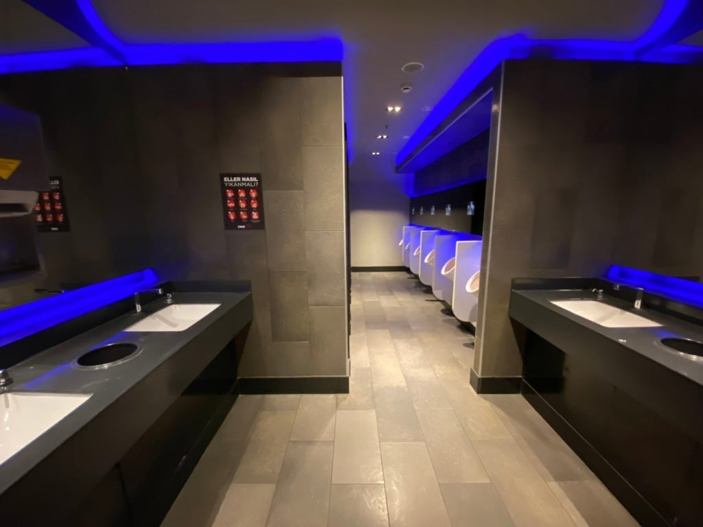
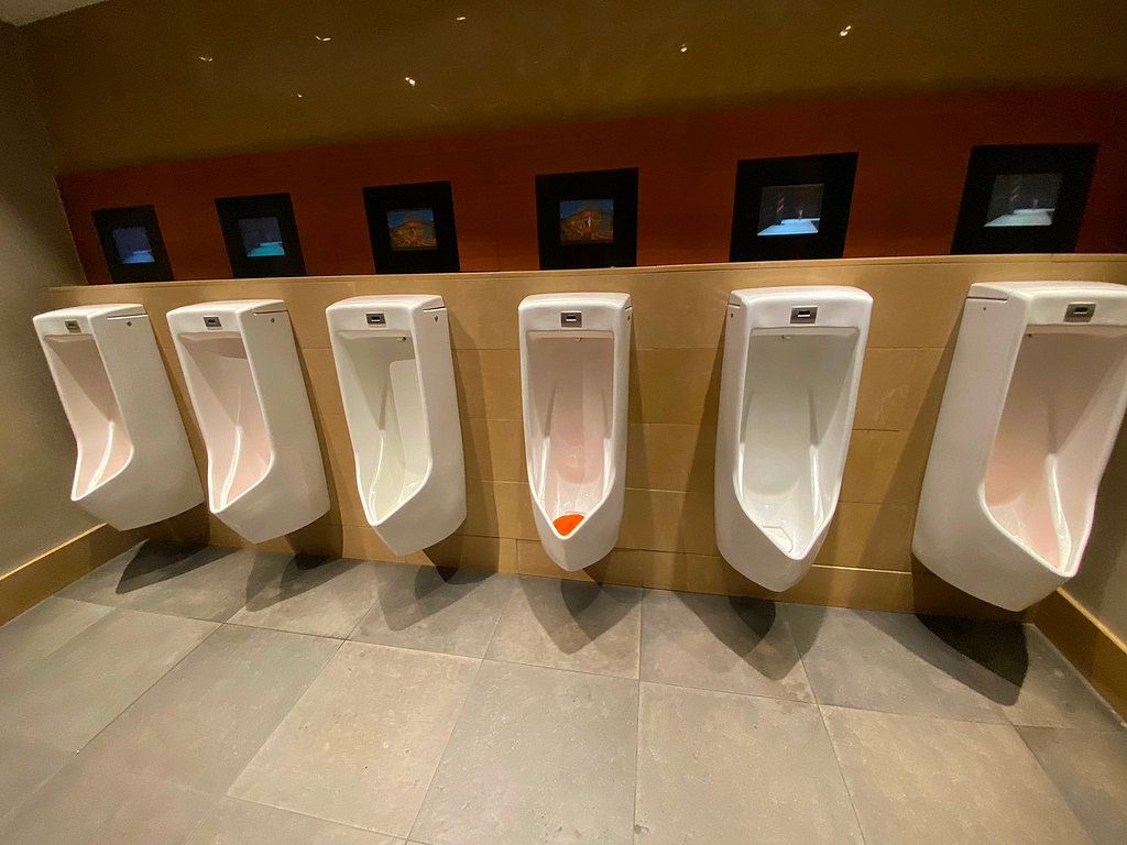
As I went to City’s Mall to watch the movie “Kurak Günler”, I entered the restroom in the cinema section and came across this urinal designed by the designer Ross Lovegrove.

Since it was a design that I had never encountered before, the urinal’s design immediately caught my attention. However, contrary to the curiosity and interest it sparked in me, its use was not comfortable at all.
After this interesting and unpleasant experience, I took a closer look at the restroom, wondering if there was anything else around. It had been recently cleaned, so I didn’t mind spending some time inside 🙂
Lovegrove, for his design created specifically for Istanbul, says the following:
The daily cleansing ritual is an extremely intimate, personal experience. When designing for VitrA, I make an effort to ensure that this experience is as enjoyable as possible.
Urinal
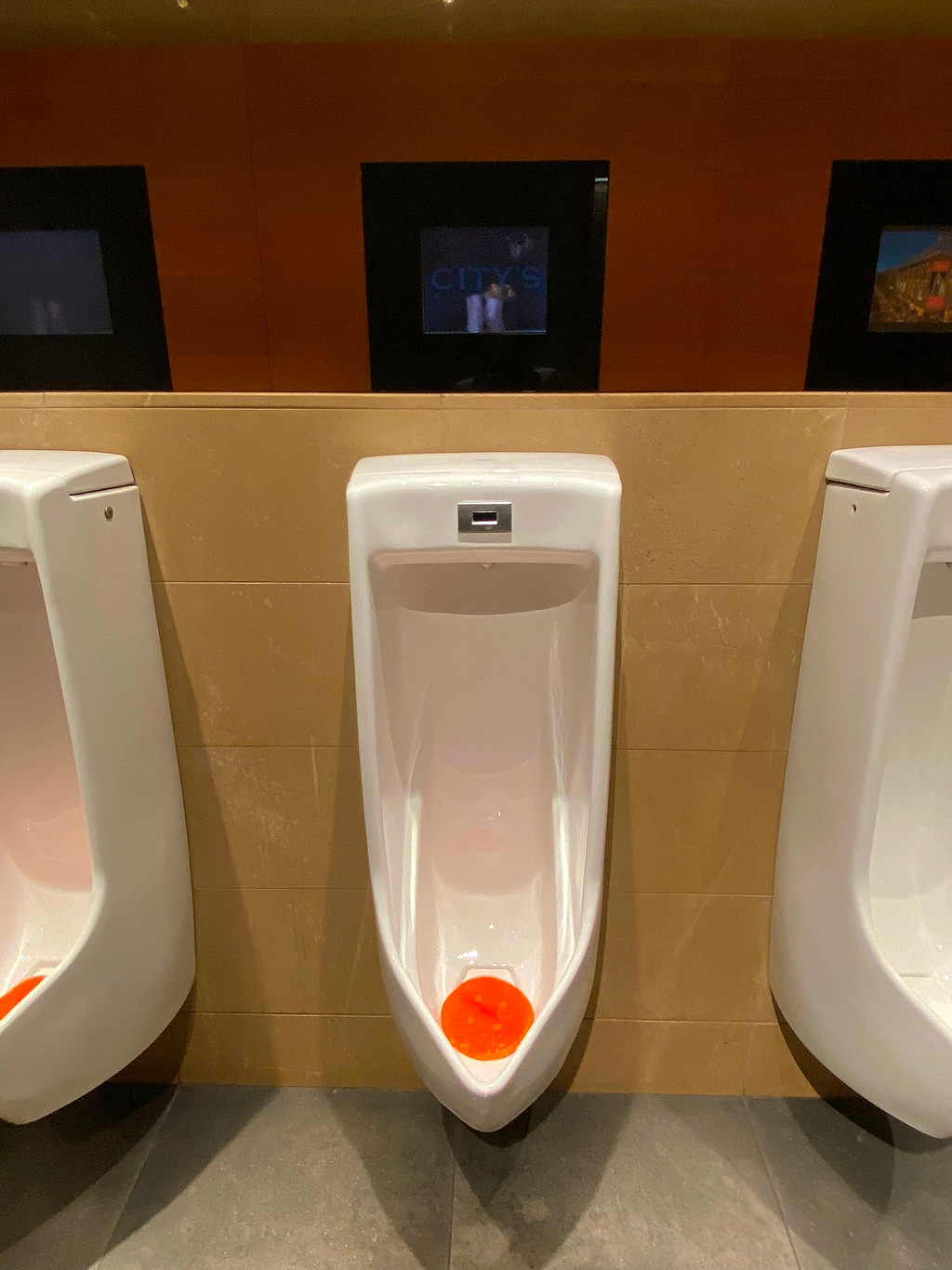
As Lovegrove mentions, during the daily cleansing ritual, the excessively wide design of the urinal obstructs the comfortable performance of the ritual, in other words, urinating comfortably. I have struggled to ensure that my hands and arms do not touch the urinal during the ritual. Until today, I had never experienced such an encounter in any urinal. While the design being hollow adds an aesthetic element, it has significantly reduced the comfort of the ritual.
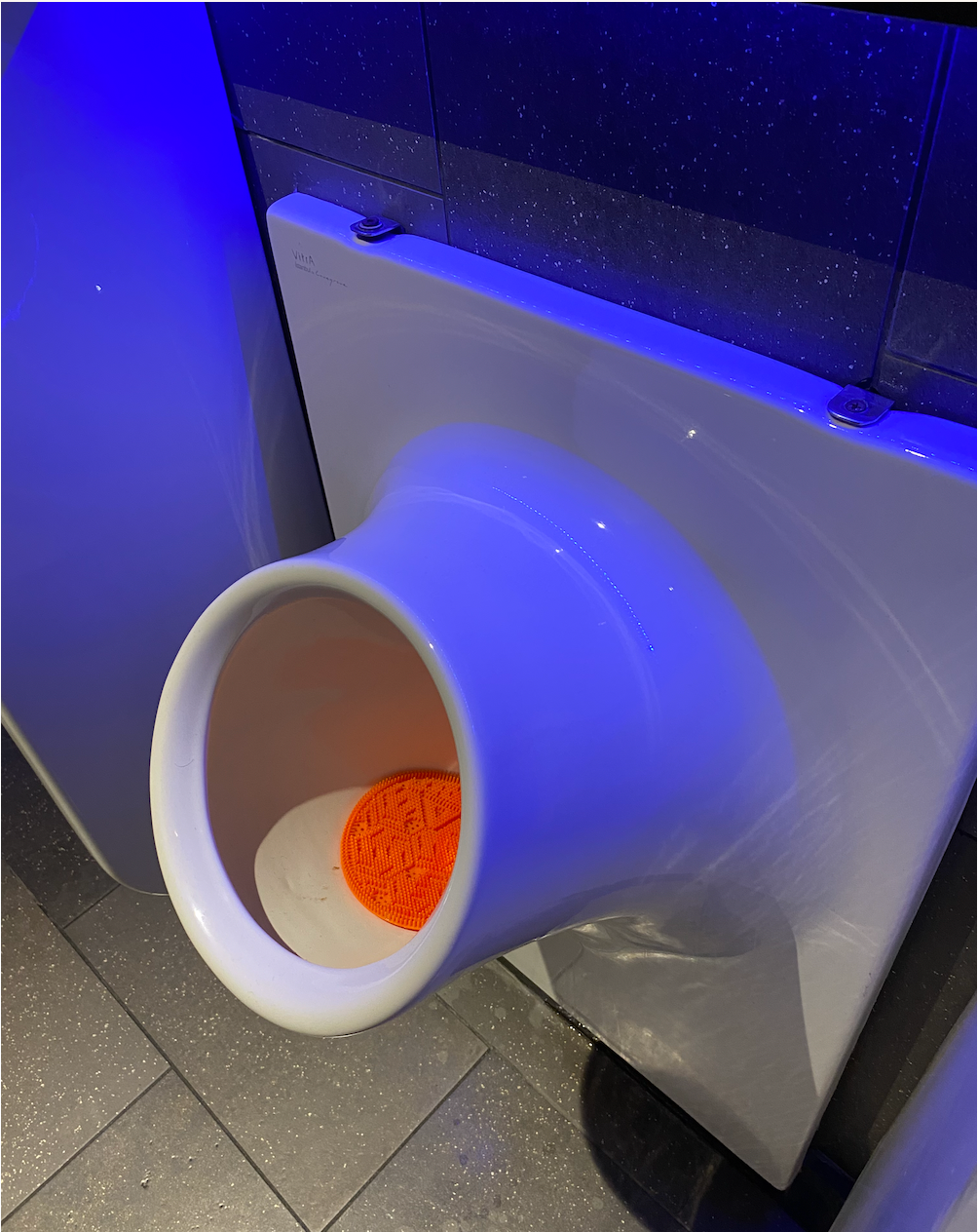
When I examined the urinals on VitrA’s official website, their widths (in mm) are as follows: 300mm, 310mm, 315mm, 335mm, and only 1 model is 385mm, and only 1 model is 400mm.
The urinal being discussed in this study has a width of 500mm. It is, in fact, the widest urinal among the dozens of models available on the internet. With this information, I am even more confident that I have correctly identified the focal point.
I also examined the urinals that have received the iF Design award from the very beginning. I looked at the urinals produced by designers and brands, and I couldn’t find another urinal of this width.
In addition, I watched all the promotional videos of the “Istanbul by Lovegrove” series, and I didn’t see the relevant urinal in any of the videos. This also caught my attention.
Urinal and separator
In Vitra’s own website promotional images, there is no separator between the urinals. In reality, when the design is implemented, there is a separator. Moreover, the design of the separator is not attributed to the person who designed the product.
We can often see examples without separators in many foreign countries. However, in Turkey, I rarely come across such examples.
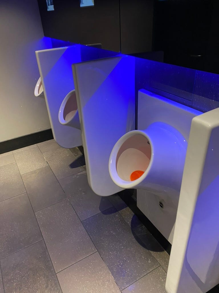
If the designer knew that the product would be implemented differently due to technical and cultural constraints, they would act accordingly.
In fact, in our use, a UX Designer or UI Designer, after receiving the outputs from a UX Researcher, could conduct their own small-scale research, try to understand their target audience, and investigate how users interact with existing competitor products, in this case, the urinal experience and usage habits of users. With more information about user experiences and usage patterns, they could create different designs.
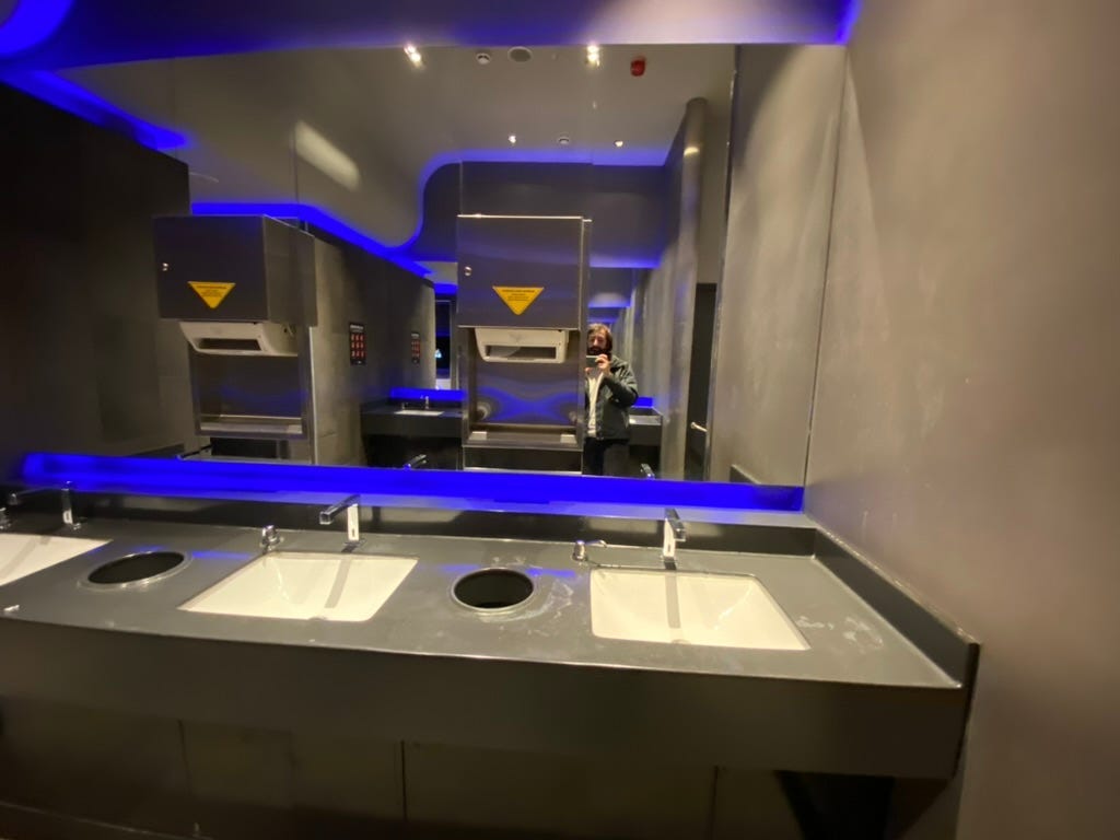
Faucet
When I reach for the faucet to wash my hands, water doesn’t come out. I experience this almost every time (90%), and to avoid this, I first bring my hands to the sensor on any sink to start the flow of water, and then I begin washing my hands. This way, it’s both more reliable and faster.
I checked relevant threads on Ekşi Sözlük. It’s possible to find plenty of entries discussing this topic. Ekşi Sözlük is like a reddit in Turkey. If you have translator you can have a look these
Papel towel dispenser
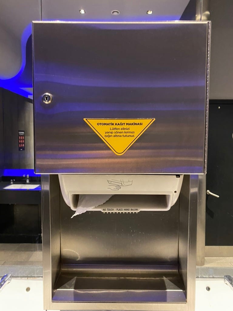
The machine has the following written on it: ‘Please place your hand under the flashing red light.’ However, I noticed two points here:
1- Before taking the paper, the light isn’t already flashing. After I show my hand to the sensor and take the paper, the light appears for half a second and then disappears.
2- The English instructions and Turkish instructions are different. In English, it says to place our hand under the part of the machine that dispenses paper, while in Turkish, it says to place our hand under the circular red light on the right.
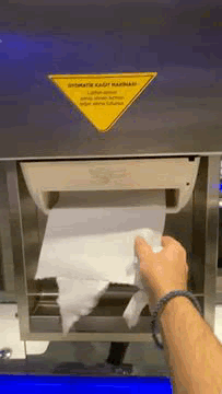
In these machines, there are often warnings like ‘Pull the paper to the left’ or ‘Pull the paper to the right.’ In this case, there was no such indication (perhaps it’s not noticeable), and I didn’t understand which way to pull, so I had to guess and force it.
Additionally, I observed that, as in the image above and in the GIF, the papers always end up crooked in these machines in other restrooms as well. If there is a restroom layout where the side the machine instructs you to pull towards is the opposite, that’s another issue, of course 🙂
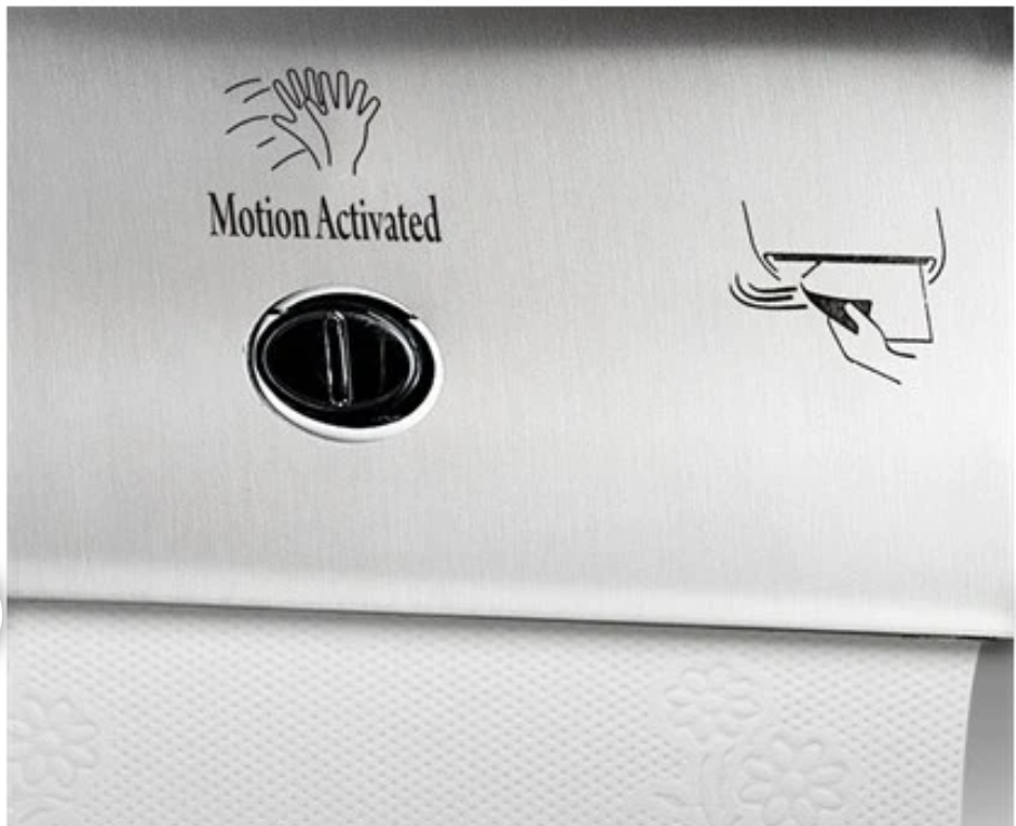
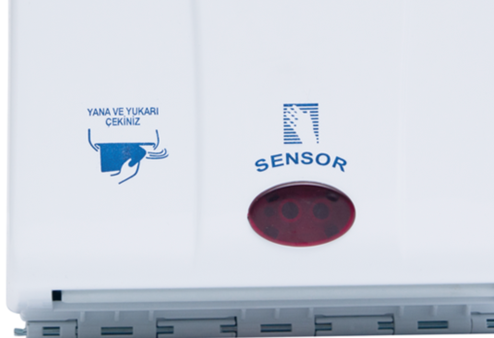
Rulopak brand instructs us to pull from left to right. In the Palex brand, as in the photo on the right, it just says ‘to the side,’ but it doesn’t specify which side, so maybe it doesn’t matter. According to the image, we should pull from right to left and upwards.
In the details you’ll read in the next section below, I observed that all 8 people pulled the paper with their right hand. Regardless of where the machine was located (I assume none of them were left-handed), they pulled the paper in the direction of their dominant hand.
Another behavior that caught my attention is that if the adjacent sink is occupied, people will uncomfortably take the paper. If the side is empty, they will go to the front of the machine to take it. I believe that in order to avoid such congestion, many restrooms now have paper towel dispensers located at a single point near the door.
Observation and contextual interview
To examine the behavior of using the faucet and paper towel dispenser, I observed 8 people by pretending to fix my hair or adjust my appearance in front of the sink. I can’t say whether the number is small or large, but I can say that this was the extent of resources I could allocate for research 🙂
Faucet
- 3 people, like me, initially thought the water wasn’t running.
- 5 people washed their hands as if everything was normal.
I pretended not to understand how the water flows successfully, and I said to 2 people who washed their hands, ‘I’m sorry, I think this faucet is broken, how does it work?’
They said:
“The sensor is like this, just hold your hand under it, and the water flows automatically.”
and
“Haha, I couldn’t figure it out the first time either. Movie ticket prices have gone up, and we don’t go to the cinema that often, but I haven’t forgotten how this faucet works. Hehe, look, the sensor is right here.”
Here’s another example from a different restroom:
Soap
To wash dirty hands, you need soap, but when you press the soap, your hands are already dirty. You know that the person before you has touched that area after leaving the restroom. You use a special and luxurious design, but even though we wash our hands afterwards, we have to touch a dirty area. After that, we wash the area we touched for a longer time, etc
The issue here is a long-standing and well-known problem, of course. Sensor-activated soaps had started to be a bit of a solution post-pandemic, but as we can see, the old practice continues.
While our product’s onboarding is smooth, the initial impression is good, and the design is fancy, suddenly asking for the user’s personal information seems like a situation that lacks meaning 🙂
One week after
About a week after starting this research, I revisited the same shopping mall. This time, not in the cinema area but in the regular floor restroom. When I entered, I encountered a scene that directly responded to my comment about the lack of urinals without separators in Turkey. There was a different design, but I can say that this design did not serve the same purpose as the separator.
When I searched the model’s dimensions online, I found out that it’s 410mm. Quite reasonable 🙂
Understanding the target audience well
I noticed something in the restroom of another coffee shop in Nişantaşı. Men have pushed the restroom door from the door instead of using the door handle, and the paint on the door is now worn.
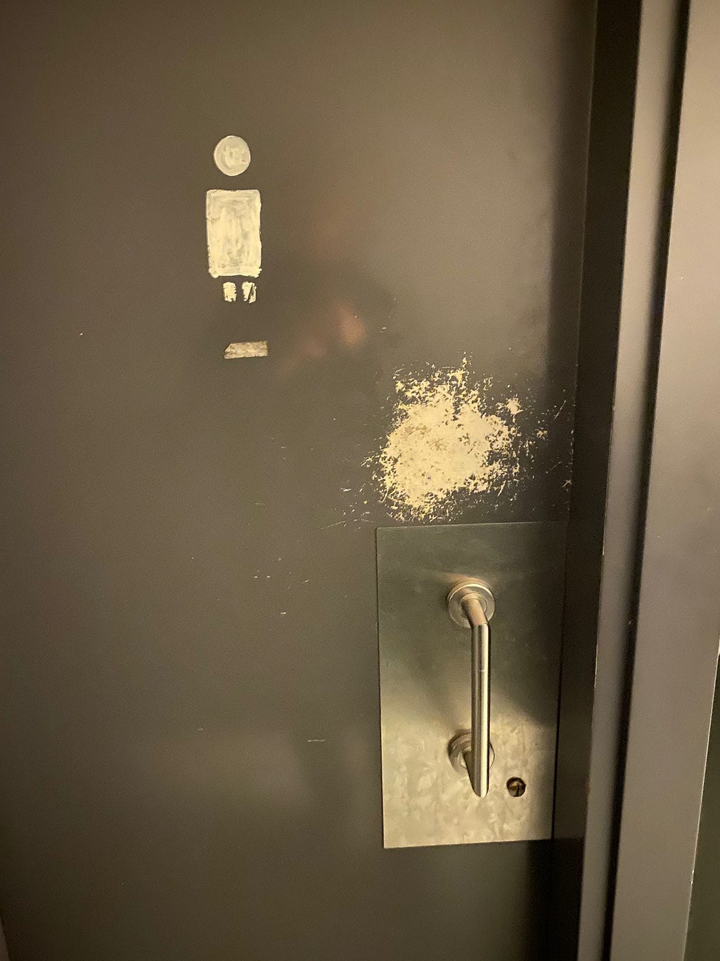
When designing the product, understanding our target audience — their behaviors, capabilities, and thoughts — is crucial.
The door is very heavy, and pushing it open with your finger through the handle is difficult and uncomfortable. It doesn’t open without gripping the handle with your palm, but that’s not hygienic either.
In this situation, the designed product is not used as intended. These experiences can have a significant impact, both financially and emotionally, on you or your business 🙂
Concluding…
There can be many efforts to enhance the restroom experience. I just wanted to brainstorm a bit, focusing on urinals and this specific example that emerged instantly. Benchmarking by visiting various restrooms is an option, although I haven’t done it. The subject is, fundamentally, very extensive, genuinely real, and significant.
English UX Articles & Cases – Kerem Can Demirtas
You can feel free to reach out to me on LinkedIn whenever you’d like.
![]()
Restroom experience — a UX Case Study was originally published in UX Planet on Medium, where people are continuing the conversation by highlighting and responding to this story.