
Splash screen is the first screen that users see when they launch a mobile app. Despite the splash screen being displayed only for a few seconds, it immediately forms a first impression about the product.
This article shares 3 essential tips for designing an effective splash screen.
1. Keep it simple
Don’t overcrowd the screen with information or visuals. Because the screen will be displayed a few seconds, there is a low chance that the user will read anything longer than a word. For the same reason, it is not recommended to use complex images.
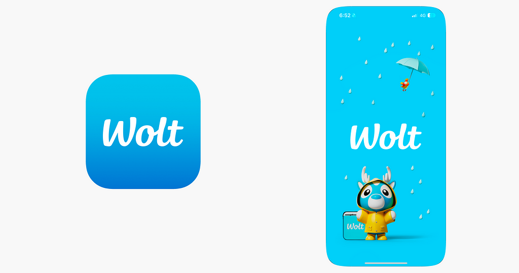
Ideally, the screen should have only your product name or (and) logo displayed on top of a single-colored background. You can use your brand colors to reinforce brand recognition.
When designing your splash screen, think of it as a continuation of your app icon. Once users tap on the app icon, it will be more natural for them to see a screen designed in the same visual style (colors, typography, illustrations).
2. Use subtle animation
Animation should support the keep-it-simple approach. Subtle animations can enhance visual appeal without overwhelming the user.
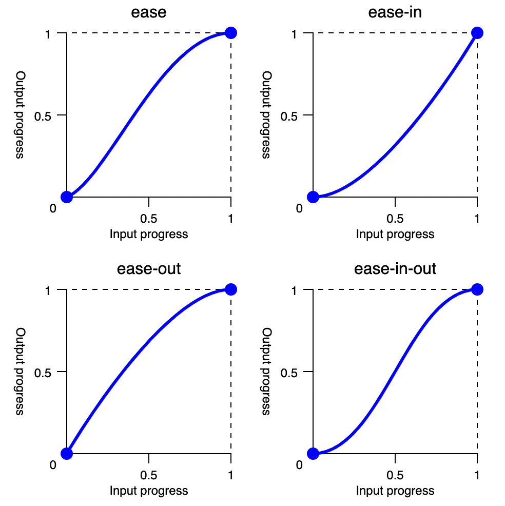
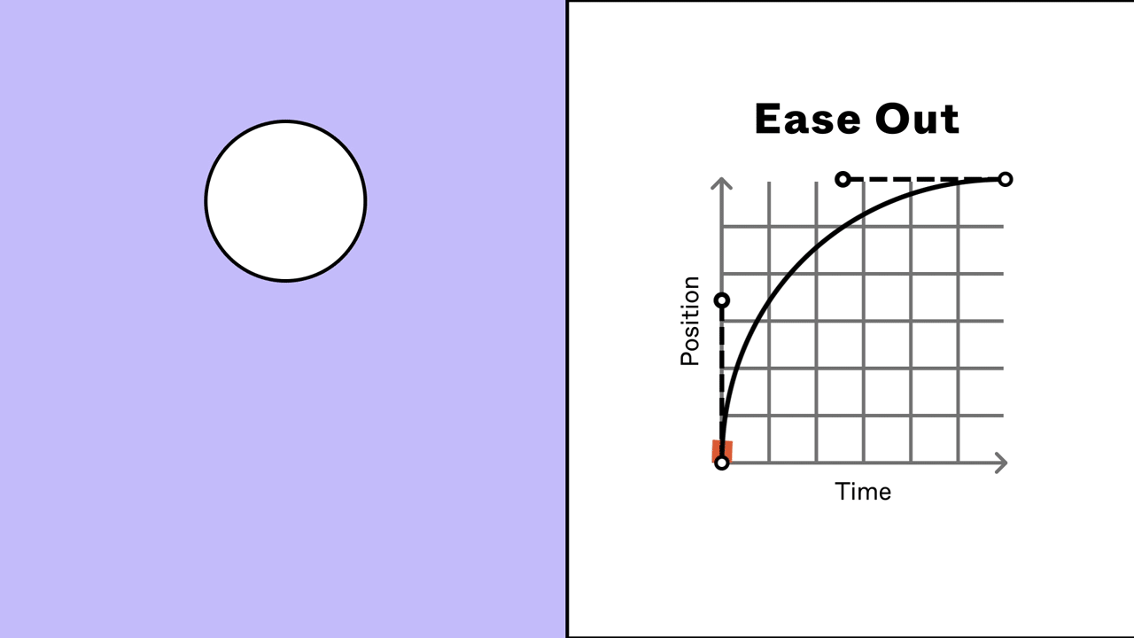
Typically, an Ease-in-out animation curve works best for effects and transitions because it provides a smooth start and end.
One critical area where you need to refine animation is the transition between the splash screen and the home screen of your app. You need to make the transition from the splash screen to the main interface seamless. You can use fade-in or slide animations. These animations are very intuitive, visually pleasing, and easy to describe for developers.
If you want to be more creative, you can use zoom-in transition like the one that Twitter used.

Here is a quick tutorial on how to create a smooth transition between two screen states in Figma.
3. Don’t make user wait for app to load
It’s not recommended to use a splash screen as a loading screen for your app. While a splash screen can mitigate some wait time during app loading, it shouldn’t be used as a full replacement for a loading state. As was mentioned before, the splash screen forms a first impression about your app, and you don’t want to create an impression of a slow app right from the very beginning.
Most of the time, it is better to load content along the way, either in the background so the user won’t notice the loading state or using techniques like lazy loading to make loading state less frustrating.
Want To Master Product Design?
Try Interaction Design Foundation. It offers online design courses that cover the entire spectrum of product design, from foundational to advanced level.
This post contains affiliate link(s)
![]()
Splash Screen Design Best Practices was originally published in UX Planet on Medium, where people are continuing the conversation by highlighting and responding to this story.