Build Empathy Through The Data Storytelling
We’ve been hearing more and more about the importance of soft skills for designers. Imagine this: we spend hours brainstorming, gathering and analyzing information, then we run some workshops, create user flows, test and validate our hypothesis. Finally, we sit down to build the interface, and now it’s time to show it off! You’re sitting in the meeting with your stakeholders or clients, looking at the screen, and the phrase comes out: “The designs are done! How do you like them?”. Of course, after saying this, you invite feedback, which is likely to demotivate you and cause you to spend many more hours on other conversations. Things could have been different, tell them the whole story!
I. What Is Data Storytelling In a Nutshell?

I’ll admit it: I recently had a job interview. It was a nice job in a good and well-known company. I went through all the steps. The head of design there added me on LinkedIn, and we even talked a bit outside the interview. Everything went great, but… As a result, not everyone said “yes” to me and I got a rejection.
The processes in this company are interesting and not standard. The recruiter didn’t send me a standard rejection letter, but gave me detailed feedback. And it was that because this position is high level, it requires a person who is not only a good designer, manager, and communicator. It also involves the responsibility of representing the company to the outside world, so on top of everything else you have to have the ability to be a good storyteller. And in their opinion, I didn’t impress them as someone who had mastered that skill. I agree, I’m probably much better at writing stories than telling them 🤭
So what is data storytelling? It is the concept of building a compelling narrative based on complex data and analytics that help tell your story and influence and inform a particular audience.
At its core, data storytelling is about finding the hidden gems in data and presenting them in a way that is both intellectually engaging and emotionally resonant. It’s not just about charts and graphs, but about weaving a narrative that connects the dots and brings the data to life.
II. Why Is It So Important?
Of course, the importance of this skill doesn’t only arise because I got rejected from my new job 😄 So let’s see what different sources tell us about this skill.
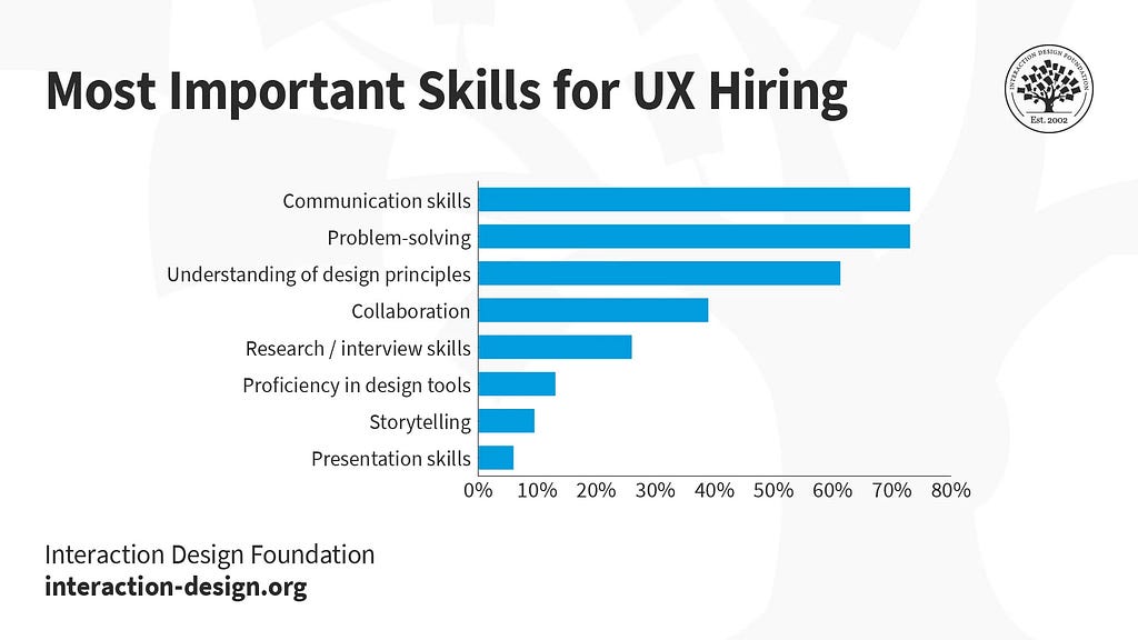
Interaction Design Foundation (IxDF) — one of the leading companies we often turn to for theoretical background, tells us that storytelling skills are as critical as design craft skills and tools knowledge. And communication skills come out on top.

Through storytelling you can build empathy.
And if you dig deeper, you’ll inevitably find tons of evidence to support this statement, in the form of “Top 5/10/20 Essential Skills for Designers” and the best learning platforms that offer courses to gain these very skills.
So there’s no doubt that data storytelling skills are becoming critical for designers today. And there are several reasons why:
Make data-driven decisions: Designers regularly need to make decisions based on data, whether it’s choosing a color palette that will resonate with their target audience or deciding which features to include in a new product. By being able to interpret and communicate data effectively, designers can make more informed and effective decisions.
Build bridges between teams: With strong data storytelling skills, designers can effectively communicate with these teammates, understand their insights, and incorporate them into their work.
Tell the story of a design: Design is all about storytelling, and data can play a key role in that story. By incorporating data into their designs, designers can create more compelling and engaging experiences for their users. For example, a designer might use data to show the impact of a new product on a community or to illustrate the benefits of a new feature.
Create more effective designs: By understanding how to use data to inform their designs, designers can create more effective and impactful work. This can include using data to identify user pain points and design solutions that address them, or using data to understand user behavior and design interfaces that are more intuitive and easier to use.
III. Practical Tips To Gain The Skill

Here I offer the resources that I have found useful. We can think of this as a kind of entry point.
- The first book everyone recommends is Effective Data Storytelling by Brent Dykes. I read it very quickly because it’s easy flows like a mountain river (of course, since it’s about data storytelling!) and is surprisingly practical.
- And if you’re not sure if you want to buy the book, here’s a half-hour interview with the author. It’s a bit sluggish (he writes better), but insightful nonetheless.
- You can also find some additional inspiration in this amazing TEDx talk given by a medical researcher.
To become an effective data storyteller, it’s important to understand the principles of good storytelling, such as creating a clear narrative arc, identifying key characters and events, and incorporating elements of suspense and resolution. You also need to have a solid understanding of your data and how to effectively visualize it to highlight key insights. To reach this level, you can benefit from Ellen Lupton’s materials:
4. A course called “Storytelling Through Visual Design: A Practical Guide” by Ellen Lupton.
5. And here’s a great video of her teaching about how people experience a graphic illustration, a workflow, or a retail environment. She teaches us how concepts such as the narrative arc, the hero’s journey, and the rule of three drive emotional responses.
At the heart of storytelling in UX is the ability to create narratives that help us better understand our users and design products that truly meet their needs. By looking at product design through the lens of user motivations and pain points, we can create experiences that resonate on an emotional level.
When a designer frames a problem in a narrative context, the primary concern shifts to the underlying idea or message that is being communicated. This core concept, known in narrative terms as the controlling idea, often proves to be the most daunting aspect of the process. Complex themes must be distilled and refined into a simpler yet profound essence.
The storyteller’s primary goal is to engage the user in the process in the most compelling way possible. This climactic moment occurs within the narrative arc of a design story. Presenting a variety of solutions to a single problem facilitates a deeper understanding of narrative techniques.
As a framework for crafting your design story, there are several foundational pillars:
- Who is your idea it for?
- How do you call it?
- What is the solution?
- What people need it?
- What evidence do you have?
- What are your next steps?
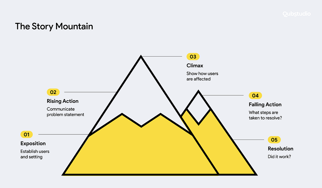
And here’s a visualization of how to come up with a plot for your story based on the data and information you want to tell.

And here I can close with a short and inspiring video by Alex Cook, a designer at Google, in which he reveals all the main aspects of creating a good narrative in your design practice.
Okay, and one more thing. It’s kind of funny, but also helpful! The next time you give a presentation with research analysis, try to imagine yourself as a grandparent 👨🦳👵 telling a story to your grandchildren. The moral of the story is your data, everything else is a story through which the moral can be learned.
IV. Examples of Great Data Stories

- The image below shows the statistics of mentions of human body parts in the literature, in the context of descriptions of women and men.
A nice and simple visualization makes dry statistics easier to understand and much more interesting. - And here you have a true masterpiece of storytelling that combines math, data analysis, design, and, most importantly, wine. In this story, you’ll meet sloths, play with the chemical composition of wine, and learn a lot of interesting things that we would never have noticed if it weren’t for the story that wraps all the data.
- Some data you’d probably ignore if it weren’t wrapped in a compelling story and supported by great visuals. This story reveals insights about inclusive leadership to increase diversity and employee engagement.
- What Africa will look like in 100 years by The Telegraph
Using data storytelling, they explore the potential transformations that Africa could undergo in the next century. While this provides an exciting and thought-provoking glimpse into the future, the extensive timeline requires a significant amount of data. To overcome this challenge, they offer clear visual representations to explain the data. - Counting Happiness and Where it Comes From
This is an excellent demonstration of exploratory data storytelling, using a large data set as a narrative foundation. With 10,000 participants each sharing ten recent moments of happiness, the creation of the Happy Database collected 100,000 responses. The author broke down this data into clusters of moments and described the sources of happiness by analyzing sentence fragments.
Indeed, storytelling is a critical skill for all of us designers today. And in this post, I have gathered the essentials for you and made it as easy and quick as possible to learn the basics. Well, good luck creating your new stories, folks!
Thank you for reading!
If you found this or any of my articles useful, you can support me on my Substack or by buying me a coffee 🤗
Storytelling For Designers was originally published in UX Planet on Medium, where people are continuing the conversation by highlighting and responding to this story.