
It’s time for the annual “Best UX Bites of The Year” breakdown. It’s like the Oscars, but actually watchable.
What is a UX Bite I hear you ask?
It’s a small moment of UX.
I post them daily on Built for Mars, and email them weekly to 38,000 product teams.
So I’ve picked 10 of the most popular filters, covering different flows, psychology, impacts and UI components.
Without further ado, here’s the class of 2024.
#1 🏆 Best Onboarding Idea
Category: Flow → Onboarding
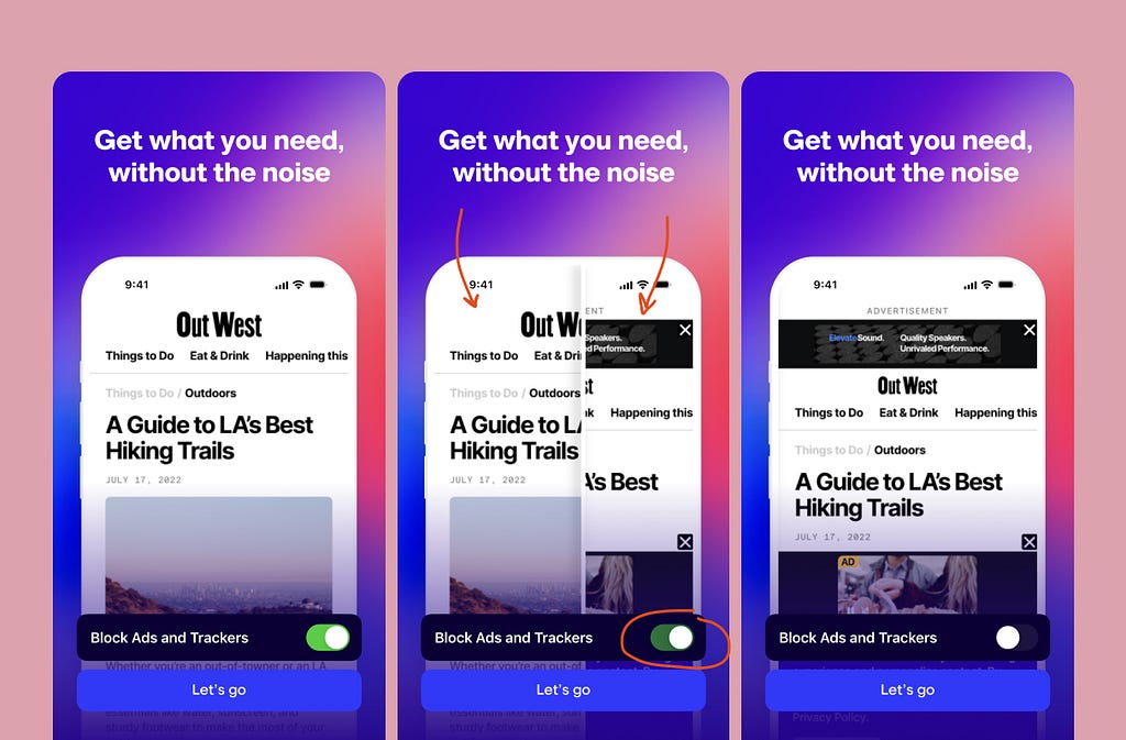
Arc’s DIY Toggle
During onboarding, Arc will encourage you to toggle adverts on a webpage on and off, to demonstrate the difference in experience (and the value they’re adding).
#2 🏆 Best Conversion Trick
Category: Flow → Upselling
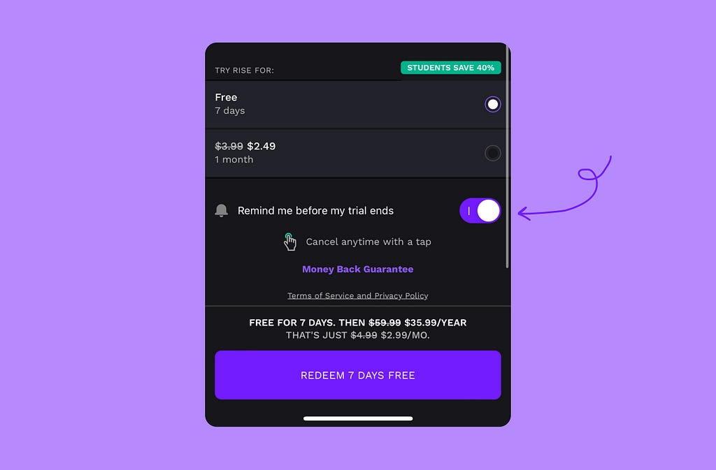
Rise’s “remind me” toggle
During sign up, users can opt in to be reminded before the trial ends — reassuring them that they won’t forget.
#3 🏆 Baskets & Checkout
Category: Flow → Baskets & Checkouts
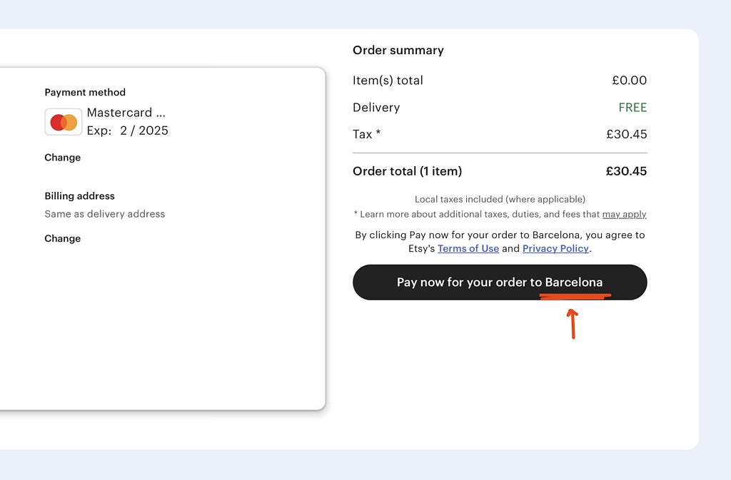
Etsy’s dynamic CTA
When placing an order with Etsy, the final CTA will dynamically show where you’re sending the item to.
#4 🏆 Pure User Delight
Category: Psychology → User Delight
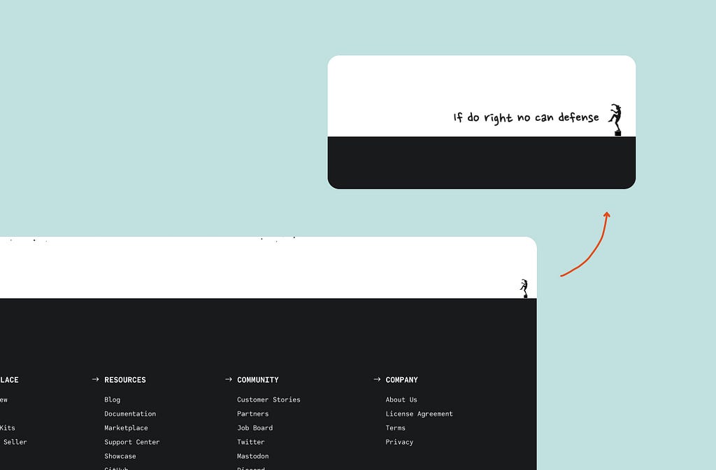
Statamic’s Karate Kid
Statamic have an interactive Karate Kid figure above the footer.
It shows a message and plays the sound of Mister Miyagi saying “if do right no can defence”.
#5 🏆 Best use of Framing
Category: Psychology → Framing
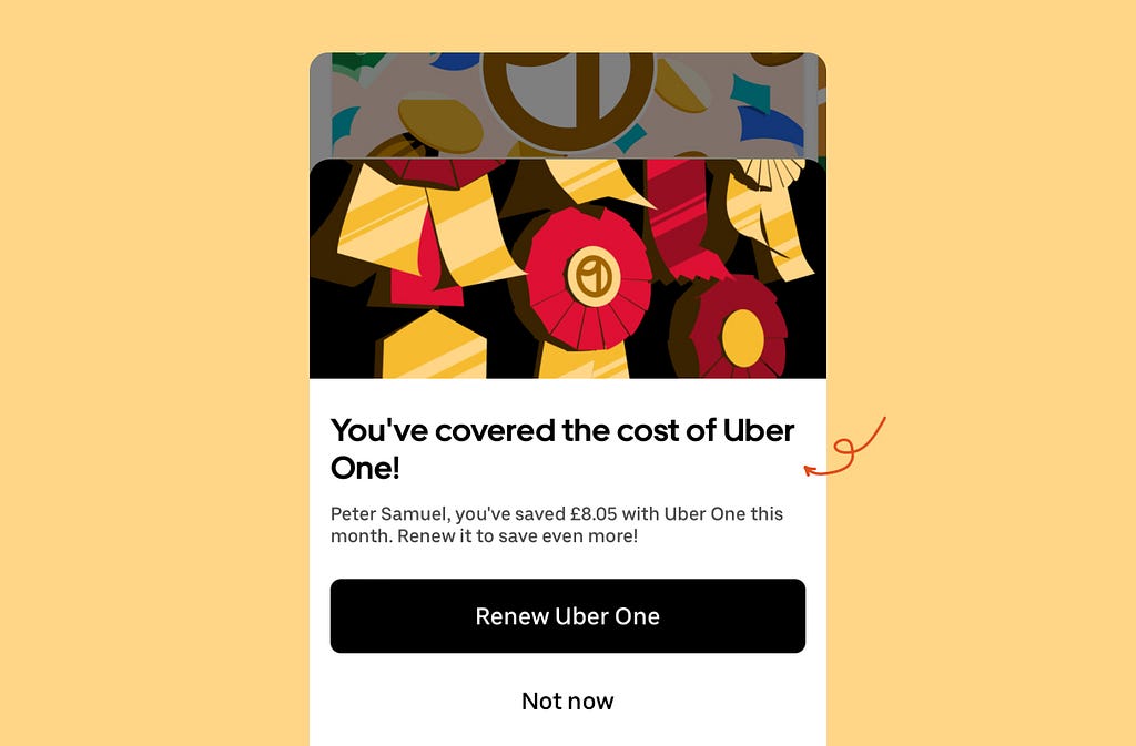
Uber framing your value
Uber will take a moment to celebrate when you’ve saved more money through Uber One, than the monthly cost of the subscription.
#6 🏆 Gamification
Category: Psychology → Gamification
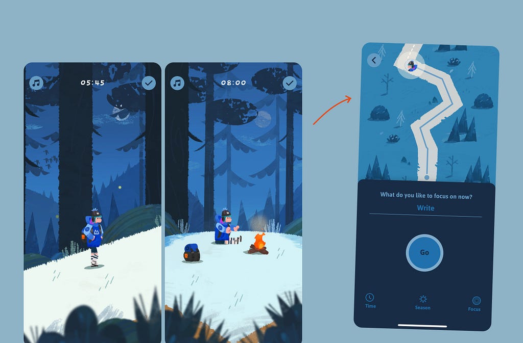
Focus Traveller’s hiking
Focus Traveller is a focus app where the user’s hero hikes a trail.
The longer you focus, the further they walk. When the timer is paused, they take a break by a bonfire.
And the longer you focus, you’ll unlock “gear” for your hiker hero.
#7 🏆 Best Easter Egg
Category: UI Component → Easter Egg
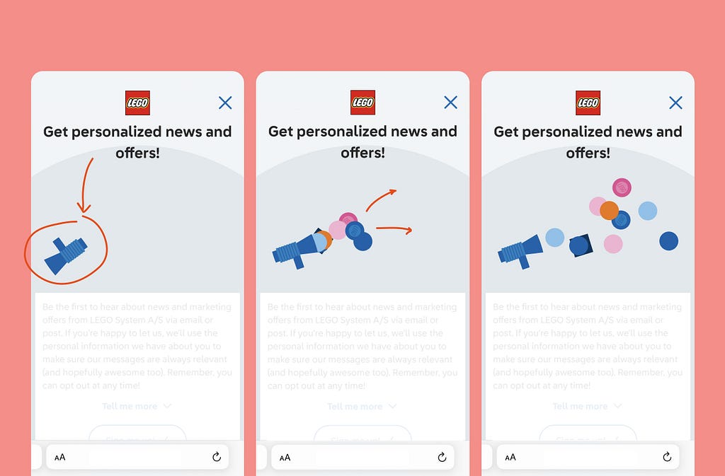
Lego’s interactive blaster
While asking you to opt in to receive offers, the Lego store shows a toy megaphone that if you tap, will shoot out Lego bricks.
#8 🏆 Avoiding Churn
Category: Impact → Churn
Canva’s cancellation screen
If you go to cancel Canva, they’ll frame how good your current deal is.
Plus, they’ll leverage loss aversion by listing the features that your team are using (but would lose access to).

#9 🏆 Most Motivating
Category: Impact → Effort & Motivation
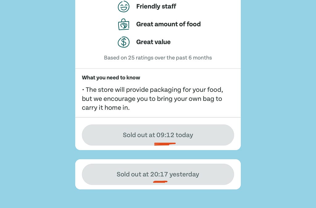
Too Good To Go’s CTA
Once a daily surprise bag is out of stock, Too Good To Go will dynamically display exactly when it sold out.
#10 🏆 Nudging Purchases
Category: Impact → Purchases
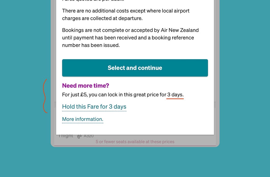
Air New Zealand’s “lock in”
Air New Zealand allows you to hold the price of a fare for a small fee.
This frames the cost of losing that flight, and offers a lower commitment way of proceeding.
And there we go.
I hope you had your notepads out.
If you enjoyed these, there are more than 800 of them on Built for Mars.
I’ll continue to hunt them.
See you in 2025.
✌️
🏆 The 10 Best Moments of UX (2024) was originally published in UX Planet on Medium, where people are continuing the conversation by highlighting and responding to this story.