
Sidebars in user interfaces have always attracted my attention in terms of research and potential for improving user experience. They are one of the most popular components of any modern web application, helping the user navigate the application by organizing and presenting content and features in a structured and logical manner, implementing the principles of information architecture (IA).
While researching many sidebars in popular web applications and designing them in different digital projects, I began to notice recurring patterns and techniques used in their design that were well received by users and contributed to their engagement. The accumulated knowledge and results of my own research in this area inspired me to write this article, where I would like to share best practices in designing sidebars that improve usability.
Why sidebar design matters
Sidebars are undoubtedly one of the most important navigation tools for users, and our task as designers is to help users access key features quickly and conveniently while keeping the main workspace uncluttered. Given that the structure and information architecture of some applications can be quite extensive and complex, designing a sidebar is undoubtedly a challenge for any designer. However, having clear guidelines in the form of examples and practices that have already proven effective and created positive user experiences provides a solid foundation for designing functional sidebars.
Below I have highlighted important aspects of the importance of sidebars:
- Efficiency: Logically structured sidebars make it much easier for users to navigate through the application, allowing them to perform targeted actions quickly and efficiently, reducing cognitive load.
- Space Optimization: Sidebars take up to approximately 15% of the workspace when expanded and can be collapsed, allowing them to be used efficiently without cluttering the main workspace while still allowing access to features and sections. Users can minimize and maximize them as needed, using them as the primary navigation tool in the application.
- Accessibility: Sidebars are customizable based on individual user preferences, making them universal in use, giving users a choice. Sidebars can change mode, size, customization in terms of structure and organization of information depending on user preferences.
- Consistency: Sidebars offer a convenient and consistent way to organize information, making the interface clear and logical, ensuring a smooth user flow. Well-organized sidebars with a clear structure guarantee efficiency, quick learning and avoidance of possible errors for the user.
- Adaptability and Flexibility: Sidebars provide a solid foundation for future product development by adding new features and sections. The sidebar can grow and improve with the product, providing convenience and functionality for users.
- Clear prioritize user tasks: A well-designed sidebar minimizes distractions, allowing users to focus on their tasks while serving as an effective navigation tool.
By following the best practices outlined in this article, you’ll not only create a functional sidebar but also a design that resonates with your users.
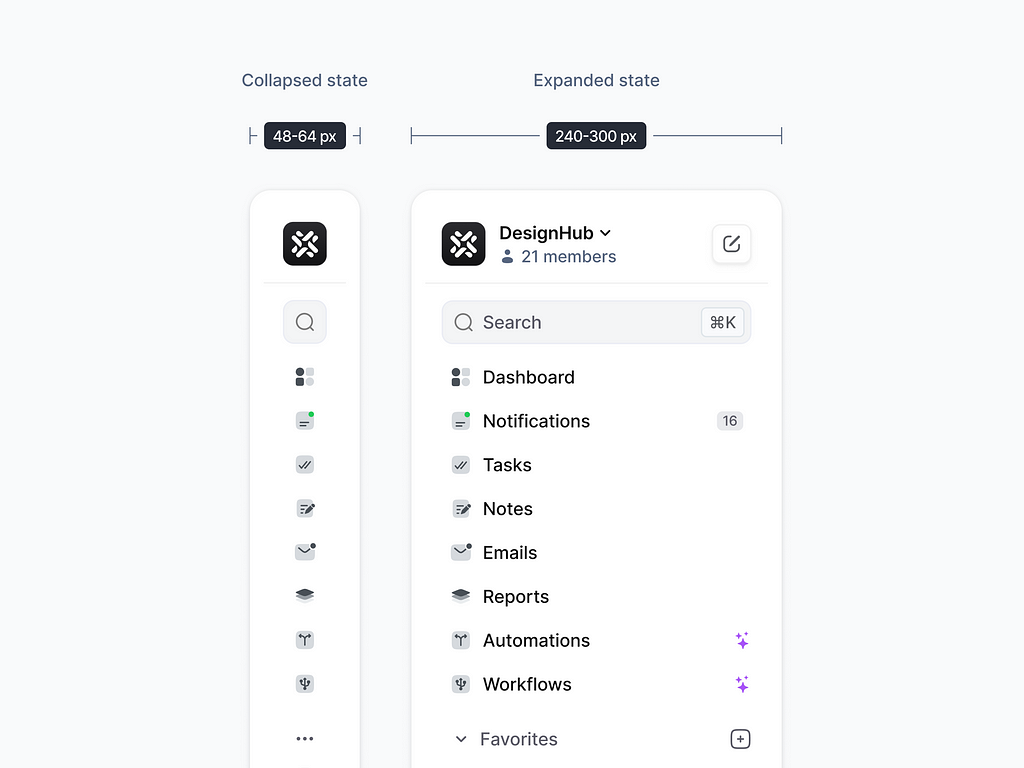
#1 Optimal Sidebar Width
Keep the width functional: 240–300px for expanded mode, 48–64px for collapsed mode. It ensures clarity without taking up too much space.
Actionable Items:
✅ Set the width ranges within the recommended limits: 240–300px for expanded mode, 48–64px for collapsed mode.
✅ Add real content, using clear names for sections and functions, taking into account different lengths of menu item names, space between items, and icon size.
✅ Conduct user testing using the expanded and collapsed views of the sidebar and gather feedback for further improvements.
✅ Optimize the responsiveness of the sidebar for different screen resolutions, and determine the behavior of the sidebar on different devices, including mobile and tablet versions.
✅ Include visual cues in the form of tooltips that are displayed on hover for additional clarity, especially for the collapsed view of the sidebar, where menu items are often displayed as icons.
💡 Pro Tip: Test your sidebar width with real content and users to ensure readability and usability.
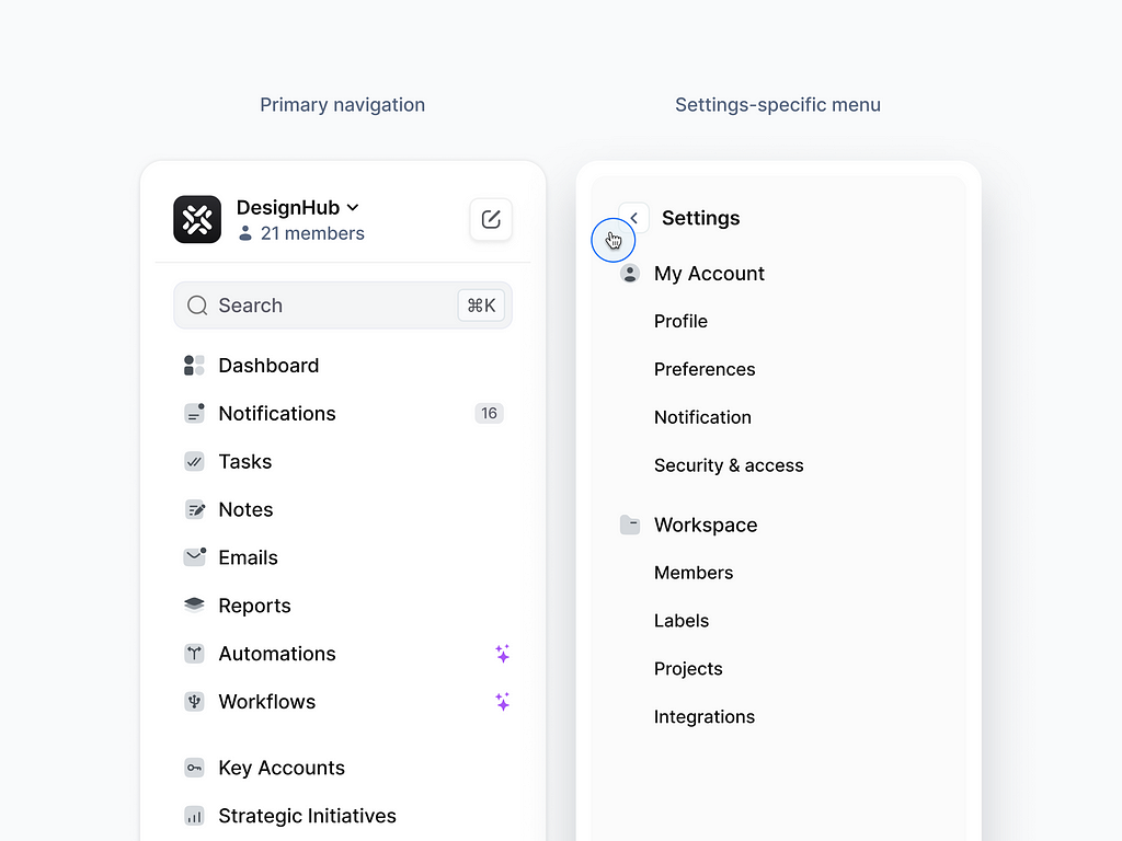
#2 Switch Navigation Dynamically for Context
Adapt the sidebar to display a focused settings menu when users navigate to specific sections like [Settings]. This keeps the interface streamlined and reduces distractions.
Actionable Items:
✅ Analyze the additional sections of the application to determine which ones need additional navigation. Typically, this is the settings section, which may include basic and other settings that require structured and organized navigation.
✅ Create a sidebar design for the selected section, showing the necessary items and subsections, providing logical transitions between the main sidebar and additional ones.
✅ Add a visual difference in the display of the dynamic panel that the user can distinguish where the main panel is and where the additional panel is.
✅ Test usability in different scenarios and determine how intuitive the dynamic sidebar is.
💡 Pro Tip: Always include a “Back to Main Menu” to allow users to easily return to the primary navigation.
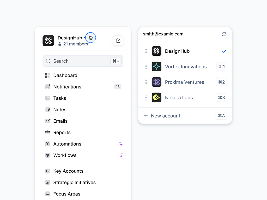
#3 Switch Accounts Easily
Incorporate an account switcher in the sidebar to enable users to toggle seamlessly between multiple company profiles or accounts. It improves efficiency for users managing multiple entities.
Actionable Items:
✅ Add a drop-down list callout item placed next to the account display for easy switching between them.
✅ Ensure the drop-down list displays key account indicators for quick scanning of information (Name, Email, Logo, ID).
✅ Provide an intuitive display of the currently active account.
✅ Make the account switching process a quick and seamless one-click process by providing clear feedback.
✅ Enable the option to add a new account, in case the user does not find the required account in the list.
💡 Pro Tip: Include visual cues like company logos, or color codes to help users identify accounts quickly.
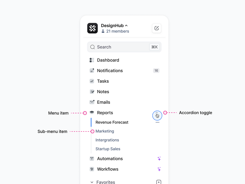
#4 Expandable Sub-Items Add Depth
Enable users to expand or collapse sub-menu items for better hierarchy and cleaner navigation. Use icons (like arrows or chevrons) to indicate if sub-menus can be expanded.
Actionable Items:
✅ Analyze the application’s information architecture to identify logical parent and child sections.
✅ Add intuitive icons (e.g., arrows or chevrons) to indicate the ability to expand or collapse submenus.
✅ Group related elements under their respective parent categories so that the structure reflects the logic of the information architecture.
✅ Limit the depth of nesting to avoid overloading the interface.
✅ Implement smooth transitions for expanding and collapsing submenus to improve visual perception.
💡 Pro Tip: Add a subtle animation (e.g., a smooth slide) when expanding or collapsing sub-menu items.
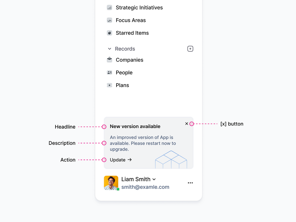
#5 Reserve Space for Updates
Use the bottom section of the sidebar for marketing updates or app announcements — visible yet unobtrusive ensuring it doesn’t disrupt the primary navigation.
Actionable Items:
✅ Reserve space at the bottom of your sidebar specifically for marketing updates, announcements or new features.
✅ Use this space for truly meaningful notifications such as new feature releases, promotions, or important messages.
✅ Make the area clickable so users can open details when they want to.
✅ Test to make sure this area doesn’t interfere with the main navigation and is seen as a useful addition.
💡 Pro Tip: Use visual hierarchy to distinguish updates — smaller font sizes, muted colors, or subtle icons.
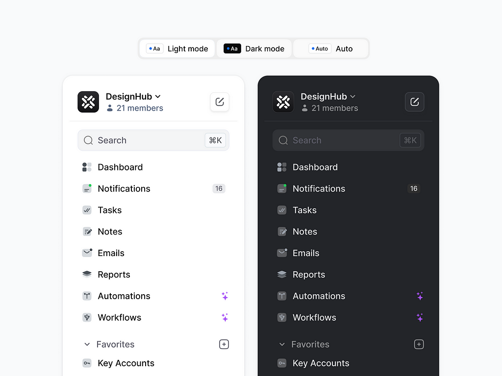
#6 Allow Users to Switch Between Mode
Provide users with the flexibility to toggle between light and dark modes for the sidebar. This feature enhances accessibility, reduces eye strain in low-light environments.
Actionable Items:
✅ Create light and dark color palettes for the sidebar, considering contrast, readability, and visual balance.
✅ Ensure that text, icons, and other elements remain visible in both modes.
✅ Implement the ability to automatically detect the mode based on the user’s system settings.
✅ Ensure that color contrast meets WCAG (Web Content Accessibility Guidelines) requirements.
💡 Pro Tip: Offer a system-default option that adapts to the user’s operating system settings.
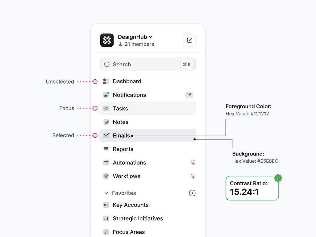
#7 Highlight the active sections of the menu
Use distinct visual cues like a highlighted background, bold text, or an accent color to clearly indicate the active menu item. These cues help to reduce the effort needed to navigate.
Actionable Items:
✅ Use prominent visual markers to highlight the active element with a background, accent color, or underline.
✅ Define clear styles for each menu item state (unselected, selected, focus).
✅ Make the text of the active section bold or change its color to make it eye-catching.
✅ Test to make sure that highlighting active sections is noticeable but not distracting.
✅ Make sure the contrast between text, background and highlighting meets WCAG requirements.
💡 Pro Tip: Conduct accessibility checks to ensure sufficient contrast for users with visual impairments.
#8 Prioritize Essential Information
By organizing elements in sidebar effectively, users can easily access essential functions and navigate seamlessly, without unnecessary clutter or confusion.
Actionable Items:
✅ Highlight the most important features and categories that users use frequently.
✅ Separate sections visually (e.g., with dividers or indents) to make them easier to understand.
✅ Implement the ability to customize the sidebar, allowing users to prioritize and display categories on their own.
💡 Pro Tip: Test with real users to fine-tune the structure.
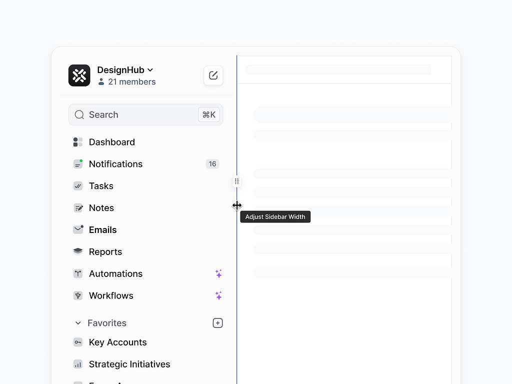
#9 Enable Adjustable Sidebar Width
Allow users to customize the sidebar width manually by dragging a slider bar. This feature enhances flexibility, ensuring the sidebar adapts to individual preferences and varying content needs.
Actionable Items:
✅ Implement the function to change the width of the sidebar by using the slider or dragging the edge of the panel.
✅ Make sure that a visual indicator (e.g. arrow or bar) clearly signals that resizing is possible.
✅ Define a width range to prevent the panel from being overly compressed or stretched.
✅ Customize the elements within the sidebar so that they adapt correctly to width changes (e.g., text is cropped or moved to a new line).
💡 Pro Tip: Use subtle visual feedback, like a guideline or preview, while resizing to improve usability.
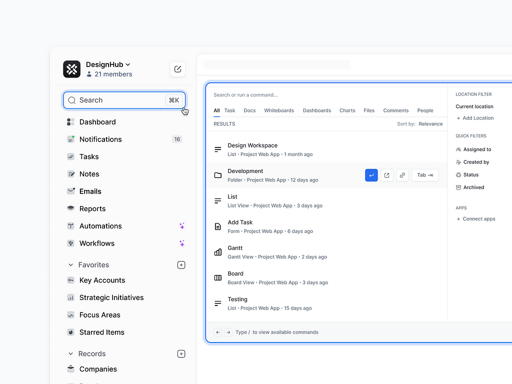
#10 Add a Quick Search Feature
Incorporate a quick search bar within the sidebar to help users find the information they need instantly. A search feature ensures users can navigate complex systems or large datasets efficiently.
Actionable Items:
✅ Place the quick search bar at the top of the sidebar so users can easily find it.
✅ Provide the ability to open a modal window for advanced search with additional filters and parameters.
✅ Provide for the use of keyboard shortcuts to invoke a quick search by displaying them in the search box, this educates the user improving usability.
💡 Pro Tip: Place the search bar at the top of the sidebar for maximum visibility and easy access.
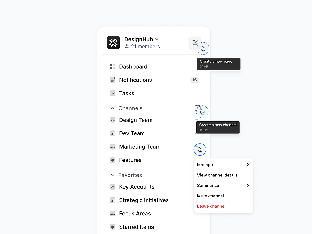
#11 Enable Targeted Actions in the Sidebar
Allow users to perform specific actions directly from the sidebar by adding action buttons. This streamlines workflows and minimizes the need for extra navigation, making the user experience faster.
Actionable Items:
✅ Place buttons next to key elements (like channels, tasks, or pages) so users can perform actions like creating new pages, editing, or managing without having to navigate to other screens.
✅ Apply icons that visually reflect the action (e.g., a “+” icon for create, a “pencil” icon for edit).
✅ Specify hotkeys in tooltips to speed up frequent operations.
✅ Check how easy it is for users to understand button and menu locations and the sequence of actions.
💡 Pro Tip: Ensure the buttons are easily accessible without overwhelming the interface.
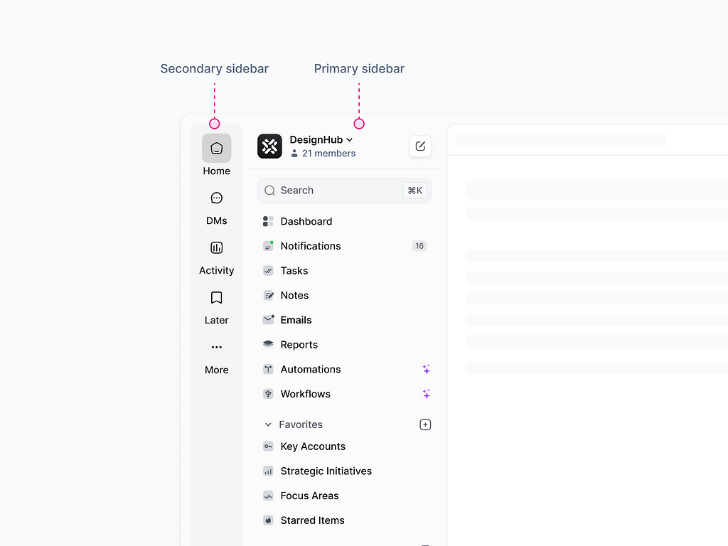
#12 Additional Sidebar for Quick Access
Add a secondary sidebar to provide quick access to favorite tools, frequently used applications, or essential actions. This additional panel helps streamline workflows by keeping critical items easily.
Actionable Items:
✅ Determine which items or features would be most useful in an additional sidebar (e.g., favorite tools, frequently used apps, quick actions).
✅ Position the secondary panel to the left of the main panel, keeping it minimalist and accessible.
✅ Implement the ability to add or remove elements so users can personalize the panel to their needs.
✅ Use small icons or shortcuts to present panel elements to keep the panel visually lightweight.
💡 Pro Tip: Allow users to customize the content of the secondary sidebar based on their workflow.
Conclusion
Sidebars are indispensable and essential components of any modern user interface, helping to structure and organize the information architecture while simplifying access to key features. By applying best practices in sidebar design and adhering to usability principles such as efficiency, learnability, and adaptability, designers can create functional and user-friendly sidebars.
Implementing the recommendations outlined above can significantly enhance user satisfaction and productivity by offering intuitive navigation. These guidelines provide a solid foundation for further exploration and refinement in the pursuit of better solutions for modern user interfaces. It is also crucial to emphasize the importance of testing your ideas, hypotheses, and scenarios with real users to continuously improve design approaches and methodologies.
Thank you for reading, and please tell me. Did you find this article helpful? 🙌
I’d love to hear your thoughts!
- What challenges have you faced while designing sidebars?
- Do you have any additional tips or practices to share?
Drop a note in the comments, I’d love to discuss.
Say hello at 📩 : ux.sergushkin@gmail.com
Visit my Website 🌎: dmitrysergushkin.com
For more inspiration, visit my profiles ✨
Linkedin | Behance | Medium | Layers | Dribbble | Twitter
Best UX Practices for Designing a Sidebar was originally published in UX Planet on Medium, where people are continuing the conversation by highlighting and responding to this story.