The anatomy of a good funnel

Most funnels have the same shape.
Trust me on this — at use-glue.com we’ve helped 32 startups wrestle with conversion and onboarding. I’ve seen the data, stared at the drop-offs, run the experiments. Funnels look different on the surface, but under the hood, they almost always resolve into the same anatomy.
Here’s our take:
Every funnel breaks down into The Bounce, The Slide, and The Catch.
Once you understand this shape, you can spot where things are normal, where they’re broken, and where you should (and shouldn’t) spend your time trying to optimise.
The Bounce
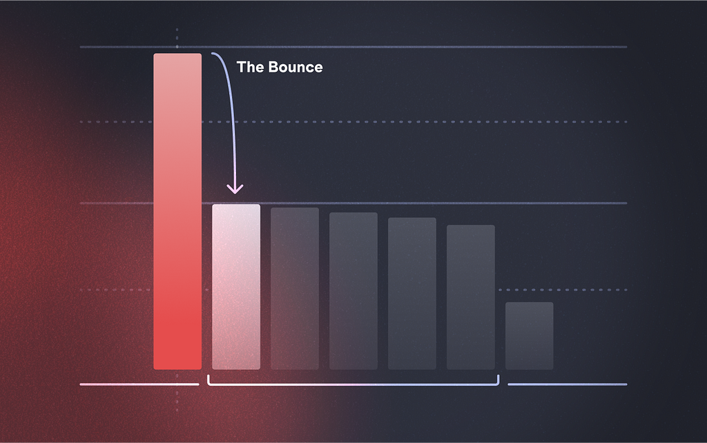
This is the top of the funnel, where people land and instantly leave. That’s usually not a UX problem — it’s a lead quality problem.
But here’s the nuance: intent.
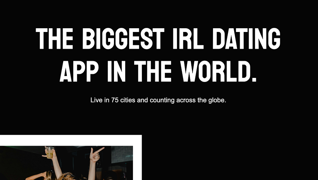
A good example is these two message positions for GetThursday.com dating app’s website:
Message A:
Message B:

A brand promise like Message A pulls in lots of traffic but little intent.
A sharper call like Message B drives users into a specific action.
That’s why bounce is often more about your marketing than your UX. Brand sets expectations, performance marketing sets intent. (If you’re curious about that rabbit hole, this explainer is a good place to start.)
If your bounce is ugly, stop fiddling with button colors. Fix your targeting and sharpen the intent.
The Slide
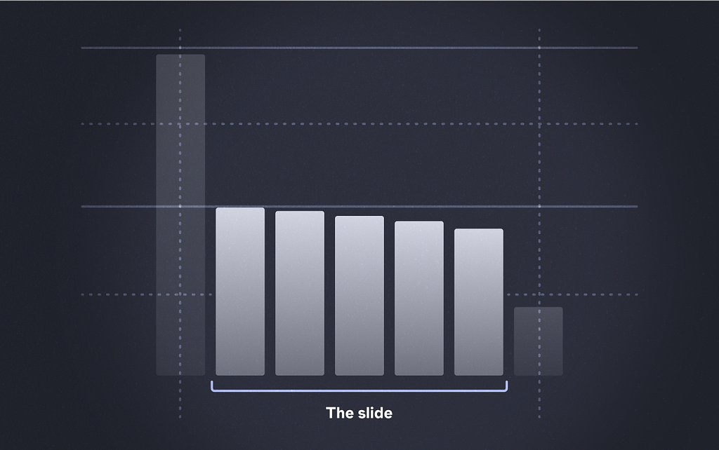
The slide is the smooth middle. People should glide from step to step with minimal drama. If they’re dropping here, that’s on you as a UX designer.
Something in the UX is making them pause, second-guess, or bail.
You should not be seeing more than a 5% dip on any one of these steps, this should signal to you that something is wrong.
How do you flatten the slide? This is a question massively covered out there and the goal of this article is to help you know what to fix not how to fix it that’s someone elses battle, but this is a good place to start.
Flat slide = healthy funnel. Any dip here is UX debt.
The Catch
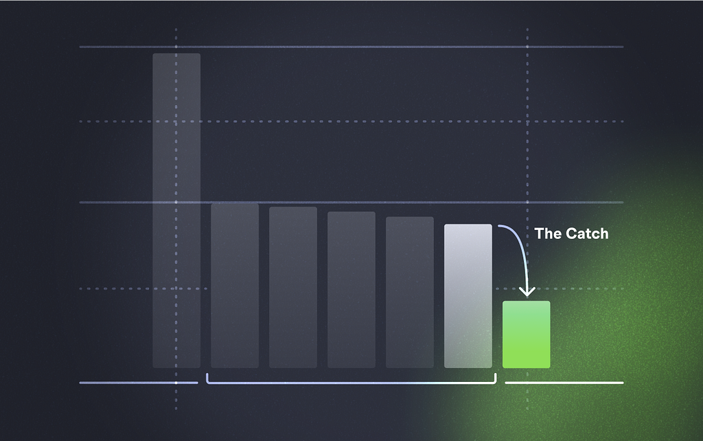
This is where things get interesting. The last step. The decision moment.
Here’s why most of your effort should live here: it’s where you can actually move the needle. The bounce is usually marketing. The slide should just be flat. But the catch? This is where the uniqueness of your product, audience, and psychology collide.
Example from the Glue archives:
In 2019 we worked on a startup called Stairway Learning (Duolingo for GCSE).
We iterated this final step four times. Analytics, interviews, experiments led us to understanding that the 40% conversion on the final step was a decision-fatigue problem.
Instead of asking the user to pick their first lesson from 100+ different lessons, we dropped them straight into one.
This is a similar strategy to how yelp drove users to simply make a first review, this is from NN/G:
Let’s look at the workflow of writing a review for Yelp.com. Because people can start writing a review without an account, this process seems both low-stakes (no personal data is shared with the organization) and easy (no work is required to create an account before reviewing, and the interaction to rate a business and to review requires only one click). But as soon as the user begins typing the review, the form field presents motivational microcopy: Keep those fingers rolling, you wizard of words. What seems like inconsequential text is actually an expert use of behavioral consistency: it reminds the user to stick to the commitment of writing a review and encourages her to make the additional commitment of writing even more.
This small tweak we made to the stairway funnel bumped conversion by ~24%.
After 4 sprints worth of work on the funnel you can imagine we were pulling out our hair but we believed that this should be higher and after relentless experimentation we found it.
As Sean Ellis put it in Hacking Growth: “Growth doesn’t come from copying someone else’s benchmark — it comes from relentlessly experimenting at the sharp end of your funnel.”
So, benchmarks? Still dumb.
I wrote a post a few days ago where I asserted that Conversion Benchmarks are dumb.
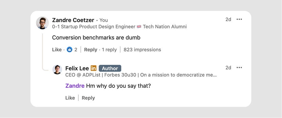
I stand by that.
Funnels are too weird, too bespoke, too tree-like to be benchmarked in any useful way. You can move the start of the funnel at any point and frame the conversion whatever you want.
Instead of masaging the data, know the anatomy:
- Bounce is about intent.
- Slide should be flat.
- Catch is where you invest your time first (and its is f**king hard to get right)
Then stop chasing someone else’s magic percentage. Get to work on your own.
References
- Steve Krug, Don’t Make Me Think (2014)
- Richard Thaler & Cass Sunstein, Nudge (2008)
- Nir Eyal, Hooked (2014)
- Sean Ellis & Morgan Brown, Hacking Growth (2017)
- Dan Ariely, Predictably Irrational (2008)
- NN/g: Conversion-Boosting Techniques
![]()
The Anatomy of a Good Funnel was originally published in UX Planet on Medium, where people are continuing the conversation by highlighting and responding to this story.