Neumorphism (or “New Skeuomorphism”) is a design trend that aimed to blend realism with minimalism. It gave UI elements a soft, extruded look, making them look dimensional and flat simultaneously.
In this article, we will explore the origin of this design trend, its evolution and death, and discuss what will come next after the neumorphism.
Origin and rise of Neumorphism
Neumorphism emerged as a UI design trend around 2019–2020, primarily gaining traction within the Dribbble and Behance design communities. At that time, many designers were tired of semi-flat design and dreamed of creating new, fresh aesthetics. The skeuomorphic Apple iOS 6.0 already seem outdated in terms of visual aesthetics, yet designers have sparked a new life in this concept.
Before iOS 7, Apple iOS used real-world textures and shadows to make UI elements resemble physical objects (e.g., leather-bound calendars and glossy buttons). Because Apple released the iPhone in the late 2000s, when the concept of touchscreen UI was fairly new to many people, skeuomorphism was a very helpful technique for educating first-time users on how to use UI. People could rely on existing knowledge about the physical world while working with digital interfaces. But as soon as users got used to new concepts, there wasn’t really any practical reason for using skeuomorphism. So, with the release of iOS 7, Apple replaced skeuomorphic UI with flat aesthetics.

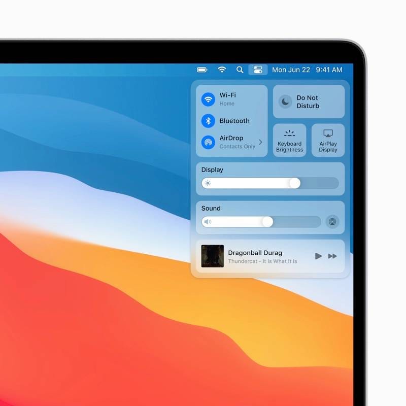
To this very day, semi-flat user interfaces are by far the most popular aesthetics for visual designers. Even the latest product from Apple — Vision Pro — uses this aesthetic.
But despite all the advantages of semi-flat aesthetic, it has one significant downside — semi-flat UIs don’t have distinct visual attributes. It doesn’t mean that all products with semi-flat UIs look the same, but they definitely don’t have many memorable details.
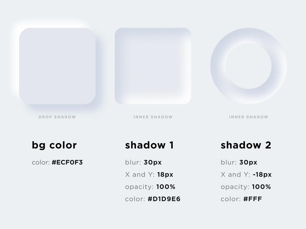
Neumorphism was born as a solution to this problem. Designers aimed to create fresh and attractive UIs that, at the same time, will look very familiar to many people. The modern evolution of skeuomorphism combined elements of realism with a more subtle, minimal aesthetic. If you look at the image below, you will see a strong focus on shadows, highlights, and pseudo-3D depth. All together, this makes UI elements feel embedded or extruded from the background.

How to design Neumorphic UI
Here is a quick tutorial on how to design neumorphic UI elements in Figma:
To achieve a neumorphic effect in CSS, you can use box-shadow to create the soft highlights and shadows. Here is how to implement neumorphism in CSS.
.neumorphic {
  background: #e0e0e0;
  border-radius: 10px;
  box-shadow: 5px 5px 10px #b8b8b8, -5px -5px 10px #ffffff;
  padding: 20px;
}
Fall of Neumoprhism
Neumorphism helps balance between realism and minimalism. It offers a modern, elegant, and futuristic look and works well with soft pastel color schemes and clean UIs. But why, despite all these advantages, is neumorphism used mainly in concept designs, dashboards, and experimental UIs?
The answer to this question is simple — lack of practical value. Apart from making UI look visually appealing, there is not much value in creating neuromorphic UI. When it comes to mobile design, neumorphism makes developers’ lives much harder because they cannot use existing components and patterns provided by Apple and Google. Lastly, neumorphism has accessibility concerns:
❌ Low contrast issues — Its hard to make elements stand out which leads to accessibility concerns.
❌ Usability concerns — Buttons and interactive elements might not be immediately obvious.
❌ Doesn’t work for dark mode — The effect relies on light and shadows, which can be challenging to achieve in dark themes.
What comes after the Neumorphism
Glassmorphism and skeuomorphism 2.0 (also known as hyper-realism) are two trends that come after neumorphism.
Glassmorphism inspired by frosted glass effects seen in macOS BigSur and Windows 11. It uses blurred transparency, soft shadows, and vivid background colors. This helps achieve a futuristic, high-tech feel while improving readability.
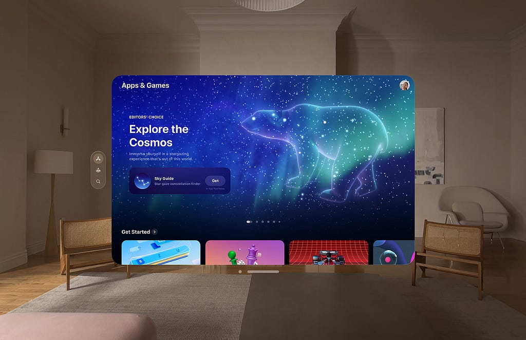
Skeuomorphism 2.0 is rooted in the concept that instead of flat or soft designs, some UI elements are making a return to realism. It uses high-fidelity 3D elements that are interactive and tactile. This aesthetic will likely become mass-market with the rise of VR and Metaverse applications. Just like first-time Apple iPhone users had to learn new concepts when they explored the first iOS in 2007, first-time metaverse users will also have to a new generation of UIs.

Want To Master Product Design?
Try Interaction Design Foundation. It offers online design courses that cover the entire spectrum of product design, from foundational to advanced level.
This post contains affiliate link(s)
![]()
The Rise and Fall of Neumorphism was originally published in UX Planet on Medium, where people are continuing the conversation by highlighting and responding to this story.