A simple tool that removes AI’s telltale punctuation so your writing sounds natural again.
AI helps us write faster, but sometimes it leaves traces. Dashy Drop cleans those digital fingerprints — turning AI text back into a human voice.
I use AI to help me write blog posts, LinkedIn updates, and YouTube scripts. It is part of how I share my design ideas.
But there is something small that kept bothering me.
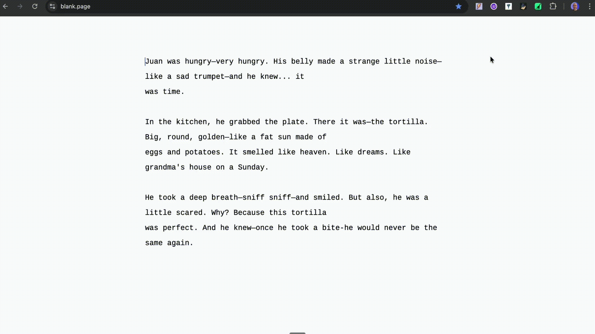
Every time I asked an AI tool to write something, it added a long dash and the medium dash.
The em dash. This one ( — ). And the en dash. This one (–).
At first, I let it slide. But the more I wrote, the more it felt out of place. It did not sound like me. It felt like a tiny glitch in my voice. Then I realized I was not alone. Writers and creators started talking about it online.
In other words, that long little dash was quietly saying: “No human touched this text”. And that is the problem.
I like AI. I use it every day, including the words you are reading right now. What I dislike is work that feels unreviewed, unpolished, or rushed.
So I asked myself a simple question.
If I can design, write, and even build apps with vibe coding, why not create something that fixes this?
Why not just tell the AI not to use em dashes?
That’s the first thing people ask. (Maybe you too )
Why build a plugin when you can just add don’t use em dashes to the prompt?
Because it doesn’t always work.
AI models can be like rebellious teenagers. You tell them not to do something, and they do it twice to prove a point.
Some ignore the rule, some swap in en dashes pretending they’re being “helpful, ” and some just keep adding them because… honestly, I have no idea why.
On top of that, I also use other tools (besides ChatGPT) that don’t always have default instruction settings, like a small local model on my laptop, Gemini, or Claude. They each have their own personalities and moods.
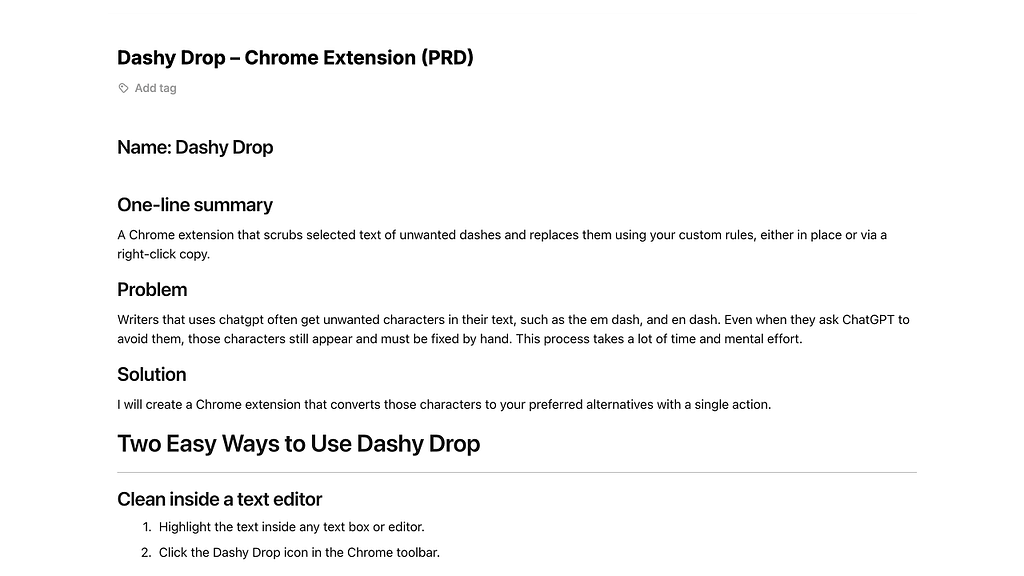
So I built Dashy Drop, the punctuation peacekeeper, a simple, universal fix that cleans text after it’s written, not before.
Designing with Clarity, Not Chaos
Before I start to design, I write a PRD. (Yes, Even When It’s Just Me)
Because let’s face it, ideas without structure multiply faster than browser tabs during “just five minutes” of research.
But jokes aside, I do it for two main reasons:
To stay clear and focused
A PRD keeps me sharp on what I’m actually building. No overthinking, no feature additions, no “maybe I’ll just add this one improvement.”
It’s my GPS, it keeps me on track when shiny distractions try to pull me off-road, and it’s essential for every team project and even for a one-person project.
To teach the AI what I’m building
I feed the PRD into Cursor so the model knows the what, why, and how.
It is critical to give the AI this info clearly because it stops guessing and collaborates. (Finally, a teammate who reads the brief and doesn’t schedule a meeting about it.)
When a Simple Fix Became a Language Lesson
At first, it sounded simple. Just remove the dashes. But soon, I realized it wasn’t that simple.
A dash can mean many things. It can connect numbers, replace commas, separate thoughts, or simply add rhythm to a sentence.
Removing it blindly would break meaning, like deleting the last paragraph of an article because someone said, “keep it short.”
So instead of guessing, I decided to teach the AI how to think about it.
I asked ChatGPT:
“List all the possible cases where em- and en-dashes appear in AI-generated text.”
It came back with many scenarios. From number ranges and side notes to those dramatic pauses only writers understand. That list became my map of how dashes behave in language.
Then I went case by case, asking ChatGPT to show me three things:
- How the text looked before.
- How it should look after.
- Why did the dash appear in that context?
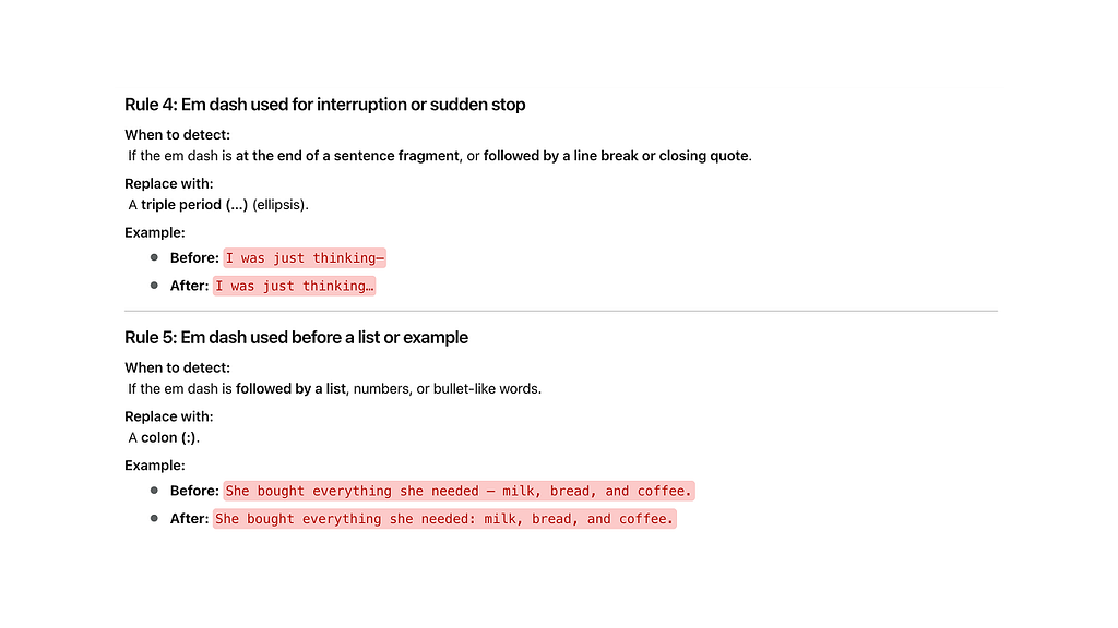
Each rule I wrote defined not just what to change, but why.
Example:
- Rule 7: Place–place or concept–concept connection → replace with “to”
- Before: Madrid — Barcelona | After: Madrid to Barcelona
- Why: Writers use En dashes between locations or entities to show relationships. “To” reads more naturally than a dash.
Once the logic was solid, I asked the model to convert the written rules into code-like syntax: structured, clear, and ready to use later inside Cursor.
That same logic became the backbone of Dashy Drop, turning what started as a “tiny writing fix” into a real, teachable system that understands language nuances.
Figma, Coffee, and a Lot of “Does This Look Right?
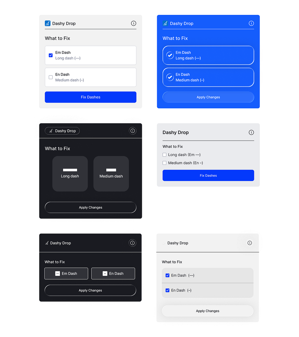
Once the logic and PRD were solid, visual design became the next natural step.
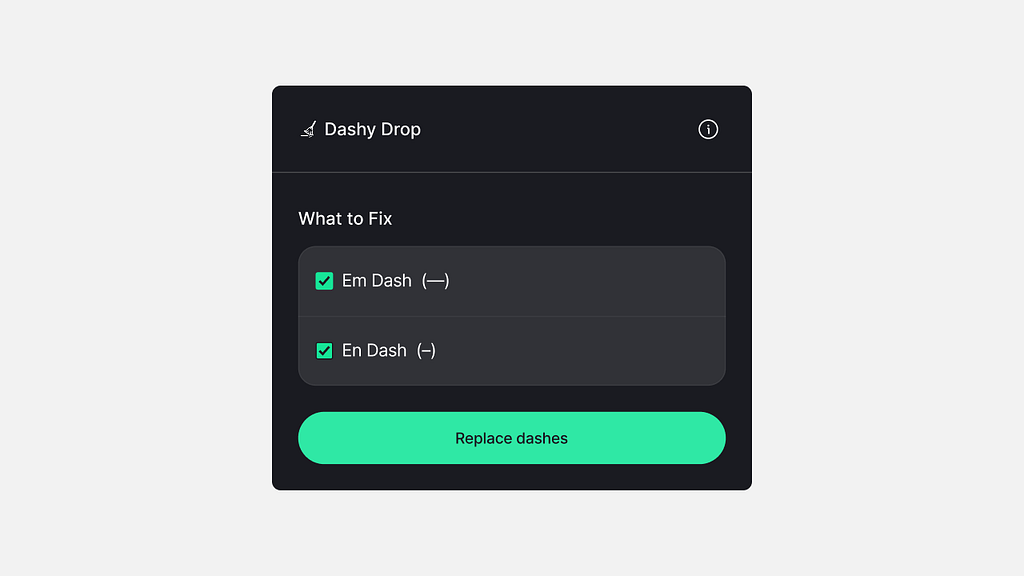
I already knew what Dashy Drop needed to do. My goal was to make it feel effortless. Simple. Clear. Direct.
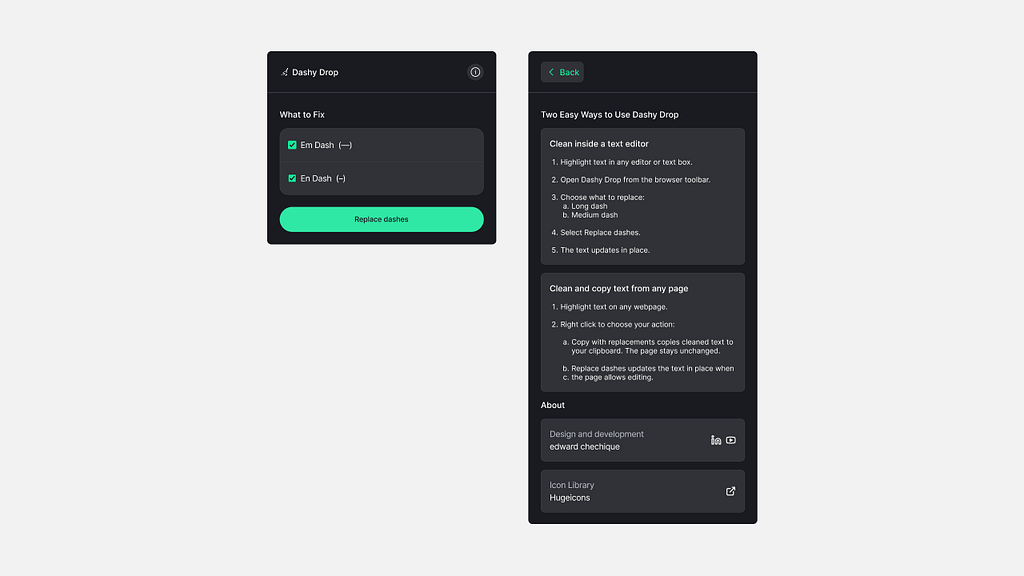
The main screen had one job: let users choose which dashes to fix. Em dash, En dash, or both. Click “Replace dashes.” That’s all. One clear action.
The small info icon opens a second page. There, I added a short explanation of how the extension works, plus links to my LinkedIn, YouTube, and the icon library I used.
Because yes, at the end of every product, there’s always a small marketing moment.
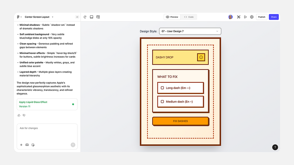
In Figma, I explored different directions. I tried liquid glass effects, bold blue backgrounds, and even oversized toggle-style buttons.
I also used Figma Make to generate visual variations. The results weren’t perfect, but they helped me see new ideas, test balance, and refine the structure.
After a few rounds, I switched to a darker interface. It felt calm and focused. The kind of design that disappears so the action can shine.
The green button was a deliberate choice. Green means “fixed,” “done,” or “safe.” If red signals a problem, green signals peace.
It gives a small but powerful emotional cue that Dashy Drop just cleaned something up.
The final design uses minimal color, rounded edges, and wide spacing. It’s approachable, readable, and calming.
A visual reflection of what the Dashy Drop stands for: clarity, precision, and peace of mind in writing.
Mouse Travel Denied. The little things matter.
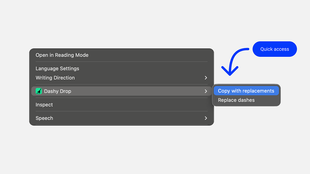
Dashy Drop doesn’t run only from the Chrome toolbar. It also works right where the user writes.
There are two more ways to use it.
- The user can select any text, right-click, and fix it directly from the contextual menu.
- The user can copy the text from tools like ChatGPT and paste it elsewhere. Dashy Drop quietly cleans it up as it lands.
I added this because it just feels faster. The user’s cursor stays where their focus is. They select, fix, and keep writing. No extra movement. No breaking flow.
Like a shortcut instead of a long trip. A small detail that makes a big difference.
I Asked AI for a Logo. It Gave Me a Cleaning Metaphor
When the extension took shape, I wanted it to have its own identity. Something simple. Visual. Meaningful.
So I opened ChatGPT and fed it the same PRD I used to build the product.
Along with it, I added a few Illustrator prompts I’d written earlier, my small “system” for guiding the model when generating illustration ideas.
Then I asked, “Give me ten logo concepts for this product.” A minute later, I had ten. Some are abstract, some literal, some funny.
But one stood out immediately. A tiny broom is cleaning a dash. I like the funny aspect of a broom cleaning a dash.
That was it: a logo that explained everything about Dashy Drop’s functionality in one image.
I asked ChatGPT to explore it further. It generates different shapes, colors, and compositions.
After a short review, I picked the one that felt just right: balanced, friendly, and calm.
Turning “I Don’t Code” Into “It’s Live on Chrome”
Once the Figma UI (and logo felt right), Cursor became the workbench to bring Dashy Drop to life.
Vibe coding works best when the model gets structure, context, and tight feedback. Build in small steps, keep scope narrow, and the LLM stays sharp.
I could go into every detail, but you don’t have time (True?)
In any case, these five steps capture the process clearly enough.
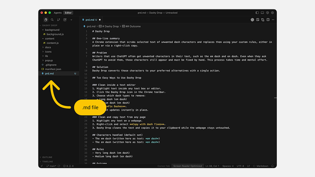
1. Load the PRD into Cursor
I started by creating a single Markdown file with the full PRD, what Dashy Drop does, why it exists, and how it should behave.
I placed it inside the repo so Cursor could always reference it. With context, the model collaborated. Without it, it guessed.
Keeping the PRD accessible meant fewer mistakes and no endless copy-paste loops.
2. Import the UI with MCP Figma
MCP pulled the design straight from Figma into Cursor HTML, CSS, and layout.
I kept the interface step separate from the logic to reduce noise. The goal was simple: stabilize the surface first, then add the logic layer.
3. Add the Contextual Menu Actions
Before building the logic, I wired the two actions that will work from the contextual menu.
4. Ship the Cleaning Logic in Passes
I added the dash-cleaning rules gradually.
- First, the em-dash logic.
- Then, the en-dash logic.
Each rule came from the earlier mapping work I did before coding the extension.
Again, working in small, focused passes kept the AI precise and the results consistent.
5. Run the Testing Loop
When the extension started working, I pushed it to its limits. I tested it everywhere, in editors, on websites, and inside input fields.
Each time something broke or didn’t feel right, I described the issue in Cursor and fixed it step by step. Every failure became a lesson. Every iteration made the build stronger and cleaner.
I don’t know how to code, but this process turned testing into my way of building confidence. It’s how I made sure the product didn’t just run, it worked well for real people.
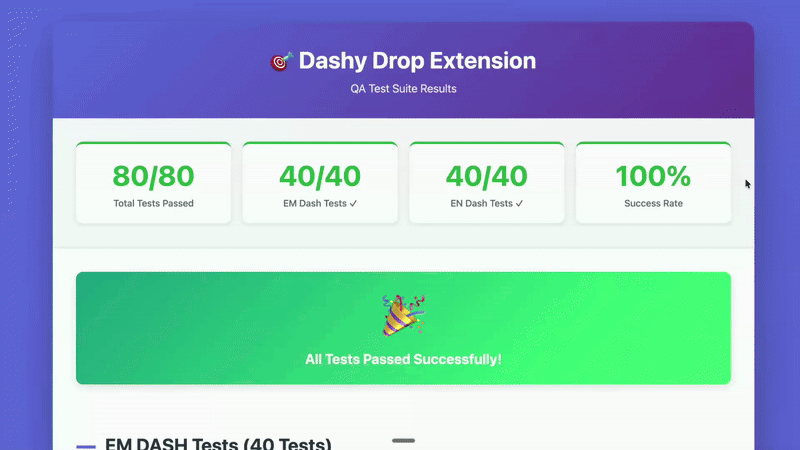
6. Automate the QA Testing
Before releasing the extension, I wanted to be sure it working well. I had already tested it myself, but then I thought, if AI helped me build it, why not let AI test it too?
So, I turned Cursor into my QA partner. I gave it the full logic file and asked it to write test cases for both em-dashes and en-dashes.
Each test followed a simple rhythm: take the “before” text, run the plugin, and compare it to the “after.” If they matched, we knew the fix worked.
To make things faster, I asked Cursor to run everything in the background. Minutes later, it came back with a summary showing what passed, what failed, and why.
But I didn’t want to scroll through dry data, I wanted to see it. So I asked for a visual report, and Cursor generated an HTML file that mapped every test. Green meant success. Red meant “fix me.”
Each red mark became a small mission. I asked Cursor to correct every failed case and rerun the test until the entire page turned green. That moment, when every line was clean, felt like a quiet victory.
Conclusion
Dashy Drop started from a small irritation issue and became proof of how design and AI can work together clearly.
It reflects my principles of ownership and precision , noticing what feels off, defining it clearly, and fixing it with purpose.
What began as a tiny punctuation problem turned into a real, working tool that saves time and restores a human voice to AI writing.
BTW, you can test it here.
If You Spotted the Dashes, So Will Your Readers.
Don’t let tiny glitches kill your voice.
🟢 Use Dashy Drop now → Get the Plugin
![]()
This Small Tool Makes AI Sound Human was originally published in UX Planet on Medium, where people are continuing the conversation by highlighting and responding to this story.