Everyone talks about the skills that will make you a better UX designer. But today, I want to talk about 7 UX skills that will become obsolete by 2026.
Yes, these are my predictions — the skills that will no longer make sense for UX designers in 2026.
A few years ago, the goal was to master Figma, build pixel-perfect wireframes, and hand off beautiful screens to developers.
That formula doesn’t work anymore.
The industry has matured. Businesses want ROI, not just aesthetics.
Agile workflows leave no space for lengthy rituals.
And AI has become a full-time collaborator in the design process, eating away at repetitive tasks and replacing outdated workflows.
UX itself isn’t going extinct — but many of its traditional practices are.
Here are 7 UX skills that will likely disappear by 2026, along with what’s replacing them.
1. Don’t wireframe on Figma anymore
Traditional Idea validation method:
PRD → Wireframe in Figma → Share static screens → Weeks of review & misalignment → Hi-fi design begins
TAT: 2–3 weeks
New method:
PRD → Parse into ChatGPT and break into flows → Export blueprint to Replit/Lovable → Build Clickable prototype → Share it with clients / users for early feedback.
TAT: 2–3 days
Wireframing has long been the first step in design: grayscale boxes sketched on paper or digital canvases to outline structure.
It gave clarity in slower times, but in today’s fast-moving cycles, static screens feel like busywork.
They show layout but fail to show flow, leaving teams arguing over rectangles instead of testing real experiences.
Why this old handoff is dying?
- Static wireframes do not simulate real interactions, so issues are only discovered later.
- Stakeholders often misinterpret the intent of gray boxes, creating alignment problems.
- In agile environments, static artifacts introduce delays when teams expect clickable prototypes early.
Learn this now:
1. Replace wireframes with interactive prototypes that show both structure and behavior.
2. Tools like Lovable / Replit / Bolt make it possible to move from idea to clickable demo in minutes.
Vibe coding early products will help test usability sooner and reduce wasted cycles.
2. Don’t Hand-off flat screens without functional Code
The traditional “handoff” meant exporting polished Figma screens, annotating specs, and asking developers to rebuild everything.
This process slows down delivery and opens endless rounds of “why doesn’t this look like the design?”
Why it’s dying:
- Flat designs fail to account for responsiveness, forcing developers to adapt them manually.
- Developers spend unnecessary time recreating visuals that could be auto-generated.
- Misinterpretation of specs causes repeated design–development conflicts.
Learn this now: Embrace design-to-code workflows where design files produce actual components.
The process is simple:
PRD → break into states/flows/tokens in ChatGPT → plugin exports real components → push to GitHub → open in Replit → deploy preview → iterate with real UI.
Here’s a quick start to convert Figma Designs to Code (100% working)
A) Builder.io to Lovable (React Components)
Use BuilderIo Plugin in Figma → select frames → open in Lovable
B) Locofy.ai (React/Next/HTML)
Locofy plugin → tag components/breakpoints → generate code → export React/Next project → commit to GitHub → open in Replit (bonus) → deploy preview.
3. Manual Usability Testing

Classic usability testing — recruiting participants, running scripts, and observing behavior — was once the backbone of UX.
While still insightful, it is far too slow for today’s pace. Continuous delivery requires faster loops, and manual tests simply can’t keep up.
Why it’s dying:
- Setting up tests, recruiting participants, and analyzing results takes weeks that teams don’t have.
- Small sample sizes cannot reveal large-scale behavior patterns.
- Findings often arrive too late, after the product has already changed.
Learn this now:
Build hybrid testing systems. Let AI-driven usability tools run large-scale simulations to uncover patterns, while humans step in to evaluate nuanced experiences. This way you maintain empathy without slowing down development.
Quick AI guide: How to use ChatGPT Deep Research to analyze your UX?
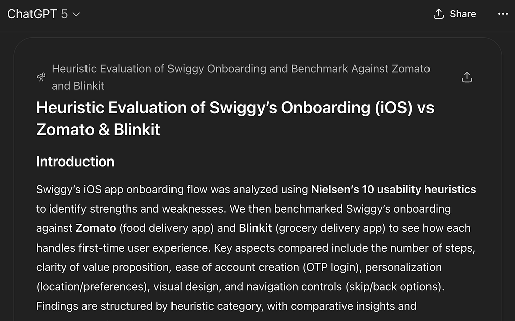
Say that you’ve designed an onboarding flow. Now:
↳ Goto ChatGPT, click on “Deep Research”
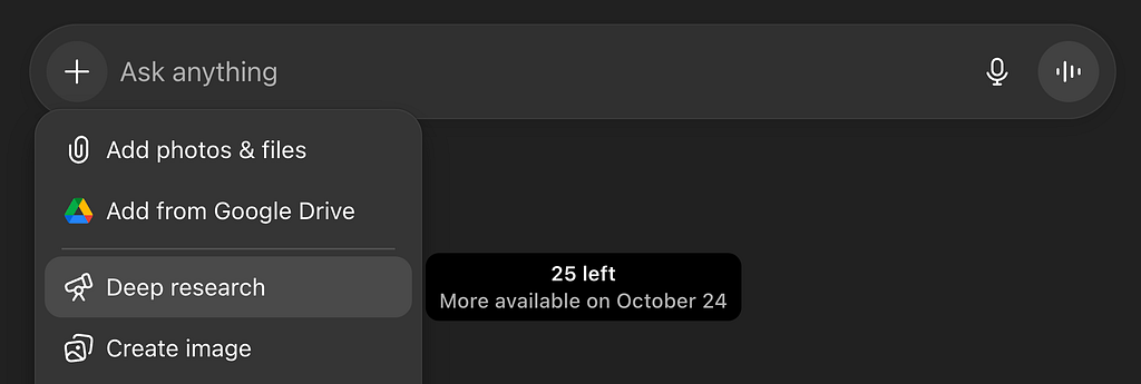
↳ Share your designs as images.
↳ Enter this prompt:
"Do a heurisitic evaluation of the onboarding flow of [App Info]. Benchmark it against [Competitor 1] and [Competitor 2]. Identify the top usability issues and higlight opportunities to improve"
↳ This will give a detailed report on how to improve the Usability of your design.
4. Designing for the “Average User”
Designing for the so-called “average user” was once the default. Teams would imagine a middle-ground persona and optimize for them.
But no one is actually average, and this approach leaves many people underserved — newbies find the experience confusing, experts feel slowed down, and accessibility needs are ignored.
Why it’s dying:
- Generic flows exclude both beginners and advanced users, creating frustration.
- Over time, small inefficiencies add up to significant financial losses at scale.
- The concept of an “average” user is unrealistic, as people use products in diverse contexts.
Learn this now:
Create adaptive experiences that flex for different needs.
For example, onboarding can show tutorials for new users while offering shortcuts to returning experts. Personalization isn’t just about delight — it’s about making products usable for everyone.
5. Click-Based Navigation Patterns

Navigation once relied heavily on clicks — hamburger menus, dropdowns, and top-left nav bars. But with bigger phones and changing behaviors, these patterns are awkward.
Hidden menus lead to features being forgotten, and thumb ergonomics make traditional layouts inconvenient.
Why it’s dying:
- Features hidden in hamburger menus often go unused, hurting adoption.
- Top-left navigation is physically difficult to reach on modern devices.
- Requiring multiple clicks slows down discovery and frustrates users.
Learn this now: Explore gesture-first and predictive navigation systems. Bottom nav bars, contextual surfacing, swipes, and voice input all provide faster, more intuitive access.
Navigation should anticipate needs instead of hiding them.
6. Designing Without Data
For years, designers made decisions based on instinct — “this feels right.” But gut feelings don’t scale. Without validation, products miss real user needs, wasting both time and money. In a competitive market, design choices must be backed by evidence.
Why it’s dying:
- Decisions made without validation often lead to rework and wasted resources.
- Teams risk building features no one wants or needs.
- Competitors using data-informed processes can iterate faster and smarter.
Learn this now:
Adopt data-informed design.
Use analytics and A/B testing where possible.
When you don’t have data yet, especially at the 0→1 stage, use tools like ChatGPT and NotebookLM to mine competitor reviews, analyze market reports, and cluster feedback themes.
This gives you a starting point until real usage data is available.
Quick AI guide: How to use NotebookLM to do data driven research
Say that you’ve too many resources from the internet to go through.
Use AI to analyze them and act as a sidekick:
↳ Step 1: Goto NotebookLM by Google
↳ Step 2: Create a new notebook
↳ Step 3: Add all the youtube videos, blogs or any online resource.
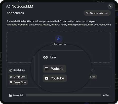
↳ Now you can generate mindmaps, video overviews or chat with the data.
7. UX Without Business Context

UX once positioned itself as “the user’s voice.” While still true, ignoring business goals is now a fast track to irrelevance.
Companies expect design to not only delight users but also improve retention, revenue, and efficiency.
Why it’s dying:
- Designs disconnected from ROI are seen as ornamental rather than strategic.
- Teams can’t justify funding design work without measurable outcomes.
- Designers who don’t speak business metrics are excluded from strategic discussions.
Learn this now: Gain fluency in product and business metrics.
Understand CAC, LTV, churn, and retention, and frame design decisions around their impact. A designer who connects user delight to business success is indispensable.
Quick AI guide: How to use GensparkAI to do business research
Say that your team hasn’t given enough context for you on how your design impacts the business, or we are unaware about the ROI.
↳ Use Genspark AI to do the business research
↳ It’s a super agent that supports multiple tools.
↳ It can create content by orchestrating various specialized AI agents and LLMs
Yes, adapting to AI will put you in the top 1%. But that’s NOT ENOUGH to Land your Dream UX job in 2026.
→ You need a kickass portfolio that showcases your work in the best way.
→ You need to know how to pitch it effectively during portfolio rounds.
→ You need to know how to tackle whiteboarding and all levels of interviews.
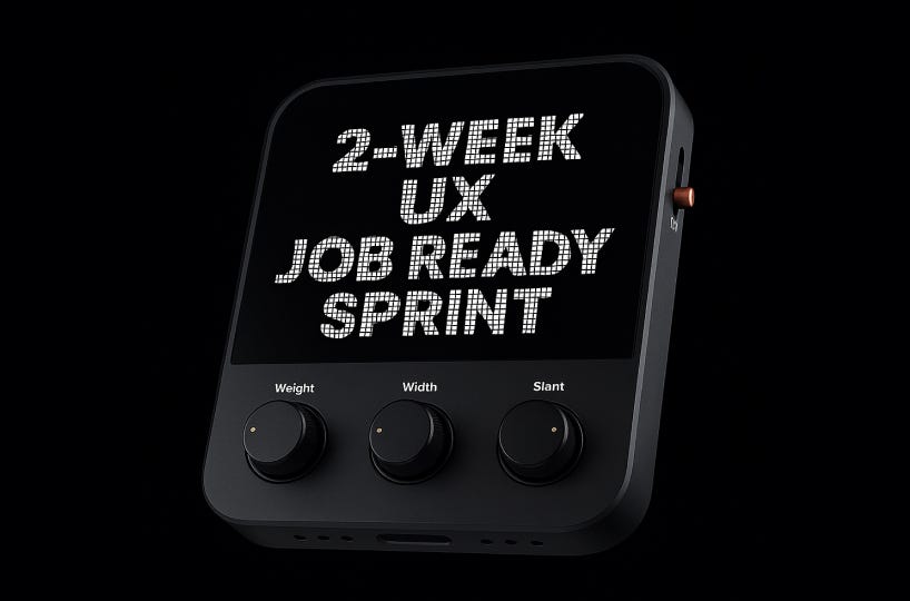
That’s why I built a 2-week UX Job Ready Sprint.
It’s designed to make you job-ready and help you feel more confident when applying for opportunities.
Want to know more about the program?
Step 1️⃣ Click the link below to join the Whatsapp Community: https://chat.whatsapp.com/IOcvgOE9VRfHFIFjJShBty
Step 2️⃣ Mention: “Let’s Go”
Step 3️⃣ The team will share the syllabus with you.
Remember: Great skills ≠ Dream UX Job
Conclusion: The 2026 UX Survival Guide
None of these skills were mistakes. They built the foundation of UX as we know it. But the world has moved on, and designers must move with it.
In 2026, staying relevant in UX means:
- Letting go of static, one-size-fits-all rituals.
- Partnering with AI instead of resisting it.
- Designing with data, not just instinct.
- Building adaptive, personalized experiences.
- Connecting every design choice to real business impact.
The riskiest phrase in UX today isn’t “I don’t know AI.”
It’s: “But this is how we’ve always done it.”
Those who adapt will become strategic, fast-moving designers that companies can’t ignore.
Anyways, thanks for reading.
Here’s to building UX that matters in 2026 and beyond.
Best,
Shai (Connect on Linkedin)
![]()
7 UX Skills that will be DEAD by 2026: AI will replace them was originally published in UX Planet on Medium, where people are continuing the conversation by highlighting and responding to this story.