37 Innovative Ways to Use Accent Colors with Visual Guide
Accent colors in UI design are like the punctuation marks in a sentence — they emphasize, guide, and create visual interest. These colors play a pivotal role by drawing attention to key elements such as buttons and calls to action, providing visual hierarchy and brand identity.
These colors can be used in absolutely any element, but not overdoing it is the key. While designing your UI, find select elements to which you want to apply accent color. Apply simply or be creative by finding innovative ways for unique implementation.
Scroll through this article to find examples of numerous websites using accent colors brilliantly. Names of reference websites are mentioned in the caption of each image.
1. Header:


2. Text Highlight:


3. Left Border Design:


4. Navbar or Tab:


5. Links:

6. Buttons:


7. Sliders:
8. Checkbox:

9. Radio Button:

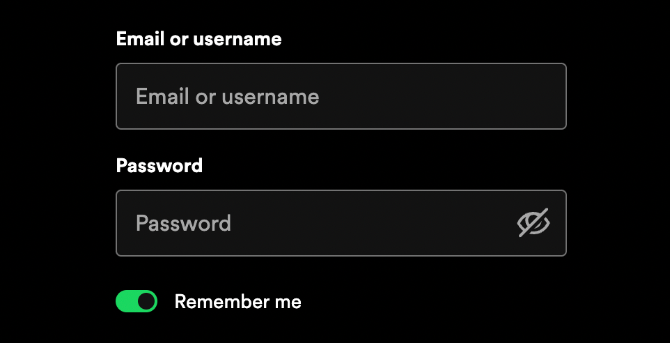
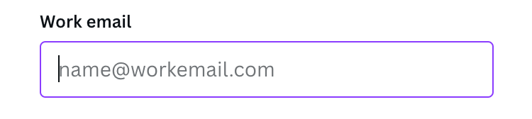
10. Active Input Fields:
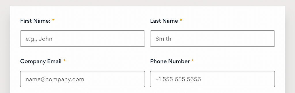
11. Mandatory Astrick in Forms:
12. Pagination:

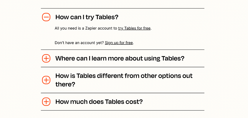
13. Accordian or Expand/Collapse:
14. Icons:


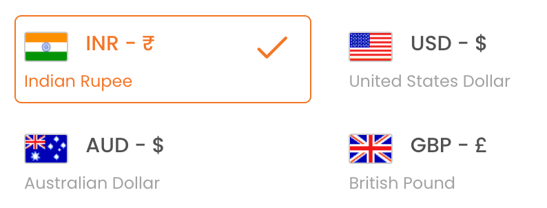
15. Selection Highlights:
16. Timeline and Stepper:

17. Badges and Chips:


18. LIVE indicator:

19. Notification Number:


20. Progress Bar:


21. Slider Indicators:


22. Indicator for New:


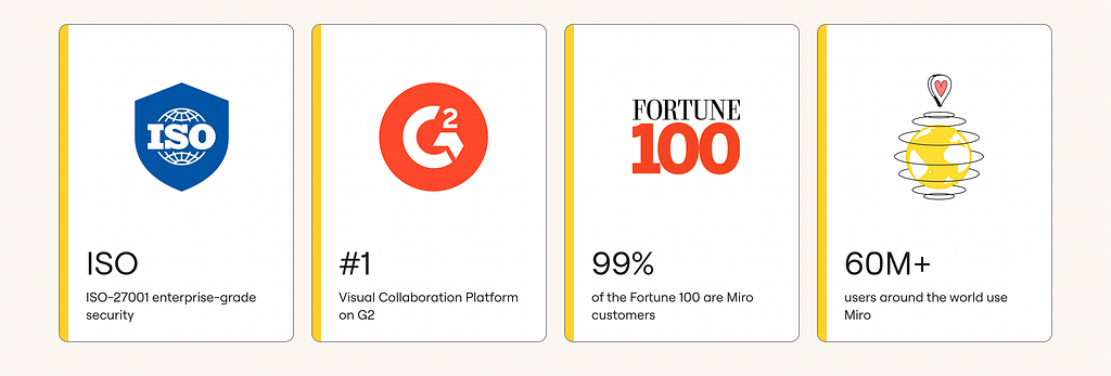
23. Map Location Pins:

24. Offers and Percentages Off:

25. <HR> Lines:

26. Entire Section Color:

27. Bullet points and check marks:
28. Star Rating:


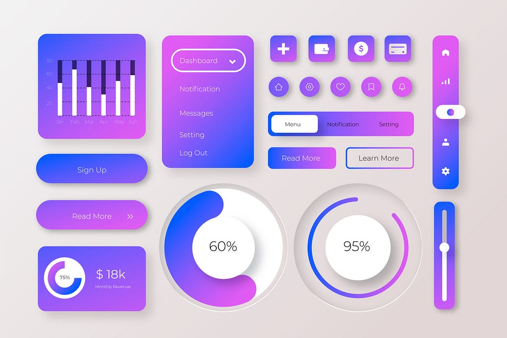
29. Analytics:
30. KPI (Key Performance Indicator):


31. Illustrations:


32. Chat Bot:


33. Card Design:
34. Social Media:

35. Notification Ribbon:

36. Testimonial Quotations:

37. Media Player:

Hope this, what must have seemed like an endless list, provided you with inspiration. Happy Designing!
![]()
37 Innovative Ways to Use Accent Colors: Visual Guide was originally published in UX Planet on Medium, where people are continuing the conversation by highlighting and responding to this story.