
In a design project at AT&T, a business request came to our team to design a target experience for selling wireless products at retail stores that will replace existing systems in a couple of years. AT&T has been using a home-grown POS system called OPUS for over 20 years and it has been showing deficiencies in the last few years as the number and complexity of products increased over time. The business decided to purchase the Salesforce platform to replace OPUS and improve sales and service efficiency. However, there is a lot to customize and develop on the new platform, and a lot of stakeholders are involved which makes changes and decision making hard. Our team was tasked to design a baseline for sales flow for the Salesforce platform.
The challenge for the design team however is to show the new design is not just aesthetically different from OPUS but also it improves the efficiency of the sales process and makes the experience more straightforward. The UX standard path is to design and prototype and test with real users and show how successful the new design is. That’s what we did for sure. However, other than proving the design will work well, one more important aspect is to show how this new design will work compared to the status quo! Everyone on the business side was wondering whether any changes are worthwhile or if we’re better to clone the OPUS experience on Salesforce and not risk disrupting a working, even though clunky, sales process in thousands of stores across the country.
Comparing an organically grown legacy flow to a new and unbuilt flow seems like comparing apples and oranges! So it was clear from the beginning that we need some easy and quick-to-understand metrics to help business partners understand the extent and impact of changes on the experience and be able to make a decision for the future based on those metrics.
The Birth of a new measurement tool
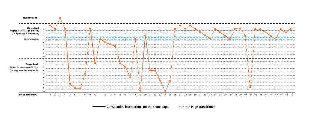
The new measurement tool that I came up with for this project is mostly an evaluation of the relative cognitive difficulty of all the interactions in the flow that come one after the other and mapping them in a way that the final output shows a big picture of the whole interaction quality across the flow that will be something like the diagram below for a flow that contains 49 steps to complete the task at hand. I will explain details of making this diagram in this article.
Make an Interaction Footprint
To start making an Interaction Footprint, make sure you have access to the following:
1- All the screens that user sees in the flow with the steps they take on the screen to achieve their goal.
2- An initial walkthrough from the real user and a list of all the elements in the flow that they pay attention to and the ones that they just gloss over only
After that, you need to take the following 4 steps to generate an interaction footprint.
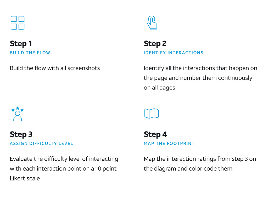
Step 1: Build the flow
Taking screenshots and building the flow from beginning to end provides you with a solid foundation to do your analysis.

Step2: Identify interactions
On each screen that the user sees, some interactions happen. The interaction might be a click, reading from a text, checking a math, etc. The criteria is anything that takes some time and cognitive and/or physical effort from user to move forward in the process.
Step3: Assign difficulty level to each interaction
This is the step in which the heuristics play an important role. For this specific project, I based my judgment on two famous interaction principles established many years ago and evaluated the level of difficulty for each interaction. These two principles are:
– Hick’s law: says the Reaction Time(RT) increases when the number of options presented to the user increase. However, this is not a linear relationship which means you cannot say doubling the options means doubling the reaction time.
– Fitts’s law: says the ease of interacting with an object on screen depends on the size of the object and its closeness to where the is (cursor or fingers in our case). It is also not a linear relationship.
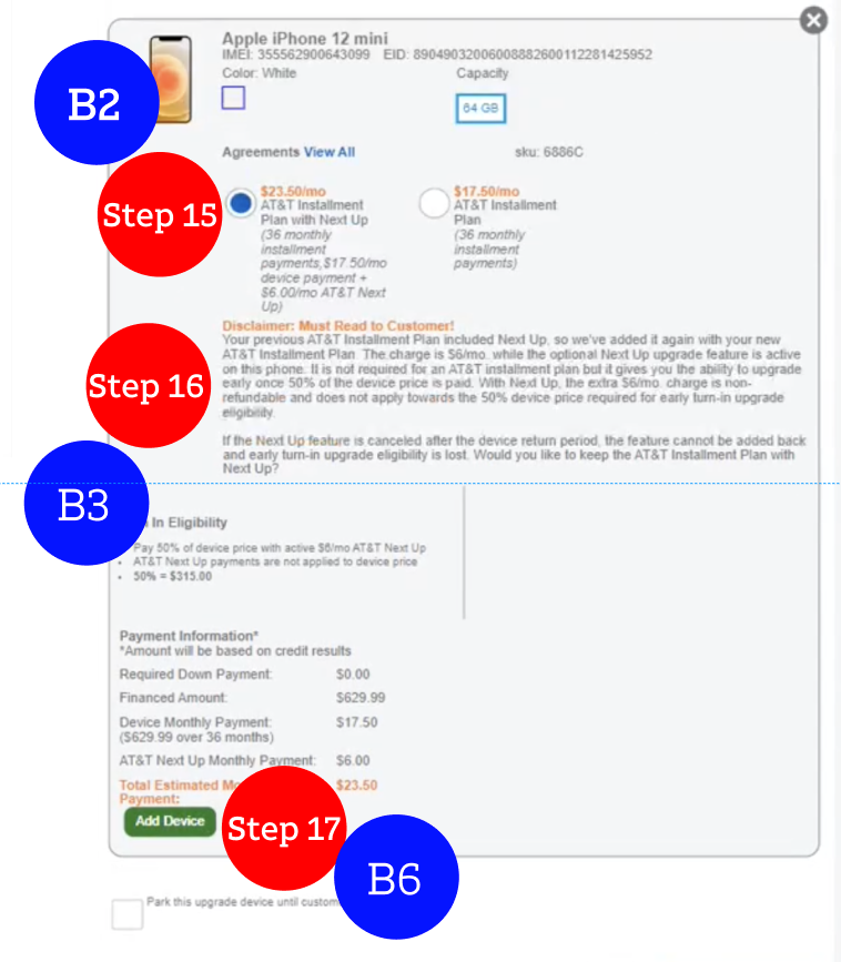
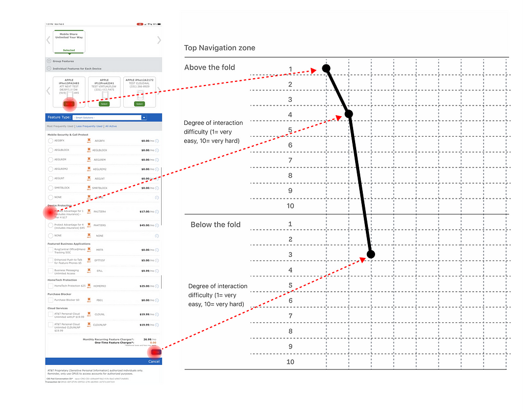
Based on these two interaction principles, I divided existing pages into 3 sections and started evaluating the difficulty level of interaction points in each section on a 10-point Likert scale in which 1 is very easy and 10 is very hard. Then I made a two-axis matrix exactly based on this division to make interaction points on.
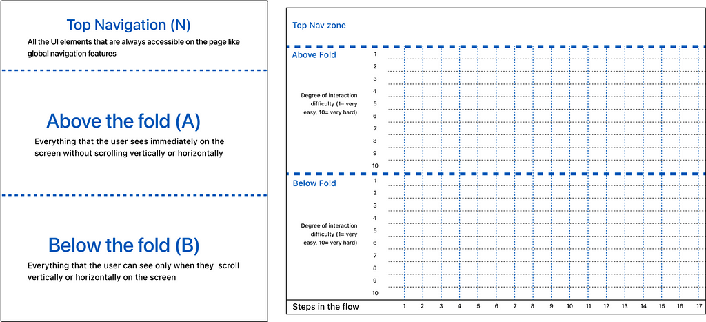
Step4: Map the Interaction Footprint
At this final step, I went on interaction points one by one and identified their position on the page (Fitts’s law) as well as the relative clutter around them (Hick’s law) to evaluate how easy or hard it is to interact with them. Here is an example of mapping interactions on a page:
The result
After mapping a few flows by this method and comparing the results, the value of this evaluation surfaced because it enables everyone to understand the quality of a flow from an interaction point of view and areas where the experience needs major improvement. The diagram below shows the interaction footprint for 3 different mobile upgrade flows at AT&T mapped next to each other:
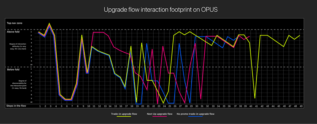
You might be wondering what you can understand when seeing an Interaction Footprint like this. Here is the answer:
- The more the valleys and hills on the flow the more the user is going up and down on pages constantly to navigate and find interaction points.
- The more interaction points below the fold and above 5 in difficulty, the more cognitive load is imposed on users.
- The steeper the slopes, the more consecutive interactions distanced from each other which will increase the risk of missing a step or confusion for the user.
The target design
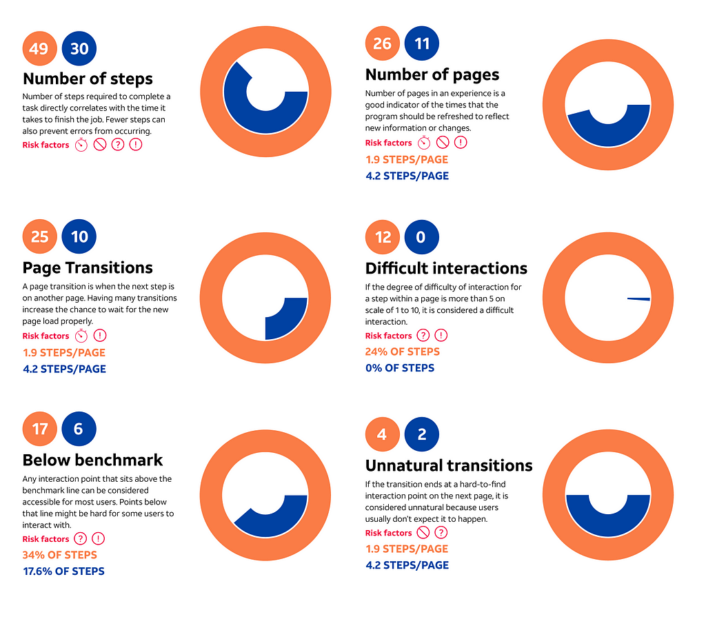
We designed a mobile upgrade flow with regard to Salesforce platform capabilities and mapped the Interaction Footprint to compare with what is currently in production.
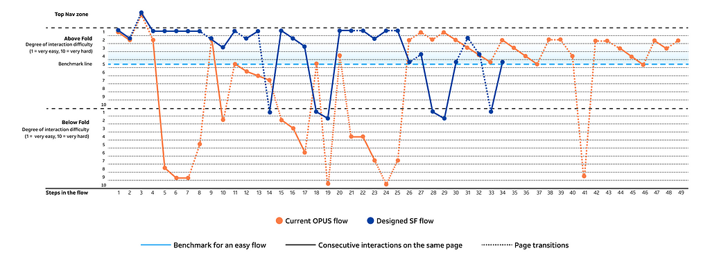
To help business partners be able to interpret this diagram, I accompanied it with some facts taken out of this diagram as well as risk factors associated with each fact.
Risk Factors
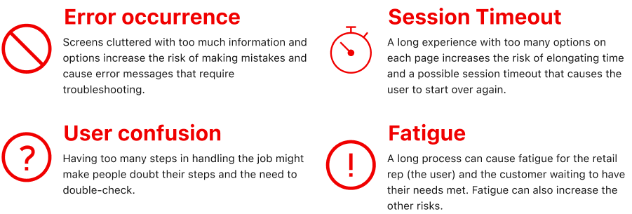
Interaction Facts
Conclusion
Measuring design impact is hard, especially for design outcomes that don’t go to production immediately. Also, it is possible to measure a design value from different aspects. In this project, I was able to devise a new measurement methodology that focuses on the whole flow rather than a single page and evaluate the quality of interactions the user experiences to do the job. It helps design teams and business partners identify flaws and frictions in their current experiences and where they can assign their resources to make a more meaningful impact. However, there are some limitations to each tool that should be considered in using them. This tool is not an exception. For using this interaction analysis tool, keep these limitations in mind:
- Like any other heuristic evaluation, recognizing and rating interaction points depends on the expertise and knowledge of the people doing it. The ideal person to use this tool is someone who has a good knowledge of UX or interaction design and can put themselves in the shoes of the user rather than doing it subjective.
- People get used to systems that work, no matter how bad they are. This interaction analysis should be done from the POV of novice users of the system, i.e. people who didn’t internalize all the loopholes and tricks of the system.
- The result of this analysis should be combined with other analysis to give a big picture of the design and its potential success or failure. For example, this analysis can show the quality of interactions mostly from a cognitive aspect but it does not speak to the aesthetic aspects. Also, it does not give a clue about how much it costs to get from a current state to a target state.
Shout outs!
When I came up with the idea of this Interaction Footprint, I received great support from my teammates and leaders at Design Technology at AT&T, a team of exceptional talents that practice UX design to the highest standards. I couldn’t get it to this level if it weren’t for the constructive feedback provided by my teammates Myan Aljets, Surya Nair, James Blevins, Jen Blake, Jenelle Seitz, Jennifer Kingsburg, Katelyn Bandy, and my leaders Kelly Beile, Mike Linneman and Woody Berner.
Interaction Footprint: a new tool for measuring design was originally published in UX Planet on Medium, where people are continuing the conversation by highlighting and responding to this story.