Bar chart is a popular chart type that presents categorical data with rectangular bars with heights or lengths proportional to the values that they represent. It is typically used to show categorical or discrete data for side-by-side comparison or ranking.
Below are key practical recommendations for designing bar charts.
Anatomy & layout grid design

Color
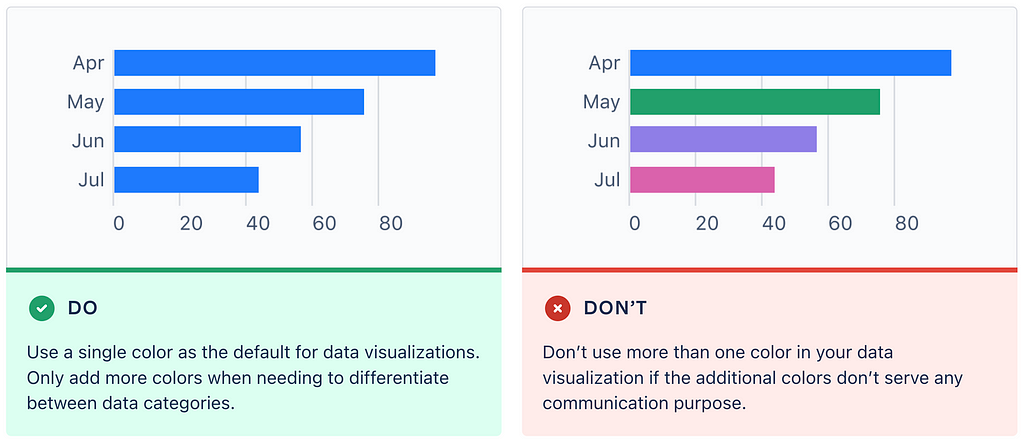
Use a single color when you display a single data series
A single data series is a data series that shows a change of the same variable over time (i.e., the number of sales per month). There are two strong reasons against using different colors for different bars in a single data series. First, different colors can introduce visual noise and prevent users from effectively analyzing data. Second, people tend to associate colors with meaning. When they see different color bars, they wonder if different colors mean different things. If you want to avoid that, use a single color for all bars to create a proper visual appearance and improve comprehension.
Text
Title
Every chart should include a chart title, except in cases where you’re showing more than one chart in the same content container. When writing a title, be brief and descriptive about the subject the chart is presenting.
Don’t place labels on bars
Text labels should be outside of bars. This will make it easier for users to scan the chart and help you avoid container size issues (when the label won’t fit the size of a bar).

Layout design
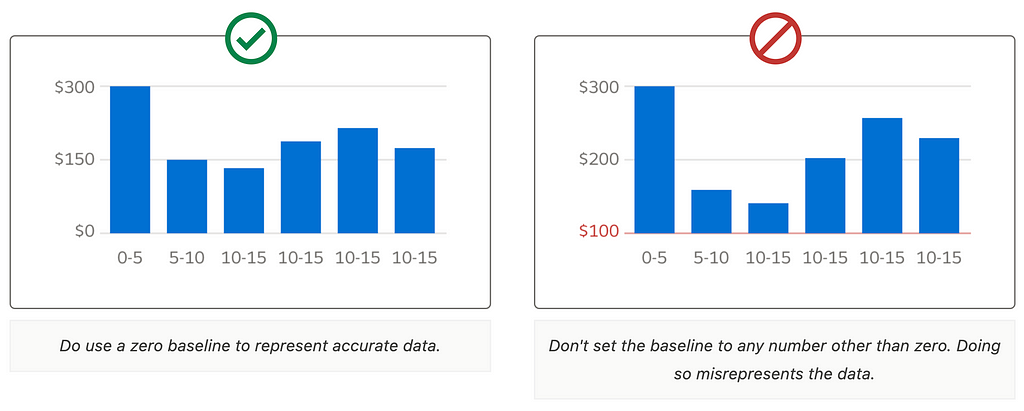
Set baseline value to zero
Use a zero baseline to prevent misinterpretation of data.
Make max numerical value visible
The bar representing the max numerical value in the data series should be visible in the plot area. Do not truncate bars to avoid misrepresenting data.
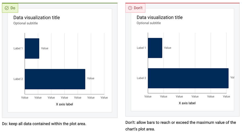
Show the x-axis label horizontally and the y-axis label vertically
It will make it easier for users to scan the text and understand the data.

Spacing
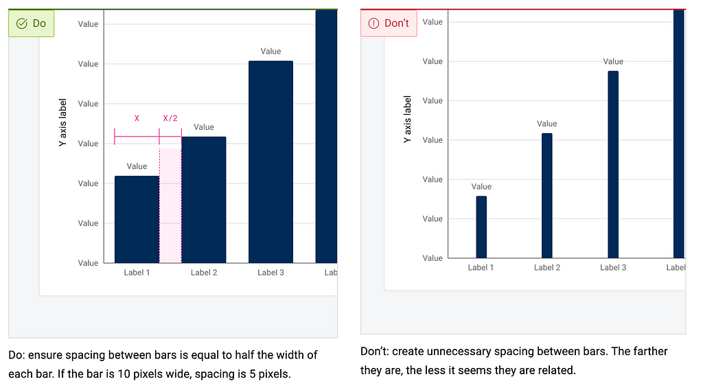
Spacing between bars should be proportional to the size of a bar
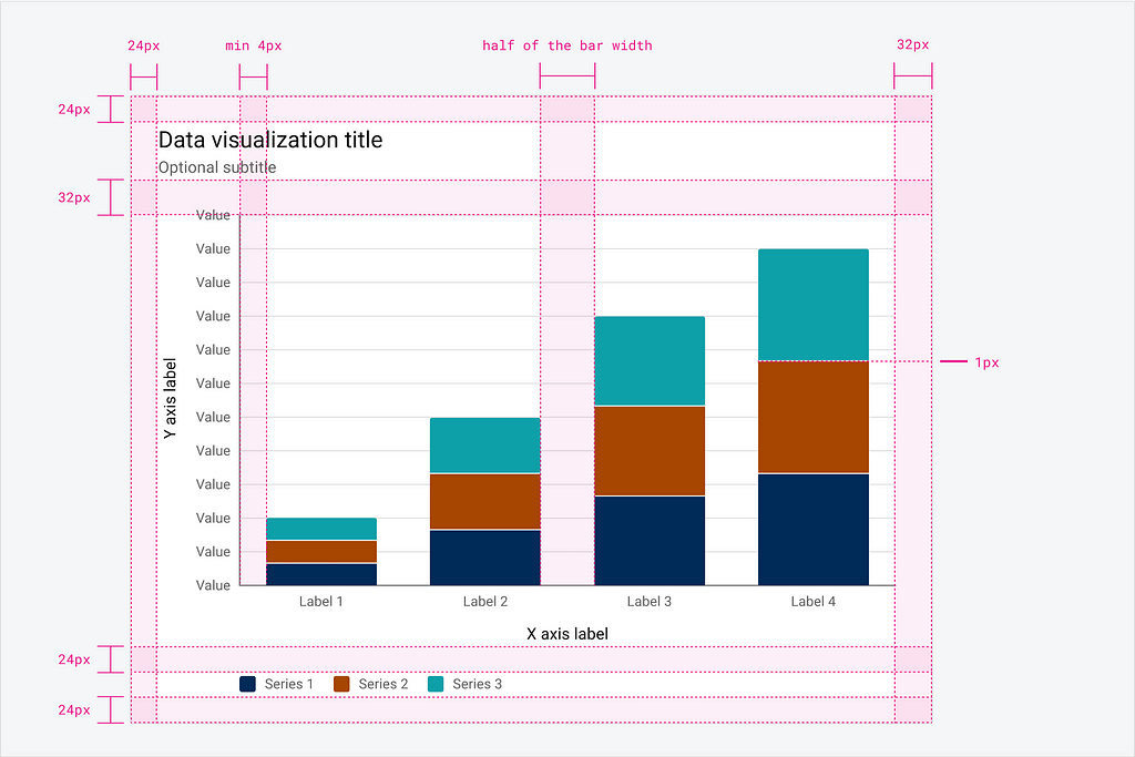
Spacing between bars in the plot area should be proportional to the bar width (i.e., it can be half of the bar width). Bar width and spacing between bars should scale with the size of the bar chart. Bar width should be consistent for all bars within the chart.
Interaction design
Add mouse hover / tab interaction
Allow users to hover/tap the bar to see additional contextual information about the data. The tooltip should display values for each bar or area within the bar.

Want to master your UI design skills?
Whether you’ve been working as a designer for years or are completely new to design, Designlab has programs and courses to help you take the next step in your design career (even if that’s your first step).
Online UI and UX Design Courses and Bootcamps | Designlab
This post contains affiliate link(s)
Bar Chart UI Design Tips & Tricks was originally published in UX Planet on Medium, where people are continuing the conversation by highlighting and responding to this story.