
Designarchy Vol. 17 — New Year’s Edition
Why Designarchy?
Because Inspiration and creativity do not have true governance, we creatives have time and feedback constraints that keep us from being true artists. Still, the process inside our minds, that split second when we decide which direction to go and what to create, based on god-knows-what, is the black box no company culture will ever own and control. And since this is the base of all other capabilities of a designer, I decided to always remind myself of that by changing the list’s name.
Your deliverables are the product of your inner mind, which feeds your taste and craft. Elevate those, and you elevate your abilities. All the software in the world won’t improve your taste.
Pro tip: use the cmd + f to find the inspiration you need faster. For example: “Portfolio inspiration”
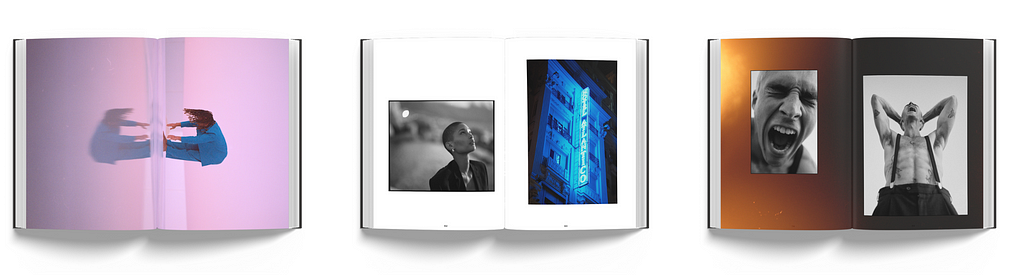
1. Theory Of Intimacy — Photography book
Marco is a Germany-based photographer who has traveled the world and continues to travel to expand his mind and his sense of aesthetics. His natural focus manifests in capturing the emotional Zeitgeist and the ever-growing impulse to long for the individual freedom of today’s digital youth.
This book is a beautiful gift, inspiration source, or artist appreciation.
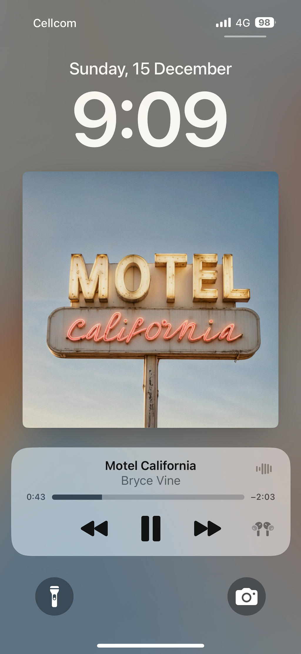
2. Duolingo Music — App inspiraiton
Inspiration always takes you to Duolingo if you’re working on a gamified app. The monster company has 113 million monthly active users (MAUs) worldwide (STATISTA).
Their new venture, Music is an awesome source of inspiration for horizontal screen usage, interactivity, and how a solid design system scales. Try it in the app store.
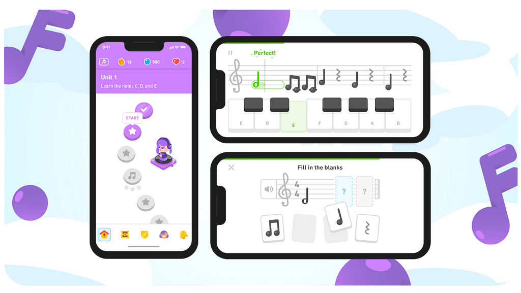
Our brand-new Music course hits all the right notes
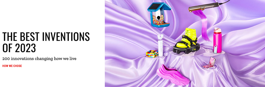
3. Best Inventions — TIME Magazine
An easy source of inspiration for anything from brand design, industrial design, web design, etc. The best inventions usually have the best design behind them.
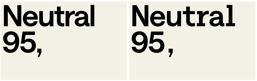
4. Saans Font — Displaay Type Foundry
Displaay is an independent type foundry established in 2014 and based in Prague, Czech Republic. Our team has numerous collaborators around the world.
This is one of the most sharp, modern, and sleek fonts I’ve seen lately and I am confident it’s a boost to almost any project you can think of.
5. Journal app — App by Apple
I’ve tried this relatively new app by Apple, and honestly, although I don’t like writing (to myself), the app is designed very well and I think you should try it to get some inspiration on how a seemingly ‘boring’ experience can have some of that apple delight.
They also do ‘smart defaults’ smartly. The app collects a few photos and videos and the location of that place and suggests you write about the experience there after you leave. Smart defaults make an experience seem smart and personalized.
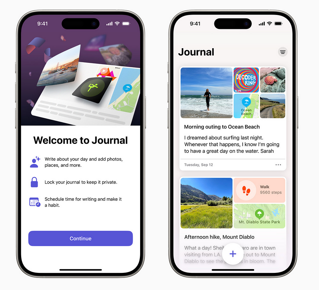
Apple launches Journal app, a new app for reflecting on everyday moments
6. Metro Boomin — Red Bull Symphonic (Full Performance)
Bringing two worlds together works if you do it well enough, and this concert is a great example. Metro Boomin is an American record producer and music executive. Known for his dark production style, he is regarded as one of the most influential producers in modern hip-hop and Trap music.
7. Mosaic — Concept Design
Louis Berger is a German Industrial Designer based in Munich & Seattle, currently working at Microsoft. His Mosiac concept project is a beautiful and thoughtful display of skills and play.
You can see the process through simple scrolling and it’s a cool concept. Great inspiration for a case study of concept projects, and also see Louis’s other projects.

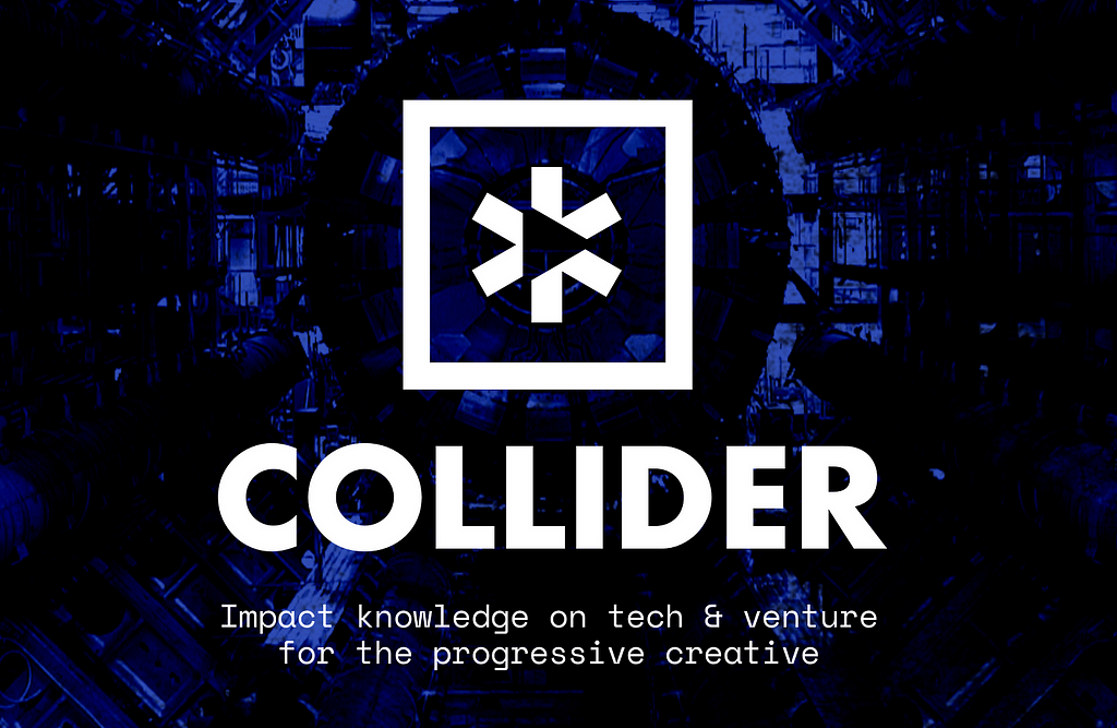
8. Design Articles — Collider
A publication accelerating knowledge and insights for the creative tribe’s journey through tech, startup, and venture.
If you are looking for high-level, deep, and thoughtful articles from top designers, this is the publication to do so.
9. AI Pin — Humane
You’ve probably heard and seen the new AI Pin by Humane, which is led by ex-Apple leadership. The product itself is very controversial but the website is pretty stylish. I like it when companies take a very techy product and diverge to a move fashion and lifestyle direction. Looks warmer and more human.

Humane Ai Pin | See the World, Not Your Screen. | Humane
10. The Art of Visual Design — Online class
I am not associated with this course but I just love the website’s visual style, the fun retro which we grew up on. Besides that, it seems like a decent and fun class where we can gain visual experience and improve our skills. Check it out.
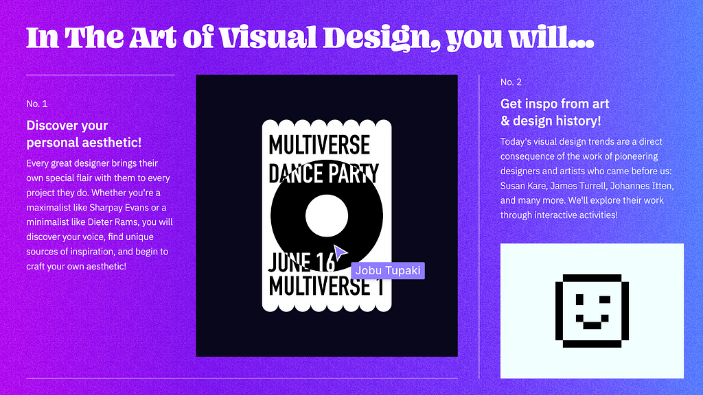
The Art of Visual Design (Elizabeth’s Version)
Summing up
If you just scrolled past this list and said “There’s nothing here that helps and ignites creativity”, you need to adjust your curiosity. These links offer hundreds of sub-links, more references, additional work, inspiration, and resource banks. Scroll back and now really look.
I hope you found this useful, Let me know in the comments.
-SH
Bonus
https://www.figma.com/community/plugin/1281668905420544225/variables-starter
Jokker – Displaay Type Foundry

![]()
Designarchy Vol. 17 — New Year’s Edition was originally published in UX Planet on Medium, where people are continuing the conversation by highlighting and responding to this story.