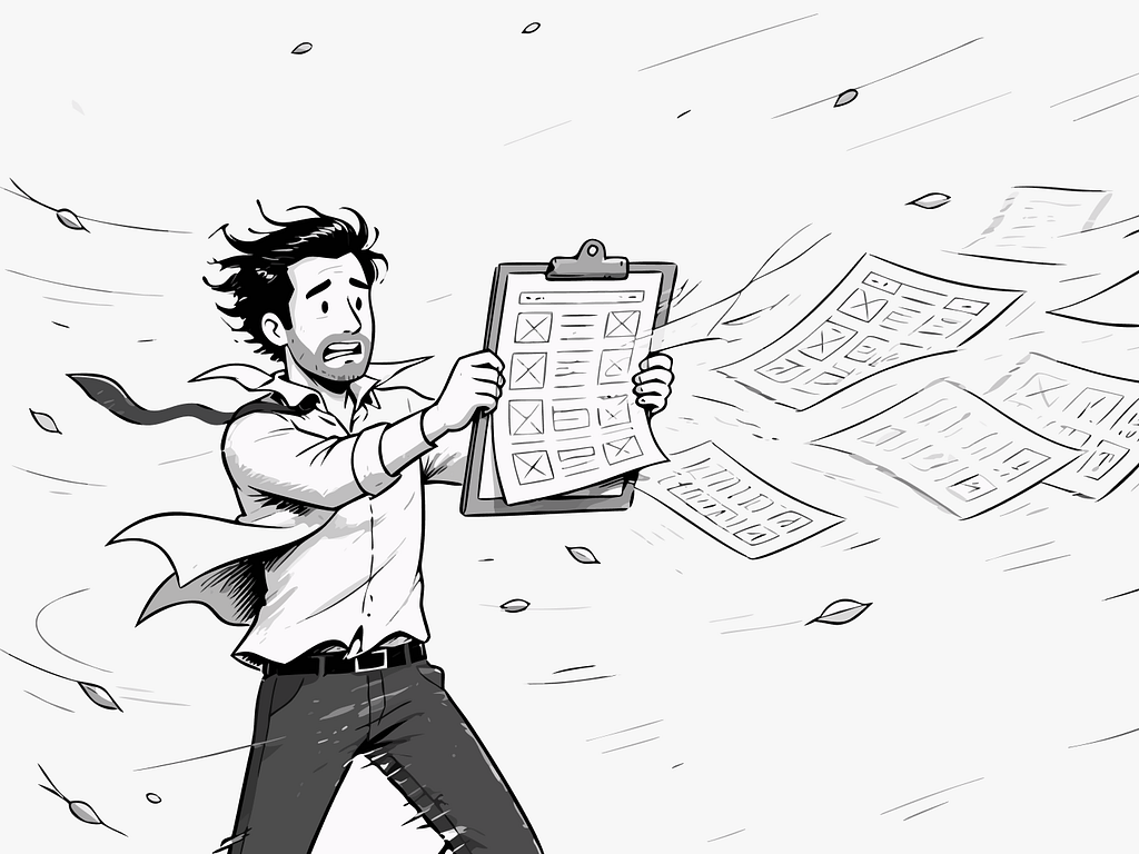
There’s a moment in an emergency when the world narrows.
Not metaphorically. Literally. Your peripheral vision contracts. Sounds flatten into background noise. The only thing that exists is the thing directly in front of you. Psychologists call it perceptual narrowing. The psychologist [J. A. Easterbrook described the mechanism back in 1959](https://doi.org/10.1037/h0047707): as emotional arousal rises, the range of cues we can take in shrinks. Your brain, under threat, stops processing what it deems unnecessary and concentrates everything on survival.
I think about this a lot when I’m designing screens.
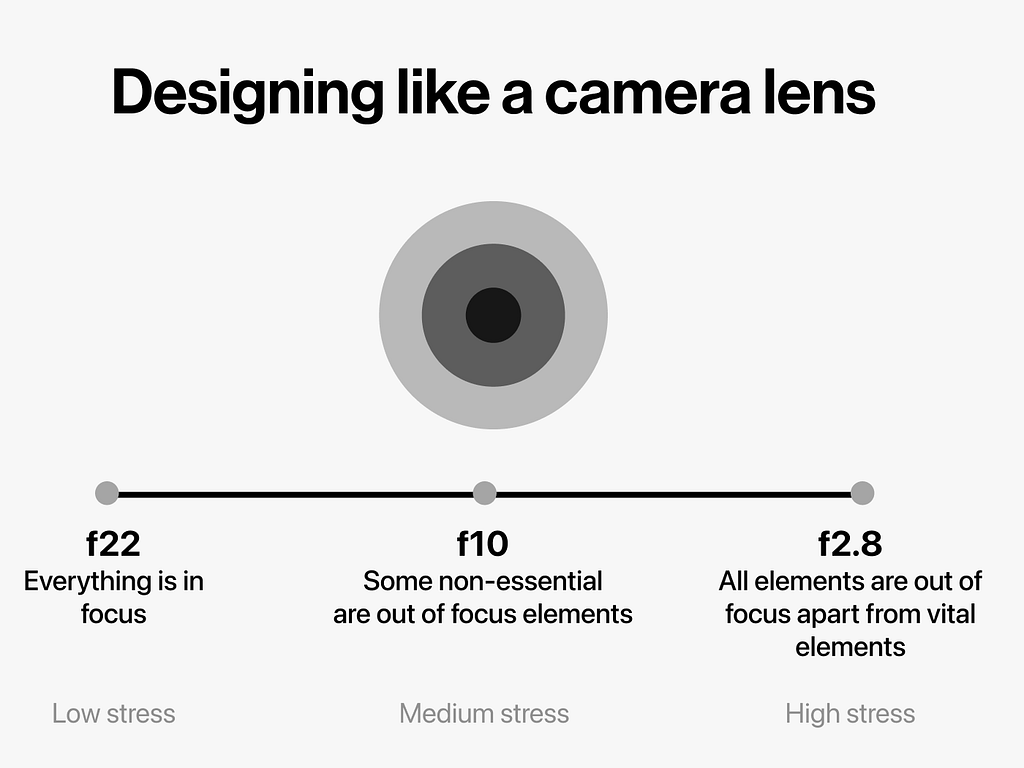
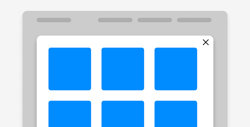
f22 — everything in focus
A camera lens at f22 keeps everything in focus. The foreground, the background, the blurry figure at the edge of the frame. Every element competing equally for your attention.
Most apps are designed at f22.
Hence a wealth of information creates a poverty of attention
— Herbert Simon, 1971
Every button visible. Every option available. Every notification badge clamouring for a glance. There’s a kind of democratic logic to it, an idea that giving users everything means giving them control. But control and cognitive load aren’t the same thing. One is a feeling. The other is a measurable weight.
When I worked on an Australian Police Service app, we were designing for over 11k officers across a state the size of Western Europe. The brief was straightforward: make them more efficient. But the deeper we went into the research, the more the real question came into focus.
What does it cost someone to use a bad interface at the wrong moment?
Two officers, one screen
We did field research. Clipboards in hand, watching officers work. Not in a lab, but in the actual conditions of their days.
What became obvious quickly was that the same officer, the same person, the same hands and eyes and brain, was a different user depending on where they stood. At a desk finishing a report, they were calm, methodical, patient with complexity. In the field, mid-incident, moving or in a vehicle, their stress was elevated and their tolerance for visual noise had collapsed.
The interface didn’t know any of this. It presented itself the same way regardless.
This felt like a design failure. Not a feature gap. A philosophical one.
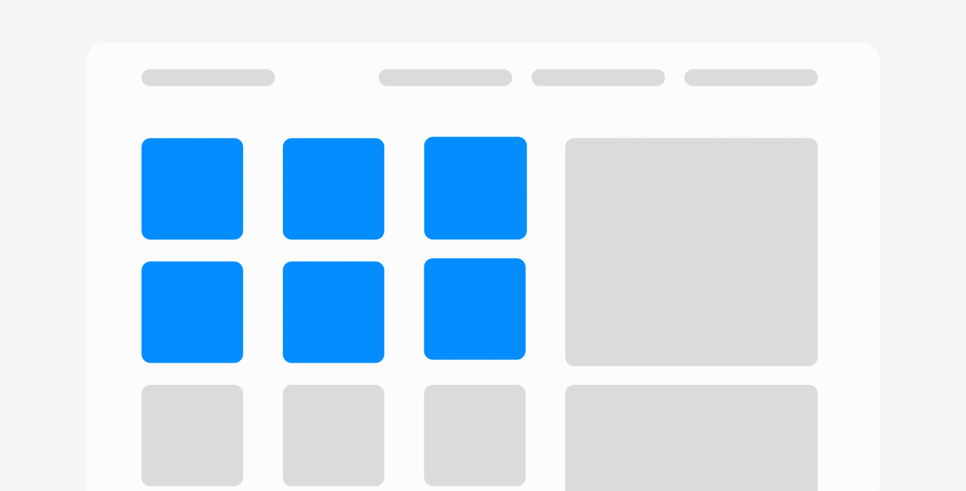
f2.8 — the aperture shifts
A camera at f2.8 does something beautiful and strange. It pulls one thing into sharp relief and lets everything else dissolve. The background doesn’t disappear, it just stops asking for your attention.
It implies withdrawal from some things in order to deal effectively with others.
— William James, The Principles of Psychology, 1890
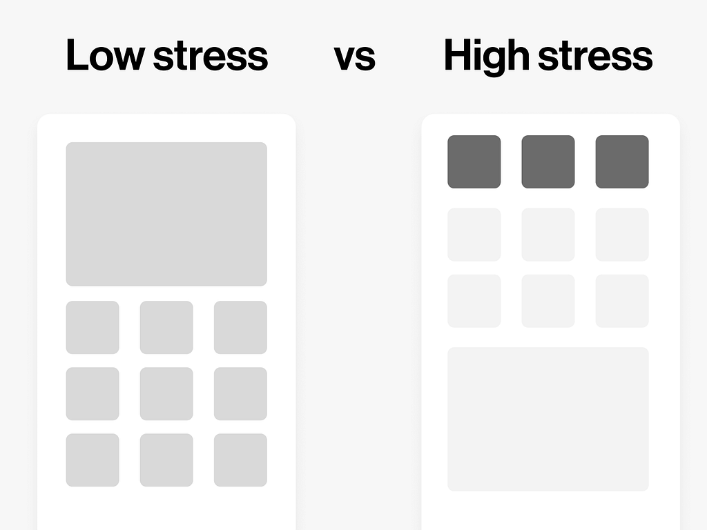
We built this into the UX stress model. As an officer’s stress increased, the interface contracted. Non-essential elements receded. Choices narrowed. The screen stopped being a dashboard and started being a torch.
The metaphor came from photography but the logic is neurological. When the brain is under load, every additional decision has a cost. Hick’s Law tells us that the time to make a decision increases with the number of options. But that’s in a neutral state. Under stress, the relationship isn’t linear. It compounds. The Yerkes-Dodson law, first described in 1908, gives that curve its shape: performance climbs with arousal up to a point, then falls away, and the more complex the task, the sooner the fall begins.
George Miller wrote in 1956 that the human mind can hold roughly seven items in working memory, plus or minus two. That was in a quiet room with a willing participant and no stakes. Put a person in a car responding to a call and that number shrinks considerably. A 2016 meta-analysis of acute stress and executive function found the same thing in the lab: across fifty-one studies, stress reliably impaired working memory.
Don Norman has spent a career making the same point from the design side. Negative affect “focuses the mind,” he writes, and under threat that focus collapses into “narrow, tunnel vision.” His conclusion for anyone building tools for those moments is blunt: they “are best served by designs that emphasise function and minimise irrelevancies.” A torch, not a dashboard.
What we don’t design for
Here’s what bothers me, the thing I keep coming back to.
Most UX design is optimised for a calm user. The personas we build, the testing we run, the environments we simulate. Someone seated, unhurried, with full cognitive resources available.
We design the f22 version of an interface and then we wonder why it breaks down under pressure.
Stress isn’t an edge case. It’s a condition of use. A parent navigating a hospital app with a sick child in their arms. A driver trying to follow directions in an unfamiliar city at night. A person rereading the same sentence in a financial document because they’re scared of what it says.
These aren’t unusual users. They’re all of us, on a bad day, when the stakes are real.
Practical methods to shift between different stresses
Stopping down the aperture comes down to a handful of concrete moves, each one a different degree of pulling something out of focus.
1. Desaturate the unimportant: Drain the colour from elements that aren’t central to the task, so the eye has less to catch on as it scans the interface.

2. Reduce the opacity of the secondary: Fade back elements that support the task without driving it, so they settle a layer beneath the thing in focus. Present enough to find, quiet enough to ignore.

3. Remove the nice-to-have entirely: Anything that lives in the optional category can go when stress is high. The most reliable way to lower cognitive load is to have less on the screen in the first place.

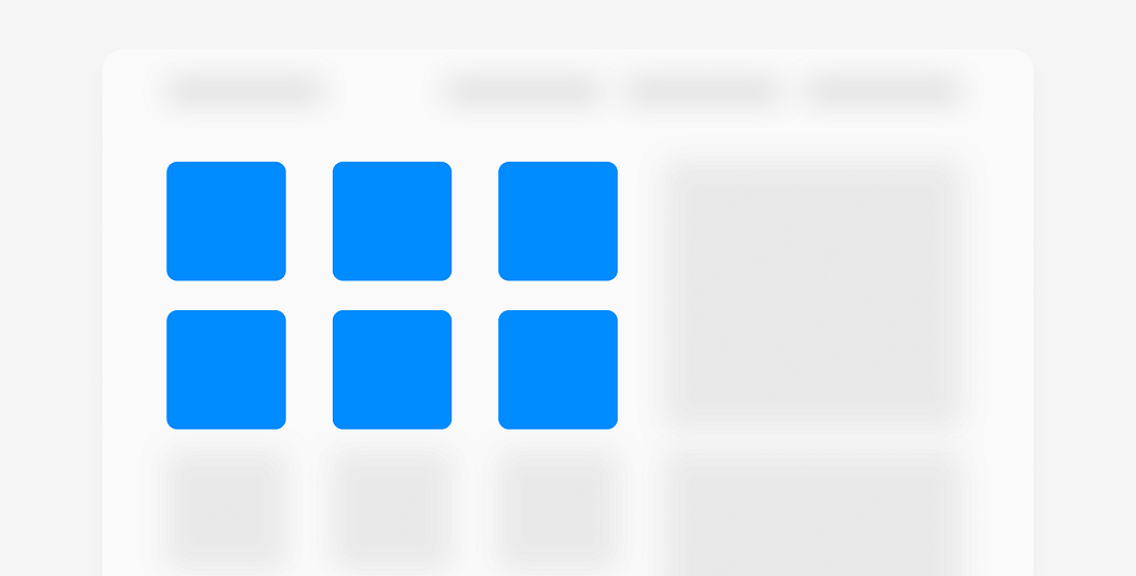
4. Blur what falls outside the task: Let elements that don’t belong to the current workflow soften into the background. They still exist, they just stop asking for attention.
5. Move into its own layer: A modal or a separate screen takes a secondary task out of sight, so the user can stay with the one that matters. A full-screen step usually beats a partial one, because it removes the surrounding noise instead of competing with it. The only context worth preserving is the kind that isn’t obvious, like where a deep link dropped someone.
6. Shift things visibly, with motion: When you move an element elsewhere, animate the change so the user sees it hasn’t vanished, only relocated, and can be reached again when they need it.
What the camera knows
A photographer chooses their aperture deliberately. Wide open for intimacy. Stopped down for clarity. The choice shapes what the viewer sees and what they’re allowed to let go.
We don’t talk much about interface design in those terms. About what we’re choosing to keep in focus and what we’re allowing to blur. About the responsibility that comes with putting something in front of a person who is already carrying more than they can hold.
I’m not sure we’ve fully reckoned with that yet. The tools exist. The research is there. Miller, Kahneman, the whole field of cognitive load theory stretching back decades.
Something else is missing. An acknowledgement, maybe, that the person holding the screen is not always fine.
That sometimes they’re at f2.8 whether we planned for it or not.
References
Perceptual narrowing under arousal. Easterbrook, J. A. (1959). The effect of emotion on cue utilisation and the organization of behaviour. Psychological Review, 66(3), 183–201. https://doi.org/10.1037/h0047707
Attention as selective withdrawal. James, W. (1890). The Principles of Psychology, Vol. 1, Ch. 11, p. 404. http://www.yorku.ca/pclassic/James/Principles/prin11.htm
The attention economy. Simon, H. A. (1971). Designing organizations for an information-rich world. In M. Greenberger (Ed.), Computers, Communication, and the Public Interest (pp. 37–72). Johns Hopkins Press.
Arousal and performance, the inverted-U. Yerkes, R. M., & Dodson, J. D. (1908). The relation of strength of stimulus to rapidity of habit-formation. Journal of Comparative Neurology and Psychology, 18, 459–482. Overview: https://en.wikipedia.org/wiki/Yerkes-Dodson_law
Decision time and the number of choices. Hick, W. E. (1952) and Hyman, R. (1953), together the Hick-Hyman Law. Plain-language summary: https://lawsofux.com/hicks-law/
The limits of working memory. Miller, G. A. (1956). The Magical Number Seven, Plus or Minus Two. Psychological Review, 63(2), 81–97. Summary: https://lawsofux.com/millers-law/
Stress impairing working memory. Shields, G. S., Sazma, M. A., & Yonelinas, A. P. (2016). The effects of acute stress on core executive functions: a meta-analysis and comparison with cortisol. Neuroscience & Biobehavioral Reviews, 68, 651–668. https://pmc.ncbi.nlm.nih.gov/articles/PMC5003767/
Cognitive load. Sweller, J. (1988). Cognitive load during problem solving. Cognitive Science, 12(2), 257–285. For the design application: Nielsen Norman Group, “Minimize Cognitive Load to Maximize Usability.” https://www.nngroup.com/articles/minimize-cognitive-load/
Affect, focus, and tunnel vision. Norman, D. A. (2002). Emotion & design: attractive things work better. Interactions, 9(4), 36–42. https://jnd.org/emotion-design-attractive-things-work-better/
Attention as a finite resource. Kahneman, D. (1973). Attention and Effort. Prentice-Hall.
![]()
Designing for the Wrong User was originally published in UX Planet on Medium, where people are continuing the conversation by highlighting and responding to this story.