Figma Sites is an incredible vision. But we aren’t at “One-Click Publishing” yet.
As product designers, our ultimate anchor is the single source of truth. We spend months building robust, scalable design systems so that our work stays clean, unified, and intentional.
Right now, jumping from Figma Design to Figma Sites feels less like a smooth sync and more like a messy translation where things get lost in transit.
I’ve been diving deep into the beta, and from a technical audit perspective, here is what Ive been struggling with.
1. The Fidelity Gap: When what you see isn’t what you get.
The canvas handles complex styling with ease, but Sites is currently hitting a wall with basic CSS translation.
- Advanced Fill & Effect Failures: Background patterns and linear gradients are completely ignored during publishing. If you want a desaturated image, you can’t rely on Figma’s native image effects — you literally have to export a flattened version and re-import it as a quick workaround.
- Property Dispute: One of the most frustrating bugs right now is text property reversion. If you change copy or text properties inside an instance in Design, it frequently snaps right back to default values the second it hits Sites. Whats worse? you cannot select multiple layers and add the same property to them.
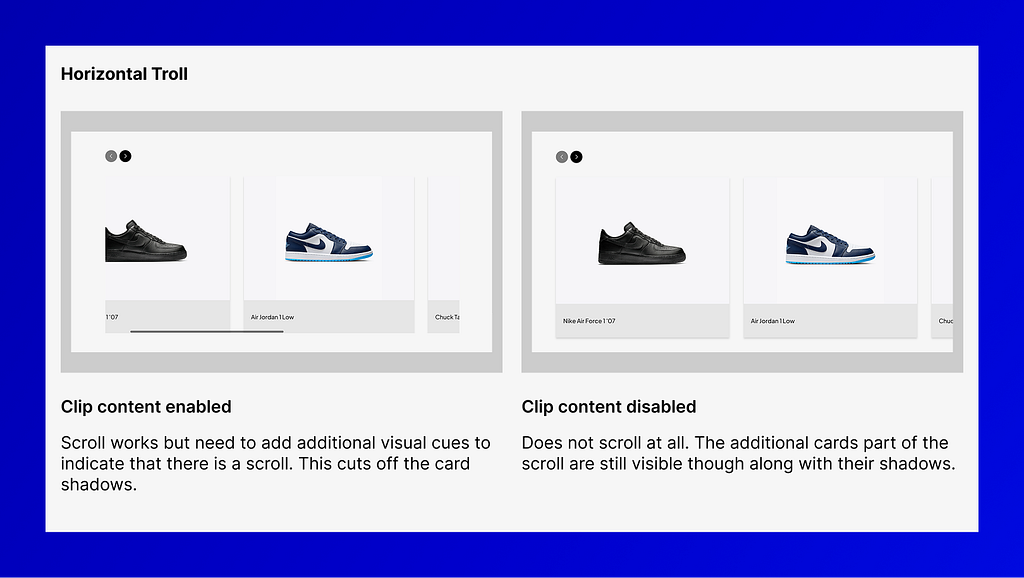
- Horizontal Troll: Horizontal scroll only works if “Clip Content” is turned on. This means you can’t let cards “bleed” off the edge of the screen to visually hint to the user that there’s more to scroll.
2. Architectural Friction: The cost of manual rework.
The core promise of Figma has always been “design once, use everywhere.” In Sites, that workflow feels fragmented.
- The Accessibility Tax: You can’t specify accessibility labels (Aria-tags) in Design and have Sites pull from them. To avoid manual, repetitive work on every single page, your workaround is to copy-paste the main component into Sites itself — which completely defeats the purpose of your original Design library.
- Navigation & Routing: Prototyping links don’t carry over; you have to rewire your entire interaction logic in the Sites panel. On top of that, nested URL structures are unsupported — Figma flattens structures like “/projects/project_1” into messy strings like “projectsproject1”. Nesting pages could have been more intuitive.
3. Performance & AI: The power struggle.
This is where the autonomy of AI clashes directly with intentional design choice.
- The “Make” Override: When you trigger Figma Make within Sites, the AI often completely ignores explicitly selected nodes, hallucinating its own text and layout instead. Worse? Once you apply an effect to a section, it’s a black box — you can’t edit it. You have to jump back to Design, fix it, and push it all over again.
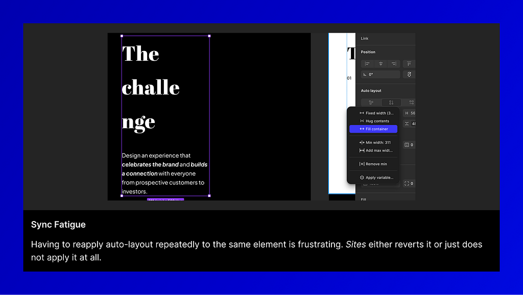
- Sync Fatigue: Syncing drops have forced me to reapply the exact same variables or auto-layout settings over and over again. It’s a massive velocity killer.
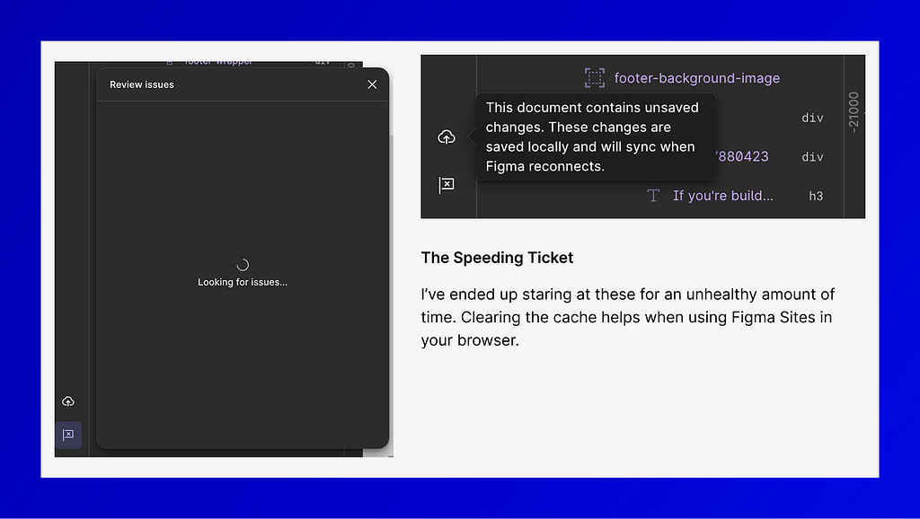
- The Speeding Ticket: Publishing an 8-page, content-heavy site takes a painfully long time. Previews are laggy, reload times are long, and we’re missing a dedicated mobile app preview (like we have in Figma Design) to properly audit responsive layouts.
![]()
Why Figma Sites Beta isn’t closing the gap yet. was originally published in UX Planet on Medium, where people are continuing the conversation by highlighting and responding to this story.