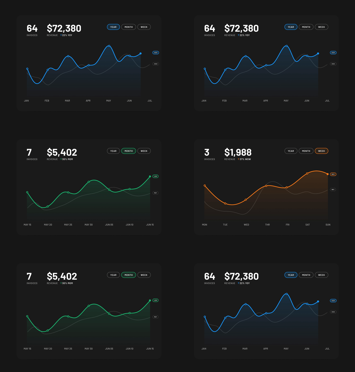
Line chart is created by connecting a series of data points together with a line. This type of chart is good at showing change over time, comparisons, and trends.
This article explains the basics of using line charts in UI design.
Data
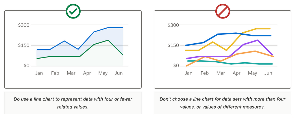
Number of lines
Don’t choose a line chart for data sets with more than four values. By adding more values, you will make the chart look busy and make it harder for users to extract important insights using it.

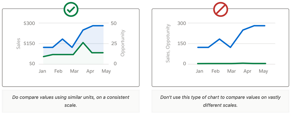
Scale
Always compare values on a consistent scale

Color
Color plays an integral part in narrating stories through data visualization.
Chart background
Opt for a neutral background color to make the lines stand out.
Lines
Use a minimal color palette when associating colors with numbers. The colors should be distinct for different lines to help users differentiate them. Design lines with at least 2pts in weight and with a sufficient contrast against the background.
Use shapes along with color to communicate information
Avoid using just color to communicate meaning in your data visualization. Add other visual indicators such as shapes, line texture, patterns, or direct labels to support users in making sense of the data

Accessibility
Chart colors meet WCAG AA 3:1 contrast ratio.
Labels
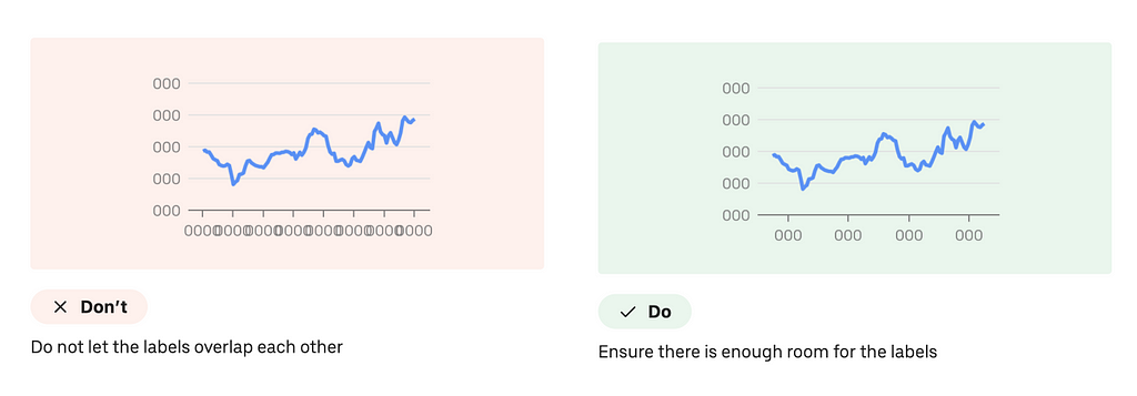
Ensure there is enough room for labels
When adding labels, provide enough room, so the labels don’t overlap.

Interaction design
Hover/Active states
Highlight data points or lines on hover to provide more detailed information. Implement tooltips that show detailed information when a user hovers over a data point.

You can also allow users to hover over/click on a legend item to highlight a particular line.

How to design Line chart in Figma
Want to learn UX design?
Try Uxcel. Uxcel will help you learn and improve your design skills with interactive UX courses and skill tests built specifically for professional designers.
Learn UX Design at Your Own Pace | Interactive Courses | Uxcel
This post contains affiliate link(s)
Line Chart UI Design Tips & Tricks was originally published in UX Planet on Medium, where people are continuing the conversation by highlighting and responding to this story.