
Essential collection of text effects in UI design
This article features some of the most used text effects in UI design—from text truncation to rotating circular text—along with design recommendations and Figma tutorials.
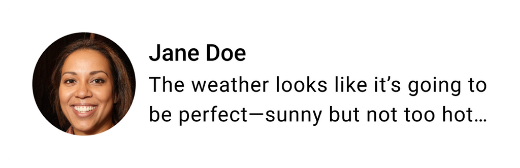
Text truncation
Text truncation is often necessary in UI design to ensure content fits within space constraints while still being comprehensible and visually appealing.
Design recommendations:
- Ensure the most critical part of the text (e.g., the start or keywords) is visible before truncation.
- Use ellipses (…) to indicate truncated text. This is a standard convention that signals to users that there is more content.
- Allow users to view the full text with minimal effort, such as through a tooltip that appears on mouse hover or inline “Read More” link / button.
Sliding (scrolling) text
Sliding (or scrolling) text is another technique that commonly used by designers when there is not enough space to show full text. Because human eye naturally attracts to moving objects, sliding text can be a visually engaging way to convey information.
Design recommendations:
- Use sliding text only when necessary, such as for news tickers or dynamic content like stock prices or sports scores.
- Ensure the scrolling speed is neither too fast (making it hard to read) nor too slow (causing frustration). A good rule of thumb is that users should be able to read the text comfortably in one pass.
- Allow users to pause scroll the text (for example, pause scrolling on mouse hover) so that they can read the text without problems.
- Avoid jerky or abrupt movements. Using smooth transitions with linear animation curve.
Glowing text
Glowing text can create a visually striking and dynamic effect in UI design.

Design recommendations:
- Don’t overuse this effect. Reserve glowing text for specific purposes, such as drawing attention to key elements (e.g., promo messages) or creating a futuristic, neon, or sci-fi aesthetic in themed designs.
- Use soft, diffuse glow effects rather than harsh, sharp edges.
- Avoid applying glowing effects to long paragraphs or body text. It can strain the eyes and reduce readability.
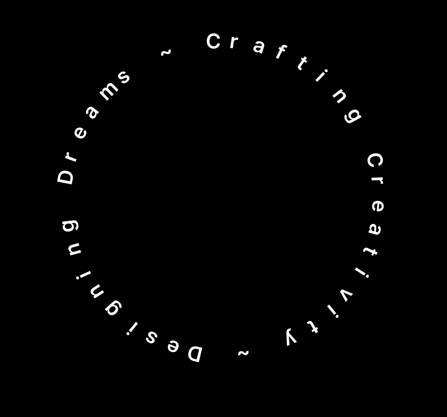
Rotating ciruclar text
Rotating circular text is another example of visually appealing effect, but unlike glowing text, rotating circular text should be used sparingly.
Design recommendations:
- Rotating circular text works well for logos or branding elements, and decorative headings or banners.
- Avoid using rotating circular text for large blocks of text. It’s best suited for short phrases or single words.
- Ensure the text is legible at all points in the rotation—use simple, sans-serif fonts to maximize readability and avoid excessive letter spacing or complex typefaces that make reading difficult.
Want To Master Product Design?
Try Interaction Design Foundation. It offers online design courses that cover the entire spectrum of product design, from foundational to advanced level.
This post contains affiliate link(s)
![]()
Text effects in Figma was originally published in UX Planet on Medium, where people are continuing the conversation by highlighting and responding to this story.