Yes, that’s a Nicolas Cage meme — you’re welcome.
I‘ve started a new thing, and it’s called UX Cheatsheets 💎.
It’s a deep dive on a specific area of product design, and a handful of quick wins that I’ve seen other product teams do really well.
Right, enough preamble, let’s talk about upselling, trials and churn. 👇
All of the content is taken from my site, Built for Mars.
1. Trial reminders (the good, and the better)
Whenever a service takes a payment card before a trial, I immediately have a dread of “oh, I bet I forget to cancel this in time”.
To be clear, companies ask for a card in advance, because it removes the need for the user to make a decision (if they want to stick around).
The inverse requires the user to actually bother logging in and entering a payment method. That’ll create churn.
One UX technique that companies use to calm some of this pre-trial anxiety is to promise that they’ll remind you a few days before your trial ends.
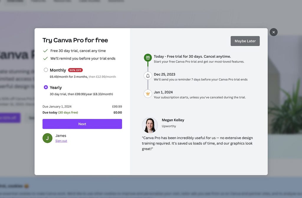
The easy implementation would be a simple email automation, like Canva above.
But you can do better.
Imagine that you’re booking a flight. Which of these two scenarios would you feel more comfortable in:
- “Company policy: all of our seats come with overhead luggage space”
- “Would you like to reserve overlead luggage space? [yes] [no]”
Although the outcome is identical, it can be more reassuring if there’s user input involved in the process.
i.e., you’re more likely to believe in the outcome. Surely the company is less likely to ignore a direct request, rather than a broad company policy, right?
Now look at Rise:
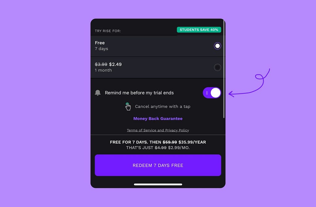
What they’ve done here is smart: they’ve added a toggle to be reminded.
What I imagine the outcome of this small component is:
- People are more confident that they will actually get a reminder.
- This reduces pre-purchase anxiety
- Rise see a slightly increased conversion rate at this stage of the funnel.
Bonus quick win 💎
Not many people who signed up to a service 3 weeks ago, will remember that they’re expecting an email reminder before their trial ends.
So, a quick win: remind the user that this safeguard exists.
Here are two examples, from Duolingo and Nibble:

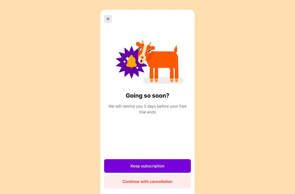
To be clear, it doesn’t need to be a fullscreen prompt like these.
As an initial experiment, it could be as simple as a bit of content near your ‘cancel’ button.
2. Value first, then credit card
Something to consider about #1, is that not every product is optimised by taking payment methods before a trial.
To a certain extent, the entire model behind Google Meets is the opposite.
They’ll let you create a meeting with almost no friction, and then when your about to hit your usage cap, you’ll be able to start a trial from within the call.
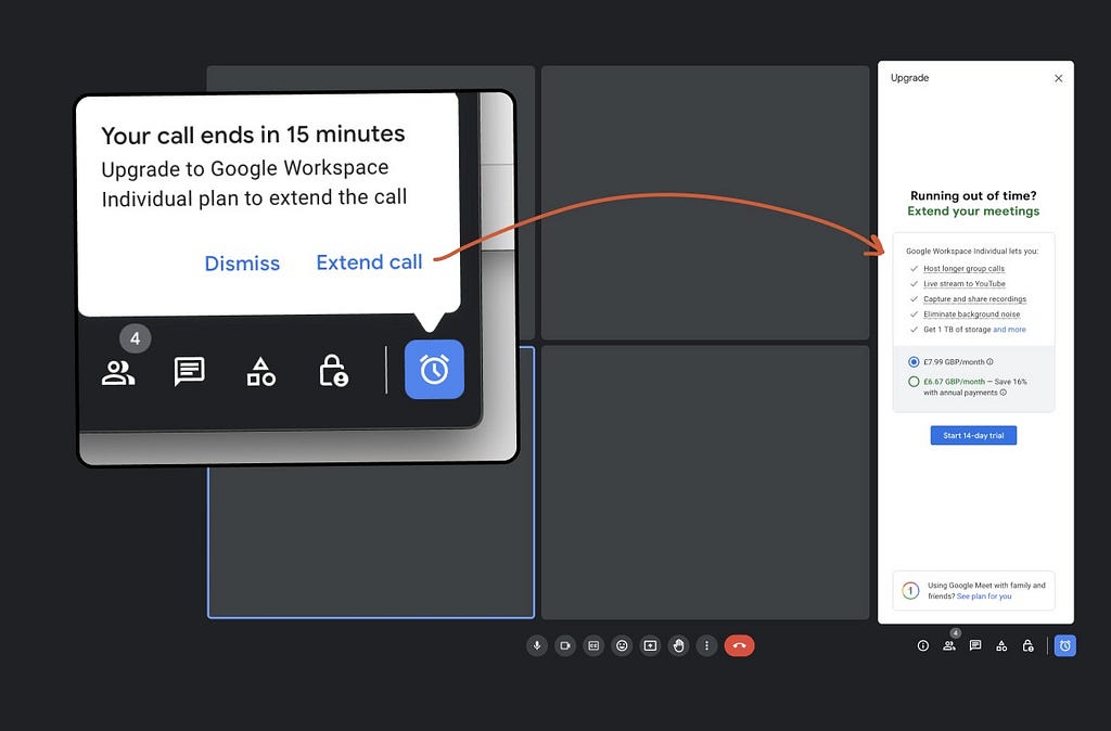
- Google gives you the product for free, with low friction.
- They’ll catch you at a good moment to start a trial in a few clicks.
Or, take Asana, who don’t even require a payment method.
They’ll let you try a premium feature for 30 days, in a single click.
You don’t need to enter a card, they’re not confusing you with a hundred other premium perks — they’re focused on getting you to experience the value.
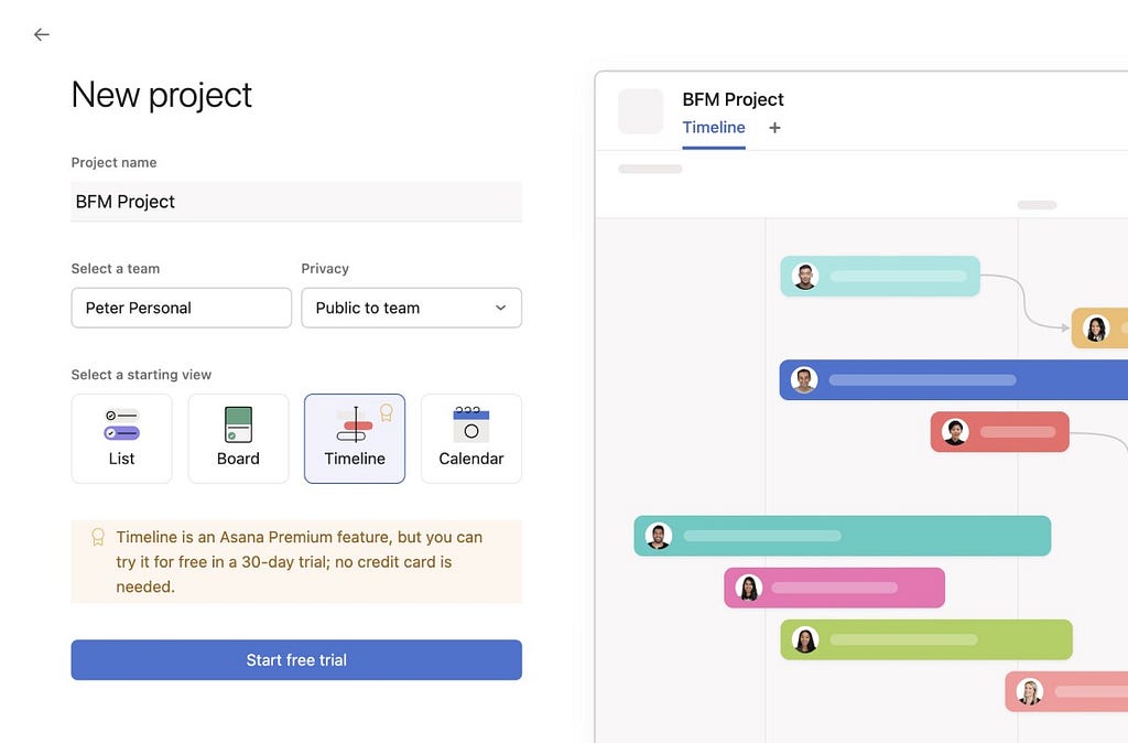
Before your 30-day trial ends, they’ll start leveraging loss aversion, and prompt you to enter a payment method before you lose access.
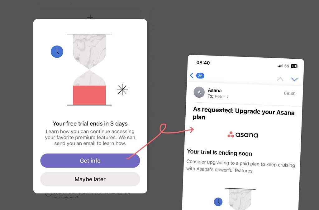
i.e., if you’re going to ask for a payment method at the end of the trial period, the users need to be against losing something.
Otherwise they’ll let it expire, and just re-subscribe whenever they next want to use it. There’s little incentive to take action now.
3. Delivering value without a trial
If you can, experiment with just getting the person to use the product, with as little friction as possible — not even mentioning a trial.
For example, Flighty (the flight tracking app) know that the value of tracking a randomflight is very low.
But it does allow you to see, and use, all of the features.
So there’s a button to experience Flighty Pro, at any time.

It’d take some experimenting to implement something like this effectively, but here are a few (fake) ideas:
- Netflix: could let you watch a random TV show in 4K, to experience the difference in quality, compared to 1080p.
- Tinder: could find you a premium match, but with someone who lives 1,000 miles away.
- Duolingo: could let you try their premium plan, but for a random language, without any means of saving progress.
You made it, awesome. You’re like, 0.006% better at UX already.

All of these UX Bites can be found here.
Or, if you want the rest of these cheatsheets to be emailed to your team every month, subscribe to BFM+ (plus, you’ll unlock 3,700+ hours of UX analysis).
The UX tricks behind upselling, trials and churn 💎 was originally published in UX Planet on Medium, where people are continuing the conversation by highlighting and responding to this story.