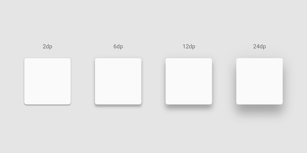
Incorporating shadows effectively in UI design can greatly improve both the visual appeal and usability of an interface.
This article explores different types of shadows and offers hands-on tips and tutorials on creating them.
Types of shadows
Soft shadows: Use for subtle depth, such as buttons and input fields.
Strong shadows: Use for elevated elements like modals or dropdowns.

Inner (inset) shadows: Use to create a sense of depth within an element, such as pressed buttons or sunken panels.

Design tips

Choose the right color for the shadow
Instead of using black or gray shadows, use subtle color variations that match the color of the UI element casting the shadow. This can create a more cohesive look.

Consistency in elevation
Use shadows to create a sense of depth, indicating which elements are on top of others. Define a set of elevation levels and stick to them. For example, buttons typically have a lower elevation than modals.
Use interaction-based shadows
When using shadows for functional elements like buttons, change shadows based on user interactions. For instance, increase the shadow size when a button is hovered over or clicked. Adjust the distance and blur radius of shadows to simulate different states and design smooth transitions between the states to enhance the user experience.

Use realistic shadows
Decide on a light source direction and stick to it throughout your design. You can mimic natural shadows by using softer, more diffuse shadows rather than harsh ones.
Layering shadows
You can layer multiple shadows to create a more dynamic and realistic effect. For example, a soft, large shadow can be used for general elevation, and a smaller, darker shadow can be used for sharper edges.
Performance considerations
When using CSS shadows, be mindful of performance. Overusing shadows can slow down rendering, especially on lower-end devices.
Creating shadows in Figma
Want To Learn UX?
Try Interaction Design Foundation. It offers online design courses that cover the entire spectrum of UX design, from foundational to advanced level.
This post contains affiliate link(s)
Shadows in UI design: Tips & Tricks was originally published in UX Planet on Medium, where people are continuing the conversation by highlighting and responding to this story.